Made Redundant
2023
Having germinated in a number of talks over the years, I started writing this up as “Made Redundant (4 Templates)” for the French graphic design journal Revue Faire some months before leaving my position as Head of Design at the ICA at the end of 2022. The title therefore has something of a double meaning, but “redundancy” here mainly alludes to the way in which design templates necessarily over-compensate for contingency.
The essay recounts four projects made with various collaborators that can be found elsewhere on this site: Metropolis M, The First/Last Newspaper, Bulletins of The Serving Library, and the Institute of Contemporary Arts. The physical publication, with many more images, is available to purchase here.
*
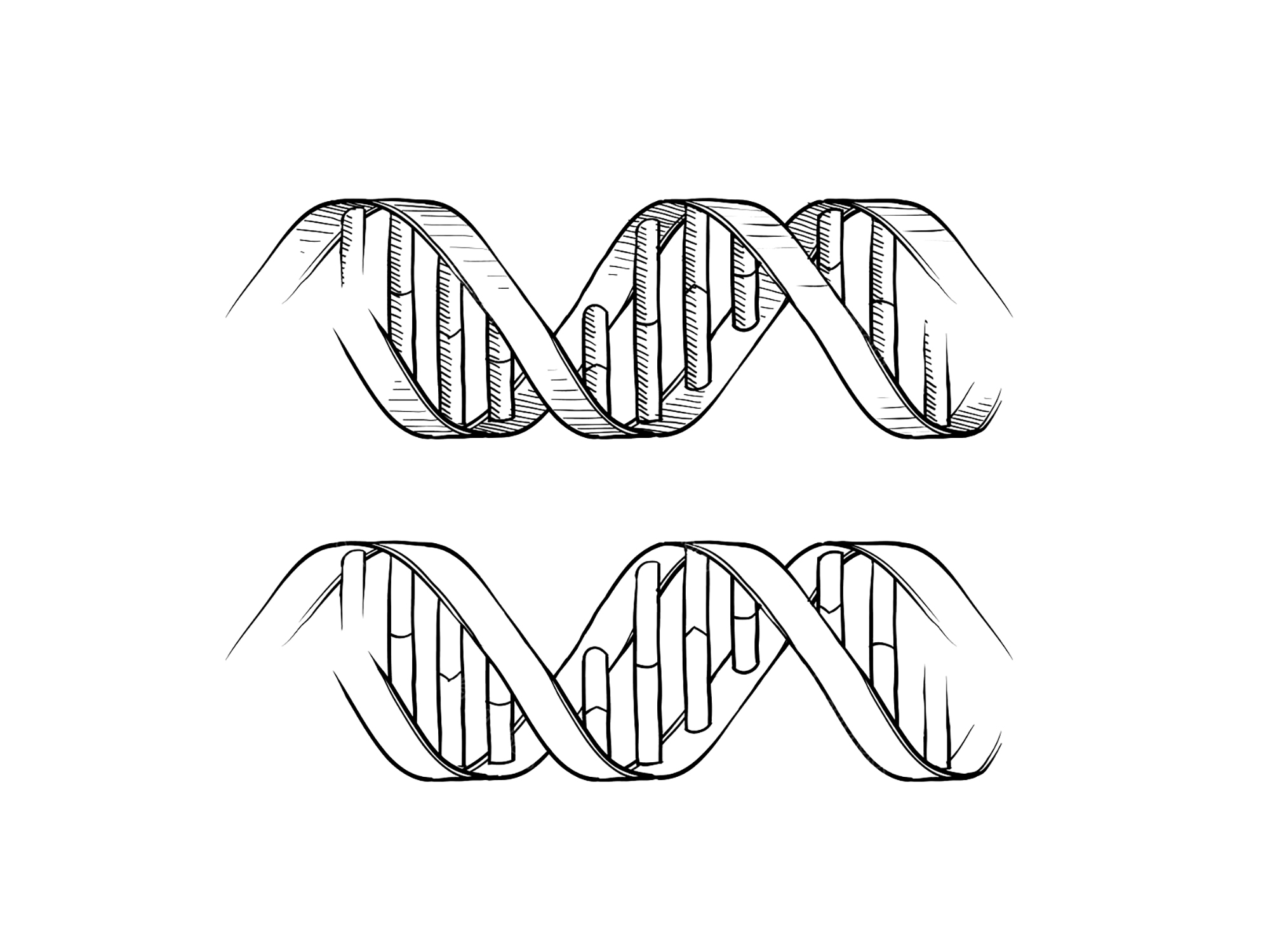
In the everyday material world, a template refers to some kind of repeatable outline used to cut metal, rubber, cloth, card, or other pliable matter, while down in the depths of molecular genetics it is a strand of DNA that sets the genetic sequence of new strands during replication. Both definitions readily extend to graphic design, where a template can equally mean a specific form designed to be repeated, or a set of principles that inform an approach. If you cast the net of definition wide enough, in fact, most of what passes for graphic design these days amounts to a template in some shape or form. Consider for instance that the underlying grid of a typical book or website is a standard framework repeated over and over with varying amounts of difference from page to page; or that any series involving some degree of graphic consistency, whether posters, magazines, emails, or social media posts, consists in the repetition of formats, materials, typefaces, colours, or image types. Unless we’re talking strictly about a one-off, graphic design is either based on—or presupposes—something else.
Templates in graphic design are associated with convenience and efficiency, their dual purpose being to speed up work by circumventing the need to make decisions, and to ensure consistency by restricting the parameters of possibility. But they can be deployed in other, less reductive senses too. Here are four more or less distinct types of templates designed with various collaborators, each based on a snowball of reasoning gathered along the way. On revisiting them I was surprised to see how neatly they trace the gradual shift from physical to digital media over the last couple of decades.
…
I. Template as Generative Headache: Metropolis M
Metropolis M is a bimonthly Dutch contemporary art magazine that has been regularly redesigned by youngish graphic designers or studios every few years. It was a favourite of mine around the turn of the millennium when under the auspices of the Amsterdam-based studio Mevis & Van Deursen in collaboration with British designer Paul Elliman and Dutch artist Barbara Visser. Back then, Mevis & Van Deursen were starting to adopt a kind of neo-International Style that would become something of a signature during the 2000s, typified by the prominent use of grids commonly associated with influential Swiss graphic design of the 1950s and 1960s. The antiseptic, blocky repetition of International Style is rooted in having to accommodate two or more parallel languages on the same page, but later became adopted as an aesthetic flavour in its own right.
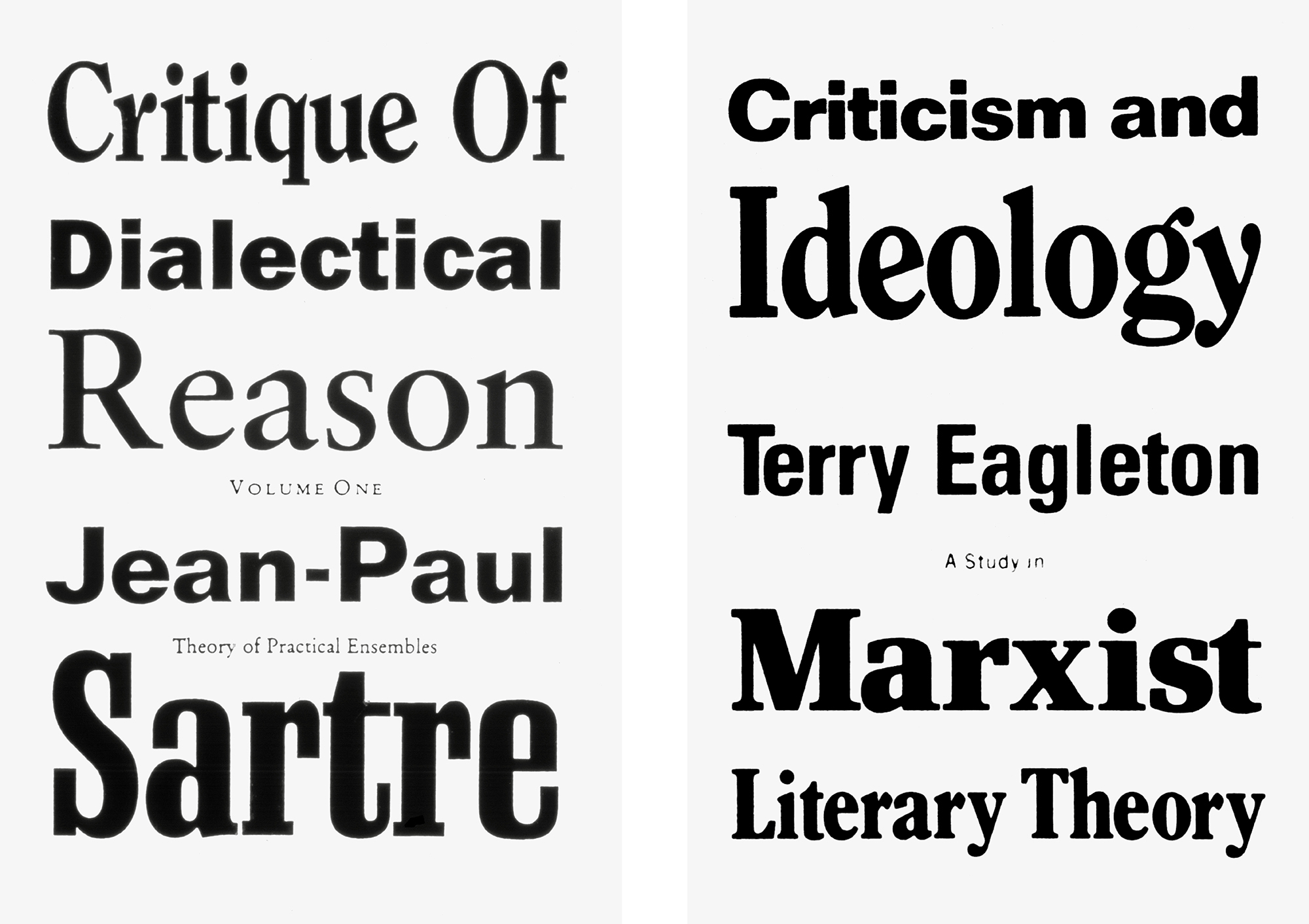
Paul Elliman’s work and influences were and still are less easy to pin down, but for the sake of convenience I’ll point to a proposal for a series of book covers put to the publishing house Verso back in the 1990s, in which he shortlisted fifty typefaces, specified them randomly line by line and asked the typesetter to set them to whatever size would fill the width. Each new cover was thus generated from this set of objective rules, as opposed to being “composed” according to subjective taste—an approach he once described as an “aesthetics of disruption.” In a way that still eludes me today, the three published covers that ended up being made by this method seem way more outlandish and particular than anyone might reasonably expect from such a dry set of rules.
Mevis & Van Deursen & Elliman’s Metropolis M design neatly conflates their respective sensibilities, but it is at least equally grounded in a shared sense of humor, based as it is on the fact that the amount of editorial space in commercial magazines is directly determined by the sale of advertising space, typically in denominations of full-, half-, and quarter-page and sometimes even smaller blocks. Their template simply mirrors this 1:1 economy of real estate, with each editorial page explicitly built from the same blocks as the adverts, compartmentalised like an in-flight meal. I recall this looking very odd and very sharp. A few years later, I even helped produce a few issues and quickly found that, thanks to the structure being so clearly defined and insistently maintained, they were remarkably easy to assemble. The template therefore did its convenient, efficient job. But there was something else going on here too: the deadpan “advertorial” principle also generated a highly distinctive look, a style.
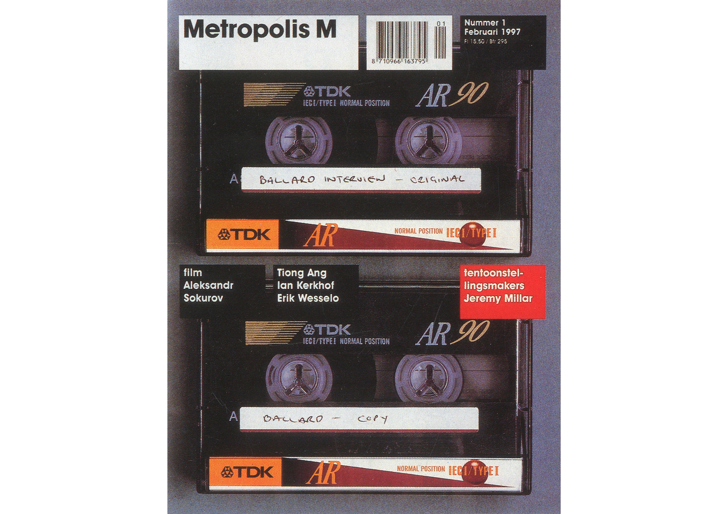
In late 2002, Will Holder and I were invited by the Metropolis M editors to propose something new. At first, this was hard to conceive inasmuch as I, at least, considered the previous design to be some kind of ideal—and it is obviously much easier to remake something you think is lacking. Will and I were also constitutionally against what back then seemed to be a routine tendency to redesign things without good reason: according to the fickle tides of fashion, or because someone new in charge of an institution wants to stamp their mark on a new era regardless of whether or not things were working well already. We tended to prefer designs that had stuck around for decades, slowly developed and refined by many people over time but still essentially the same as when they began. In terms of magazines, I’m thinking of stalwart periodicals like The New Yorker, The London Review of Books, or National Geographic.
Our response was therefore less a proposal, more an arrogant assertion: that the editorial approach in general and writing in particular should be improved, ideally breaking from the usual formats of news, reviews, interviews, articles, and essays, and pushing into a more freely experimental, literary territory. We felt that the magazine had been designed to be browsed rather than read, which was a shame given the amount of effort put in by its writers and other contributors. As such, we weren’t interested in contributing another superficial redesign, but rather in altering its ambition. And to that end, it was necessary to reconsider everything from scratch, including aspects like the means of production, cost, and language.
To demonstrate what we meant, we gathered some of our favourite art writing, past and present, into a modest publication we called Tourette’s (as in, “we can’t help ourselves”) to hand round at the next meeting. Despite trying to avoid presenting anything that looked remotely like an actual design at this stage, these collected texts still had to be presented in some form or other, so we “dressed” the text in what we considered to be generic book pages: the Platonic idea of a page from a novel, conservatively typeset for maximum legibility, printed two-up on our A3 studio laser printer, then folded and stapled to make an A4 booklet. The result was a mongrel format: a book page within a magazine page.
Naturally, a “reader” wasn’t what the editors expected, nor particularly wanted, but they were gracious enough to meet us halfway and discuss how we might practically carry the idea forward. They also kept asking whether these Tourette’s pages in some sense were the “design” that, with any luck, we might eventually get around to actually presenting. Not really, we said. But the more we thought about it, maybe! We then wondered how the “generic book page” might translate into the display of images, and concluded that the most obvious counterpart was a neutral gallery wall, or its printed equivalent, the single work in the middle of a page in a catalogue raisonné. By the same logic, if our ur-book page were to be black-and-white on uncoated paper, its ur-image twin would instead be full colour on coated stock.
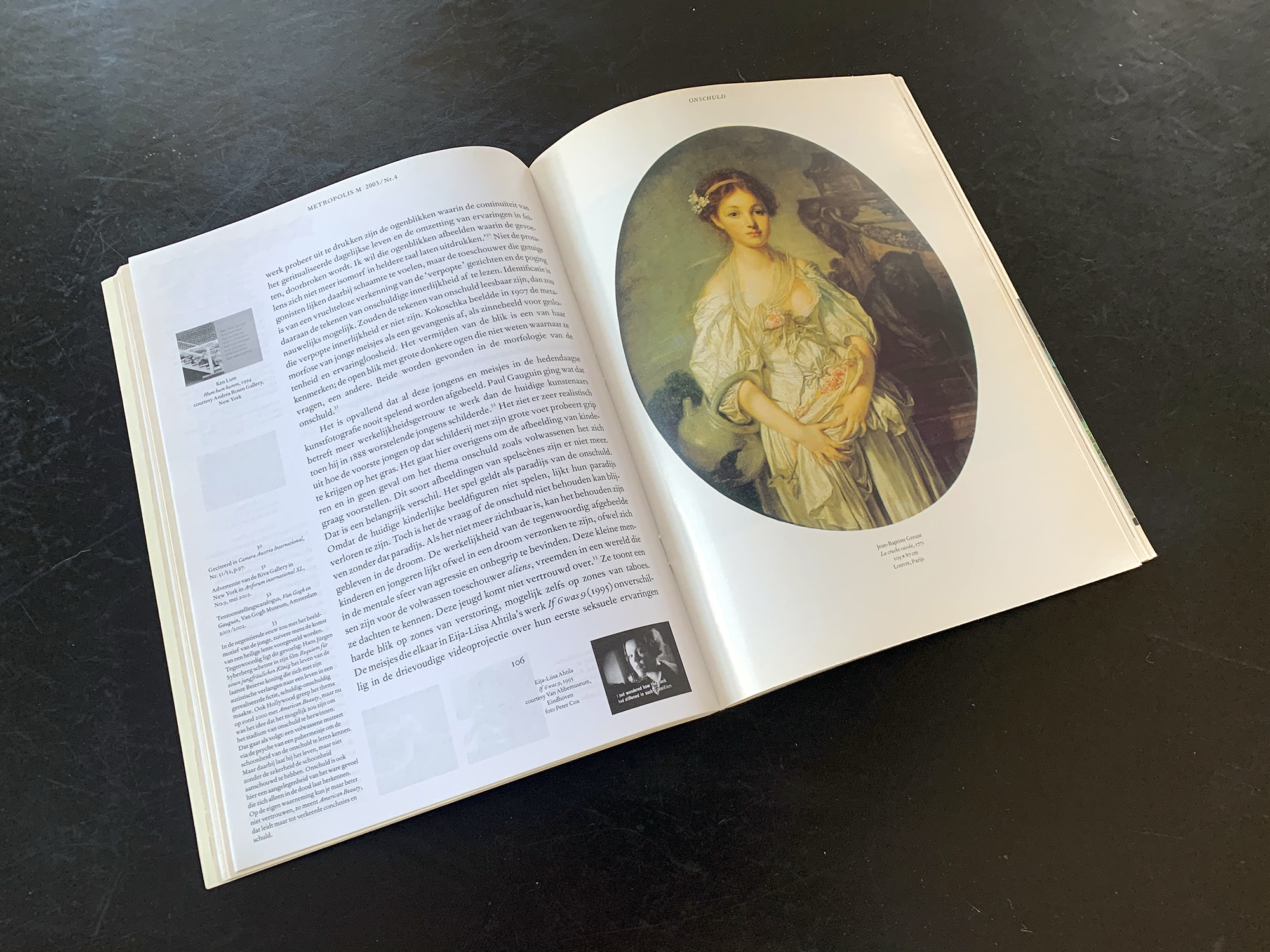
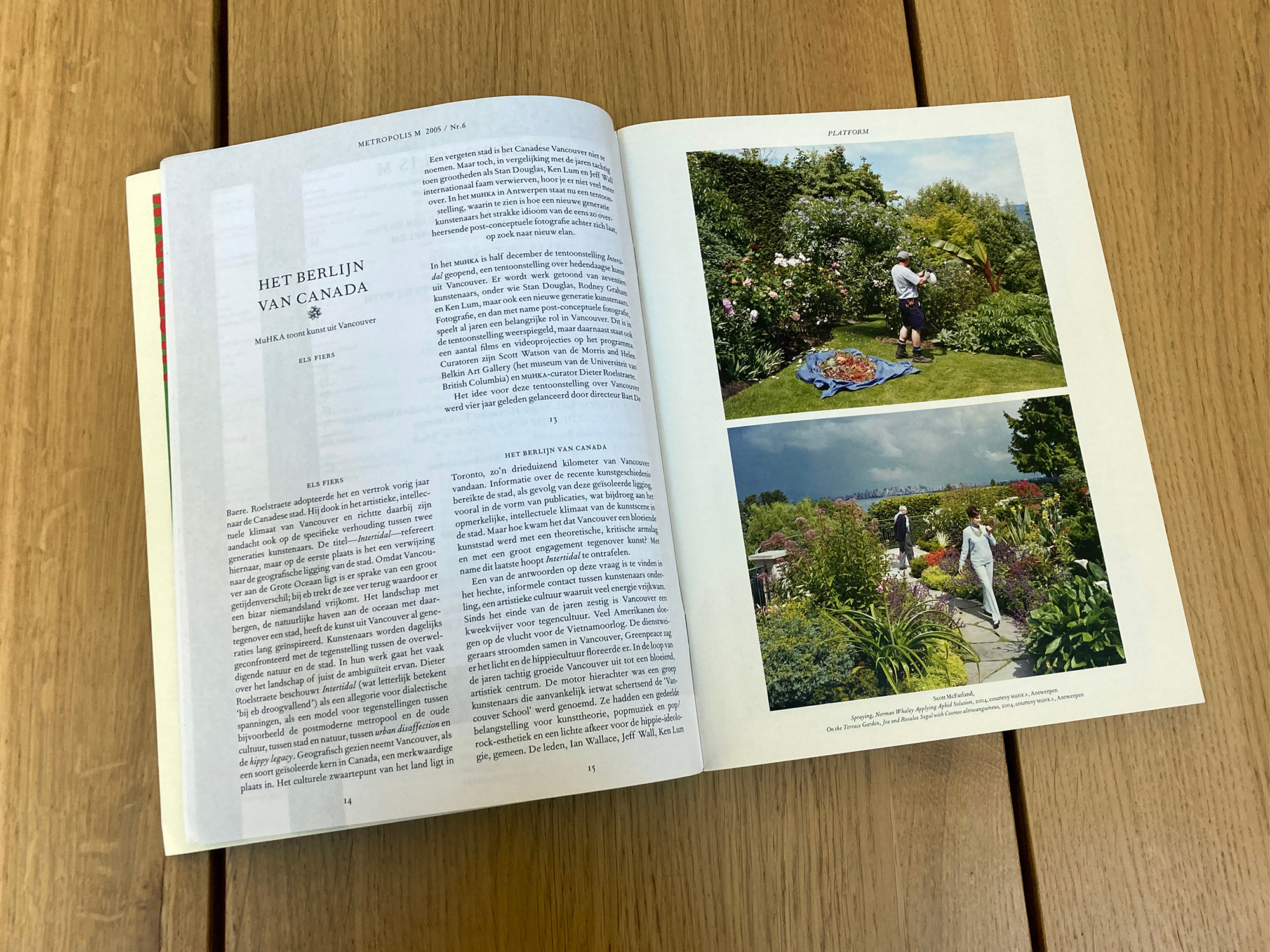
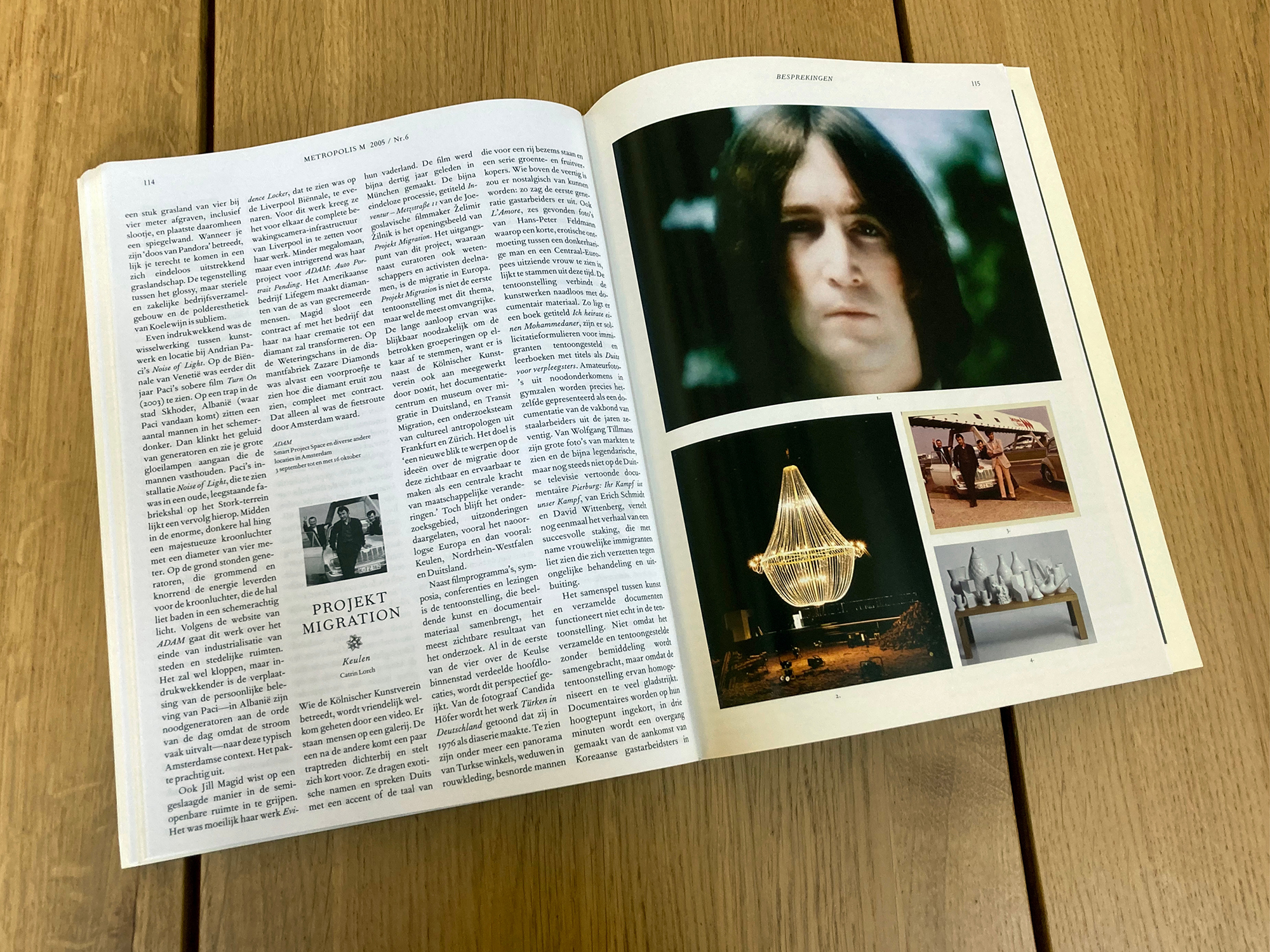
Working from the Tourette’s template, we redrew the body text area according to the classical rules of the golden section, which left a pair of conspicuously large margins on the outer and lower edges of each page ready to be populated with sundry marginalia like footnotes, smaller reference images, captions, and biographies—but also more idiosyncratic secondary texts, incidental quotations or commentaries, satellite interviews, and so on. Will once noted that setting up the conditions for this lateral relation between the body and margin texts privileged “not only reading, but also reading’s side effect: thinking relationally.” As the template developed and details were tightened up, the generous margin became a space for such sideways exploration, increasingly adopted by many of the magazine’s contributors as well as its editors once its potential began to be put to use. These generic text and image pages formed the heart of the magazine, with its cover a composite table of contents in the text field on top of a full-bleed image. There were also a couple of satellite sections: an introductory “Platform” that carried shorter, more timely contributions with pages scaled down to half their original size so there were eight on a spread instead of two; and the usual summary “Review” at the back, instead set as four dense columns with the feel of a newspaper along with a single leaf of reference images.
With the template in place and the first material to fill it, we soon discovered an intractable consequence of the above, rooted in the fact that those sister text and image pages were to be printed on different papers before being folded and stapled like our Tourette’s pilot. This meant the publication was physically symmetrical, i.e. the arrangement of coated/uncoated pages in the first half had to be mirrored in the second. This material palindrome proved to be a massive constraint, and it took a couple of issues of trial and error before realising the best way of dealing with it was to map out all the pages on the studio floor, with the first-half spreads running from left to right up to the centrefold, then turning 180 degrees so the second half ran back alongside (upside down) to ensure that the black/uncoated and colour/coated pages aligned with each other.
Trying to get the arrangement to work equally well for all the articles in a given issue was like pulling teeth (or on a good day “playing Tetris,” according to Will) as we were perpetually having to resolve this basic structural problem that no regular (or sane!) magazine would have imposed on itself. And yet, it both kept things lively and trailed a very particular form, as the majority of design decisions were based on logistical rather than aesthetic reasoning. Ultimately, the defining quality of this particular template was that, despite the essentially mundane nature of the basic page designs, the organisational puzzle made each new issue feel like a reinvention. We loved that, but it was slightly absurd, definitely tiring, and eventually just plain annoying for anyone who didn’t want a workout every six weeks.
In any case, the template was used to generate around fifteen issues over two-and-a-half years before the editors had had enough, clearly ready to return to something that felt more like a help than a hinderance. By this point, however, Will and I were far too fond of the design to simply bin it, not least because by now it genuinely felt less like just another redesign and more like a blueprint for a whole way of working that forced a different kind of attention and involvement. As a parting gesture, the editors agreed to give us a double-page spread in our final issue in order to announce its forthcoming availability under the heading “FOR SALE.” The advert both inventorized and performed its soon-to-be-unemployed ingredients, undersigned by what had become our conflated working name, Will Stuart.
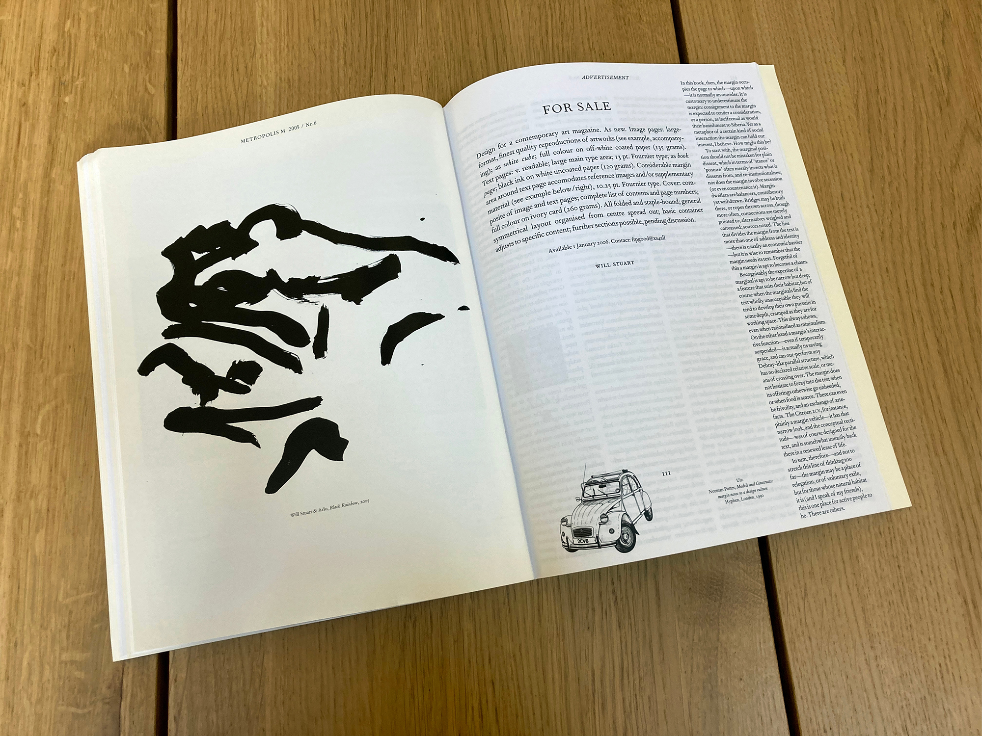
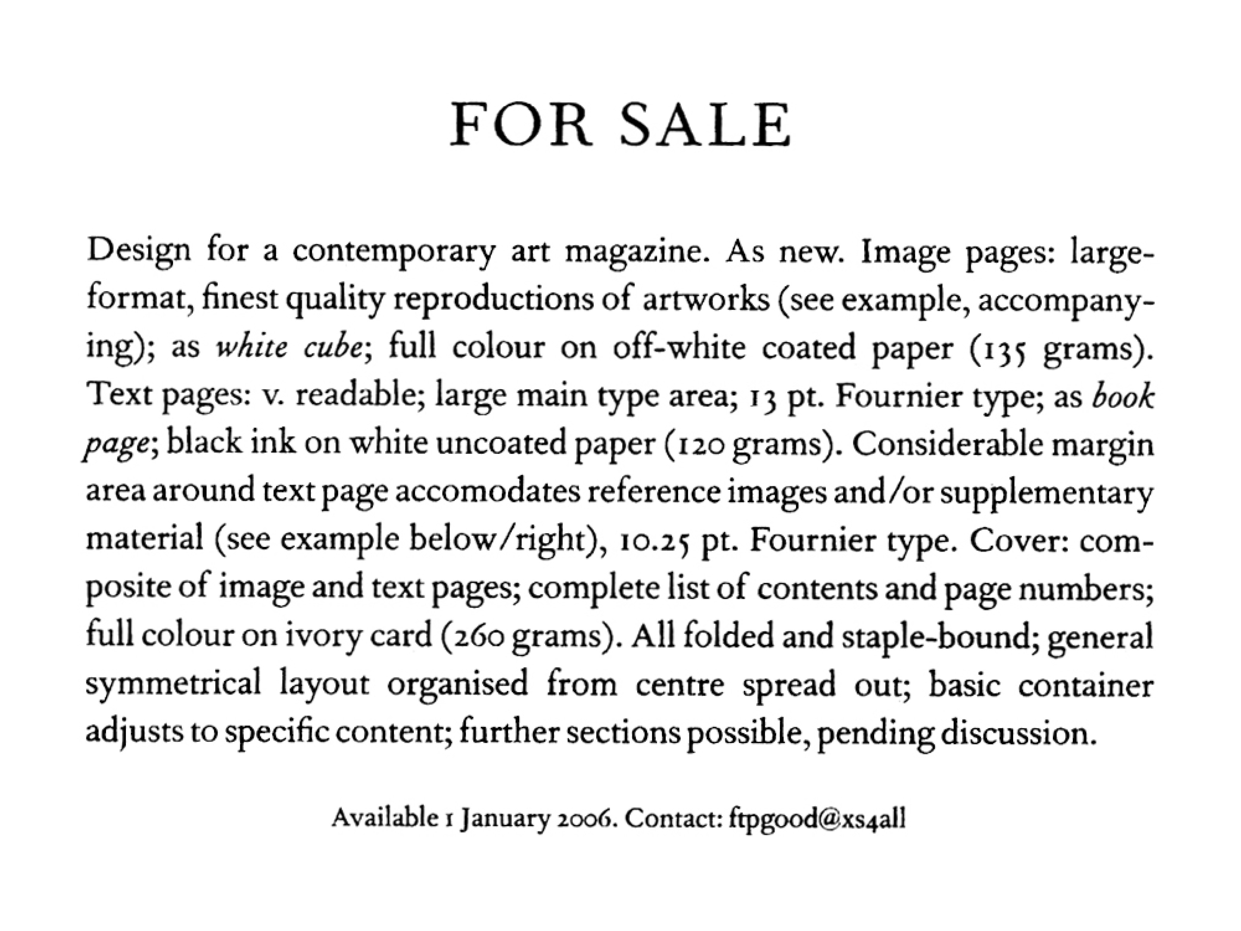
In the sixteen years since the ad appeared, the template has indeed been employed many times. Aspects of it cropped up the following year in a seriously ad hoc catalogue Will made to accompany the exhibition Just-in-Time at the Stedelijk Museum in Amsterdam. In 2009, it was adopted (initially under Will’s guidance) by Sarah Boris at the Institute of Contemporary Arts in London as the basis of a short-lived quarterly programme-journal Roland, with the basic layout retooled to handle more variable types of text in a diminutive A5 format. Around the same time, I used it to make a couple of slim exhibition booklets for the Houston Museum of Modern Art. Since then, the template has proliferated more freely,[1] sometimes clearly stamping its influence, sometimes serving as more of a spiritual guide for a modest library of publications whose diversity is testament to its basic aim “to privilege content and minimize the subjectiveness of design decisions.”
Note:
1. It has been put to further work by myself and David Reinfurt (as Dexter Sinister) for twin catalogues accompanying a programme of performance art in New York, Hey Hey Glossolalia (2008), and well as the pilot issue of Cypriot art magazine UNDO (2008); and by Will for a book by art-film collective The Otolith Group, Long Time Between Suns (2010), a publication accompanying the Witte de Witt exhibition A Wild Boar Passes (2008), an ongoing series of publications for a sprawling project dedicated to performance and performativity, If I Can’t Dance I Don’t Want to be Part of Your Revolution (2012 onwards), most emphatically for a tour de force series of loosely-related (loosely) music books comprising Agapē, Between Thought and Sound, The Tiger’s Mind, Yes, But Is It Edible?, and In Memoriam… Mary Cecil (2007–18), and most recently at the time of writing for an edition of the aptly-titled Palimpsest, a 1926 novel by American writer H.D. (2018). It has also been deployed, with permission if not for money, by at least couple of other people over the years.
…
II. Template as Meeting Point: The First/Last Newspaper
Dexter Sinister is the working pseudonym of David Reinfurt and myself. At various times, it has also been the name of a publishing imprint and a bookstore we ran on New York’s Lower East Side. Performa is a biannual festival of performance art also based in New York who, in the run up to their 2009 edition, invited us to help produce a newspaper. The programme was being assembled to celebrate the centenary of Futurism, a hundred years since F.T. Marinetti’s incendiary “Futurist Manifesto” was improbably published in the mainstream French newspaper Le Figaro on 20 February 1909.
Performa’s reasons for wanting to make a newspaper didn’t seem to extend much beyond a rudimentary reference to that event, but paying homage to the container rather than its contents seemed the wrong way round to us. The celebration also seemed dubious in a more general sense, given that the Futurists aggressively resisted monuments (“Smash the museums” etc.). What aspects of a century-old art movement might be usefully made new today—as “transferable qualities,” in today’s jargon? More pointedly, how might we circumvent Futurism’s notorious violence, destruction, provocation, confrontation, glorification of the machine, war, chauvinism, and machismo generally, to focus instead on its more abstract, haptic interests and qualities like time, space, motion, and speed?
A newspaper is by definition a timely, spatial, moving, and speedy format, and one of the main stories in the news right then was the upheaval of the news industry itself. Newspapers were fast becoming old news, less and less economically viable as they painfully worked through the paradigm shift from physical to digital media. A decade before the lamentable reality of fake news, the validity of professional journalism was being called into question, under siege from major independent online news sites, forms of public participation, and niche blogs. Some major national newspapers and countless local and regional ones were folding for good or otherwise seriously recalibrating. And, naturally enough, the situation was being reflexively reported and discussed by those very channels in crisis at an especially high pitch.
With all this in mind, we took Performa’s invitation as excuse to make our own newspaper about the news industry, a publication that would cover the crisis from a very different vantage, of disinterest. By 2009, David and I had co-edited the left-field arts journal Dot Dot Dot for a number of years, and so had ready access to a large pool of contributors. Hardly any of them would consider themselves professional writers and none worked within the news industry itself, so they would inevitably be “reporting” on the matter at least one step removed, without any immediate or obvious professional stake in any of various debates at play: material versus digital, professional versus amateur, establishment versus egalitarian, and so on. Our hope was to grasp something of the moment by way of projecting its future, addressing an emphatically “on” topic from an ambiguously “off” angle, and with a relative anonymity we thought could prove useful.
We started with a name, The First/Last Newspaper. The Last alluded to the absurdity of launching a new newspaper under such collapsing conditions, while the First referred to the fact that we would adopt the format of the earliest newspapers: the large-format, single-leaf “broadsheet” dating from early seventeenth-century Europe. This full-circle return to the medium’s original size was well-suited to our circumstances: a readymade template that was easy to conceive, simple to produce, cheap to duplicate, and convenient to distribute. Broadsheets were also initially hung to be read in public as well as circulated for private reading, which seemed a further anachronism worth reviving given the festival’s performative basis.
We began to consider the layout. A major signpost here was the artist Robert Smithson’s 1966 article “Quasi-Infinities and the Waning of Space,” originally published across four pages in Arts Magazine.
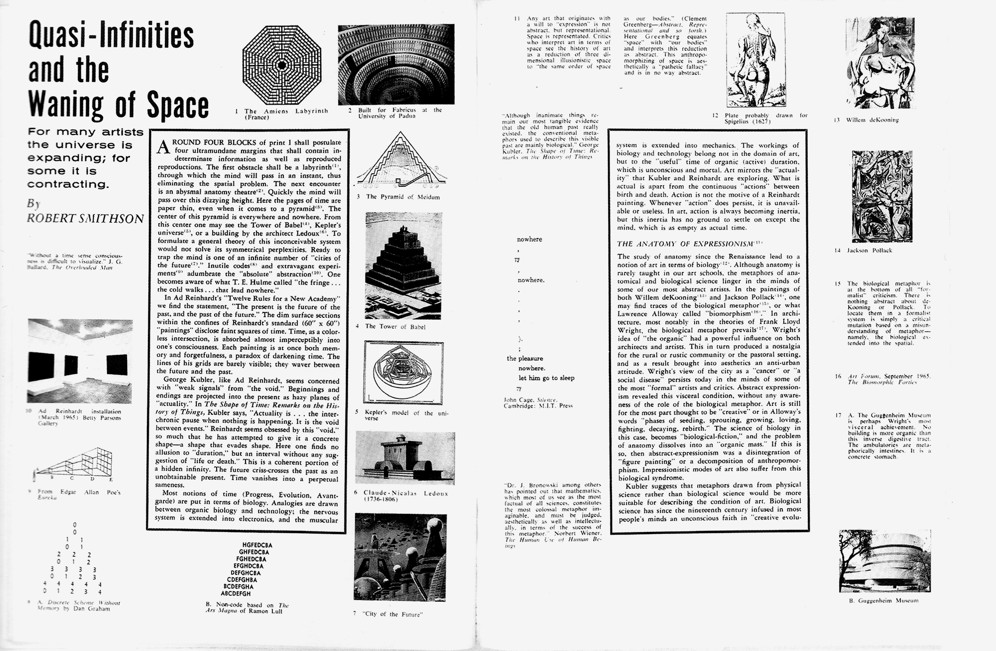
This characteristically compressed, elliptical piece of work debunks what Smithson considers the “pathetic fallacy” of biological metaphors then being applied to Abstract Expressionism. He instead posits counterexamples of artists preoccupied with framing “ideas of time” in a commentary that runs through a central field marked off by a thick frame from a large “ultramundane” margin. This auxiliary space is populated by a collection of thumbnail images and fragments of others’ texts that zoom in and out between expanded and contracted depictions of the universe. And like many of the works in its margins, the layout explicitly embodies its subject matter—a Russian doll of a page that serves as a kind of iconic mnemonic of the whole piece. For our proposal to Performa, we assembled four sample broadsheet pages on Smithson’s “Quasi-Infinities” template, with its central text now floating the idea of a newspaper about the news industry, flanked by our own set of references in the margins.
Auspiciously, Performa had managed to secure the use of a storefront space in a corner of New York’s uptown Port Authority Bus Terminal building, a major transport hub directly opposite what was then the brand-new office block of The New York Times. The proposal was duly accepted, and we began assembling a team of “correspondents” to work in this makeshift newsroom along with some productive limits. We would publish six broadsheets over the festival’s three weeks using a web press at a Chinese printing house a handy couple of subway stops away, with a print-run of 1,500 double-sided, black-and-white copies distributed via various means, and a PDF version circulated online. The remainder of the build-up involved trying to work out how to make the production as expedient as possible, which led to our designing a template for the newspaper based on two techniques: TeX typesetting and paste-up composition.
TeX is an automated typesetting system developed by computer scientist Donald Knuth in the late 1970s in order to facilitate professional typographic production. It remains popular today in certain academic quarters, particularly mathematics and science. As opposed to the arts industry-standard page-layout software that deploys a What-You See-Is-What-You-Get or WYSIWYG interface, TeX operates according to a What-You-See-Is-What-You-Mean or WYSIWYM one. WYSIWYG-based software (such as Adobe InDesign or Microsoft Word) immediately displays changes in typographic articulation as and when implemented, such that I can see a word italicized as soon as I format it. WYSIWYM, by contrast, involves a semantic markup language that separates the instructional input and the graphic output, effectively “programming” a text without yet seeing the results.
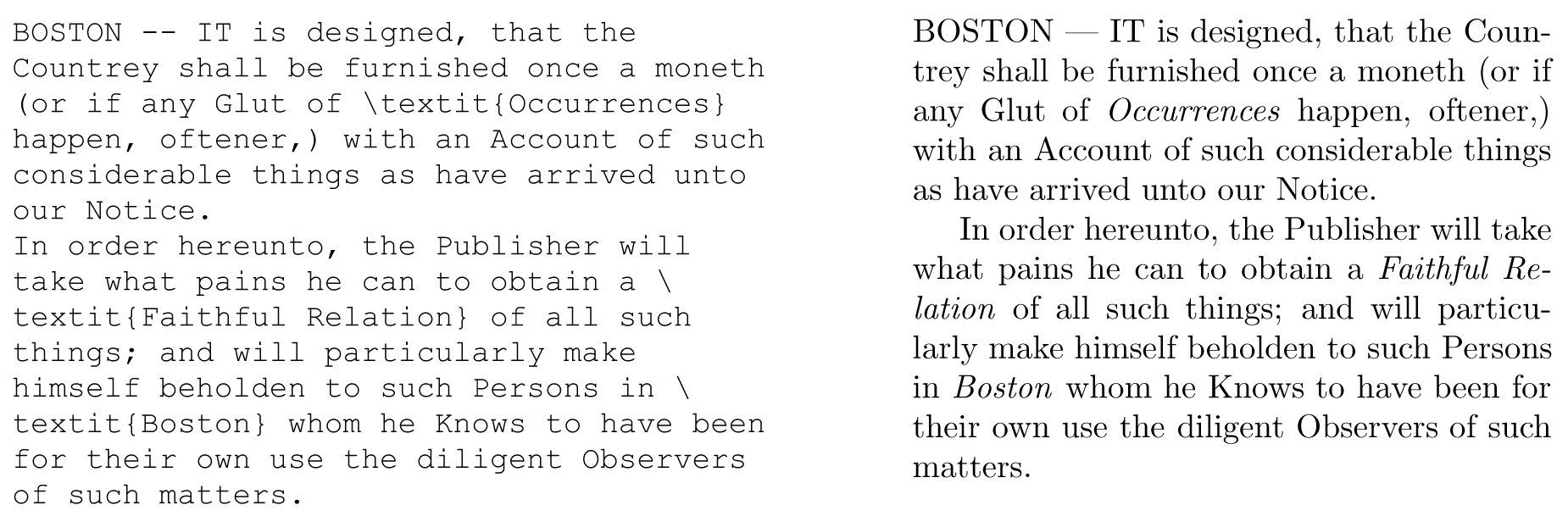
These two examples show a typical programmed input and processed output: at the word level, TeX has applied the instruction code “/textit{}” to render the indicated text italic, while at the paragraph level the text has been set to a certain predetermined type size and line spacing, justified across a certain column width with words broken according to fixed hyphenation values.
Since the advent of desktop publishing in the 1970s and its mainstream adoption in the 1980s and 1990s, WYSIWIG has been the standard in art and design software for obvious reasons: it renders stylistic changes immediately and is therefore easier for non-specialists to grasp and use. The main benefit of “reverting” to a WYSIWYM system to produce the newspaper was precisely to emphasise the division of labour between input and output, creating a more efficient and secure production line by keeping at arm’s length those editorial aspects that focused on the text (writing, editing, subediting, proofreading) from those focused on the graphic design (the hierarchy, order, and arrangement of text and images). Such separation would preclude the now-commonplace blurring of activities, one outcome of which is the tendency to make perpetual changes because it’s perpetually possible to do so. In short, adopting TeX would force us to assume the sort of focus and discipline necessary to get the thing out twice a week—another pragmatic anachronism.
The same goes for the second key aspect, paste-up. This is a production technique that, like TeX, is also a generation or two out of date, its heyday being roughly the middle of the twentieth century when pages were assembled by arranging material blocks of texts and images, literally “pasting them up” (i.e., sticking them down) on a larger sheet, which was often a gridded template for the sake of convenience and consistency. Such collaged sheets were then individually photographed in order to make printing plates. Today the process is virtually extinct, with pages configured using digital technology, organized and output either as printed or digital files via such as the ubiquitous Portable Document Format.
We imagined a three-fold benefit of using 1:1 scale paste-up at Port Authority. First, we would be forced to work on the micro-editing of words, sentences, and paragraphs entirely apart from the arrangement of macro elements like headlines, blocks of text, and images. Second, it would allow us to see the page at actual size, which, given the relatively large broadsheet format (707 × 1000 mm), combined with the fact that we would inevitably be working on compact laptop screens, meant we would only ever be able to see something like 10% of the page at 100% scale, or 100% of the page at 10% scale—neither being very practicable. And third, given that a group of people can gather around an in-progress, actual-size, pasted-up page, we would be able to make properly informed decisions collectively.
All of which fed into a base template that carried the DNA necessary for anyone in the team to be able to produce a page.
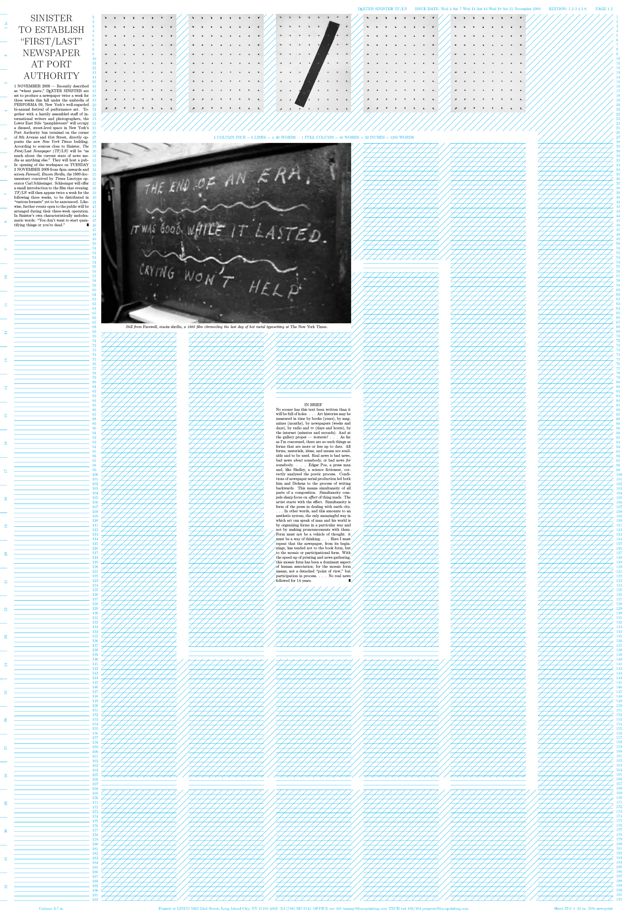
The underlying grid is printed in non-reproducing blue, an ink native to original paste-up that resists photographic reproduction. This aspect is now technically redundant, and yet the blue remains usefully visible while unobtrusive. More precisely, it is an amalgamation of two grids laid on top of each other. The first is a fairly straightforward newspaper layout: seven vertical columns, derived relative to the particular styles and sizes of typeface, line spacing and gutter width. The second follows the recursive logic of “Quasi-Infinities,” centred on a rectangular block identified by a collection of “IN BRIEF” fragments, then suggesting a series of consecutive rings that radiate outwards, identified by diagonal cross-hatching. The idea here was to try to negotiate both grids at once to result in a schizophrenic organization of material: the top-left-to-bottom-right movement of a regular page combined with this other “centrifrugal” logic. This might imply a lead article or image positioned at the centre rather than top left and “above the fold,” with whatever eccentric knock-on effects this might yield. The template also includes ancillary information including measurements, line numbers, edition numbers, dates, and the printer’s phone number.
The masthead is assembled from artist Shannon Ebner’s 2009 Strike Alphabet, a set of letters built from U.S.-standard concrete cinder blocks, with the name reduced to the acronym TF/LN to be legible at a distance. (Apart from the forward slash, Shannon’s panels are left blank on the empty template.) Next, there’s a sample “article” at top left: a general announcement that also served as the first issue’s editorial. It demonstrates the formatting of a standard headline, lead-in, and body text (at paragraph level), then its internal articulation (at sentence level), concluding with a black “halmos” character to mark the end of an article. This example text is accompanied by an equally generic image and caption, a still from a 1980 documentary about the last day of hot metal Linotype typesetting at The New York Times on 1 July 1978, along with the morning after when the new electronic computer system gets up and running. The film, titled Farewell etaoin shrdlu, therefore simultaneously mourns and celebrates the news industry’s last major technological shift, from a pre-press operation largely still based on mechanization and manual labour, largely unchanged since Gutenberg’s invention of the printing press in the mid-fifteenth century, to a digitized, relatively automated equivalent.
In practice, as soon as each front and back page had been satisfactorily pasted-up from laser prints on the template sheet, we immediately reconstructed the same arrangement in InDesign. Despite the newspaper premise, our main circulating medium was always inevitably going to be a cross-platform PDF, and given that this is now also the standard format that any lithographic printing press uses to output plates, we could simultaneously send to print and disseminate the same file via digital channels without extra work. Just as importantly, the route from digital (TeX) via analogue (paste-up) and back to digital again (PDF) required a series of checks at each stage, and proofing for errors is far easier when switching mediums as attention is reinvigorated in the process.
Here’s one of the last column inches announcing the project’s end:
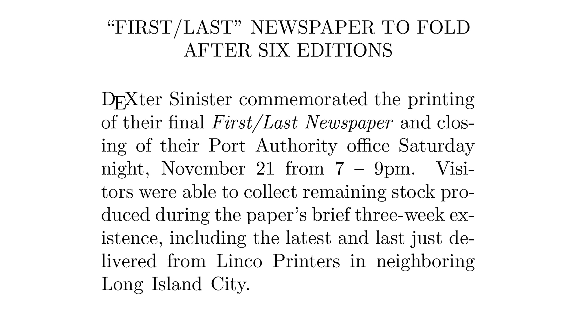
On the same day, The New York Times itself ran a brief review of TF/LN in their “Weekend Arts” section. This was curiously obsolete inasmuch as it was reviewing a project that had ended by the time the Times came out. This echoed a line we’d quoted regularly throughout, from the Italian art critic Germano Celant: “As soon as this text is written it will be full of holes.”
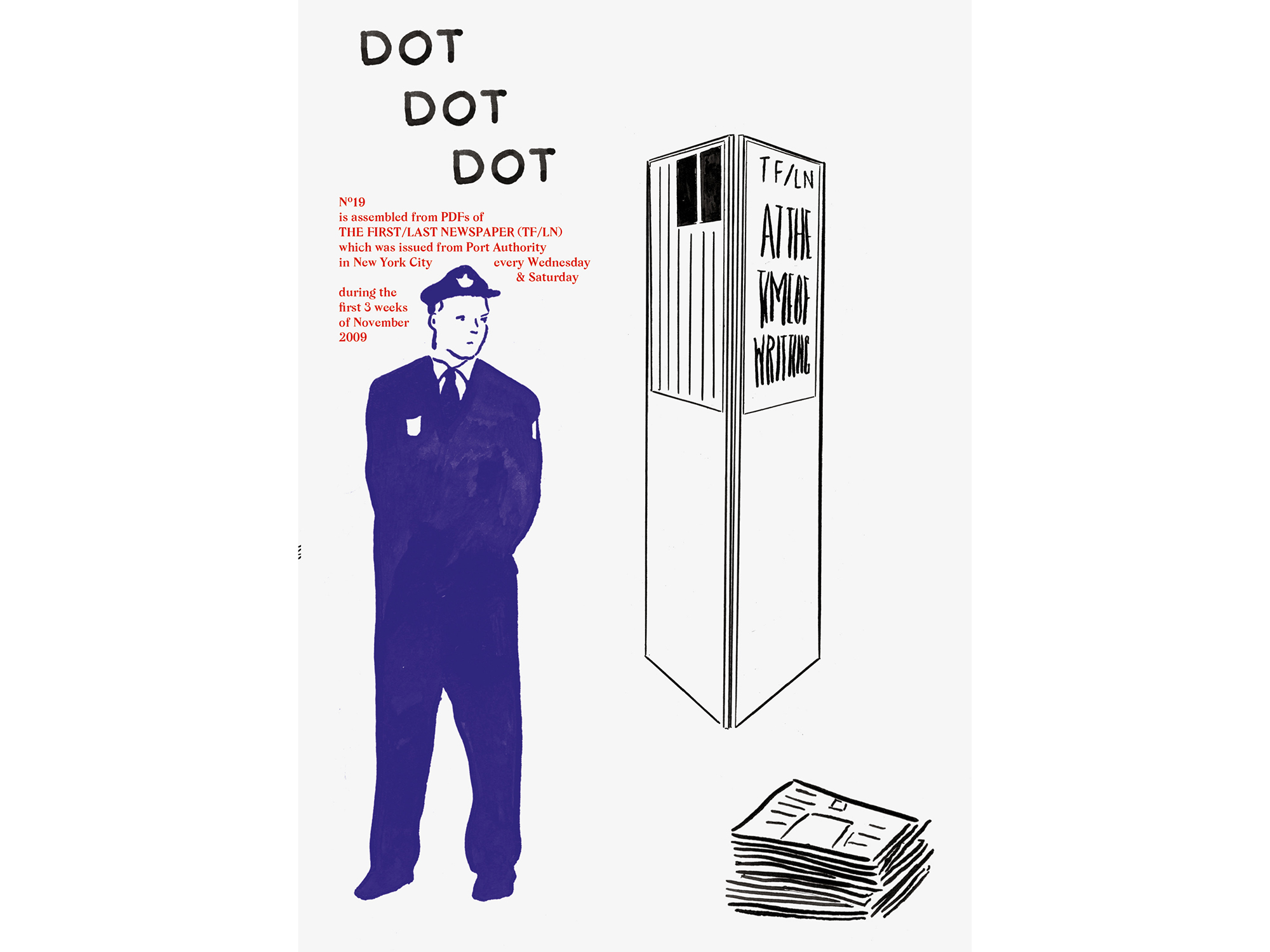
Finally, a few months later, we took a scalpel to our twelve broadsheet pages and reconfigured them to form the nineteenth issue of Dot Dot Dot—the product of one template dismantled to fit into another.
…
III. Template as Happy Medium: Bulletins of The Serving Library
Dot Dot Dot was founded back in 2000 by myself, Peter Bil’ak, Jurgen X. Albrecht and Tom Unverzagt, though the last two left after the second issue. Rooted in graphic design, the journal was initially defined more by what it wasn’t than what it was, being neither particularly commercial, nor academic. Although the scope soon broadened to encompass the rest of the arts and later beyond, it always remained distinctly “from graphic design rather than about graphic design,” as the design critic Emily King once put it.
In the beginning, when the majority of the contributors were graphic designers by trade, the idea was to encourage them to design as well as write their contributions in view of channelling a multiplicity of visual as well as verbal voices. This free-for-all didn’t last very long as the sort of productive symbiosis we had in mind never seemed to happen the way we’d imagined—and it turns out that graphic designers who write are far more precious about their layouts being edited than their writing. By the fourth issue we were instead designing the whole thing ourselves.
During these early years there was no fixed template to speak of—to the extent that Paul Elliman once summed up its sense of being stuck-together from disparate parts as “a kind of prosthetic aesthetics.” Perhaps under the spell of this phrase, the tenth issue took the idea to a logical conclusion, being a “best of” the first nine, with the original pages of twenty or so pieces stitched together Frankenstein-like to form a new whole.
This roughly coincided with David taking over from Peter as co-editor. After the maximal tenth issue, it seemed time to strip back the journal’s approach, most clearly marked by finally implementing a consistent template. Over time we’d become more interested in the words and less with their appearance, so standardizing the format, as most other periodicals would naturally do from the outset meant we could simply spend more time editing and less designing. The second half of Dot Dot Dot’s life therefore rarely broke from a two-column grid and two or three sizes of a single typeface. This relative stability was, however, immediately contradicted by commissioning Radim Peško to design a new, open-ended font that amalgamated the general demeanour of those we’d used so far, inspired by a couple of historical examples with triangular serifs.
A basic roman version of what was christened “Mitim” (after a project by artist and regular contributor Ryan Gander to introduce a new word into the English language) was ready for Dot Dot Dot 11. The idea was to develop this font from issue to issue, adding a new member of family each time. Six months later, Radim dispatched Mitim Alpha’s italic counterpart, Beta, and, as this first pair already felt more than enough for our Calvinist taste and temperament, they were used more or less exclusively until the final, twentieth issue five years later. While the obvious thing to do next would have been to introduce bolder, lighter, condensed, and compressed variants, we instead ordered a set of eccentric symbols and invited our most literary contributor, Louis Lüthi, to compile a series of historic glyphs together with Radim that we might put to use in subsequent issues. Duly assembled for issue 13, Mitim Gamma was a free-ranging set of symbols, some ubiquitous, some obscure, drawn from the histories of literature, comics, advertising, science, fine art, medicine, and more. From there, additional members of the family became increasingly eccentric, like mad uncles and distant cousins of the prodigal son.
By the twentieth issue, we felt the journal had exhausted itself and so resolved to somehow “break” it. David and I asked another regular contributor, Angie Keefer, to join us in setting up a crowdfunded, not-for-profit project called The Serving Library—a continuation of the personnel and interests that made up the journal, only now to be dispatched predominantly via digital channels. The website www.servinglibrary.org became the “engine room” of the enterprise, set up to “serve” individual PDFs we called “Bulletins” in batches, then collected twice a year into a printed compendium, Bulletins of The Serving Library, that effectively picked up where Dot Dot Dot left off. We had also spent the last few years gathering and exhibiting a collection of the original material sources of items that had at some point appeared as illustrations in Dot Dot Dot. These three interrelated elements—the web archive, the printed journal, and the collection of objects—were and still are intended to coalesce into a single resource for teaching. But that’s another story.
Just as we’d taken the tenth issue of Dot Dot Dot as an occasion to reflect in order to find a way forward, so the transition to Bulletins of The Serving Library was an excuse to make some similarly destabilising changes. In terms of the writing, inviting Angie to be involved was partly a way to expand the journal’s range. She brought an easy fluency with a far broader set of interests including mathematics, science, psychology, and philosophy in a manner consistent with Dot Dot Dot’s contradictory humour. Regarding the design, we felt even further from the desire to (re)design the journal in any normal sense and so tried to let the technological switch determine the way it looked.
The continuation with Dot Dot Dot was marked by keeping the same B5 format, halfway between book and magazine, but the new digital bias led us to adapt the Bulletins layout on the basis of PDFs being read on a phone. Unlike an e-reader or website, where the size of text may be changed and lines reflowed relative to the width of a device or browser window, the PDF is a definitively fixed format. We settled on a single column with a relatively large type size in order to be as legible as possible on the then-smallest iPhone, yet not overly large on an iPad or laptop screen. And because, again for the sake of convenience and expedience, we would use the same PDF files to make the printed journal, when poured into Dot Dot Dot format this single column of larger-than-average type on a printed page looked markedly medium, distinctly bigger-than-expected without quite straying into the territory of “large print.” Otherwise put, the typography was designed to be bang in the middle of all channels in order to be as readable as possible on as many devices as possible.
Next, just as the Bulletins’ single-column non-grid was even more rudimentary than its predecessor, we began casting around for a typeface that would reflect this degree-zero design in the same way Mitim had mirrored the stripped-back approach of Dot Dot Dot. David and I had long been interested in a project called Metafont by Donald Knuth, the man behind the TeX typesetting system used for The First/Last Newspaper. Knuth originally conceived Metafont in the late 1970s as a component aspect of TeX, a program that generated the typefaces to be configured by the master application. He was interested in developing not a single font or a family of fonts, but a set of “meta” parameters that could be tweaked to generate an endless number of letterforms, and ended up developing Metafont as a discrete piece of software too.
In early 2010, around the time we were setting up The Serving Library, we started developing an updated version of Metafont based on what scant information we could find about the original work. The aim was to write a program that would generate endless PostScript fonts (the standard contemporary protocol) using Knuth’s original parameters. These paramaters more or less map onto the usual aspects of typeface design: Weight (more or less bold), Slant (the fundamental quality of italic), Curliness (the more decorative aspect) and Superness (less easy to define, but a kind of relative angularity), plus a fifth para-parameter, Pen, which is best thought of as the shape of the “nib” of the “writing implement” that draws the skeleton letterforms based on the combined parameters.
So, one instance of the potentially infinite number of MetaFonts might have the values of (imagine twiddling the knobs on a mixing desk) Weight = 26, Slant = 0.3, Superness = 0.7, Curliness = 20, and look a certain way, distinct from another version with different values. We were already developing and using our update of the software, which we named Meta-The-Difference-Between-The-Two-Font, for a couple of other projects when it suddenly seemed ideal for The Serving Library too. One curious aspect of MetaFont is that when all values are set to zero, no font exists. As such, there is no “standard roman” version to speak of, only a set of values that may look to our eyes more average than other, more eccentric ones. And so in order to match the “medium” credo of the Bulletins’ design so far, we generated a version that seemed the most vanilla to our eyes, eventually settling on Weight = 100, Slant = 0, Superness = 0.75 and Curliness = 0 as sufficiently middling. From this point, MTDBT2F was used exclusively to typeset Serving Library material, including variations with different values as and when required, to distinguish quotations or other distinct types of text, for instance. We also wrote about it extensively in two of the early Bulletins (here and here).
We’d always been interested in publishing as a subject matter in and of itself, and often addressed it indirectly through the manner in which the journal was published rather than directly writing about it. And so, to flag some of the similarities and differences between digital and physical formats, such as the relatively adjustable nature of the online Bulletins versus the relative fixity of their print equivalent, we included a discreet time stamp in the bottom left corner of each page marking the date and time it was last output to PDF. This would register the near-invisible discrepancy between digital and physical versions if, say, entire bulletins or single pages were amended after having been sent to print. We also put an equivalent, live time stamp in the corner of the website that linked to a record of each time an individual Bulletin was downloaded, along with the downloader’s server address.
Although the Bulletins were ostensibly far less “graphic” than Dot Dot Dot, each one was fronted with a full-page image that served as a thumbnail icon on the website. And the fact that all the PDFs were collated unchanged into the printed issue meant they would have to start on a recto and end on a verso, even if the last page was blank. This emphasized the sense of the journal being a dossier of discrete parts that could effectively run in any order.
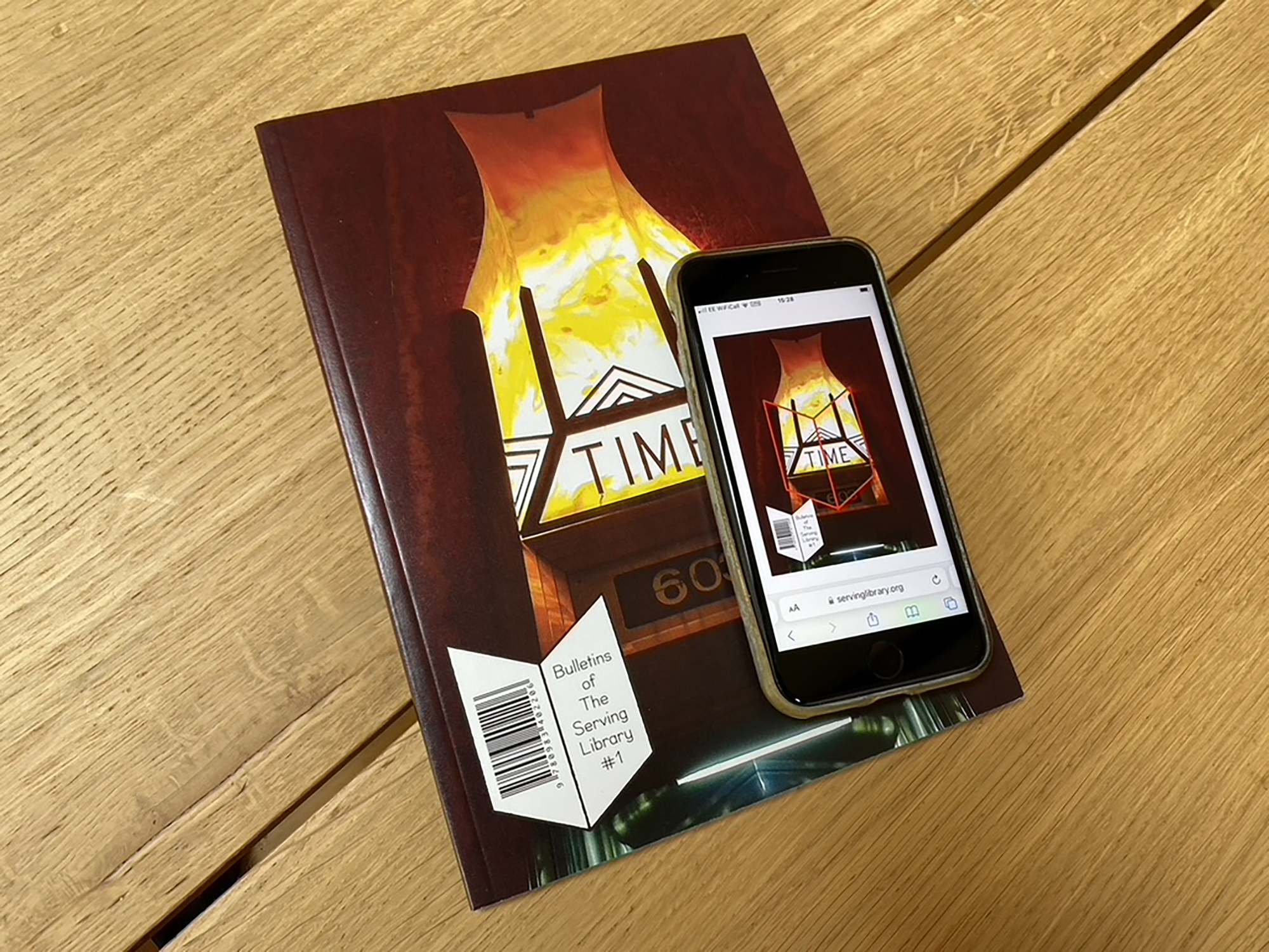
Another change from the knockabout nature of Dot Dot Dot was to base each issue on a theme—the inaugural one being Time. We had recently come across the word TIME set in metal above a huge digital flip-clock behind the concierge’s desk in the lobby of the Chrysler Building. David took photo of it at 6:03pm one evening, which, thanks to the peculiar light distortion of a rough iPhone image, seemed to show some kind of furnace burning behind the sign, like a Midtown gateway to heaven or hell. It ended up on the cover of the first issue along with an in-out optical illusion “book spread” that became The Serving Library’s symbol, and this happenstance cover design became the template for the rest, each with a found word or words that in some (often very loose) sense pointed to the general theme, embedded in a photograph taken on a phone. The following issue on Pedagogy, for instance, shows the sign on the ornate door of the Registrar’s Office in Charles Rennie Mackintosh’s seminal building for the Glasgow School of Art; on the next, a magnifying glass in the hand of type designer Matthew Carter zooms in on the MoMA logo for an issue on Typography that doubled as a catalog for an exhibition at the museum itself; and so on.
One final, emphatically templated aspect that we carried through all the journals played out in the advertising pages at the back. In the early years of Dot Dot Dot, we were frustrated by both the amount of time spent trying to get designed adverts from such as type foundries and arts institutions, and the general ugliness of them once they eventually arrived. We instead returned to the minimal standards of old adverts in periodicals dictated by the restricted possibilities of metal type, offering whole pages only, each with a space for a large text up top (typically a name, tagline, or URL) and a couple of columns of smaller text below, all on the same grid as the rest of the journal. At first, they were further distinguished by a flat colour background chosen by the advertiser—including gold, silver and bronze during the 2004 Olympics—but later we further limited these backgrounds to different shades of grey and charged according to the percentage: the lighter, less legible ones were cheaper, and the darker, more legible ones more expensive. Partly due to the novelty, and I suspect also the convenience, this scheme proved popular and continues today; the only difference being that, since the Bulletins began, all the backgrounds have been white and the type instead greyscale, which makes the economy of legibility even more pronounced.
Due to ballooning shipping costs in the wake of the 2008 financial crisis, we started to publish half the print run in the USA and half in Europe, both produced at cheap academic printing houses on the most basic paper stock, and perfect bound. This setup lasted five years before Sternberg withdrew due to declining sales, at least in part due to the individual Bulletins being freely downloadable from the website. Bookstores were also increasingly reluctant to stock the journal due its ambiguous status somewhere between book and magazine, as well as its free-ranging subject matter: they literally didn’t know where to place such a medium medium. In somewhat tongue-in-cheek response, we downscaled the printed version to half its former size to make it more obviously book-like, cheaper to ship and easier to store. And in yet another duplication of Dot Dot Dot, at our customary five-year point of reflection, the tenth Bulletins of The Serving Library become a best-of the previous nine, including all front and back covers along with tweet-length synopses of each of the hundred or so individual Bulletins published so far. All aspects of the original template remained unchanged in the new format, only downscaled to 50%.
Three issues later, we made things easier on ourselves by publishing only once instead of twice a year, which precipitated another name change, to The Serving Library Annual, now to be published by Roma in Amsterdam. They weren’t keen on the recent shrunken format, and insisted instead on switching to a format bigger than the original—that most medium of mediums, A4. And contrary to Bulletins of the Serving Library’s extreme economy of means, they reverted back to something of Dot Dot Dot’s “object quality,” with exceptional care taken over materials, pre-press, printing, and binding.
At the time of writing, the first four Annuals have been produced in this manner, with an adapted version of the original page template reconfigured to handle more text per page and a gradual loosening of the initial grid to accommodate more idiosyncratic material. The 2019–20 edition, for instance, was an English translation of an underpublished collection of the Italian polymath Bruno Munari’s writing, Codice Ovvio (‘Obvious Code’), in which his original page layouts were recreated at the centre of the larger Annual page with new marginalia from fans and commentators old and new. The most recent edition is a catalogue of our collection of objects, now numbering close to 100, released in parallel with a long-term installation of the collection at 019, an art institution based in Ghent, Belgium.
In these various ways, the pronounced medium-ness of that rudimentary Bulletins template has slowly and happily shapeshifted into some other related form, two or three times at least.
…
IV. Template as Industry Default: The ICA
In 2011, Dexter Sinister made “Identity”, a three-screen video projection co-commissioned by and presented for the first time at Artists Space in New York. This animated study blended the stories of three art-institutional graphic identities (the Centre Pompidou in Paris, MoMA in New York, and the Tate in London) with a backwards whistle-stop history of graphic design told mostly through logos. The piece had no particular thesis beyond pointing to the growing importance—and hence pressure and anxiety—placed on the design of institutional identities during the twentieth century, with particular reference to its adoption by cultural institutions of all shapes and sizes in the twenty-first. The voiceover was collaged almost entirely from others’ writing, drawn from design history books, corporate identity manuals, online blogs, and Wikipedia entries. The only part we wrote ourselves was a triangular concrete poem-of-sorts at the end, which also supplanted Artists Space’s own triangle logo by the German graphic designer Manual Raeder for the run of the show.
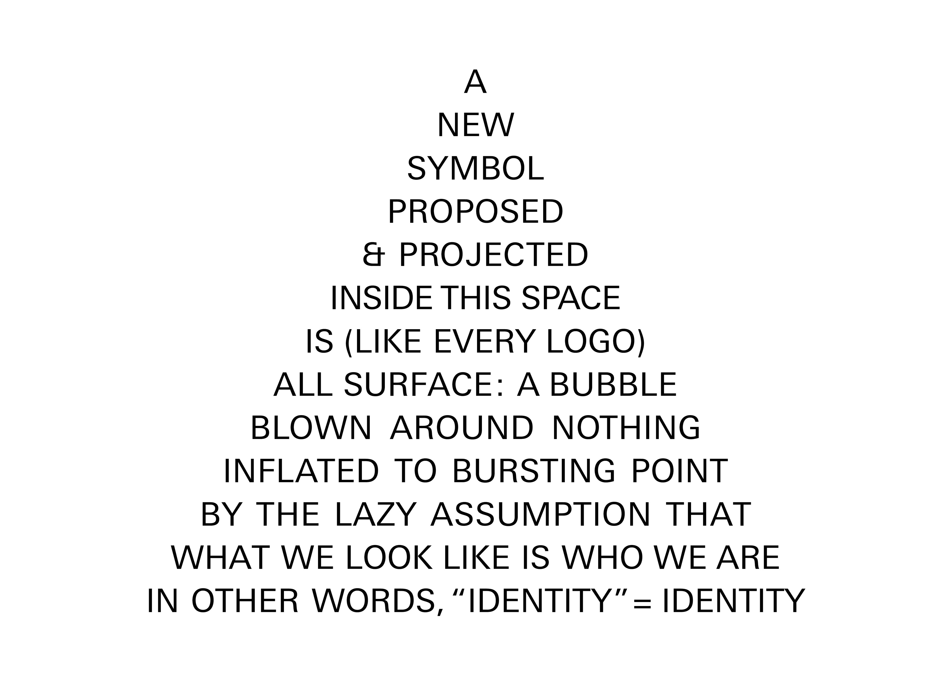
The oblique suggestion here is that there can be a fundamental difference between an institution’s actual identity (what it comprises and the way in which it operates) and how contrives to present itself in public (alluded to here by an “identity” wrapped in scare quotes). As a line in the middle of the piece sums up: “When we use the word ‘image,’ we plainly confess a distinction between what we see and what is really there—and we express our preferred interest in what is to be seen.”
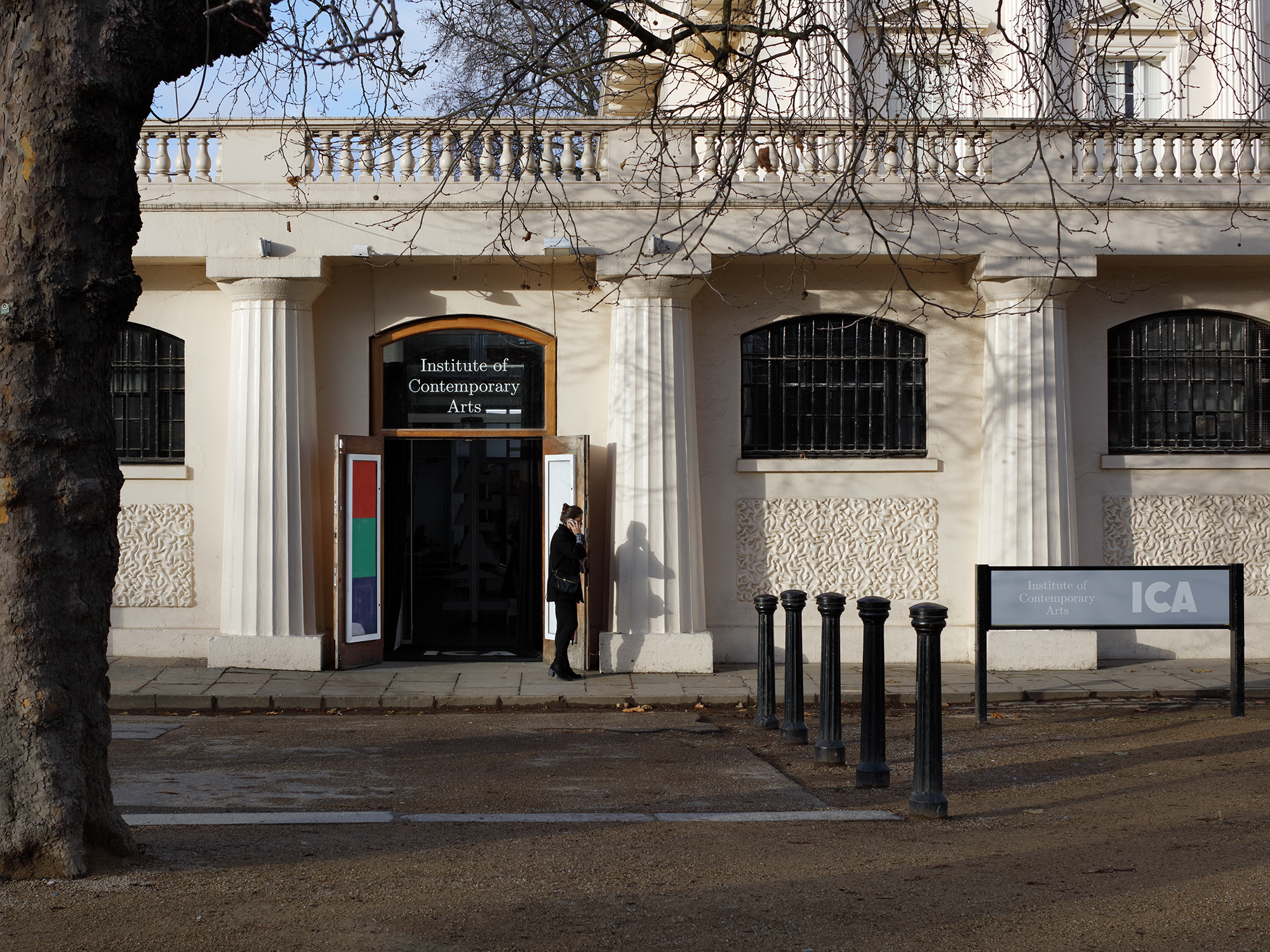
Five years after the installation at Artists Space, its director Stefan Kalmár moved to London to take charge of the Institution of Contemporary Arts, an esteemed, sometimes controversial venue for vanguard art founded in 1948 and, since 1960, the unlikely resident of a neo-classical building down the road from Buckingham Palace on The Mall in the heart of the city. 75 years on, the ICA just about manages to sustain its radical reputation and run its progressive programme from the heart of the capital’s establishment.
Soon after his appointment, Stefan invited David and myself to rethink the ICA’s identity, providing us with the unlikely opportunity to put some of the speculative thinking behind “Identity” into actual practice. What might an institution look like if there were no difference between how it operated on the inside and appeared on the outside? The ICA’s maverick position has always been a license to do things a bit differently to other art institutions, and so we spent the first six months considering an approach from scratch.
A motif at the back of our minds was an image of what we’ve come to think of as “the hollows,” after an apparently throwaway term in a prescient essay from 2007 by design group Metahaven, White Night Before a Manifesto. According to Metahaven, the hollows is “the surface equivalent to the stock market crash … surface without surface, the exposure of the naked infrastructure or root level system language which precedes surface itself, surface without its effects.” We visualised this as the grey-and-white checkerboard image of transparency common to software such as Adobe’s Creative Suite and currently the default preview background of PNG-format logos.
As with Artists Space some ten years previously, Stefan embarked on a project to return the building’s interior to its original, skeletal modernist architecture as designed by Jane Drew in the 1960s. The first main programme under his tenure was titled In formation, a cross-disciplinary series of installations, films, talks, and other live events that collectively attempted to explore the ICA’s role as a civic institution in 2017. This sense of curatorial reconstruction dovetailed with our intention to work out aspects of the identity on the fly, incrementally trying things out as and when required in advance of committing to any particular identity template for as long as possible, perhaps even indefinitely. For In formation we commissioned a signwriter to gradually paint the developing programme on the walls of the downstairs gallery, and printed a set of weekly programme notes in-house to trial a few typefaces, colours, and image styles. We continued this approach of being publicly under construction for the first major exhibition, of the American artist Seth Price’s audio-visual work, by developing a trial website at dev.ica.art that ran parallel to the existing one at www.ica.art.
Another point of reference here was Towards a Lexicon of Usership, a modest 2014 publication by the Canadian philosopher Stephen Wright that argues for an arts practice founded on a “1:1 scale” relationship between work-as-proposition (= art) and work-as-utility (= design) without prioritising one or the other.
Art and art-related practices that are oriented toward usership rather than spectatorship are characterised more than anything else by their scale of operations: Though 1:1 scale initiatives make use of representation in any number of ways, they are not themselves representations of anything. It is certainly possible to describe them as having a double ontology; but it may be more closely in keeping with their self-understanding to argue that this is not an ontological issue at all, but rather a question of the extent to which they are informed by a certain coefficient of art. Informed by artistic self-understanding, not framed as art.
Wright’s “double ontology” seemed to sum up the collected thinking behind the thought-piece “Identity” and its eventual application at the ICA: something that wasn’t exactly an artwork that informed a speculative working model. By the time the website was ready for us to make the full switch, a year or so after our appointment, we had tested in situ more or less everything that we had in mind, which evolved into the following DNA:
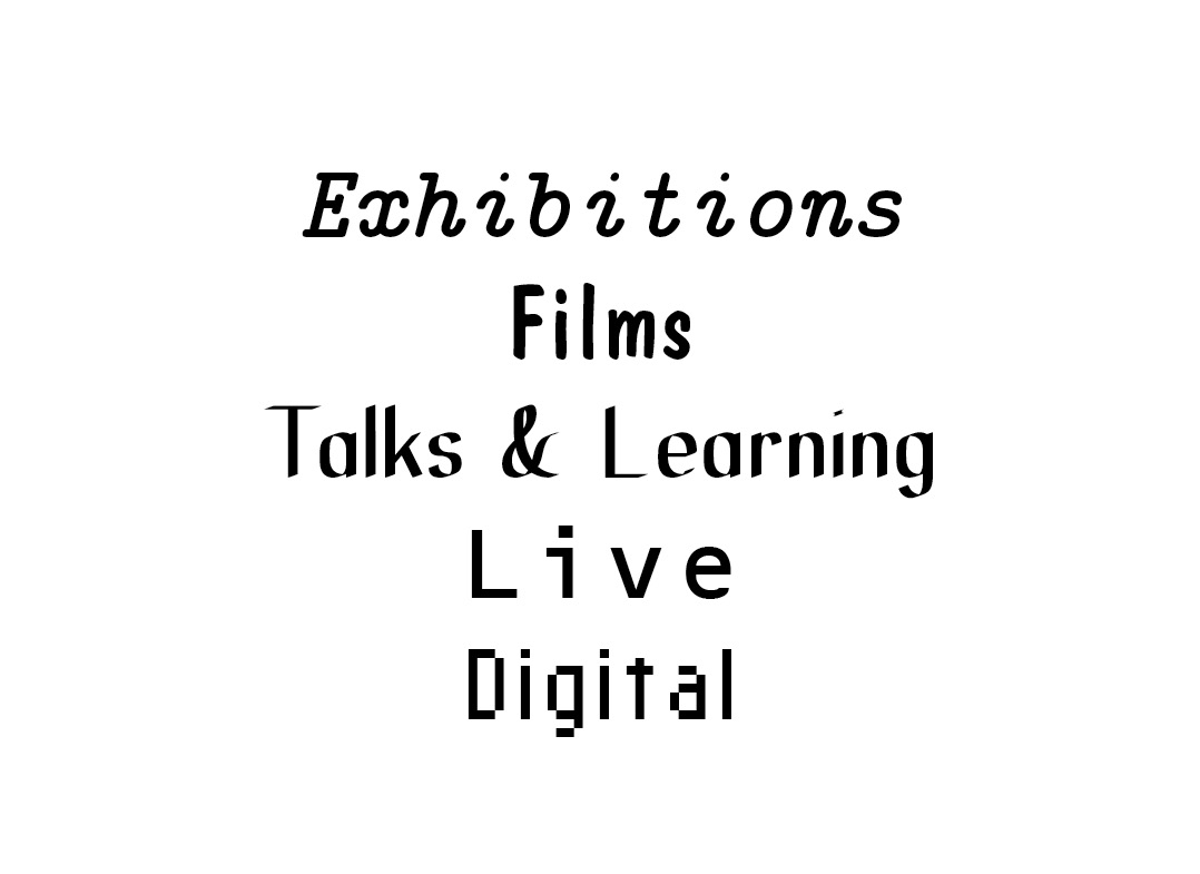
1) The parallel, equivalent use of the full name Institute of Contemporary Arts and its acronym ICA, spelled-out to emphasise the plural arts in a place that had recently become more immediately synonymous with its singular allusion to contemporary art, despite the fact that a daily film programme had long been running on two in-house cinemas, and that for long periods of its past the ICA had been one of the city’s leading venues for alternative music and a number of seminal talks. Similarly, various typefaces were to be used more or less interchangeably, with a principal serif (Computer Modern, one of the early fonts generated by Metafont and commonly used in TeX) and a principal sans-serif (Standard Grotesque, with the same proportions as Computer Modern and a similarly neutral character), along with a bunch of wilder fonts for the four main lines of programming, Exhibitions, Films, Talks & Learning, Live, and since the pandemic, Digital—a selection based on being as visually distinct from each other as possible, especially on small screens.
2) The frequent use of “digital primary colours” red, green and blue (RGB), often on a light grey background, with occasional gold, silver, and bronze used for more prestigious (= money-related) situations such as communication with Friends or Donors. The idea, in the beginning at least, was to avoid print and work exclusively in digital media for all ICA communications going forward. This, coupled with the fact that the prior ICA identity had been predominantly black-and-white, led us to emphasise the shift from “subtractive” CMYK to “additive” RGB as the dominant colour system. The light grey was more accidental, initially one of many test backgrounds on the website that we realised was particularly useful given that both black and white text were equally readable (for most viewers), and so allowed for greater typographic articulation: white could be used to indicate links within an otherwise black text, for instance. They grey backdrop also makes images “pop” more immediately, as if backlit on a lightbox. Over time it has become a consistent fifth colour after RGB and their combined white. Red, Green, and Blue also ended up naming the ICA’s three levels of Membership.
3) A logo derived from a poster-catalogue designed by the artist Richard Hamilton to accompany an exhibition he curated around the work of James Joyce in 1950. Hamilton printed the abbreviation from wood type, which explains the slightly clunky spacing, and in the following decades there have been countless ways of typesetting or illustrating the acronym that trace technical and stylistic trends of the various eras, from early traditional letterpress typography in the 1950s, through hand-drawn geometric forms in the 1960s and 1970s, the colder, rational influence of computers in the 1980s and 1990s, and on to a slicker, more innocuous corporate sheen in the 2000s. Hamilton’s acronym was never conceived as a logo per se; it was a one-off for that particular piece of print and never repeated until we revived it, effectively dating from a time before logos, or at least before their widespread adoption as the de facto public face of all institutions today. This full-circle return to the ICA’s origins was at once a general nod to its storied history and a particular tribute to one of its earliest acolytes. We also enjoyed the idea that the slow circulation of the Hamilton anecdote would itself comprise part of the identity. It is usually rendered in white (i.e., the sum of R+G+B) and, where possible, located in the bottom right-hand corner of whatever medium, more akin to a publishing imprint or watermark.
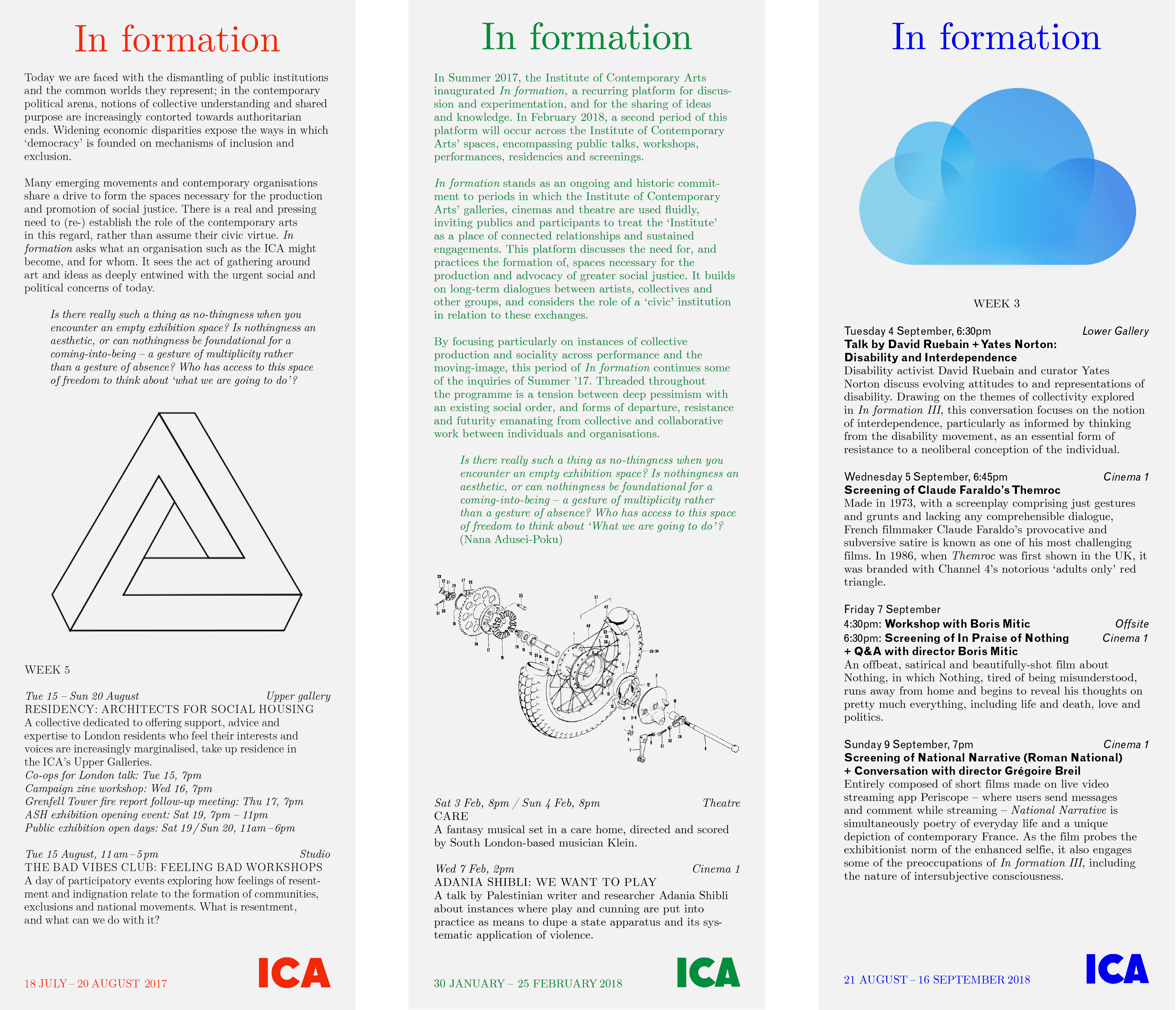
4) A set of well-known optical illusions, such as the Duck-Rabbit, Impossible Triangle, or Reversible Stairs. The idea was to put these images to work as visual headers for categories that didn’t otherwise have any obvious title or unifying theme. As many of these illusions have an “either/or” aspect, in the sense that the Duck-Rabbit is both Duck and Rabbit, they are fundamentally difficult to pin down and, as such, usefully ambiguous—as optical allusions. They also have the benefit of being free-floating, freely signifying icons that don’t really belong to anyone, surely doing the rounds in the public domain long before intellectual property or copyright laws were dreamed up. The Impossible Triangle, for instance, has been widely used as a symbol, most visibly in recent years by Palace Skateboards. But precisely because the triangle seems so ubiquitous as to resist being trademarked, it seemed more interesting to go ahead and also use it. Moreover, in another wink to the ICA’s past, the triangle was in fact devised and popularised in the 1950s by the psychologist uncle (Lionel) and mathematician nephew (Roger) of one of the Institute’s founders, Roland Penrose, and hence more properly known as the Penrose Triangle, described by Roger as “impossibility in its purest form.”
5) An emphasis on the non-hierarchical, parallel programming of the ICA’s five main strands of activity, again to emphasise the multiple arts while acknowledging the fact that they run at very different speeds. In a typical season, there are anything up to eight different films playing in the cinemas every day, maybe one talk or learning event a week, one live event a month, and a daily exhibition that runs for around three months. A useful visual metaphor here was a motorway, with vehicles moving at different velocities along its various lanes, enacted most prominently on the website. The earliest version very literally involved four vertical programme channels on the homepage, which soon proved problematic given the dominance of films and so was quickly reworked first into a scrollable calendar, and latterly into a daily set of highlights. But it dictated other formats too, such as a set of four adjacent portrait monitors in the lobby, each dedicated to one strand of programming.
6) An attempt to set up the various communication channels so as to be equally useful for staff on the inside and public on the outside of the institution, via what we thought of as a “Janus interface.” The ICA has long been an infamously chaotic place to work, and has doubtless retained a certain energy and unpredictability because of it. In ancient Roman religion and myth, Janus is the god of beginnings, gates, transitions, time, duality, doorways, passages, frames, and endings, and as such is usually depicted with two faces looking in opposite directions. Like the parallel programming, this idea had greatest traction on the website, initially based on a scrollable calendar interface that functioned more like a dedicated app than an overarching website. The Janus aspect points back—and forward—to Stephen Wright’s 1:1 notion of usership, as well as to the triangular text at the end of “Identity,” in view of presenting the ICA as close as possible to how it really is. Whether such an aim is desirable—and whether we came anywhere close to achieving it—is debatable, but that was the big idea at least.
What does all this have to do with templates? Well, naturally there are countless design templates involved in establishing and maintaining the identity of such an institution: Word templates for letters, funding applications, board reports, and job descriptions; InDesign templates for leaflets, booklets, programme notes, membership cards, and cinema holding slides; PowerPoint templates for presentations; and many, many more. But one of the most pervasive influences on such an identity these days, especially one with a mandate to avoid print where possible, are the myriad given templates provided by whatever software is required to circulate via digital media. These are likely to be commercial Content Management Systems used to run websites, along with the platforms required for email marketing, social media, streaming, selling merchandise, e-readers, and so on.
But there is a big difference between this software and their print equivalents. Any file created in, say, InDesign will open with a whole raft of predetermined settings (from general page formats down to the nuances of hyphenation), but they can generally be changed if you know what you’re doing and where to look. While certain aspects of the software for digital platforms can be similarly controlled and expanded, the restrictions are far more prevalent and influential—and for good reason, because the ways in which they are required to operate are determined not only by the sender but also by the receiver. Moreover, the received format is determined not by a single technical factor but a number of factors in combination, from the nature of the device on which it is viewed (desktop computer, laptop, tablet, phone, watch) to the software via which it is received (browser, email, social media), which are themselves determined by both centralized, general settings, and local, personal preferences.
All this is necessary and desirable in order that texts and images can scale to different device and interface widths as opposed to, for example, the fixed format of those Bulletins PDFs. But it means a great deal of redundancy has to be built into what is being sent in order to survive being pushed and pulled through the unpredictable complex of settings and preferences on the other end, while retaining some semblance of what was intended. What is called for, then, is a “fluid” or perhaps “redundant” template, explicitly designed to allow for these slippages.
There is a diagram by information theorist Claude Shannon, in a 1953 film by designers Charles and Ray Eames called A Communications Primer, which is designed to model “noise” in any communication process.
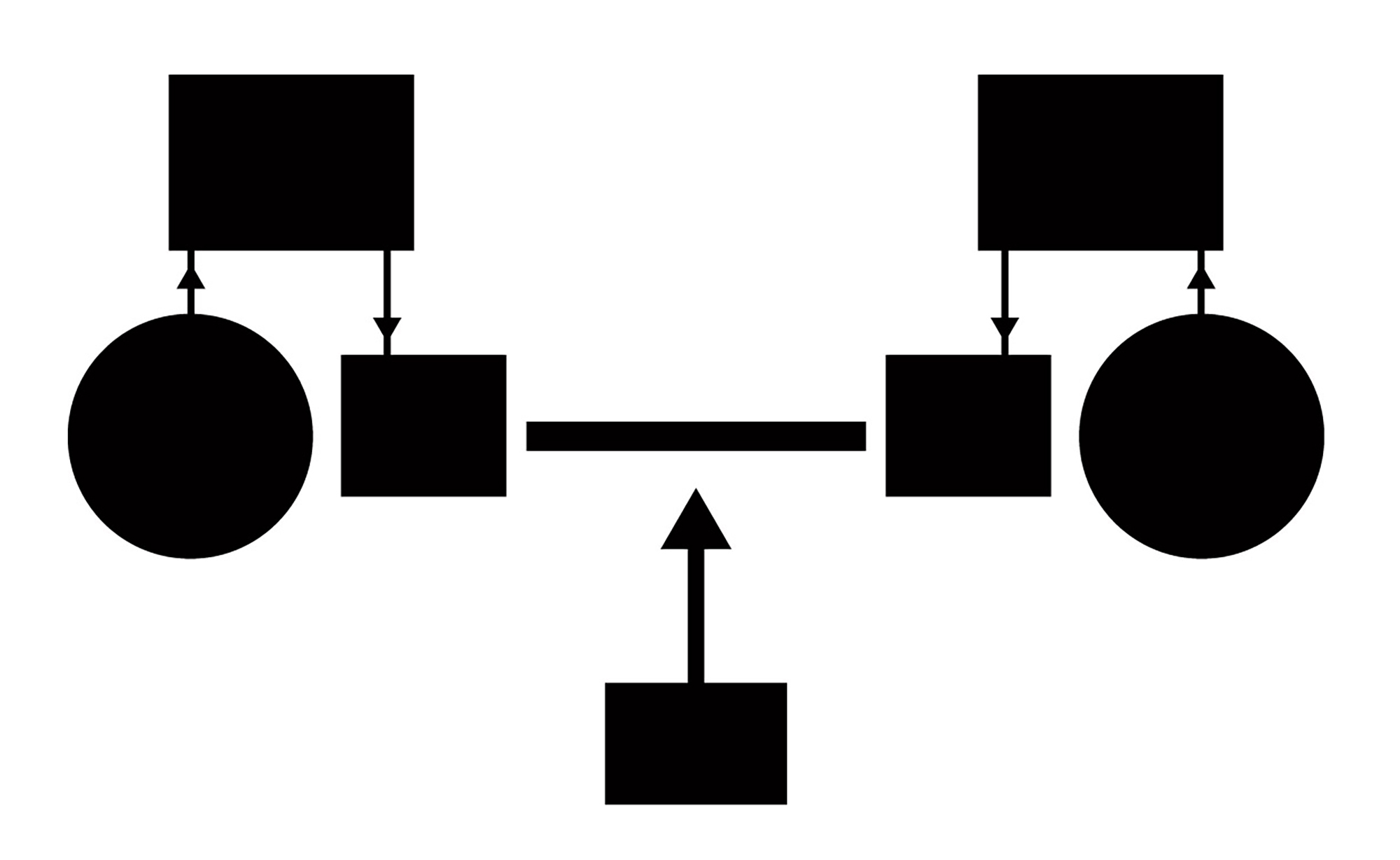
The circle on the left is an “information source,” the large rectangle a “transmitter” and the small rectangle its “signal.” This signal is channelled along the line of communication to an equivalent signal receiver, where it is decoded back into the message and delivered to the destination on the right. The rectangle at the bottom represents “noise” that will almost inevitably occur from external sources during this process, more or less diminishing the chance of a 1:1 transmission of information. Back in 1953, this noise would likely be aural (a siren, an air conditioner, scratches on a record) or visual (fog, traffic, scratches on a film). In one sense, digital communication has vastly reduced the likelihood of noise in the system adversely affecting communication in this way, based as it is on the effective transmission of zeroes and ones by remarkably efficient means. But what has also changed to skew this diagram is that where once the transmitters on both ends were likely the same or very similar entities (a handwritten letter, two telephones, human mouths and ears), now those at either end can be markedly different, with wildly different capacities for processing the signal—such as all those combinations of devices, software, and settings preferences outlined above.
To take one example of a fluid template, an ICA email is currently built using Dotdigital, an email marketing platform constituent of a commercial database software Spektrix, which is itself required to enable both an efficient ticketing operation and the cross-referencing of audience data. Like all such platforms, while the basic Dotdigital setup offers a limited set of typefaces and formatting options, the possibilities stop at a certain threshold of typographic detail. You can’t control line-spacing to the nth degree, for instance, and you can forget altogether about tracking or kerning. Some factory pre-sets can be expanded: with a bit of programming, typefaces can be added and other details adjusted in HTML—if you’re able to do that, or pay someone else to. But again, there is a threshold of possibility, and even then, not all devices and platforms will themselves be able to view those amendments as intended.
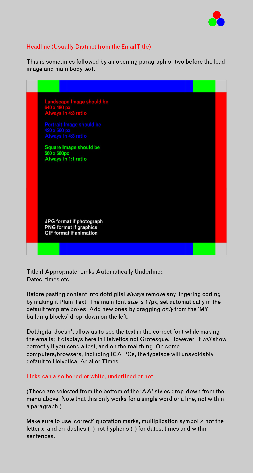
A typical ICA email built with the identity components described above as sent, then, will have a light grey background, be mostly typeset in black Standard Grotesque with some headings and further links in R, G, or B. Depending on the nature of the email, it will be headed by either the full name in Computer Modern or a revolving RGB GIF. There will be images cropped to 4:3 ratio and scaled to 640 pixels wide @ 72 dpi to ensure maximum quality via as many channels as possible, probably some additional yellow Calls-To-Action buttons, and perhaps a Membership advert involving a further GIF animation of the Penrose Triangle.
But as received, we have no real way of knowing how it looks beyond checking on friends’ devices. What we do know is that even on the majority of the maybe decade-old PCs in the ICAs own offices, often the typeface is supplanted by Helvetica or Arial, GIFs and sometimes JPEGs or PNGs need to be clicked to start working, frequently the email won’t even show in the browser without choosing in the email to go ahead and receive it, and, on a couple of particularly deviant machines, that rotating GIF blows up to fill the screen, a phenomenon known among ICA staff as Big Ball Syndrome. Not to mention the fact that the identity doesn’t even begin, as yet, to address accessibility issues such as the difficulties some people face in viewing images, reading certain colours on certain backgrounds, or adverse responses to flashing animation. Suffice to say that if you add these considerations to the limitations already described, the possibilities for 1:1 accurate and inclusive communication become severely squeezed.
The ICA has so far resisted the drive towards lowest-common-denominator programming that countless institutions adopt to attract the highest audience numbers. And likewise, we have aimed to avoid the bland, diluting effects of design-by-committee industry defaults that precipitate the easy slide into monoculture, instead championing the idiosyncratic and particular. In the ongoing drift from physical to digital means of channelling information, holding specific information in suspension with a generic template is not getting any easier, but it is a necessary job lest we are shortly made redundant ourselves …
•
With thanks to James Langdon and David Reinfurt for reading and improving the text.