World Format
2015
This is an email conversation, predominantly about poster design, between myself and James Langdon. It was commissioned for Some Posters from the NGV (Melbourne: National Gallery of Victoria, 2016), edited by Stuart Geddes and Megan Patty. The starting point of the exchange was a much earlier piece of mine, “Zurich Long Weekend,” published in Poster Collection: Posters for Exhibitions 1980–2000 (Zurich: Museum für Gestaltung, 2002). All mentions of the “Gallery“ refer to the National Gallery of Victoria, Melbourne (NGV), while all mentions of the “Museum” refer to the Museum für Gestaltung, Zurich (MfG).
*
S: As you know, Stuart Geddes sent us a link to a selection of posters made for the National Gallery of Victoria from the 1960s to the 1980s for us to consider and discuss from our “international perspective.” It so happens I was asked to do more or less the same thing fifteen years ago for the Museum für Gestaltung in Zurich, and ended up writing a small essay about their contemporary collection. Despite the shift in time and place, my response to the Australian posters today was identical to my response to the Swiss ones back then.
It’s easy enough to sum up. Basically, the common quality of this couple of decades’ worth of posters is that they have no common quality: each one is organically drawn from the specific exhibition they announce, rather than having been plastered with the Museum’s blanket style. I’m sure we’re both against the bland, homogenising effect of overwrought and overbearing institutional identities. Templates can be useful, certainly, but I don’t think they’re that necessary or appropriate where culture’s concerned (as opposed to, say, academia or economics). And so it seems all the more imperative to archive and exhibit such increasingly rare, carefully maintained and diverse collections, as examples of what’s possible outside the marketing mindset that’s all but wiped out such lively, thoughtful production since.
Let’s see what I wrote back then:
The more I spoke to those involved with the posters and policies of the Museum für Gestaltung, I realised that their contrariness is the main reason they’re consistently effective. They achieve an identity through non-identity. Cultivated over many decades, this tradition is delicate. It’s not too difficult to imagine an injection of marketing sensibilities destroying everything in one fatal campaign.
As far as I’m aware the Museum in Zurich remains relatively unscathed, but it’s hardly news to report that virtually everywhere else has gone this way—and then some.
Anyway, I thought the most expedient thing to do would be to republish that old essay while pointing readers to mentally substitute NGV examples for the MfG ones I’d referred to. On reflection, though, I’d rather get to the same place by a series of short cuts—perhaps by liberally quoting my younger self and seeing where your and my opinions align or diverge. I’m also interested in rehashing these thoughts without actually having seen what the recent history of NGV publicity looks like, and only later to check whether my own presumptions and biases are valid. Or whether it’s all melodrama. Something like that.
J: I’m comfortable with your assessment—the posters are certainly various. And it might undermine the “international perspective,” but the forces that likely shaped their design seem reassuringly familiar and therefore in some way universal to me, at least from my European perspective. I started grouping the photographs for my own reference, with arguably the most handsome examples in the selection ending up in a folder that I named “group shows are easy.”
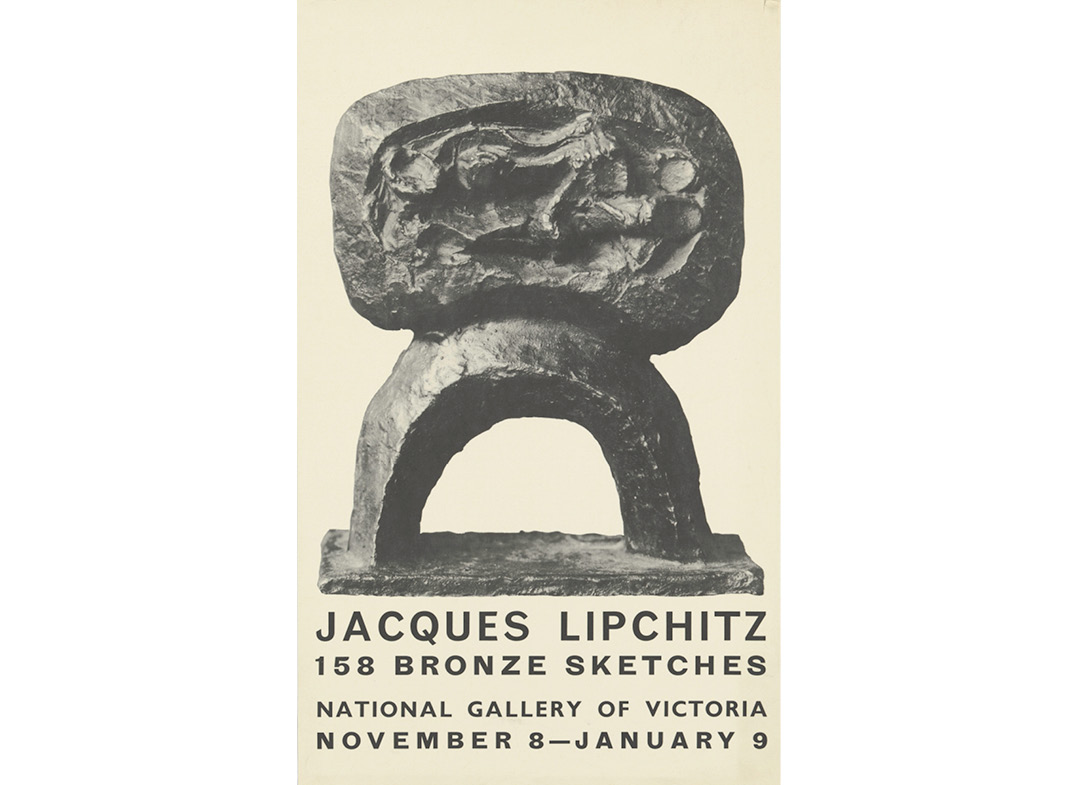
That’s not to say that graphic freedom is the mark of a good poster in this context. The Jacques Lipchitz poster is routine and conventional, yet pleasing. But one product of the “case-by-case” way of working that you identify is the inevitability that sometimes there is a rapport between the work of an artist, or the proposition of an exhibition, and the graphic language, or interpretative capacity, of a designer. And sometimes not. Then sometimes there are artists, or gallery directors, who insist on this or that detail, to the point of inhibiting the possibilities in the work. Such are the dynamics in most design processes.
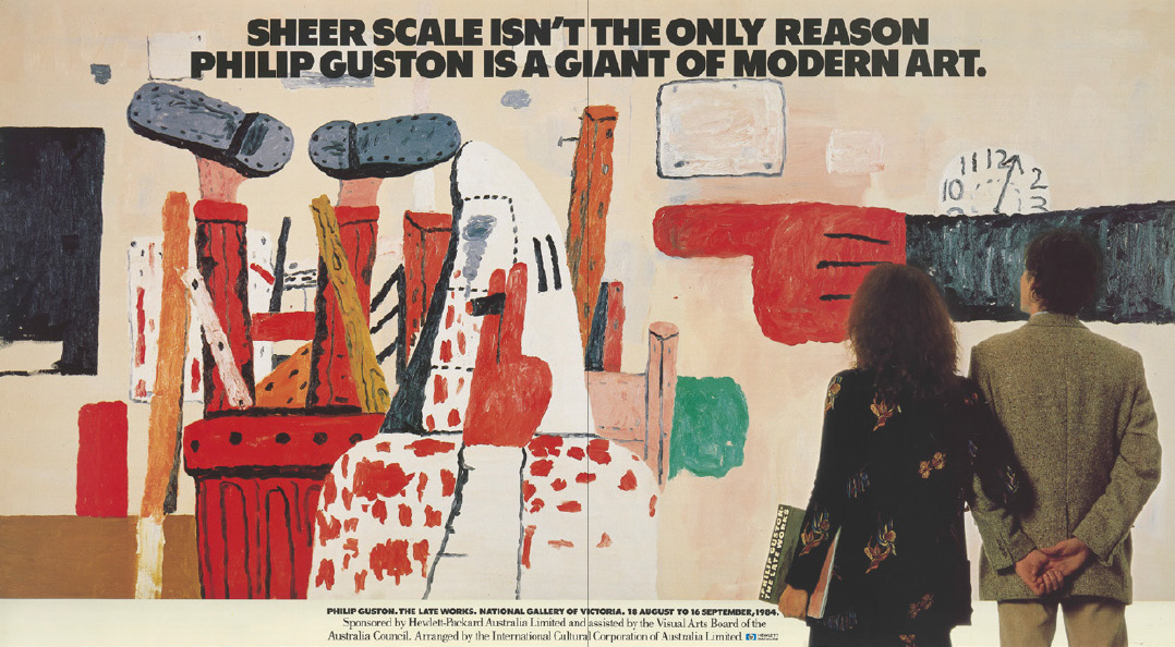
Back to the international perspective: given that we both seem to see the posters having much in common with comparable examples from any other institution, the decisive question must be, are they “provincial”?—or the more euphemistic “critically regional”? There’s something to this. I mean, I can’t imagine the Philip Guston poster being made in the United States.
S: Regarding provinciality or parochiality, here’s another flashback from the piece about the Swiss posters:
It’s impossible to over-emphasise the value of seeing the Museum’s posters firsthand in their various habitats. From the exhaustive history of the exemplary Poster Collection (a modest museum of posters in plan chests housed in a separate building over the road) and recent selections for sale in the museum shop, to those advertising the current exhibition outside on the street and first copies of the new ones arriving for the next show. A few basic facts were essential. Firstly, that the posters are generally the “Weltformat” (128 × 90.5 cm)—a machine size common to Switzerland, though difficult to find elsewhere. Secondly, that they are printed in editions of 700, of which around half are displayed in and around Zurich, then sent to an international range of other arts institutions, and half reserved for public sale (including seventy regular poster subscribers). Thirdly, that in German there is a distinction between “Plakat,” meaning functional—generally advertising—matter, and “Poster,” meaning the kind of souvenir reproductions of Chagall or Van Gogh. The Museum’s posters fall into both categories. They have multiple functions, simultaneously considered advertisement and art, as well as social documentation. This schizophrenia mirrors my reaction to them.
I still think that this “schizophrenia” at the level of commissioning has a huge influence on the Swiss posters. The idea that they’re simultaneously conceived as publicity and a piece of work (of composition, of Zeitgeist-capture) seems fairly alien today; something we more readily associate in a misty-eyed way with, say, London Underground posters between the wars, or, further back, the classics by Toulouse-Lautrec and his ilk for French cabaret around the end of the nineteenth century.
I’ve always been surprised, too, that in discussing the work made in those countries supposedly at the vanguard of twentieth-century graphic design (Switzerland and The Netherlands being the obvious examples), commentators rarely point out how much the relative wealth of those countries, and so their state-sponsored cultural institutions, presumably played a huge part in fostering their celebrated “experiment.” That’s to say: a license, a willingness, to devote the time and energy to pushing the form (for its own sake) beyond merely attracting an audience based on second-guessing its collective response; and the attendant idea that they’re equally designed to be collected and archived in their own institution. On one hand it’s a luxury, or seems so today when designers are obliged to answer to bureaucrats rather than directors, curators or artists. But it’s also long-term savvy in terms of establishing a reputation and an audience (and even some supporting income) beyond immediate results at the box office. It’s easy enough to consider such expansive reasoning behind posters such as Josef Müller-Brockman’s for the Zurich Tonhalle, or Wim Crouwel’s for the Stedelijk Museum in Amsterdam. This longer view appeals to me, of course.
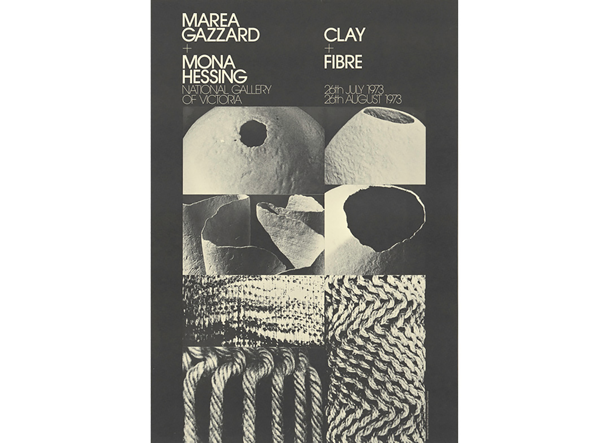
All of which makes me wonder if similar forces were at play in Melbourne, and whether we might read them off the surfaces of the posters themselves. Flipping through the collection again, I’d say the most interesting examples are generally well-conceived versions of those European vanguards like, say, “Clay+Fibre,” but it’s hard to spot anything more telling. It still seems more accurate to just say they’re absolutely plural. Put any three together at random and there’s no common denominator whatsoever. Can we maybe consider this in itself a sort of latent provinciality, in the sense of Melbourne having no overriding style of its own, or is that a bit much?
Incidentally—and this is perhaps symptomatic of what I’m suggesting—I don’t agree about the Philip Guston poster. The elongated format reminds me of a New York Subway placard, that strapline as typical of Mad Men-era drollery, and the overbold, tight-fitting type absolutely native to 1980s New York City graphics. But it doesn’t seem so much second-hand as, again, well-observed. This makes me wonder about the fine line between pastiche and appropriateness. I suppose pastiche implies some degree of ironic detachment, whereas the NGV set seems positively eager to please. They please me, certainly.
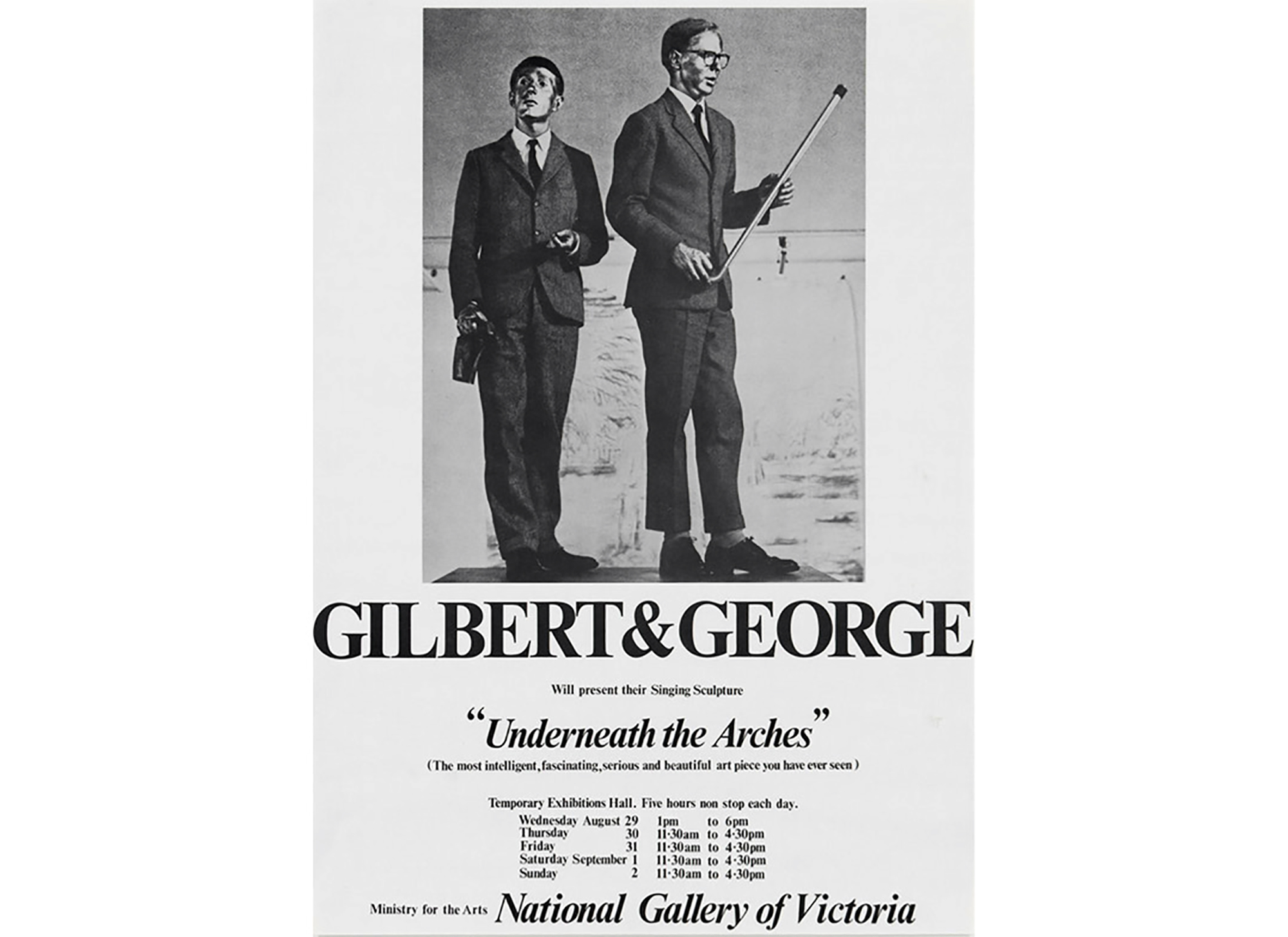
J: By coincidence, a few years ago at around the same time I was asked by two regional UK galleries if I would scan some posters from their archives for retrospective exhibitions. Most of the posters were considerably larger than my scanner, so I had to scan them in parts and stitch the parts back together digitally. At one of the institutions the examples I was given generally conformed to some kind of prototypical idea about communicating art that must have been emerging at the time—roughly the same era that we are looking at in Melbourne. The NGV’s 1974 Gilbert & George poster is not a million miles away. White space, no full-bleed pictures, minimal typography, generally monochrome printing. The kind of visual language that still dominates the advertising pages in most art mags. So those stitch-ups were easy work. But at the other institution it was all psychedelic geometries, intense colour, intricate typography. I still remember trying to align two scans with text set in one of those multi-linear Op-art typefaces.
The point being that I came away from those processes with the idea that there were very distinct chapters in the visual languages of these galleries, and that this was explained by the personal preferences of the attendant directors, their choices of designers, their being receptive (or not) to particular graphic trends and so on. Superficially this is quite contrary to your observations about national tendencies. Maybe there’s a distortion there, allowing for some kind of English provincialism in the examples I am talking about. But perhaps this is really just one continuum, with the countries of international influence that you identified in the centre, and then the rest, spreading out gradually until you find the really dodgy derivatives way out in the weeds.
It’s this idea of distance that prompts my reaction to the Guston poster. We agree that it does belong to an American idiom. My reaction isn’t to the aesthetics. I look at that poster and think that Philip Guston’s estate maybe never saw it, or never gave it the same attention that it might have gotten if it were being displayed on the New York Subway. Given his notorious temperament, surely the artist would never have approved it if he were alive. I can’t work out if it’s handling the confrontational elements of Guston’s later paintings or ignoring them. I’m being very speculative—and more than a little ignorant myself—but is some measure of Melbourne’s great geographical remove from the centres of the art world visible here? Having myself always worked outside of London my feeling for the periphery is that it can be liberating, but also exerts some degree of cognitive load—there can be a doubtfulness at the margins.
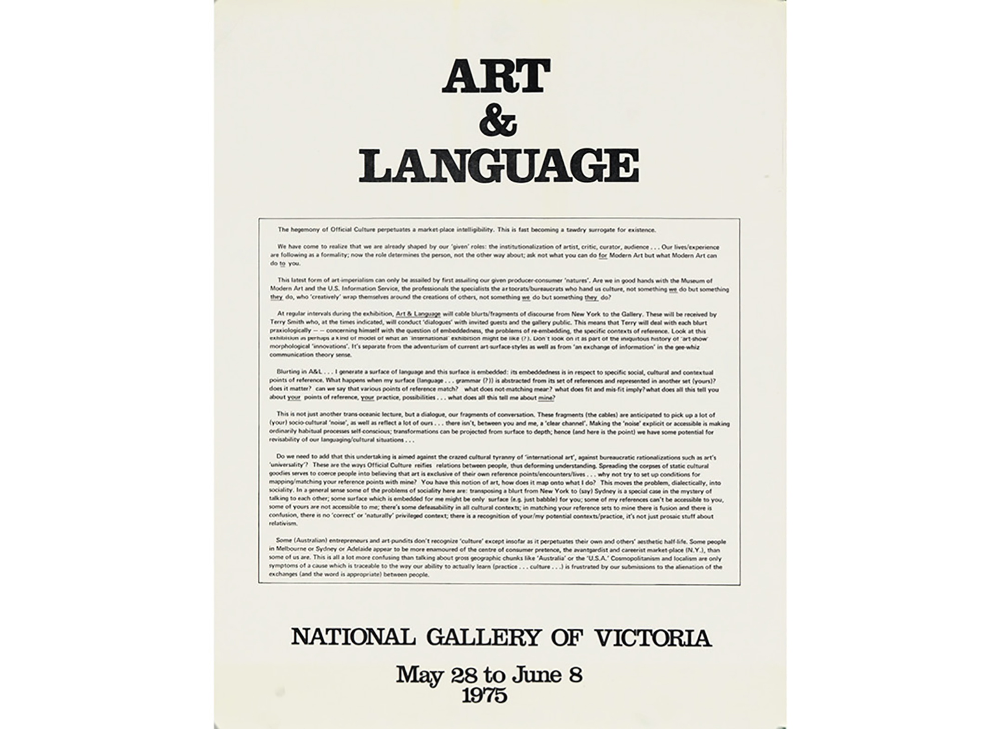
The counter position to all of this, and the name of one of my other groupings of Melbourne examples, is the “just do it like this” kind of poster. The 1975 Art & Language poster is the best example. It’s not really a poster at all, in the sense that the Museum für Gestaltung’s subscribers would appreciate. It looks like the artists demanded that it be that way. That’s partly a product of Art & Language’s work itself already being designed, and partly one of those commandments that some artists make about the mediation of their work by designers. Just another tension between a local reading and an international one, I suppose.
SBB: This equation, a stylistic continuum with a centre of influence and a periphery at its two extremes, strikes me as accurate and obvious enough. It also makes me wonder whether the “international perspective” premise isn’t a bit of a red herring. At least, it seems more appropriate (and natural) to approach all this foremost from the perspective of a couple of middle-aged designers in 2015 …
Anyway,
A few years ago, the well-regarded, traditionally artist-run New York gallery Artists Space appointed a new director. As part of his general overhaul—and as a means of stamping his own identity on the place—he stripped back all the architecture, cleaned the place up, and in doing so unearthed a considerable archive of printed matter made since the gallery’s conception back in the early 1970s: posters, flyers, invitation cards, stationery and so on. He then invited David Reinfurt and myself to “do something” with this material, as he could see how it told a story about institutional identities, specifically the increasing obsession with how the same place with the same fundamental motives “comes across” to its potential public at different times under different direction. Moreover, he intuited that some kind of exhibition or book or conference or series of talks might draw out this idea in view of the similarly accelerated interest in identity politics in a more general sense.
It seemed a good idea to get some immediate distance on the subject by seeing it through someone else’s eyes, so we commissioned the designer and writer Rob Giampietro to rifle through the files and assemble a talk for a small, private audience. He duly assembled a fairly straightforward, wholly convincing graphic narrative that ran the gamut you might expect from any graphic design history book: from early quirky conspicuously pasted-up DIY, through something more patently punk, then marked by the influence of early computer graphics, various iterations of corporate slickness, and finally onto something more plural and anonymous. The point being, it all looked exactly as anyone with a basic awareness of the technology and social temper of the times might expect.
And it was precisely this straightforwardness—its absolute exemplariness as a case study—that made it difficult for us to get a handle on how to possibly transform it into something worthwhile for a new audience, for the same sorts of reasons we’re discussing here. We couldn’t conceive of how to collect and organise such material in a way that wouldn’t be sort of deadeningly obvious, something any nominal audience would already appreciate through everyday cultural. “Explaining” how identities work, and why, and why they’re capable of causing such institutional anxiety, is akin to explaining how advertising works.
Okay, I’m seriously off-roading from our Melbourne conversation here but, to steer us back on track, the one thing that was clear from the Artists Space archive was how surprisingly unsurprising it all was. There was no particularly local inflection to it all, or anything that seemed to exist in some stranger, less immediately classifiable zone. As it turned out, though, the new graphic identity commissioned by the new director as part of the same overhaul was something a little different: a deceptively simple equilateral triangle proposed by designer Manuel Raeder. And during our subsequent research towards what ended up being a sort of informational cartoon on the subject, we discovered that the same triangle was the first-ever registered trademark—by Bass Brewery back at the tail end of the nineteenth century, more or less coinciding with the advent of graphic design as a distinct field. So we suddenly had a sense of graphic design having come full circle. Or full triangle.
What’s this got to do with the NGV posters? Well, to me the Gallery’s poster collection similarly suggests a “terminal point” of graphic design. It sounds reactionary, I know, but I think that stylistically speaking everything’s been done. Since roughly the end of the 1990s, the surface of any graphic design can’t help but reference earlier formal associations. I don’t see this negatively; more as inevitable. At best it forces attention onto other aspects of graphic design less concerned with vanguard style for its own sake and more with formal appropriateness. Again, this is where the NGV posters are generally successful: stylistically apt, the result of keen eyes referencing different eras and idioms, and otherwise well-configured.
But what I miss in these posters, that I reasonably expected to find, is evidence of some native ambience that takes these ingredients from those centres of vanguard style we mentioned (Switzerland, The Netherlands) and transforms them into something more weird and particular. I’ve been thinking of a certain strain of Australian music from the 1970s and 1980s that does as much. The Go-Betweens or The Birthday Party, for instance, who took the basic sound and attitude of The Velvet Underground and forged it into something uniquely antipodean. Think equally of Australian cinema from the same era, from Picnic at Hanging Rock to The Year My Voice Broke, or even Dogs in Space. It’s hard to pinpoint this quality, but it’s absolutely present.
This next example might annoy our sponsors, as it amounts to sticking New Zealand to our Australian premise, but an equivalent from graphic design would be the typefaces of New Zealand type designer Joseph Churchward, which designer David Bennewith recently spent a considerable amount of time and energy relaying to the wider world. Churchward’s whole project is indelibly marked by the idiosyncrasies of his environment, its particular histories. This is what I miss in the NGV posters, then: the local assimilation of that continuum of style doesn’t undergo a change in kind. It’s not “made new,” to paraphrase Ezra Pound.
Er, discuss.
J: Helpful to read your band analogy. It’s given me an image of the Melbourne art-poster scene being more like Charles Darwin’s Galapagos than one of Kenneth Frampton’s “Critical Regionalism.” But probably the NGV is too large an institutional creature to register the idiosyncrasies you’re after.
And yet I’m going to throw even more relativism at the problem, by suggesting that the “everything’s been done” theory is subject to local contentions. I’ve been at a design conference in Antwerp this week. The roster of speakers was enjoyably diverse, with several “proper” designers amongst the expected characters producing the good looking, uncomplicated work in the margins. By “proper” I mean the kinds of designers who work on big public projects and present slides showing focus group meetings in plush meeting rooms labelled with clichés like “Know when to trust your instincts.”
A lecture given by the Swiss pair NORM started just as you might imagine if you know their work. They were talking about grids. All the slides were black-and-white with calculations and definitions on them, all placed neatly on a grid and set in their own typeface designed on the same grid, etc. But gradually it took a speculative turn. After a cursory mention of Borges’s Library of Babel, they announced a plan to generate algorithmically all of the possible combinations of pixels on the grid, thus revealing all of the possible images—expressed as “PP” for “possible pictures”—on the slides. I think the grid was 80 × 120 pixels, something like that. They demonstrated the pictorial limits of such a resolution with various images of cows in fields: crude, but legible enough to see the difference between the breeds. For a moment I wondered if we were present at a defining moment in world history, and that they were about to set the algorithm running and we would see on-screen images of the entire history and future of the human race, programmed to take exactly forty minutes, so their presentation wouldn’t run over the allotted time.
But the lecture then proceeded to focus on the inevitable issues with the proposal. They described how they would arrange the images in books printed on Bible paper, specified the number of pages, and the height and width of the pages in millimetres, and showed how many of the images would fit on each page. They’d had a mockup made, so they could reliably determine the spine width. Things started to get big—they showed a design for modules of shelves that would house the books, then buildings that would house the shelves (ceiling heights specified as 220cm, not the usual 240cm—no reason given for the deviation), then later superstructures that would span continents. All of this was supported by mathematics carefully documented on each slide. Eventually they had to stop when the size of the library could no longer be represented comparatively on the grid. A single point was too small to represent the known universe in relation to the giant black monolith of the library. This was all delivered with the kind of Swiss-ness that can be hard for an English sensibility to read. Are they serious? The mathematics seemed serious. They said they work on the project one day every week, closing their office to clients to avoid distractions. They weren’t smiling. They looked tense. It was hysterical.
But by the end the proper designers were shuffling in their seats. I turned to see one guy’s dissenting face scrunched up incredulously. Obviously not familiar with NORM, he said: “Are they fucking Swiss?”
It was great. Real friction. By dinner everyone was friends. NORM really liked that other guy’s talk, apparently.
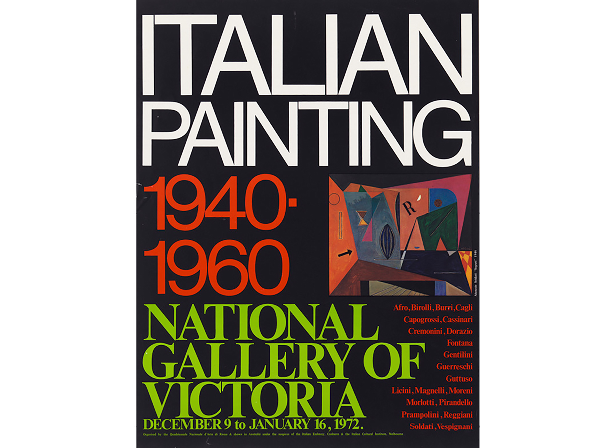
Anyway, with that out of the way I’ve just stopped to review our progress on this. On reflection I feel compelled to get into more specifics. It’s your influence making it all meta. But you are right—importantly—the whole international perspective thing is a red herring. What about this; I’ve identified a notable poster and put the image of it in a new folder called ‘just fill the space’. It’s the one for the exhibition “Italian Painting 1940–1960.” What I like most about it is not the fact that it eschews the tendency to observe ‘that’s a hyphen, not an en-dash’ that afflicts graphic designers. It’s that it’s designed with a kind of graphic opportunism, making all of the elements as big as they can be and finding how they can still fit on the page. The obviously off-grid overlapping of the list of names with the words NATIONAL GALLERY OF VICTORIA is pleasing to me.
Is this a good direction? Did your younger self get into the details?
S: Yes, my younger self was well-steeped in the details of graphic design, and it’s as hard to get rid of him as it is to stop the later meta-me spinning his wheels.
I completely understand your enjoyment of what you nicely describe as graphic opportunism in the Italian Painting poster—a quality I often think of as positively childlike, as opposed to negatively childish. The best example of this I can think of is the work of the (very) English designer Richard Hollis, who spent much of his career doing NGV-type arts publicity, and managed to imbue it with that elusive local character we’re chasing here. His well-known work for the Whitechapel Art Gallery from the 1970s and 1980s is a case in point: he takes the fundamentals of modernist graphic design and somehow bends them in view of London’s East End. Some kind of local aesthetic transformation occurs: it becomes itself, so to speak.
Back when I’d first graduated, I remember talking a lot with the graphic designer John Morgan—we shared a house and some after-hours work—trying to describe what it was we were interested in doing in graphic design, knowing only that it was neither hyphen-not-dash affliction (which we were force-fed at the University of Reading) nor end-of-print-ish abandon (the modus operandi of Trainspotting-era London). The closest we came to articulating what we were after was along the lines of “grounded oddball,” which is to say markedly idiosyncratic, yet still intrinsically derived from the specifics of the job at hand (i.e. not just weird for the sake of being weird). Twenty years on, David and I are always talking about trying to make work that’s “specific” or “particular”—which are really just less fanciful words for grounded oddball.
It’s perhaps interesting to pursue how this sense of “locality” applied to a given piece of work overlaps with the idea of a local scene, a local look. I want to push you to dig deeper into your use of “pleasing,” which is a very gentle (Norman Potter-ish, even) term of critique. I recently re-read an anecdote about the mathematician-engineer-linguist-pedagog Alfred Korbyzski, who methodically pushed “subjects” to define the meaning of any descriptive term they might use towards some sense of root-level meaning (like looking up a definition in a dictionary, then the definitions of the words used in that definition, ad infinitum). Only he was so relentless—to a sadistic degree—that he’d eventually reduce his victim to a spiralling, gibbering mess, without the faintest idea what he or she had meant to mean in the first place. I try (unsuccessfully) to bear this in mind when evaluating work—especially with students in the United States where it often seems as if the only aesthetic term adopted for anything anymore is “cool.”
Actually, let me try to pre-empt what’s behind your “pleasure,” and you can disagree. I suspect what’s pleasing about the poster—beyond the minimum requirement of articulating the necessary information—is how it traces the designer’s mind at work, thinking things through in a way that isn’t rote, whether that means following the dictates of hoary old principles (Reading) or the latest fashions (London); and so you sense a certain joy, an involvement, an engagement at work that ideally induces the same in its audience. It’s this “life” that stops it being bland, despite the ingredients being fairly mundane. What I want to imply, then, is an equivalence between this local life at work in the work, and the sort of local energy that can be mustered up in a local scene. To return to music, take the Manchester scene, whether in the late 1970s or early 1990s, for instance; or indeed Peter Saville’s graphic realisations of both.
There’s something else I want to get at here. Given that this book is likely aimed foremost at graphic designers, what might these posters *teach* beyond simply recording the look on the streets of Melbourne at a certain time? There’s a conversation between Richard Hollis and Robin Kinross from the early 1990s, in which they suggest that the key products of modernist design are quite literally “keys” in that they enable a careful viewer to “unlock” how and why a certain poster (for instance) was made the way it was. You can follow the technological, social, political line of thinking that went into making it, and this intelligence is transferable to other contexts and subsequent eras. Leading by example, during the discussion Hollis duly unpacks the involved reasoning behind a classic Jan Tschichold poster (for the 1923 exhibition Der Berufsfotograph), from the configuration of its various bits of information in terms of size and arrangement to the ambitious use of negative printing and judicious colour to emphasise meaning. Today, when technical constraints are far less, er, constraining, it seems to me far less easy to capture or read such thinking off the surface of things. What lessons might we learn from these NGV posters, with an era between then and now?
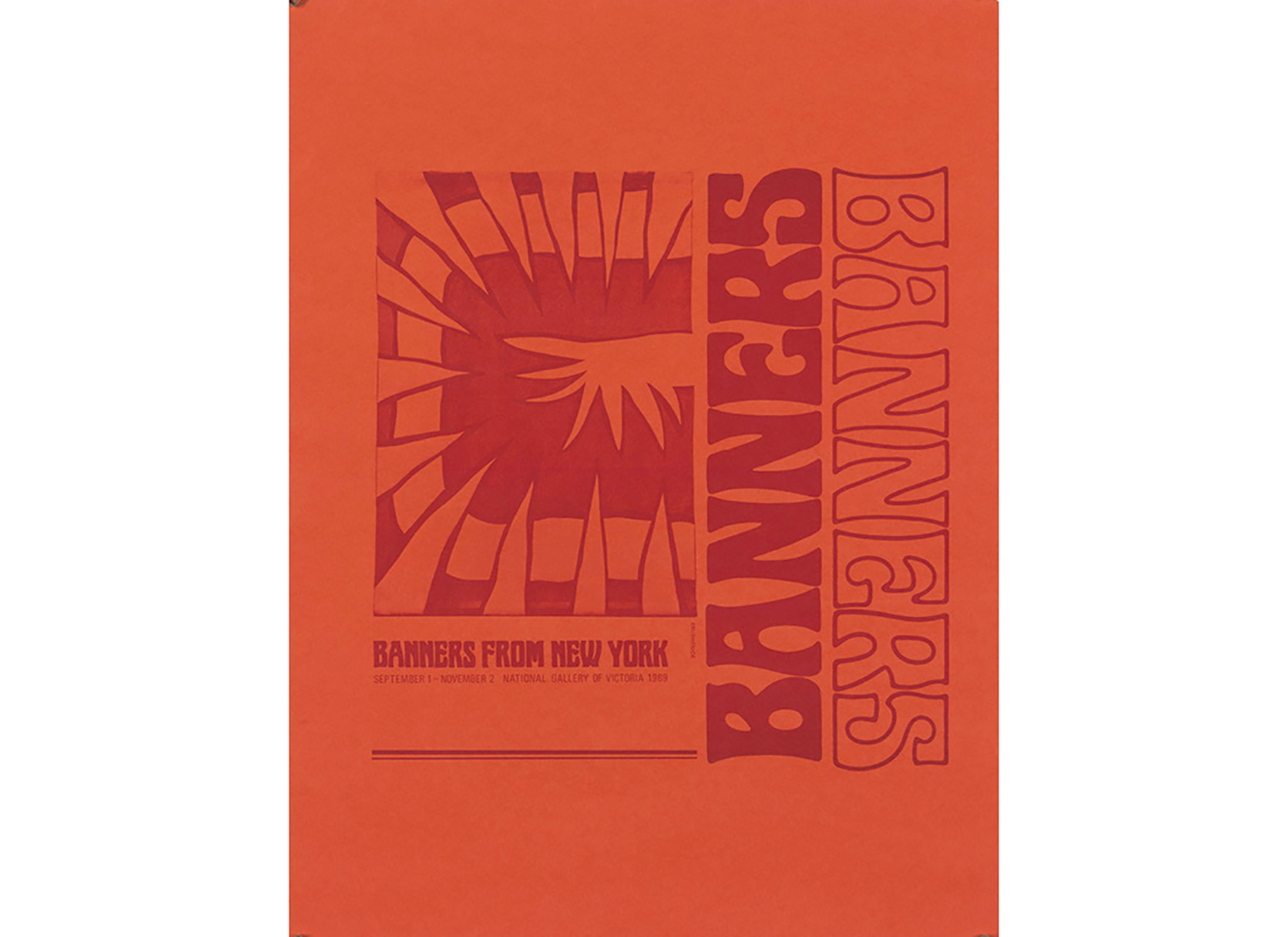
Taking your lead, here are two posters I find pleasing. The first is “Banners from New York,” for these reasons: (1) it makes the most of single-colour printing, which I presume is how most banners were produced back then (and I suppose still are, although less often since the advent of digital printing); (2) the printed area is set within a considerable margin, which suggests screen-printing, again presumably faithful to the era—and even if the poster is actually lithographed, this limited area still suggests a concordance with one of the technical restrictions of actual banners; (3) the unusual combination of red on orange is appropriately low-rent psychedelic, ditto the type; (4) the ‘childlike’ 180-degree butting-up of two “BANNERS” are hung and repeated in a banner-ish manner; and (5) these words are equally weighted with the abstract image, emphasising how in this context words themselves turn overwhelmingly graphic, iconic. Everything I’m saying is quite rudimentary and it’s a bit absurd to labour such points, but I mean only to say that this poster goes the extra mile in depositing that behind-the-scenes thinking I mentioned.
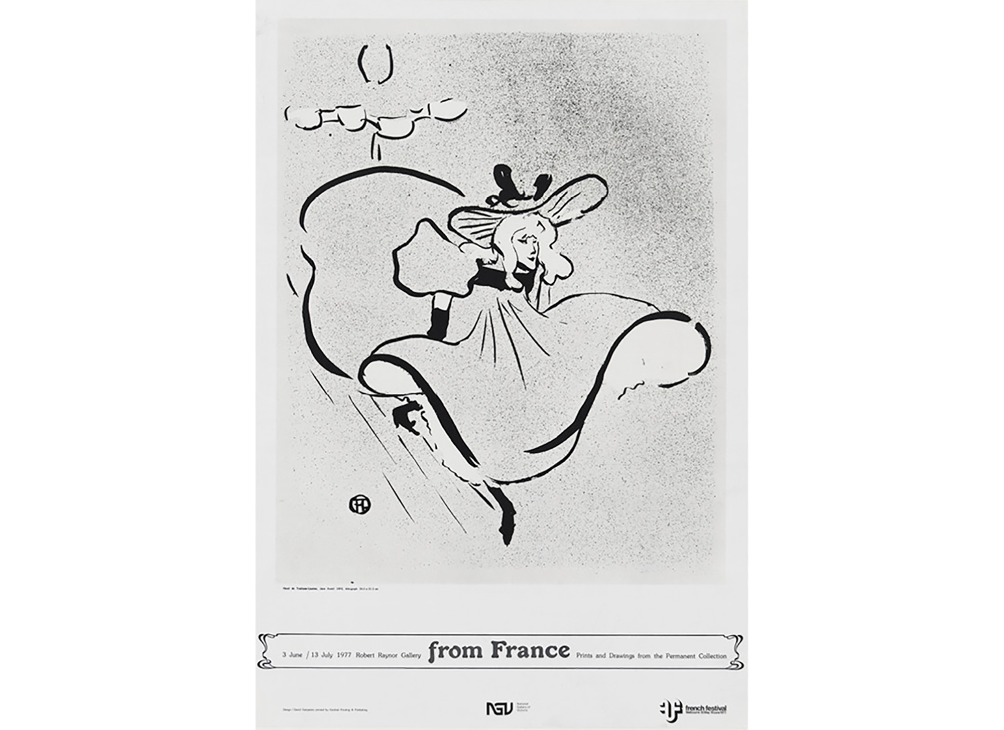
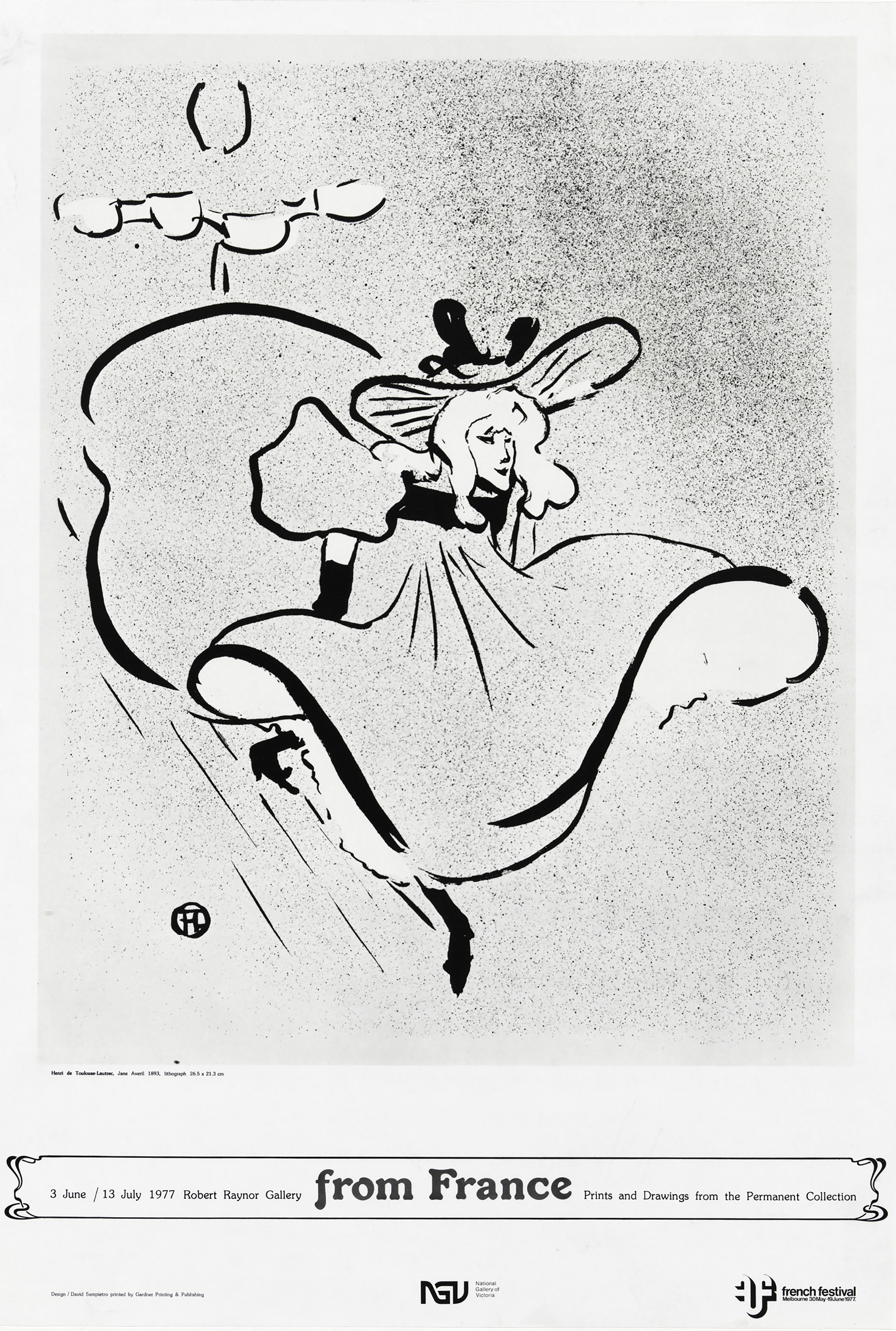
For different reasons I also enjoy “from France”: partly for the simple fact that the cabaret fairy is looking me straight in the eye, and seems well-chosen to appear to be arriving on lines of cartoon movement directly from France; partly for the fact that her pivotal dainty French toe sets up the symmetry for the rest of the poster, which is then dressed in modest Art Nouveau without being overbearing; and most of all for how the NGV and French Festival logos echo Toulouse-Lautrec’s monogram—a protologotype from some seventy-five years earlier! Now that’s the sort of detail that makes me smile, and which I suspect didn’t escape its designer’s eyes either.
Returning to the earlier part of your response, here’s another curiously auspicious and perhaps instructive anecdote. Around the same time I wrote that piece on Swiss posters, I also wrote a little paragraph about NORM in view of celebrating their having just won the Jan Tschichold award. I began by referring to a classic photograph of Tschichold facing the title page of his Typographische Gestaltung, sat at his desk admiring a piece of work (presumably his own), fingers touching delicately in satisfaction as if to say *just so.* Tschichold was, of course, the typographic figurehead of the “form follows function” dictum, at least in his earlier, most influential years. To me, NORM’s work had, and it sounds like it still has, the look of excessive functionality. This is what I presume the person to your left was insinuating by asking, “Are they fucking Swiss?”; an extreme, airless and frequently annoying extrapolation of ideas such as those of the young Tschichold. Only now its prime “function” is precisely a stylistic one; i.e. to “look functional.” The insane functionality of their algorithmic experiments surely exceeds the actual demands of whatever actual book they might be designing.
What I meant to get at with the Tschichold/NORM comparison in the note I wrote was: if Tschichold’s function back then was relative to the meaning inherent in a given job, NORM’s version now is primarily self-serving, ostensibly concerned with all jobs. Don’t get me wrong, I think NORM make interesting work—especially once, or perhaps only if, you realise there’s some humour involved. But what they’re up to sounds closer to the poetic project of, say, Mallarmé’s unrealised Le Livre, which was similarly founded on cosmic maths, and therefore has little to do with graphic designing per se. Indeed, NORM’s project seems to be more about meta-design: design about design about design. That’s a sign of the times, too.
J: Yes, that’s exactly the pleasure. I’ve never particularly thought to identify it before—thanks for the Korzybskiing. One of my first experiences of a graphic designer at work came while I was interning at an art gallery immediately after graduating. I was visiting the studio of our designers, who were finishing the typesetting of a catalogue essay. The essay wasn’t fitting, or was producing some awkwardness on the last page. I remember the designer scanning back several pages—nimbly, all keyboard shortcuts—making some minor adjustment in tracking, and then back to the end to see the problem solved. It was a fist-pumping moment, and surprisingly performative.
And interesting you mention John Morgan, I’d also thought of him while formulating the previous response, and that piece of his that you published in an early Dot Dot Dot. I haven’t checked the facts—I’d say it’s important not to when measuring the influence of something—but I remember it being him writing a letter to an anarchist society to tell them that their justified typography was undermining their politics. That kind of isomorphism is idealistic and smug, but also represents an inspirational strand in graphic design. And somehow that letter has come to represent this idea to me, even though I probably haven’t re-read it for a decade.
I think one reason why English minds like Potter’s were drawn to isomorphism was that it remains relative. Not reductive or optimal, like bad modernism, but conditional and resourceful like good modernism. Ad-hoc in the sense that Charles Jencks used that word, to mean something like our adopted critical method—the legibility of an artefact, the degree to which it allows itself to be unpicked by an inquiring observer. This also highlights the fact that what is communicated by a piece of design is so much more than just the message constructed by the designer, and for that reason I strongly concur with you and David on being particular. The decision makers in any design process have to motivate their decisions, to satisfy themselves that the direction they take is appropriate. If a particular detail or choice can do that, whether or not it’s reasonable to anticipate it being apparent to the larger public, then that might be enough.
Having been through that thought exercise, I’m jumping back into the mind of the designer of the “Italian Painting 1940–1960” poster, and it’s not such a pleasing perspective. Speculatively mapping the decisions that led to that typographic detail in the bottom right corner doesn’t reveal much. It’s even likely that the reason one finds oneself setting up such typographic overlapping is because there isn’t anything more meaningful shaping the design process.
So now I’ve put everything back in one folder and I’m looking for something that will unpick more productively.
I’ve been thinking about an earlier point of yours, what you call “schizophrenia at the level of commissioning.” You mean it in a positive way, if I understand you correctly. I think I’ll expand on this thought, just to top off my speculative series of contributions to this conversation. It’s interesting to reflect on the selection of posters as a broader portrait of a particular kind of exchange—between designer and commissioner—and specifically as a measure of the confidence in graphic design that the museum directors of the period felt. We’ve talked about international centres of influence, and it’s believable to me that the secret sauce that sustains the production of exceptional work in these cultures is what you suggest: a certain belief in the value of designed messages above their function as messages about an institution’s program or expressions of institutional identity.
This of course means a different kind of question is being asked of the designer, and suggests a threshold that likely occurs in the careers of most successful designers, when the conversations around a commission start to refer to the preferred aesthetics of the designer as much as to the demands of the institution. This phenomenon is in conflict with the homogenising influence of marketing that you begin with, but is still consistently visible.
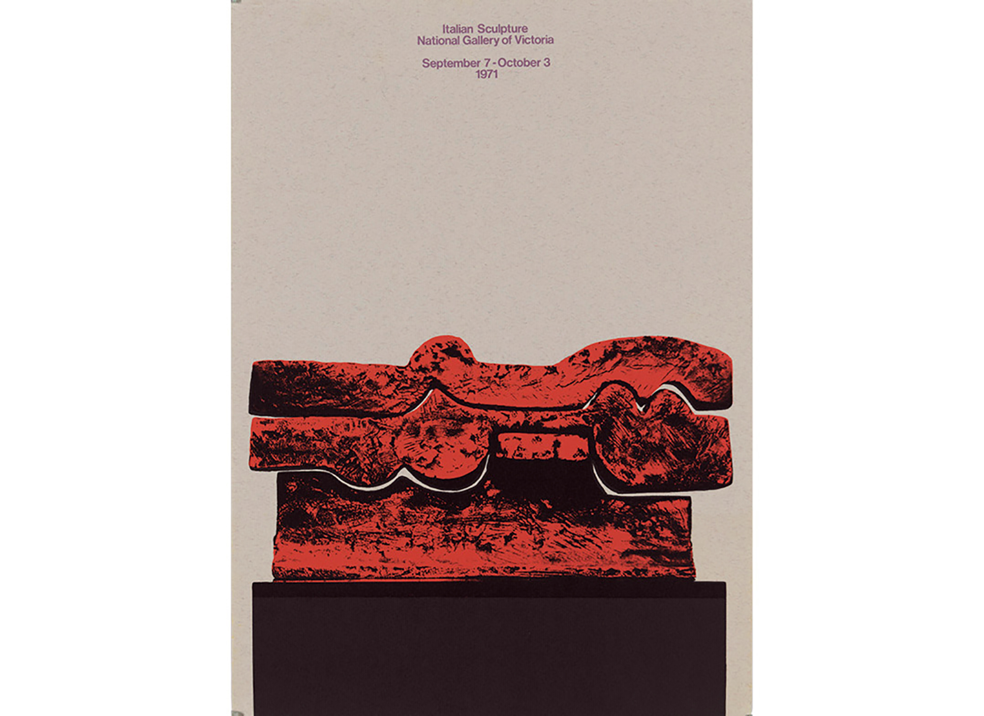
The “Italian Sculpture” poster is the best example I can see, just for the plain fact that the type is so small. “Why is the type so small?!” the Gallery’s director presumably did not shout at the designer of the poster. It’s heartening to me to attempt to describe why that might be. As a designer I’ve never particularly come under the spell of the classic sans serif types, but I do accept that there is some reasonable logic in the way that these kinds of letters seem to represent things in a very elementary, apparently uncomplicated fashion in a certain public consciousness.
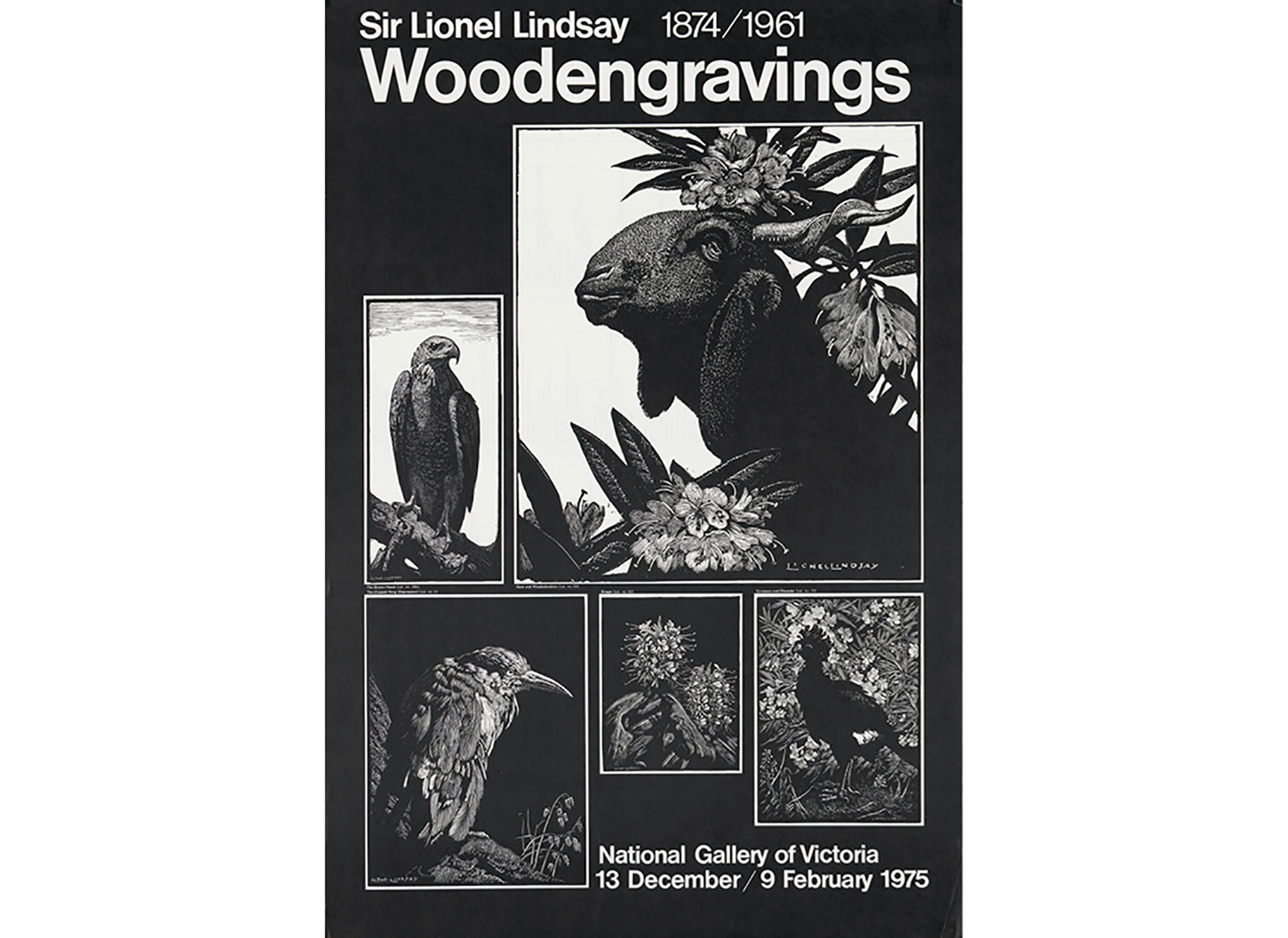
Whether or not the type can be read from across the street is in some sense beside the point for a poster. If the whole visual proposition of the poster appeals to someone, that person will inspect the poster, will take a few steps out of their way to read it. The words “Italian sculpture” are so perfectly explanatory that they don’t need to be big. They are more informative than the name of an artist that the person in the street doesn’t recognise, be they large enough to read from a distance or not. After typing that sentence I went back to the posters for an example, and realised that there is hardly one to choose. The shows represented are almost all group shows. Even in the case of the “Lionel Lindsay” poster, a rare example of an exhibition by a single artist, the word “Woodengravings” is twice the size of the artist’s name.
S: I’d like to end on the summary image of you finally trashing your temporary category folders, shifting all the jpegs back into one general one with a shrug: heterogeneity wins out over pigeonholing in the end …
That said, I just read through that Swiss posters piece again to see if there was anything that chimed with your last paragraphs, and discovered this protracted account of coming across a poster by NORM (!) on the street. It seems to compress a lot of what we’ve been saying into one anecdote, including our ambivalence about undertaking such an exercise in the first place:
I was in Zurich earlier in the year when the exhibition As Found had just begun. Walking down the Limmatstrasse, I was drawn to the posters displayed in front of the Museum, and spent a good few minutes trying to work out what was going on. Although some of the angular terms (New Brutalism, Kitchen Sink Drama, The Independent Group) were familiar enough to me, the association was blocked—or at least disoriented—by the mechanical flavour of the modular typeface, overprinted with a collection of indefinable white shapes arranged to suggest another font or code. (It now seems crazy that I really stood there clinically dissecting it like this, to end up writing about it eight months later.)
I saw the exhibition anyway—and loved it—but on returning to the poster afterwards, still couldn’t see any connection. More significantly, this was exactly the sort of show I would want to know about, and I had some familiarity with the subject. If I was confused, how was anyone else going to get it? And now, the more I look at it, it seems to me that out of the whole collection this is the exception that proves the rule. This is a poster designed from the outside-in, style pasted on top of a subject without any evident connection to its content. Or if there IS a connection, it remains in the collective mind of its designers—it’s not publicly answerable. The strongest association I can find within the poster is a certain parallel between the term “Brutalism” and the industrial type or crude shapes. What does this poster have to do with the gritty realism of Free Cinema and Angry Young Men? Where’s the sense of post-war austerity in which the work is commonly rooted?
And yet, having said all that, I can’t really bring myself to DISLIKE the poster. On the contrary, I remain intrigued by its tactility (the semi-transparency of the white ink), economy of means (the basic left-alignment and arrangement and articulation of information by type size only), and disorienting mismatch of references. More to the point, it genuinely sucked me in. I don’t feel obliged to resolve these contradictions. At the back of my mind throughout this writing is the idea that posters simply shouldn’t be thought about this much, they should just BE—and that trying to explain them misses the point precisely.
*