Calling Cards
2016
This short piece was a contribution to the book Oracles. Artists’ Calling Cards, edited by Pierre Leguillon with Barbara Fédier and published in 2017 by Edition Patrick Frey & HEAD-Geneva, which has now been reconfigured as an amazing website.
*
For a stretch of time in the late 1990s I knew that my most treasured possession was officially worth one Dutch Guilder. A quick online calculation tells me that this would have been equivalent to 0.45 Euros—except the Euro was only an abstract idea and not in physical circulation until 2002 when it replaced the Guilder along with twenty-one other currencies. Today, the phantom value of one Guilder has apparently increased to 0.65 Euros.
The economy of influence is an entirely different matter. In the Autumn of 1997 I had made a modest pilgrimage to Arnhem in the Netherlands to visit the then relatively uncelebrated graphic designer Karel Martens, whose work I had admired since the design historian Robin Kinross had introduced me to it perhaps a year beforehand. Karel’s work was something of a revelation for me: serious and principled yet also somehow free and easy. It continued the formal tendencies of continental Modernism – form following function, unfussy and neutral, a distinct sense of “truth to materials”—but also captured the joy of simply making stuff. Counter to Modernist design’s reputation for being cold and clinical, this was unusually warm work. It was also what Robin once called “answerable”, which is a word that’s also since taken on a talismanic aspect for me. What he means is that the work speaks for itself, straightforwardly and without pretension. It doesn’t require the designer or an advocate to point out what’s smart about it.
Karel and I spent the day rifling and talking through bits and pieces of his work in a disused radio station that he was soon to collaborate on turning into the Werkplaats Typografie, a staunchly independent design school now in its nineteenth year. He had just finished the design of a series of standard phone cards for the Dutch national telecom company PTT, an institution with a long but soon to be wiped-out tradition of working with vanguard designers. A key aspect of Karel’s work is how his free play with printing at home bleeds into his commercial work in the studio. He would—and I expect still does—typically make prints from small bits of plastic and metal (strips of Meccano, washers and hinges) and other found objects, overlapping found shapes and colors to form unusually intense and magnetic compounds of color that he calls “druksels.”
The phone cards are a perfect example of this carrying-over from after-hours hobbyism to the professional day job, or equally from fine to applied art depending on how you want to read the influence. The real point being, of course, is that there is no distinction. The chip side of each card carries the value in denominations of 1, 5, 10, 25, 50, 2.5 and 7.5 Guilders set in bold condensed Futura along with some small print instructions, a couple of logos and a slender red arrow. Flip it over and you’ll find a field of overprinted numbers, their quantity and size proportionate to the card’s initial value so the more expensive ones have more numbers—which makes sense as the user can afford to make more calls. The gridded arrangement and overprinted colors duplicate the form of many of Karel’s druksels, such as the one that wraps around the cover of his 1996 monograph Printed Matter. What’s new is that the free patterning is now tethered to fixed meaning. Moreover, the set of numbers on each card are not randomly chosen but determined by a letter-number code based on the words of the Dutch national anthem.
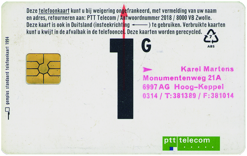
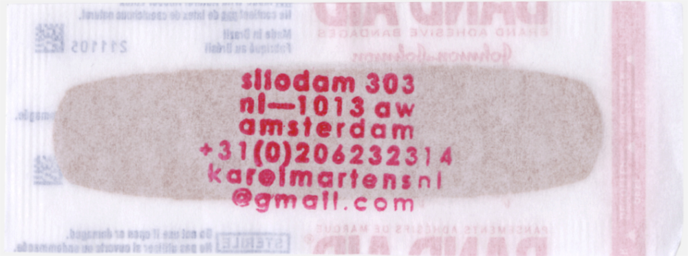
As I was about to leave Arnhem, Karel handed me one of the cards—with a difference. When the series was released he’d bought a stack of the cheapest ones in order to stamp on his address and hand out to friends and acquaintances. This overachieving calling card then doubles as a carrier of the caller’s work, not to mention a minor gift of communication—perhaps worth a five minute chat at local rates back then.
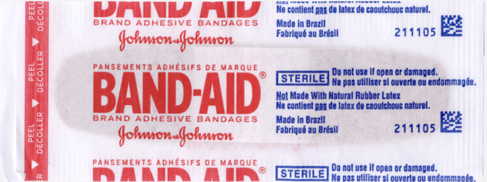
Cut to two decades later. Another cheap, quotidian object turned into another mini-gift by another pink rubberstamp with a new address that again manages to be tongue-in-cheek while actually practical. Karel might not have designed the substrate this time, but it’s a compact summary of his graphic toolbox: the straightforward contrast of that red and blue print, that big and small type, that squared-off translucent paper and rounded opaque plaster, and especially that vertical strip with the holes, are all quintessential Martens. Different time, same sensibility: a wallet-size memento that may prove useful in an emergency.
*