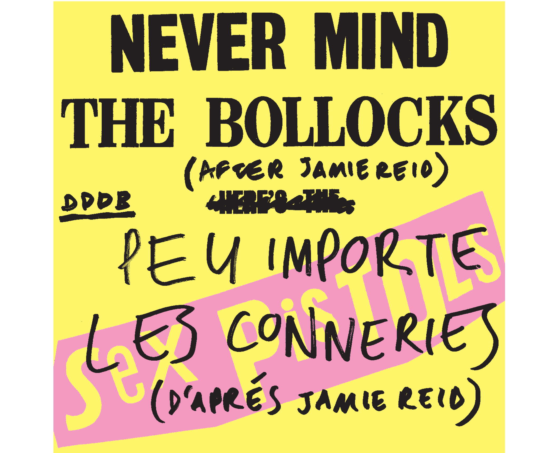
Never Mind the Bollocks (After Jamie Reid)
2005
This is an edited transcript of an hour-long walk through a collection of objects in a garage somewhere in the French town of Chaumont as part of its annual poster festival that summer.
Partly conceived as an exhibition of those objects, hence the reference to “this second DDD exhibition,” it was generated together Sven Herzog, then a student at the Werkplaats Typografie, which had organized a series of collaborations between students and working designers. This version was then published in the Werkplaats’ book Dutch Resource: Collaborative Exercises in Graphic Design (2006) in both its original English and (I was later told very bad) French. Soon after, surplus copies of the same 32 pages were included in Dot Dot Dot, no. 11 (2006).
*
– Jean-Luc Godard
1. The Sex Pistols, NEVER MIND THE BOLLOCKS HERE’S THE SEX PISTOLS, cover by Jamie Reid, 1977 (doctored)
A couple of years ago I was invited to give a talk at some event in Barcelona, replacing Jamie Reid, who had pulled out at the last minute. I decided to use the opportunity to present a collection of friends’ work I admired. Upon realising this didn’t amount to very much, the idea stretched to encompass a general collection of work from the past century by a gang of both dead and living spirits who made work with some common link; a bond—or umbilical cord—stretching through the twentieth century from some anonymous modernist mother. I might reluctantly describe this work as being cerebral, rigorous and worthy, if those words weren’t so cerebral, rigorous and worthy-sounding. So instead maybe: charged, luminous and illuminating, like a series of momentary cartoon light bulbs flashing on and off above my head.
I generally find talking about my own work is a problematic and deflating experience. This is partly just the awkward feeling of being on some election rally, magnifying something quite ordinary and everyday out of all comfortable proportion, and partly because I tend to find myself describing the mistakes and failures in the work—what went wrong, why, and how it should and could have been otherwise. When talking about other people’s work, on the other hand, it’s a relief to skip over such incessant disclaimers to just focus on the good parts—the pub anecdotes rather than the dull mess of business meetings. At its most fundamental level, then, this talk is just a collection of work I’d like to have made myself. It represents what I’m trying to do better than anything I’ve managed to do. They are ideas, ways of looking at things, and as such, maybe even charged with philosophical potential. This collection doesn’t necessarily conform to what would conventionally be considered graphic design—there’s as much music, film, art, and literature here—but the common denominator is always language, and how it is designed.
So I started by deciding to title the talk Never Mind the Bollocks in homage to Reid, and to use his classic Sex Pistols’ cover as a title slide. I never really intended to say
anything about the way the cover looked, but it gradually dawned on me that it single-handedly embodied a lot of what I was trying to say elsewhere. Not unlike Reid’s second-hand Situationism, I was hijacking an iconic style for my own purposes; a Russian doll of tribute. In a recent conversation the writer Michael Bracewell described to me how he increasingly found himself observing the world from the vantage point of 1977. He didn’t mean this in a sentimental or retrospective way, more that this was a personal lens through which he reflexively viewed other aspects of culture, like a homemade pinhole camera, or maybe a magnifying glass to channel the sun and burn a few ants. He meant looking from the past forwards as well as the future backwards. He meant 1977 as an ongoing present tense.
On the occasion of presenting this second DDD exhibition in Chaumont, then, I’m offering a literal translation of the title into French: Peu importe les conneries (d’aprés Jamie Reid). Unlike many nationalities, the French stubbornly insist on translating the titles of foreign films, often resulting in the ridiculous or misleading outcomes, though not without charm; I prefer it to the arrogance of Dutch voice-overs or German overdubbing. It reminded me how graphic design is always a form of translation—in its broadest sense, from a cerebral idea into a physical object—and something is always lost in the process. The work here seems to me to come about as close as possible to forging a direct link between the intial idea and its eventual communication. The typographer and teacher Anthony Froshaug wrote: ‘design consists […] in translating all the problem, set of problems, into another language, another sign system, with love.’ The majority of what passes as graphic design doesn’t really stick to any reasonable notion of form following function. On the contrary, I would say form generally fucks function. And to proceed with such a dubious metaphor, I’ll turn it around again and say that, on the contrary, the examples here show form and content having great sex, mutual and inseperable. Or at least French kissing.
No matter how much I try to keep it at bay, all this comes out of failure anyway: Jamie Reid pulled out, and in the end I pulled out of replacing him too. But here, two years later, the idea has
settled and enough work has gathered in the corners of my mind to be able to make a reasonable attempt. As I began to stick it all together I came across a piece of writing which described an attractive paradox in the Bollocks cover. While Reid’s signature amphetamine typography gobs an easy cartoon degeneracy, the sleeve was actually quite difficult to make. Fluorescent pink and yellow are difficult colours for a printer to hold flat and consistent over a large print run, so the apparent cheap simplicity of Reid’s design betrays an expensive luxury. As someone else (I've forgotten who) at some other point in time wrote: The simple things you see are all complicated, and there’s another key to unlock the work here: they are all products of care, commitment, and attention to detail, with second- and third-hand stories and anecdotes behind each surface which not only complement but complete the design. And before getting around to actually beginning, allow me to quickly emphasize the obvious fact that these are merely poor illustrations of real-life objects, which should be sought, found, and held. Their function here is merely to sit on the screen or page and vibrate.
2. Daniel Spoerri, with Robert Filliou, Dieter Roth, Emmett Williams & Roland Topor, AN ANECDOTED TOPOGRAPHY OF CHANCE, Something Else Press, New York, 1966, (originally published as TOPOGRAPHIE ANECDOTÉE DU HASARD, Paris, Editions Galerie Lawrence, 1961)
The structure of this talk is well described by this first piece of work.The French artist Daniel Spoerri began his Anecdoted Topography of Chance by mapping the breakfast table of his Paris apartment one morning. He laid a sheet over it, traced all the objects and made a brief description of each one, then added further notes, subjectively supplementing the original objective facts. Spoerri asked Roland Topor to draw each item from memory, and another friend, Robert Fillou, to annotate the first set of annotations. Then when it was later translated from French to English, he also invited the translator, Emmett Williams, to add further notes. So the book traces this series of ever-branching anecdotes, and its graphic translation clearly mirrors this, from the double column of the original description and accompanying image, down through the ever-diminishing sizes of footnotes. From this visual analogue the reader grasps the process immediately. The project represents how the apparent banality of an everyday table contains an infinite potential of stories and interpretations. It recalls a scene in Godard’s Two or Three Things I Know About Her, where the camera hones in on a just-stirred cup of coffee as a deadpan voiceover intones philosophy and the universe, while the silently spinning bubbles in the centre of the cup seem suddenly choreographed as atoms and planets.
3. Raymond Queneau, EXERCISES IN STYLE, Gaberbocchus Press, London, 1958 (originally published as EXERCISES DE STYLE, Éditions Gallimard, Paris, 1947)
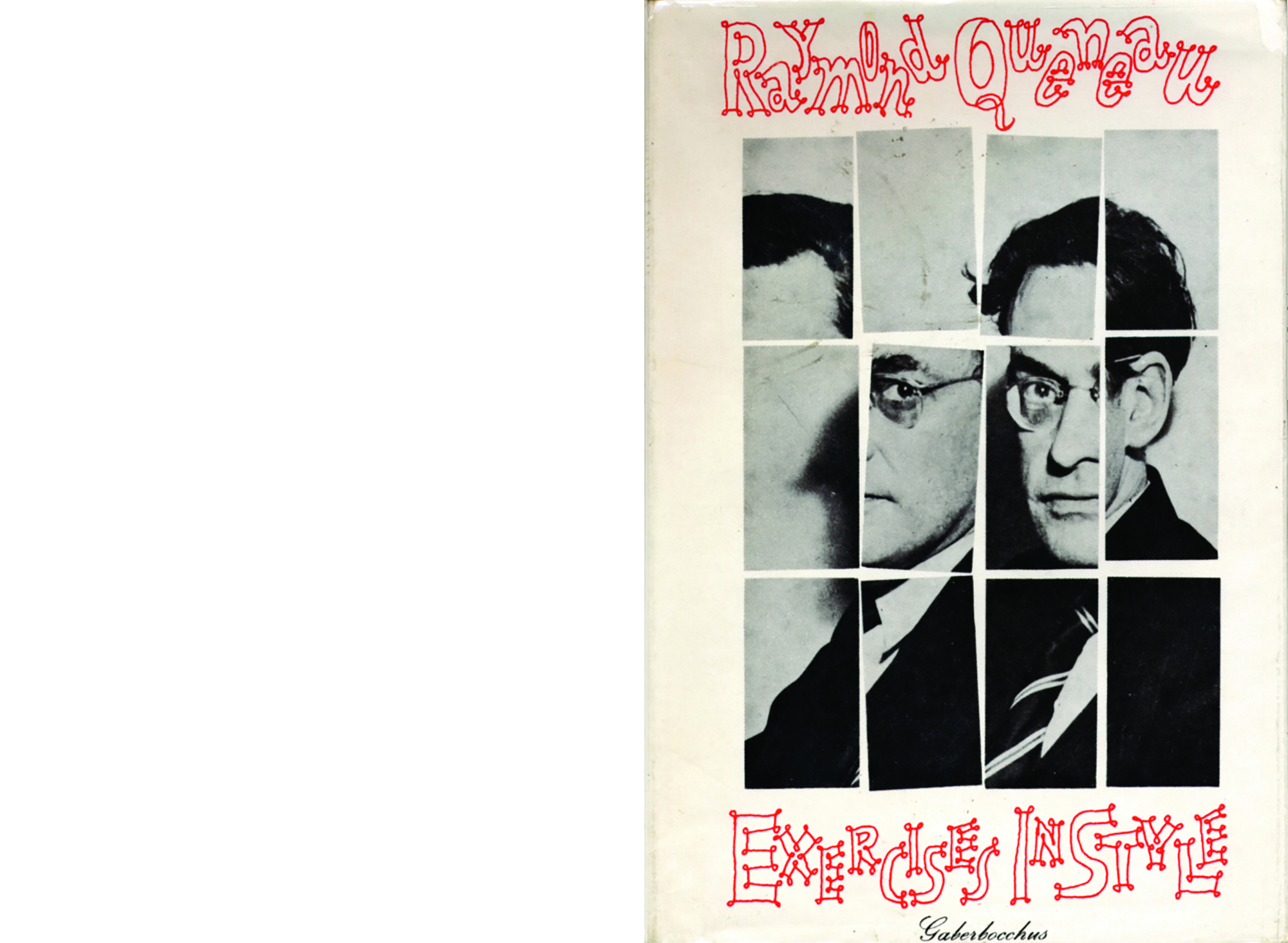
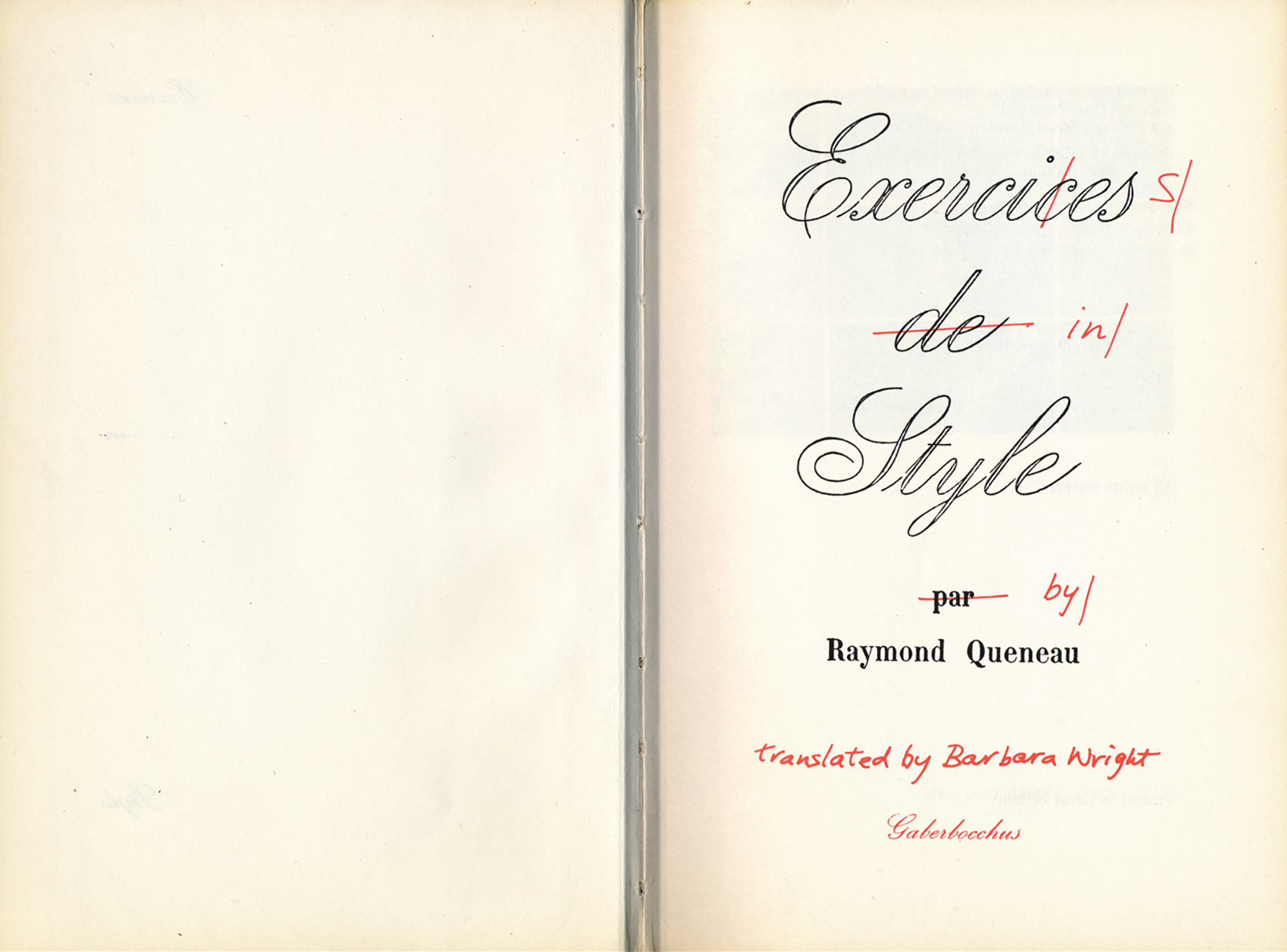
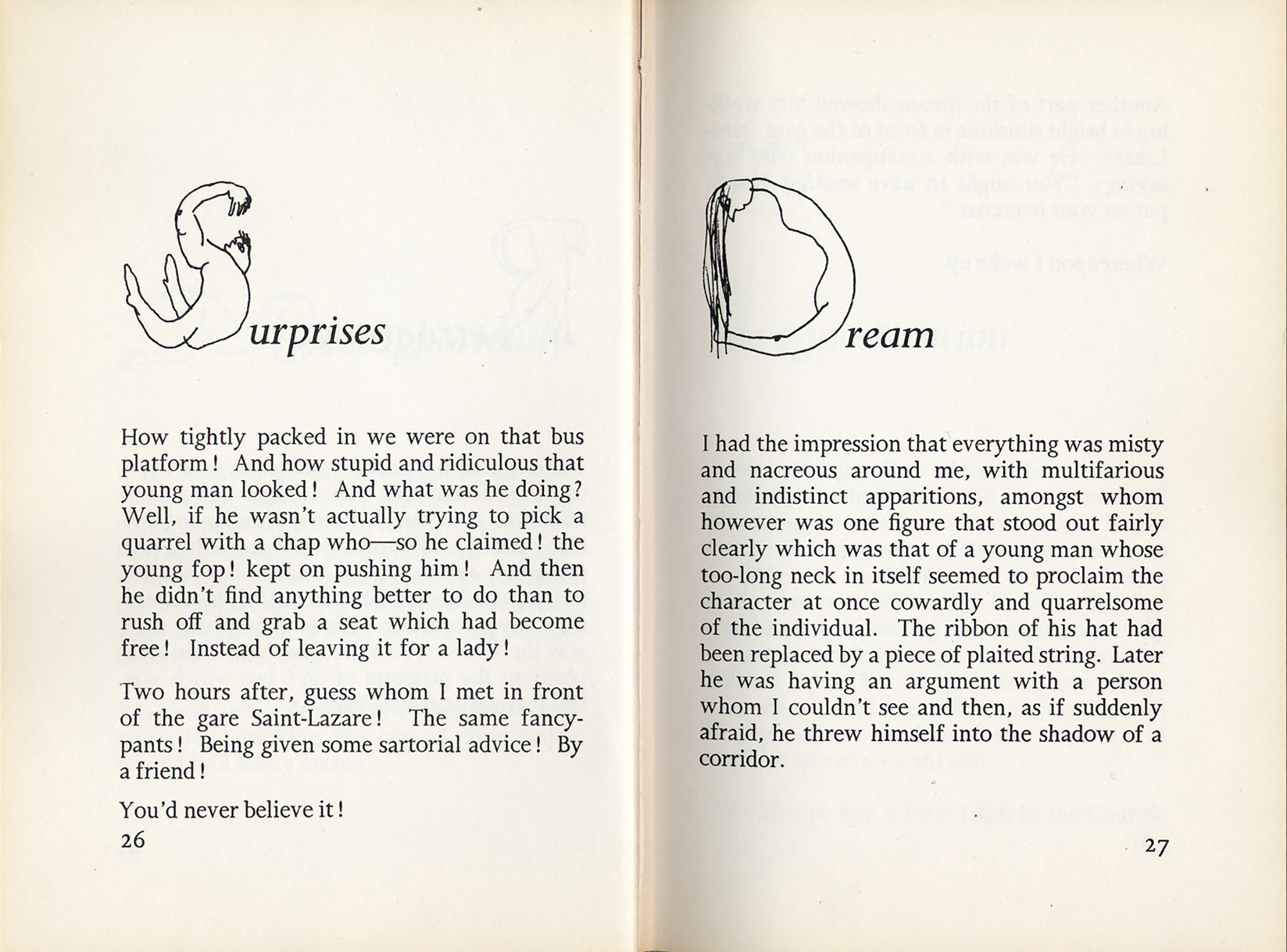
Yet another angle on this talk is to consider it a series of exercises in style, after the title of the next example, in which French author Raymond Queneau conceives a throwaway incident based on an altercation between two men on a Paris bus, then rewrites it in 99 different rhetorical styles, from “Exclamations” to “Spectral,” “Dog Latin” to “Haiku.” It emphasizes the compact efficacy of language, and the same is true of graphic language: like Spoerri’s Topography of Chance, the design of each new edition of this book significantly adds or detracts from its content, being more or less in tune with the intentions of its author, and so more or less inspired, appropriate, interesting, and communicative. This one was designed by Stefan Themerson, a Polish writer-designer-philosopher who lived and worked most of his life in London. The brilliance of his graphic interpretation begins on the cover, a photograph of the author cut up and rearranged according to a simple mathematical pattern—a 1:1 graphic equivalent of one of Queneau’s 99 categories, “Permutations.” Passing over the reflexive title page and the contents list of Queneau’s attempted styles, the spread of “Surprises” and “Dream,” with Themerson’s absurd initials, demonstrates the rest of the book’s flippant virtuosity. In the introduction, Queneau’s translator Barbara Wright describes her initial surprise on learning how keen Queneau was on having what seemed to be a particularly untranslatable French text translated, until realising “in the same way that the story as such doesn’t matter, the particular language it is written in doesn’t matter as such [...]” She goes on to suggest that “Queneau’s attitude of enquiry and examination can, and perhaps should?—be applied to every
language.”
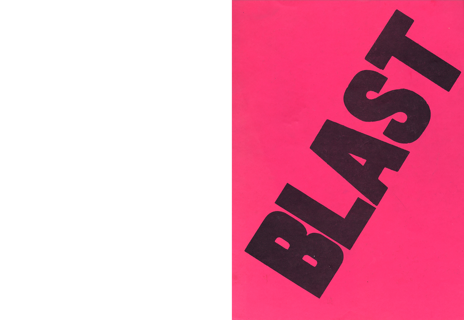
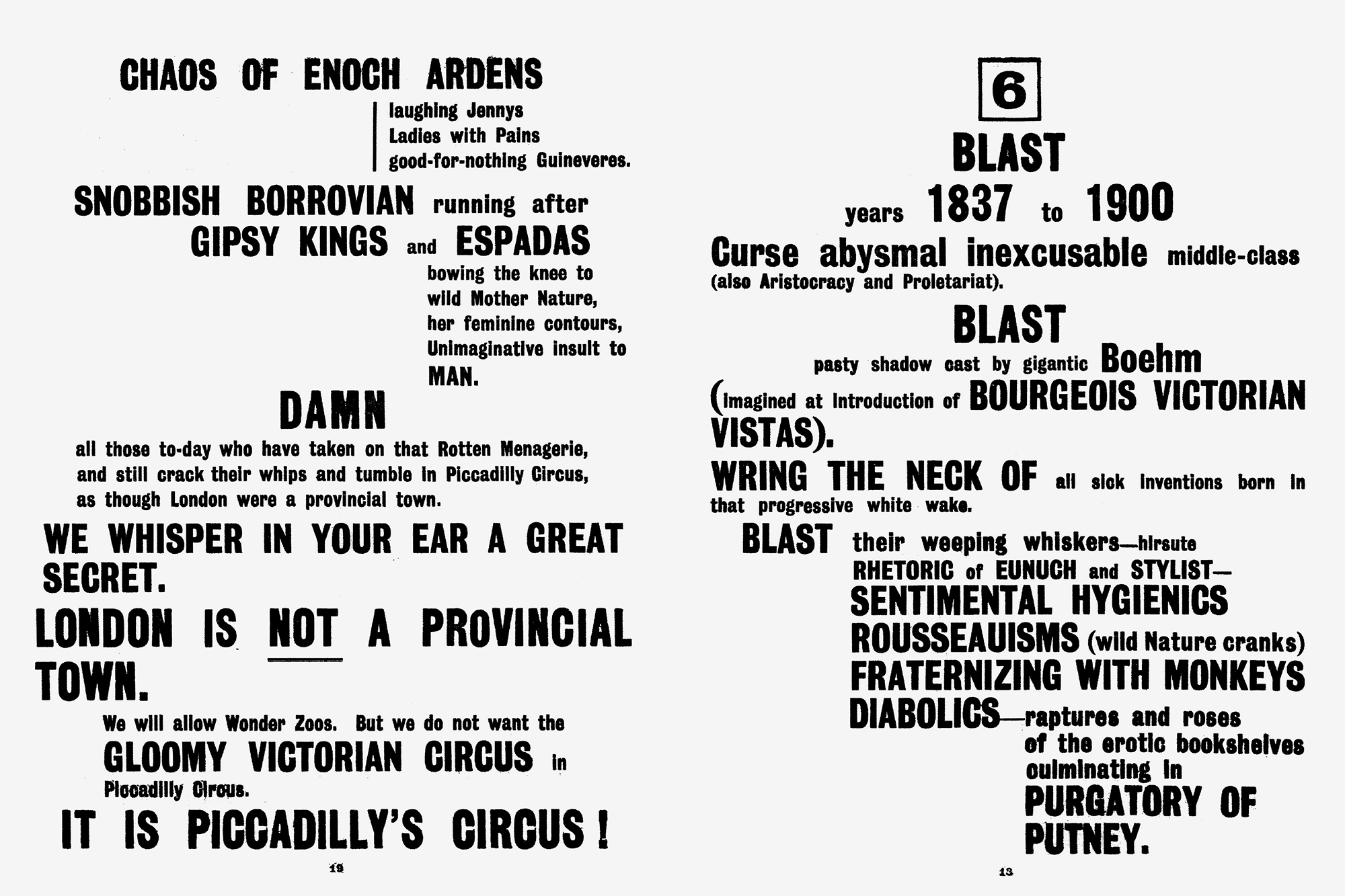
4. Wyndham Lewis, BLAST, London, 1914
This is the first of only two issues of a journal-of-sorts edited and mainly written by the English artist-writer-agitator Wyndham Lewis which appeared just before the First World War. The original publication had the awkward stature of a telephone book, designed to expose itself on the coffee tables of the pre-war London intelligentsia. Like Lewis’s public persona, its bright pink exclamation was a conscious pose, impossible to ignore, forcing opinion and reaction. Lewis was gleefully scratching the same public unease as the Sex Pistols would sixty years later, even—anticipating John Lydon—sardonically dubbing himself The Enemy, and it hardly seems coincidental that both these debuts of public agitiation share the same graphic strategy: delinquent brother and sister BLAST and Bollocks dressed up in violent pink, spitting an economy of language in tall grotesque black block capitals. These examples burn on so vividly today because their site-specific production remains so firmly embedded in their respective forms, whether via Reid’s hand-me-down pop-Situationism, or Lewis’s chance encounter with an alchoholic former printer, reportedly the only person who consented to typeset according to Lewis’s incendiary typography.
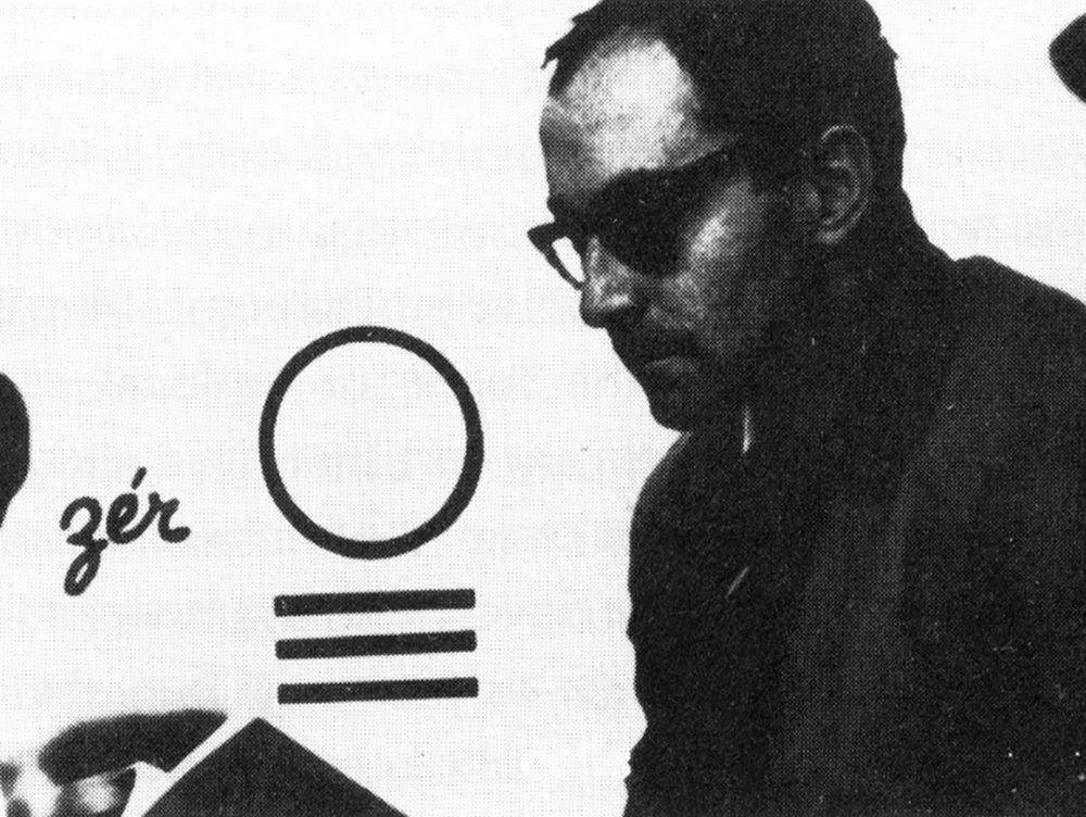
5. Stefan Themerson, KURT SCHWITTERS ON A TIME CHART, in Typographica, no. 16, London, 1967
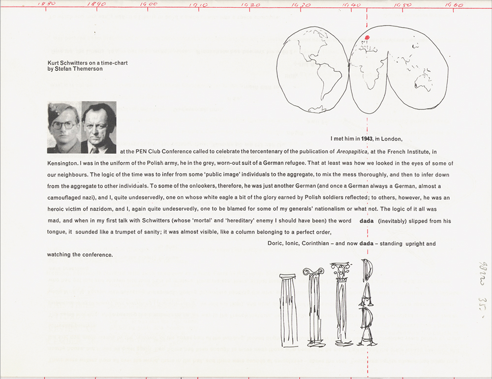
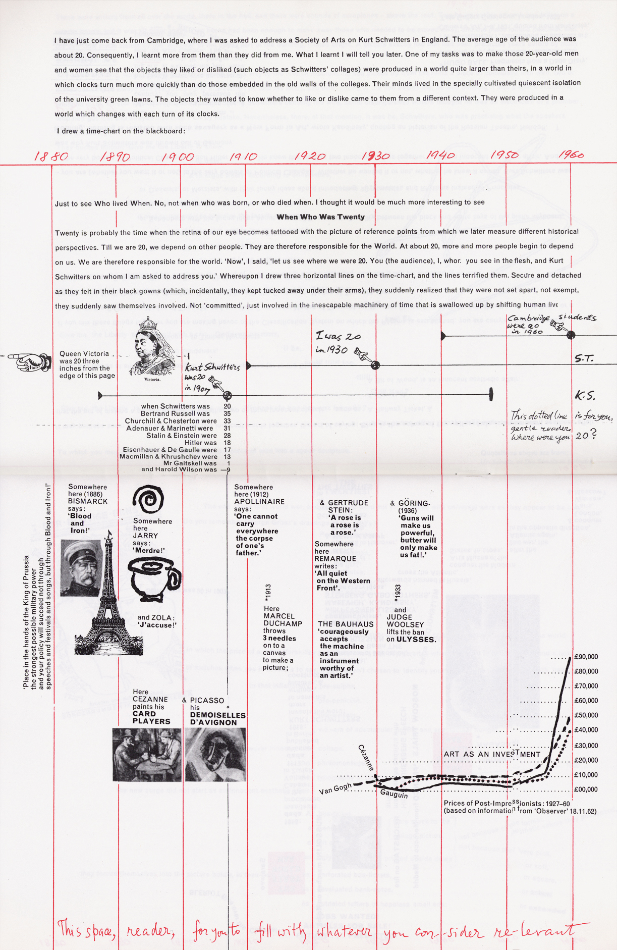
Here’s another piece of work by Themerson, but this time he wrote as well as designed it. Together with his artist wife Franciszka in the 1950s, he established a small publishing imprint called the Gaberbocchus Press, as well as an irregular art salon called The Common Room. Both were important channels for the European avant-garde to bleed slowly into Britain. This particular piece of work has a lengthy history, again rooted in failure. One of the early publications of the Gaberbocchus Press was a particularly well-crafted book about the life and work of Kurt Schwitters. Compiled, edited, and designed by Themerson, this publication was an adventurous, particularly tactile attempt to capture the nature and sensation of Schwitters’ work through chaotic, collaged layout; scraps of text and image combined with different textures and colours of paper. Some years after its publication, however,
Themerson was unhappy with it, feeling he’d fundamentally failed to capture the artist’s true spirit. He denounced it as being closer to parody, mimicking certain material but ultimately superfluous aspects of his subject’s work. Rooted in Schwitters-like idiosyncracy himself, Themerson despised the inevitable distortion inherent in any conventional idea of biography, but his dogged reflection and determination to work out a satisfactory antidote resulted in a major revision and two further pieces of work. The first was a lecture, delivered to a group of 20-year old students in Cambridge three years after the book. He began by drawing a timeline on an overhead projector on which he then marked that year, 1960, when his audience were 20 years old; then the year he was 20; then the year Schwitters was 20. This deceptively simple opening salvo immediately situated the students in time, as active participants,
collapsing any comfortable anaesthetic of history as something that merely happened in the past, detached. The timeline then receded to a template on top of which which Themerson added relevant people and events—the World Wars, Hiroshima, Hitler, Queen Victoria, Picasso, Duchamp—situating Schwitters’ work in the various explosive contexts of his life and, by implication, on into in the present. Themerson then submitted a graphic translation of the lecture to
Herbert Spencer, editor of Typographica magazine, though it wasn’t published until almost a decade later. Here the time chart was redrawn laterally over twenty pages, transposed from 3D to 2D, and accommodating the necessary shifts in speed, cadence and technique. Apart from everything else, this piece of work is vital as a representation of the idea that design is a fluid, ongoing thought process that can carry on even after the cut-off point of an initial deadline or publication. In a postface to the published piece he wrote: ”Perhaps the reader must endure this book, (together with its time-chart and other nonsense), and then throw it away. Perhaps that is what he must do in order to enjoy K.S.’s work rightly.”
6. Ryan Gander & John Morgan, ON CAMOUFLAGE poster, 2001
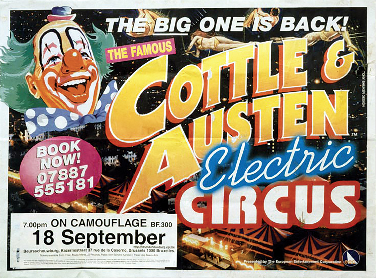
Leaping forward another 40 years or so, here’s a very graphic demonstration of lateral thinking from a project initiated by the artist Ryan Gander. As an exercise in relinquishing any aesthetic control of his work, he asked around ten designers to make posters for fictional events or products based on a series of formal briefs. His brief to John Morgan was to make a poster advertising a lecture
titled “On Camouflage” for an international intellectual panel discussion in a Belgian theatre hall. John’s reaction was to take a poster from the street—one which might be reasonably deemed the most poster-like poster imaginable—for a travelling circus, and to apply the details of the lecture on the blank panel typically reserved for the local information. In doing so he created his own act of camouflage, with the poster then literally enacting the title.
7. Ryan Gander, installation view from THE DEATH OF ABBÉ FARIA, Stedelijk Museum Bureau, Amsterdam, 2003
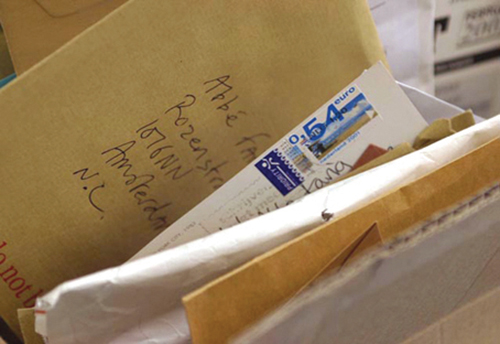
Here’s another piece of Ryan’s. There are a number of characteristics that resonate across his work, though he generally refuses to admit it. One is the appropriation, transfer, and reconfiguration of everyday signs and symbols that are generally overlooked or unnoticed—such as the result of months’ worth of street posters pasted over and torn away from each other. Another involves investing inanimate objects with almost human melancholy—such as a broken flip-dot bus
sign which can no longer form texts, only drip random dots like tears. Both aspects combine in this piece of work, a reticent piece in the corridor of a larger installation. The show was loosely concerned with the death of a fictional character called Abbé Faria. A couple of months prior, Gander and various friends began sending letters, packages and junk mail to the gallery addressed to Abbé Faria, so by the time the show opened a large pile of mail had amassed as a sculptural illustration of absence.
8. Will Holder, SAFE HAVEN, invitation card, 2003
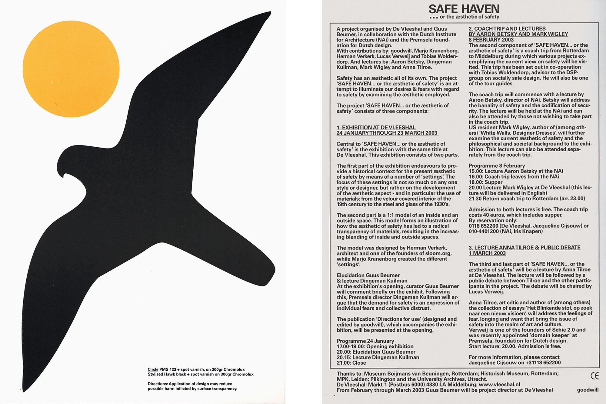
This is a flyer for an exhibition subtitled “The Aesthetics of Safety.” Like the previous two works, Holder appropriates an existing form, a found aesthetic of safety: the ‘“stylised hawk” silhouette sticker often found on large areas of glass and plastic in public to prevent birds from flying into the panes or panels. What turns a good idea into a great one, however, is Holder’s further use of the yellow circle usually found in combination with the bird on the plexiglass of Dutch railway platform windows, where they appear in a chest-high row to stop humans making the same mistake as the birds. When combined the circle becomes a sun, and the whole scene is further aestheticised into a new form: a landscape. Other details spin off from and compound this idea: a gloss laminate around the two symbols which fake the appearance of a sticker sheet (again referring to the aesthetic of functionality, of safety—the flavour rather than the reality of it); and on the reverse an overload of information from the curator set tight, with a nod to User’s Guide typography. This kind of rigorous supporting detail is what I meant elsewhere by the statement “God is in the footnotes.”
9. Robin Kinross (editor), Jaap van Triest & Karel Martens, KAREL MARTENS, PRINTED MATTER \ DRUKWERK, London, Hyphen Press, 1996, designed by Jaap van Triest & Karel Martens
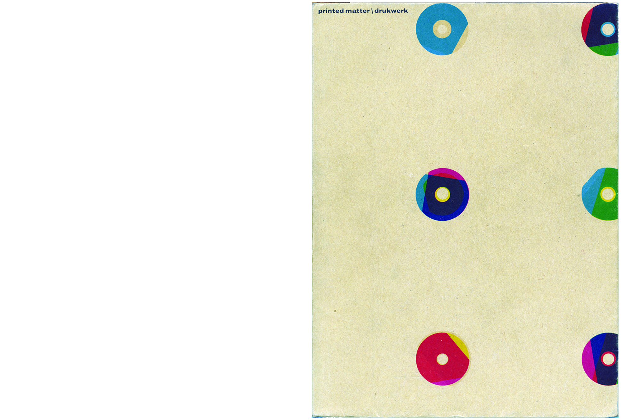
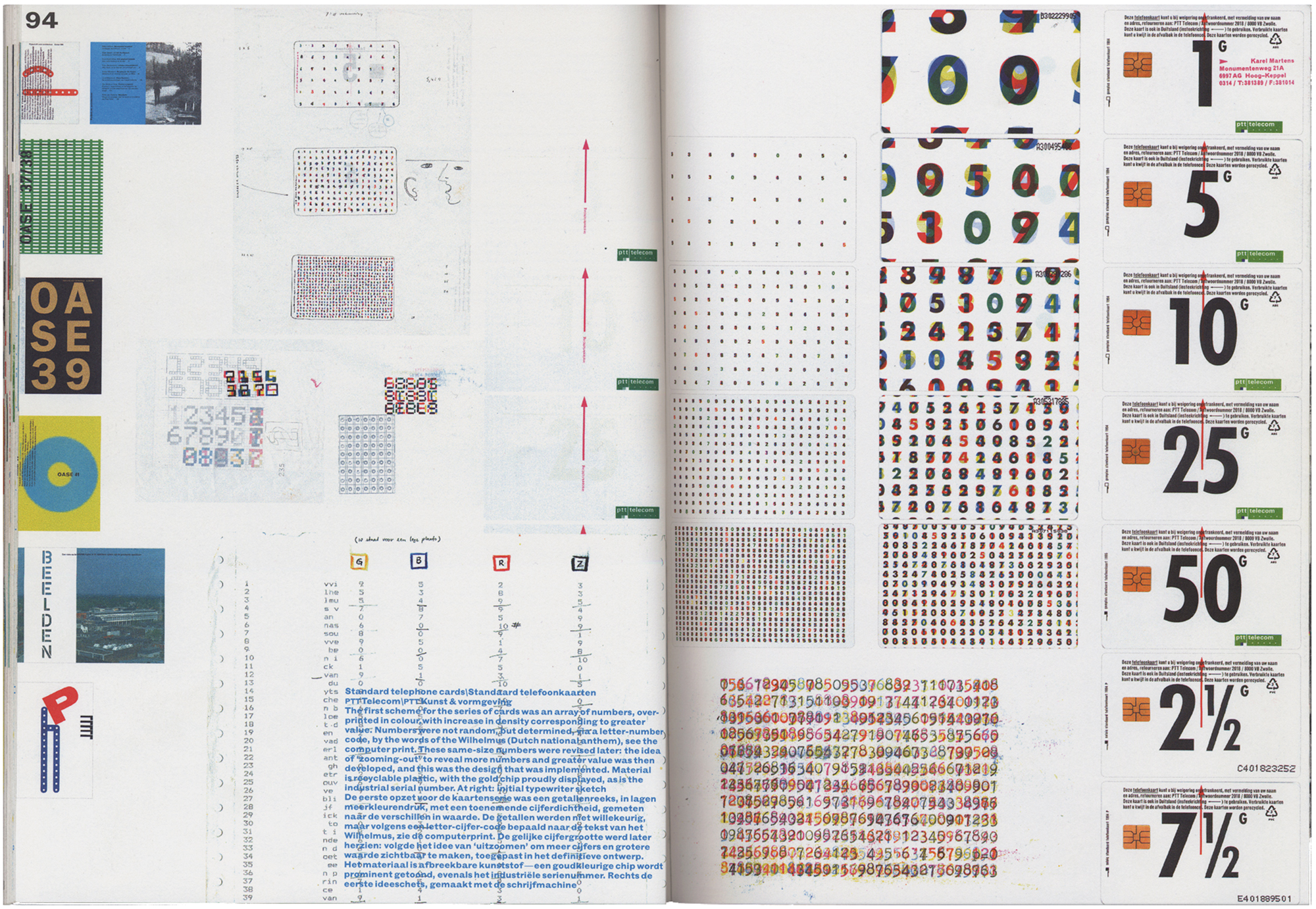
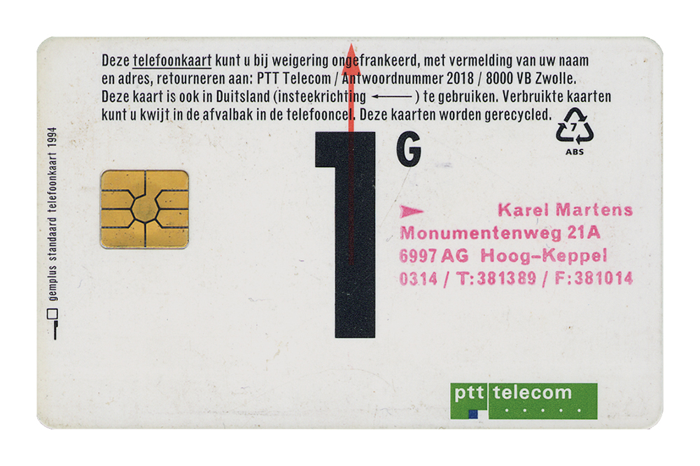
I’m showing both the cover and an inside spread of this Karel Martens’ anthology to point out the similarities between his so-called free and applied work, specifically the way the abstract and the representational feed off each other. The cover is a collection of Karel’s druksels—homemade experiments in overprinting colour with pieces of found metal and other detritus, combining pattern and chance. Inside, his commissioned work is loosely arranged on an underlying grid; a running, chronological arrangement of small reference covers on the far edges of Japanese bound pages, setting off the free arrangement of supporting sketches and larger reproductions of the more important or telling work. The phonecards on this spread obviously demonstrate the influence of the free work, now applied with reason: the quantity and density of the numbers and colours increases in relation to the value of the cards. Both the cover and interior pages of Printed Matter perform their respective jobs of attraction
and articulation within the same intimate, personal style. And zooming in even further, Martens bought a supply of the cheapest 1 Guilder cards and rubber-stamped his address to create a composite of address card and portfolio on top of the wry bonus gift of communication.
10. Barney Bubbles & John Cooper Clarke, SONGBOOK, 1979
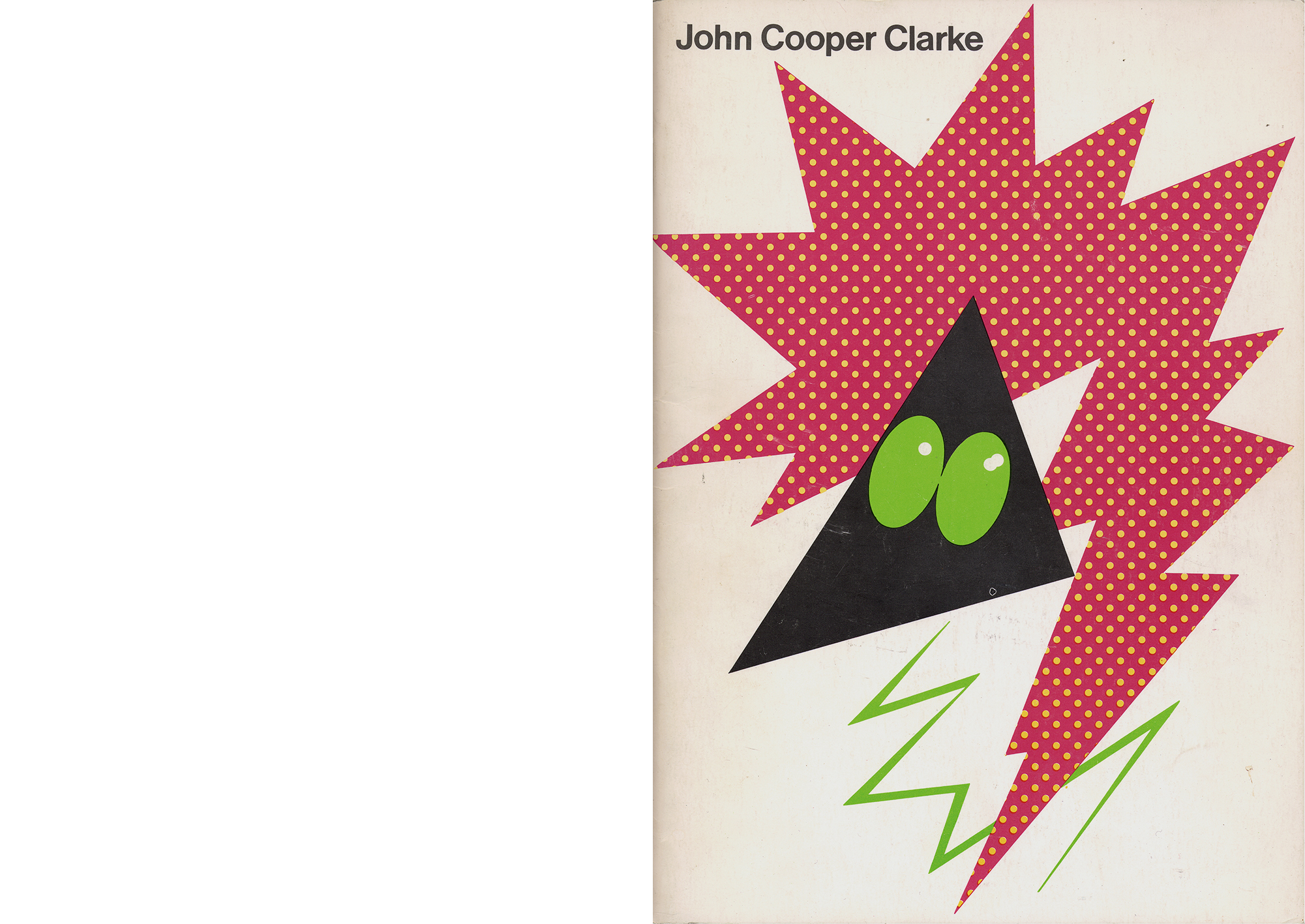
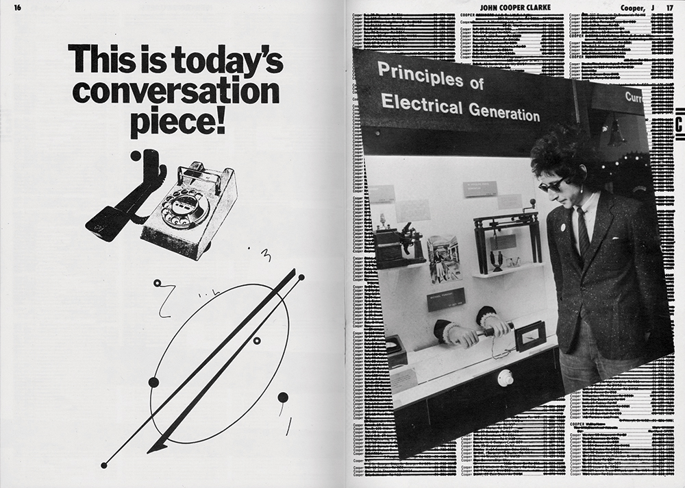
Most of the work shown here results from a designer and an artist (or writer, whatever) collaborating to producing a new piece of work, rather than a merely documenting an existing one. Contrary to the general and
generally accepted situation of a designer working at least one step removed as a detached form-giver (to borrow from the Dutch vormgever), these works push for a resolution which neither designer nor artist could have achieved alone, something greater than the sum of their constituent parts. Here are the cover and two spreads of what is essentially a book of lyrics by post-punk poet John Cooper Clarke. Cartoonish abstract character portraits were a recurring motif in the work of Barney Bubbles, and the one of Cooper Clarke here typically captures multiple
facets of his style and character: sharp, spiky, electric, contrary. Inside, Bubbles took every page of Coopers and Clarkes in the phone book, crossed them all out and used them as a background wallpaper on which to compose a series of formal collages incorporating fragments of angular poetry and judicious photography. This freeform invention is carried over onto the phone book’s advertising pages, subverted by Bubbles into a series of cryptic announcements.
11. Mike Figgis, camera script for TIMECODE, 2003
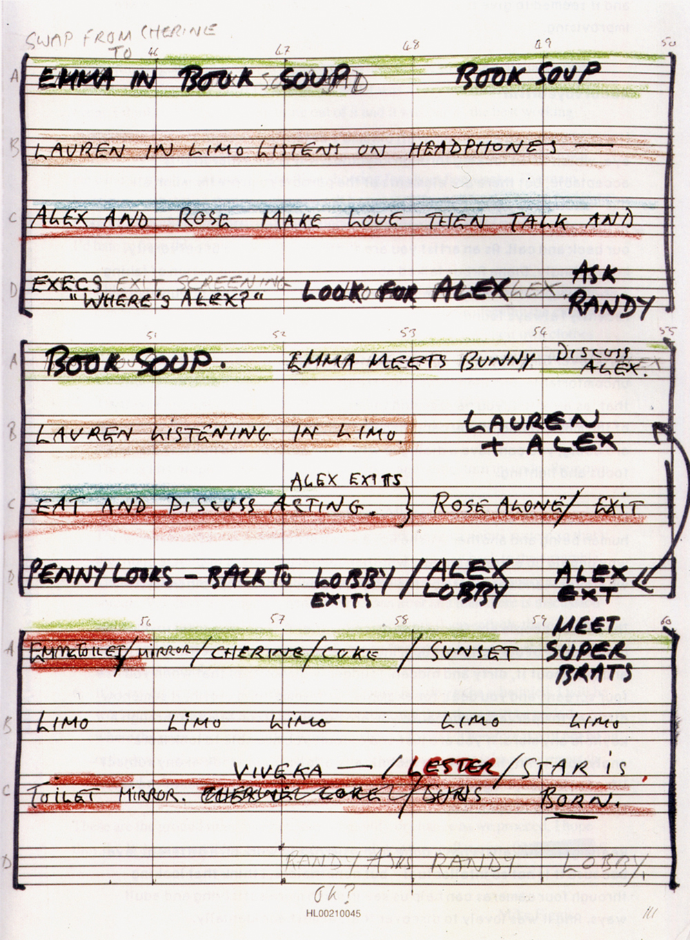
This is one of a number of sheets which outline the screenplay of Figgis’s film Timecode, another example of transposing the particular qualities of one medium to another through necessity. Timecode was conceived from the outset as a quadruple split-screen film, with four
cameras following the simultaneous action of various characters in different locations across Los Angeles. Midway through writing the screenplay, Figgis came across some standard music notation paper which sparked the idea of using the music staves and bar divisions as a basis on which to work out his story and transcribe the synchronicity; to score the film for four cameras rather than four instruments. He proceeded to write the film and distribute instructions to the cameramen in this way, developing an elaborate colour coding system, with each bar of notation representing a minute of action. Regrettably, the resultant film is awful.
12. Wire, PINK FLAG, 1977; CHAIRS MISSING, 1978; 154, 1979; ON RETURNING (compilation), 1989
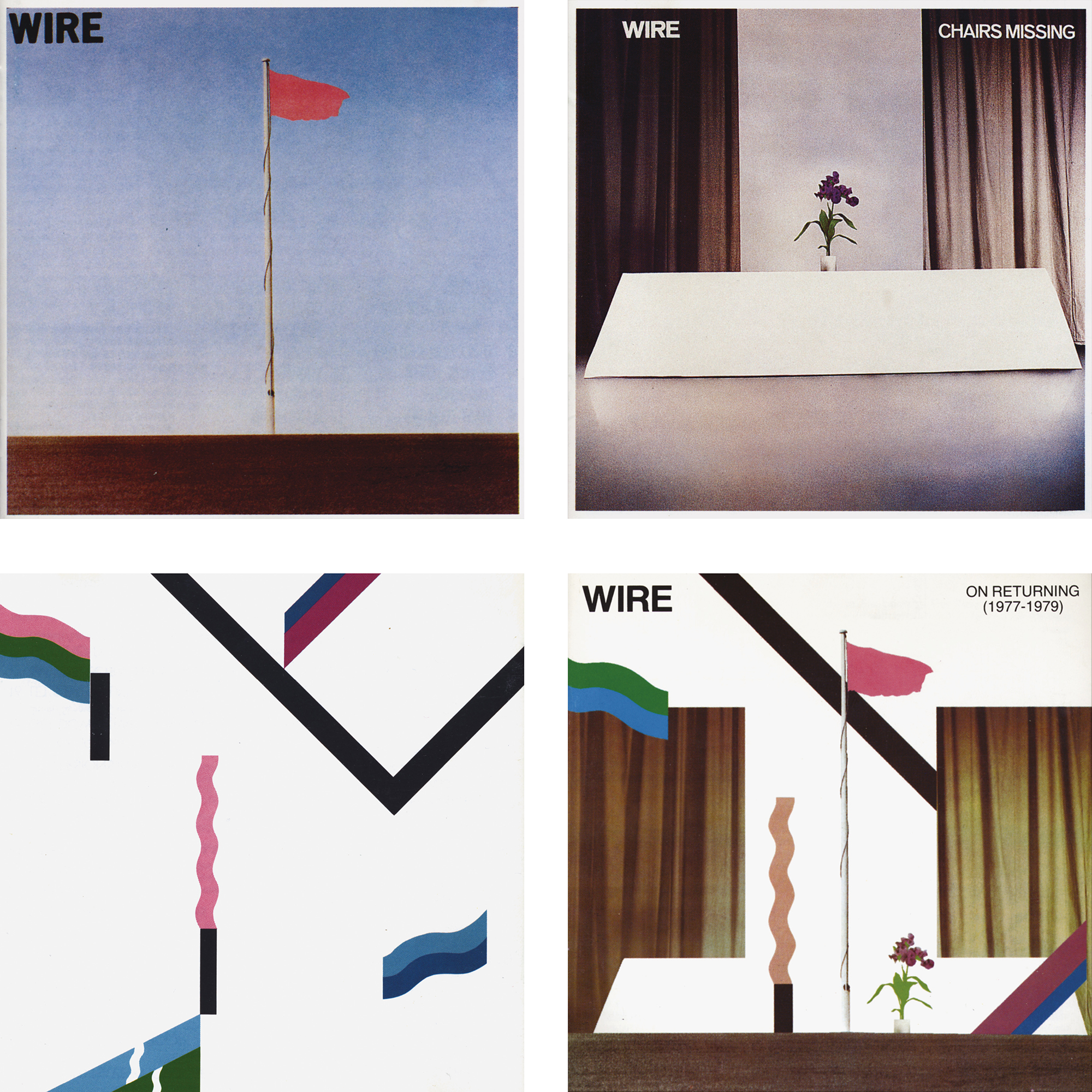
These are Wire’s first three albums from the end of the 1970s, plus one compilation from a decade later. Each of the first three has its own independent anecdote. For example, immediately after the band had decided on Pink Flag as the title for their debut, they played a gig in the British seaside town of Plymouth, and were walking along the seafront the following morning when they came across a perfect solitary pink flag flapping against a spotless blue sky, which they photographed immediately (a good example of designing backwards rather than laterally). But the best thing about these albums is the Best-of, On Returning. Although Wire had an extensive output inbetween, this compilation collected tracks exclusively from those first three, and so the cover similarly montages all three orginal covers together to form a new composite. It’s a good example of one of those ideas so perfectly obvious that it’s almost reflexively overlooked.
13. Jimmy Cauty & Bill Drummond, THE MANUAL (HOW TO HAVE A NUMBER ONE THE EASY WAY), London, 1988
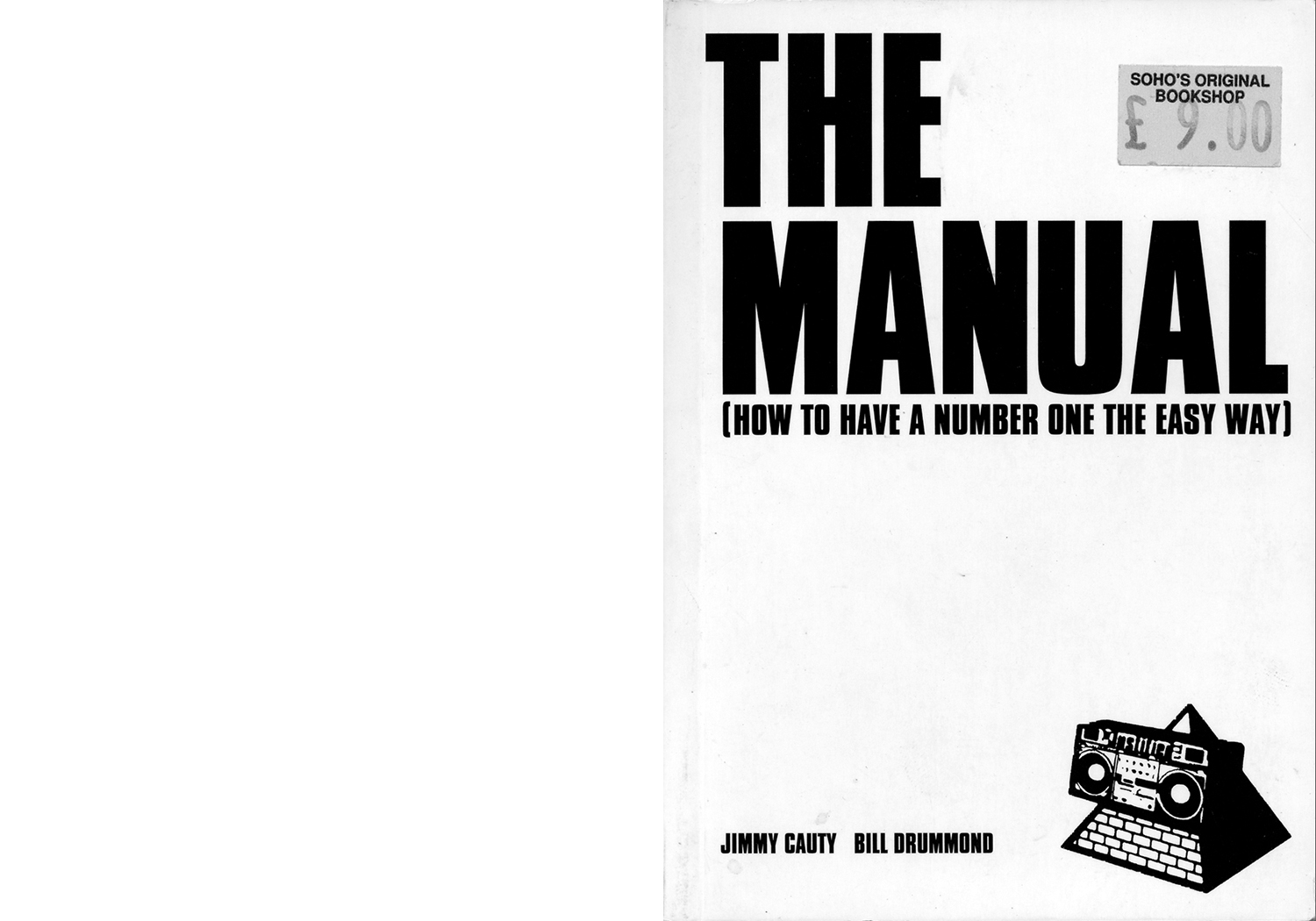
Cost has such a direct bearing on graphic design, yet is rarely mentioned when describing or critiquing it. Although at first glance The Manual might have little in common with Never Mind the Bollocks, graphically
they share some kind of debut aesthetic—the archetype of the first release: rough, basic, probably flawed in terms of technics and technique, but with an authenticity and integrity manifest in years’ worth of honed, compressed ideas. Cauty and Drummond worked as the KLF around the early 1990s, created a string of hits, notoriously burnt
£1 million on a remote island, announced their withdrawal from the music industry, then continued to resurge with increasingly obscure and eccentric projects on the fringes of art, music and literature. In the middle of all this they wrote and published this self-explanatory DIY book, and all I really want to point to here is the importance of their decision (or non-decision) to bypass graphic design. This is about as unadorned as an idea gets, lacking even the minimal refinement of the average novel, unpretentiously typeset by a friend. In this case the lack of refinement only emphasizes the text’s intent and insistence. It says the words are more important than how they are dressed. And here are those same condensed grotesque Bollocks-BLAST capitals on the cover again, as if they can’t help filtering through to herald more obnoxious activity.
14. John Berger, WAYS OF SEEING, London, BBC/Penguin, 1977, designed by Richard Hollis
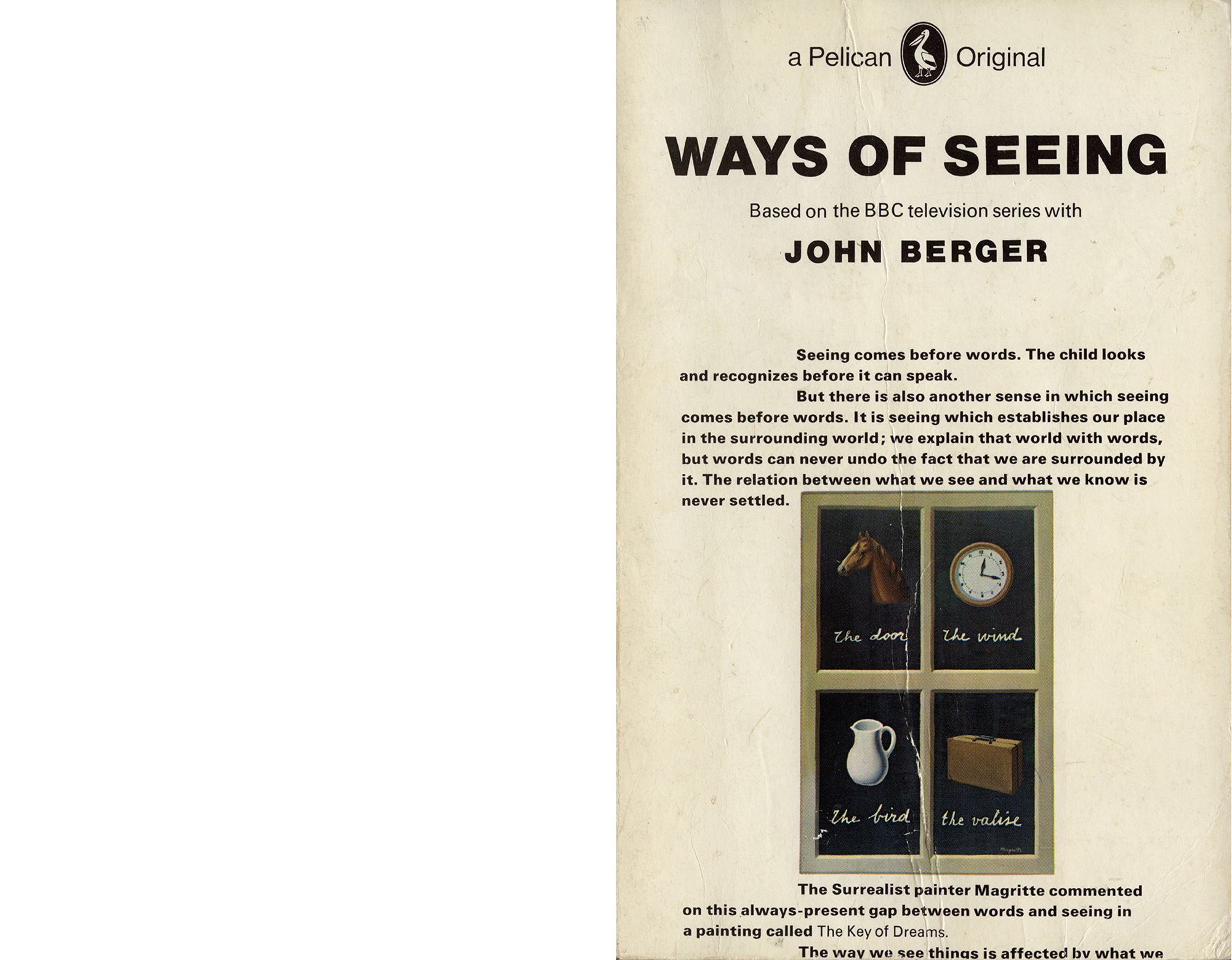
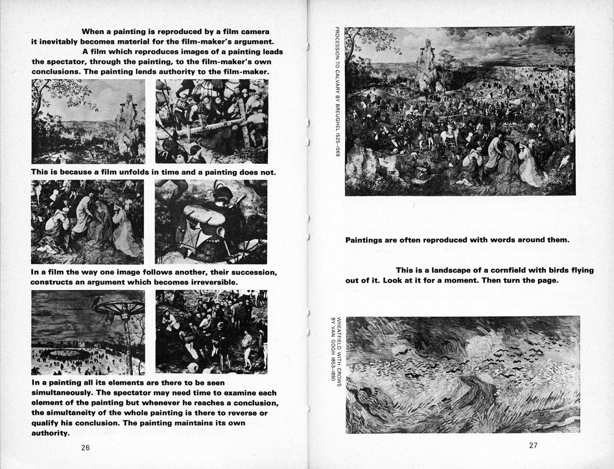
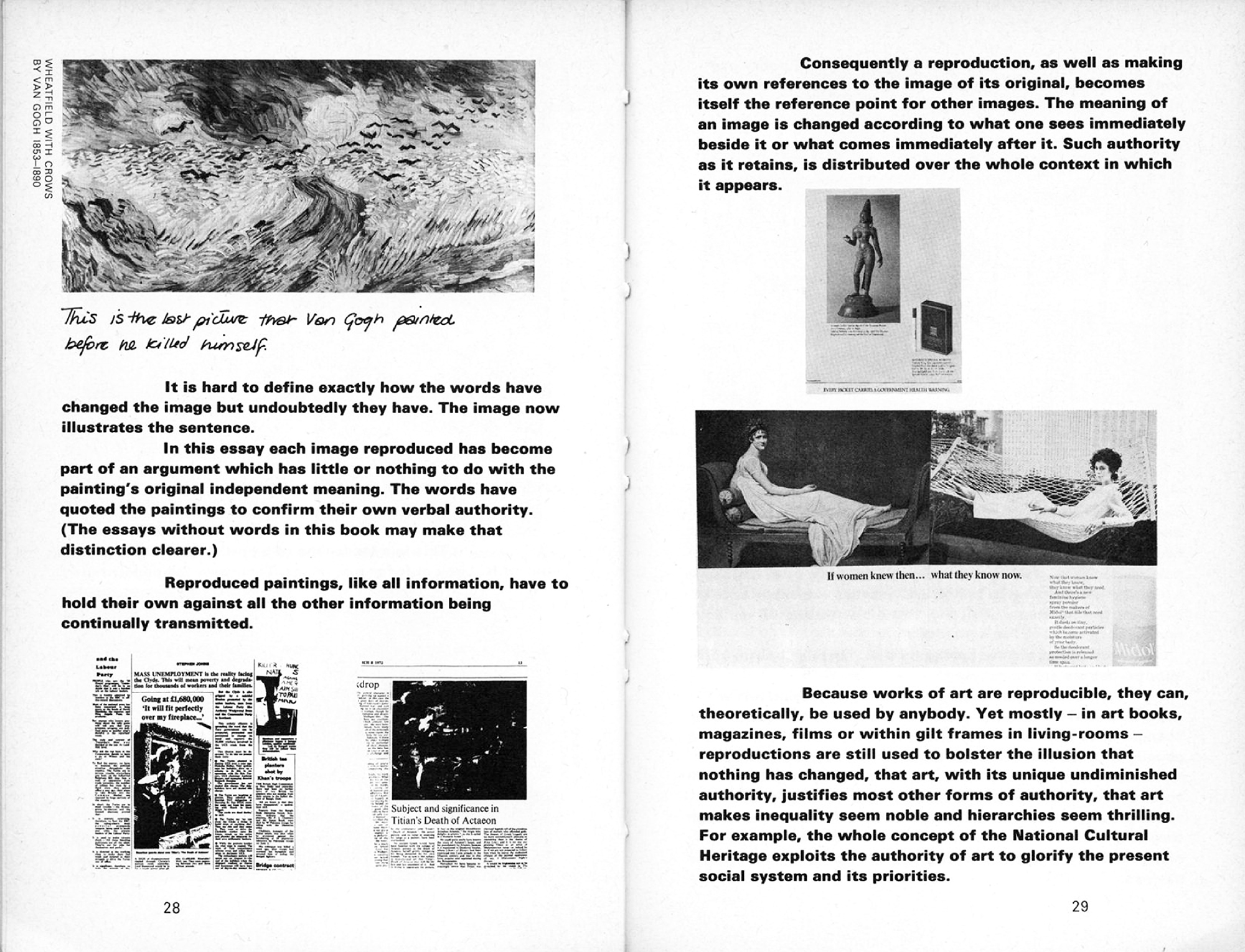
Ways of Seeing was made by a team of five, including designer Richard Hollis, with more or less overlapping roles. It demonstrates a childlike state of working, rejecting conventions and preconceptions to embark from zero. Such innocence is mirrored in Berger’s opening line, “The child looks and recognizes before it can speak,” and his team’s subsequent articulation of this idea is consistently engaging precisely because so extraordinarily obvious. The book’s hypothesis begins on the cover where it immediately embodies its opening statement that seeing comes before words: you see the idea of the text starting on the cover before you read the words: you see Magritte’s painting before you read the explanation, and this easy synchronicity of form and content is maintained throughout. The text is set in bold Univers so that text and image are visually equal, and this principle is followed through to details such as the captions being set at ninety degrees up the sides of images to discourage the speed-reading of illustrations. Ways of Seeing was originally a BBC TV programme, conceived as an antithesis to the existing treatment of fine art on television (more or less Sister Wendy), relating art to pornography, advertising, biography, children; basically, to the everyday, methodically deconstructing and demystifying. For the book, Berger’s team filters the transience of TV through the stasis of the printed page, and the result is an emphatically animated book. In the bottom right hand corner of one spread, for instance, a detail of a Van Gogh landscape is captioned, “This is a landscape of a cornfield with birds flying out of it. Look at it for a moment. Then turn the page.” The image is then repeated at the top of the following spread, with the text altered and handwritten: “This is the last picture that Van Gogh painted before he killed himself.”
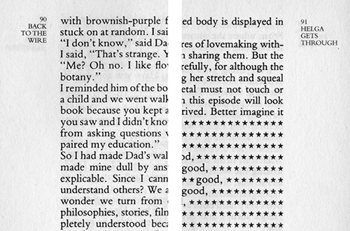
15. B.S. Johnson, ALBERT ANGELO, London, 1964 (republished as part of OMNIBUS: ALBERT ANGELO, HOUSE MOTHER NORMAL and TRAWL, London, Picador, 2004)
This is a detail from what the British avant-garde writer B.S. Johnson considered his debut, even though it was actually his second published novel. Throughout this largely plotless character study of a would-be architect working as a supply teacher in a series of difficult London schools, Johnson writes each new scene in a different style of language (and as such it might reasonably be considered a practical application of Queneau’s Exercises in Style, or even a pop version of Joyce’s Ulysses). Johnson’s formal experiments were rarely gratuitous, drawn directly from the particular demands of his subject matter. In fact he resented the label “experimental,” arguing that any experiment by definition remained in his notebooks, and that whatever made it into published works were rather his best solutions to the particular problems thrown up by the subject matter, which might succeed or fail on their own terms, but could no longer be considered experiment or research. Albert Angelo is a chaos of rhetoric towards capturing the fragmented nature of life and personality. In this example, Albert begins one day in a single column of interior-monologue narration, then as the first class begins the column
bifurcates, with the classroom action and dialogue continuing in the left column, and Albert’s simultaneous italicised thoughts in the right. This exterior/interior device continues for the remainder of the class, whether tracking Albert’s self-doubt during teaching, or his daydreaming about a girl while the class silently works on an assignment. From the reader’s point of view this doublethought is surprisingly accessible, with the distribution and speed of corresponding action and thought paced in a convincing approximation of realtime. At a later point in the book a hole is cut through two pages to reveal a future event. Johnson uses this device to prematurely announce a death, effectively collapsing time while typically pointing to the conceit of fiction. As Johnson’s biographer Jonathan Coe points out: ‘the best way to think about B.S. Johnson’s novels is to conceive of them not as experiments, but as “literary heresies”—a heresy being “any opinion or doctrine at variance with the official or orthodox position.”
16. Richard Hamilton, HOW A GREAT DAILY ORGAN IS TURNED OUT (from the ULYSSES series), 1988–90
This is one piece of work from an ongoing series based on James Joyce’s Ulysses that Richard Hamilton has worked on intermittently over the past forty years. Of the many finished pieces and studies, this one both typifies and encapsulates the rest. Hamilton was also interested in translating from one form to another, in this case written to graphic language. he compounded the challenge by using the twentieth century’s masterpiece of literary rhetoric as source material. (Each chapter of Ulysses is famously written in a different style, with a web of embedded symbols and correspondences to Homer’s Odyssey.) Hamilton’s self-appointed task was to represent each chapter by an appropriately corresponding choice of image and graphic technique, towards capturing the spirit of Joyce’s work, as Themerson did for Schwitters. The piece here represents the “Aeolus” chapter, set midway thorough the book in a newspaper office. Ulysses’ main character Leopold Bloom is an advertising canvasser, and spends this chapter at work, where the regular narrative is punctuated by random headlines. To mirror this particular location and situation, Hamilton takes a number of trial etching plates made for other chapters—each already loaded with their own unique styles and stories—and combines them within the rough frame of a newspaper page, as and when they can fit alongside each other. As with a newspaper, the result is one overall form containing a number of others, each telling their own story, whether a sketch for the typography of a pub sign, a hallucinogenic portrait, or a child’s drawing of his father following Joyce’s exacting description: “a large globular head with five hairs erect, two eyes in profile, the trunk full front with three large buttons, one triangular foot.”
17. Bank, FAX BAK, faxed press releases, 1998
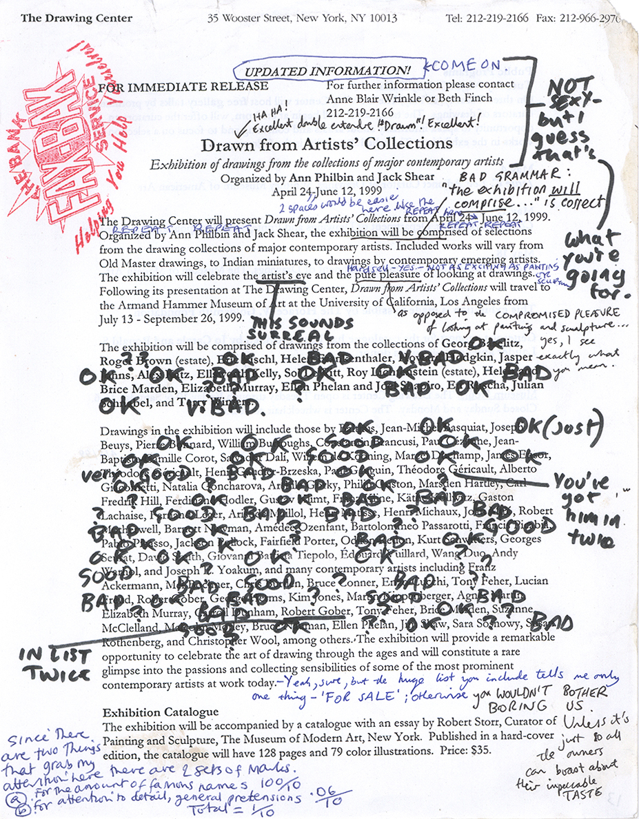
This in one of more than a hundred examples from a project by the now defunct London artist group Bank. One week towards the end of 1998 they asked all the London galleries to fax their latest press releases to Bank’s studio, then set about rabidly correcting the grammar and spelling, offering candid comment on the gallery exhibition and artists, awarding a mark out of 10 (rarely higher than a 2) and rubberstamping the slogan Helping You Help Yourselves! before faxing it back to the source. Such gallery propaganda is typically written by some intern to a template of institutional pretension, and as usual Bank were naming and shaming a superfluous and even sinister art world mechanic with a combination of pitbull humour and alarming acuity. Once again, the form of the work effortlessly (literally without effort) mirrors the attitude: the staid, uptight gallery PR scrawled all over with righteous black felt-tip, equal parts schoolteacher and adolescent. Two footnotes: when Bank presented the faxes at a show, framed on the gallery wall, the prevailing irony of the late-1990s London art scene resulted in galleries buying back their own faxes. But when they repeated the show half a year later in the USA with New York galleris, the response was overwhelmingly hostile, an international mis-translation of humour accidentally documented on a collection of middle-of-the-night transatlantic phone messages to Bank’s studio.
18. Alasdair Gray, 1982, JANINE, London, Cape, 1984
I’m showing a couple of details from the Scottish writer Alisdair Gray’s second novel to demonstrate how he manipulates the form
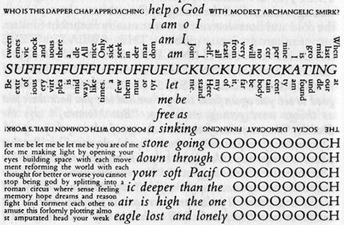
of the book in line with his particular idiosyncrasies—honed isolation and hallucinatory depression—in a way that a third-party designer never could. There are two examples here, one subtle and one extreme. The former is the inclusion of ever-changing running heads (or sides) from page to page, which distill the story into a series of clipped phrases or single words. The latter is a specific sequence in which the story’s protagonist swallows a jar of sleeping pills with suicidal intent, but fails, instead plagued by a collection of simultaneous voices, including that of God. The typography is suitably haywire, but still tightly packed within the frame of the page, duplicating the narrator’s mental claustophobia.
19. Arthur Wainwright, PENNINE WAY COMPANION, 1968
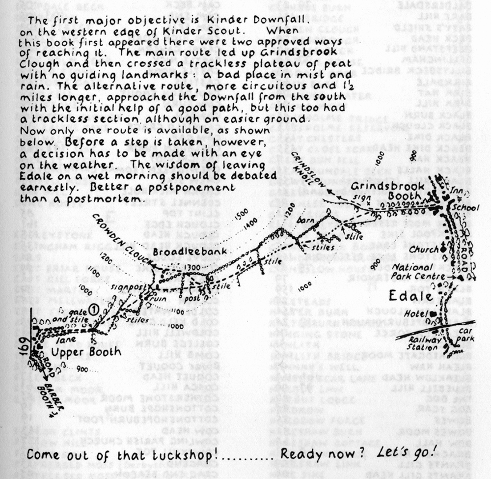
From the late 1940s on, Arthur Wainwright developed a complete personal graphic vocabulary in his renowned series of English walking guides, remarkable not only for their concise in-transit articulation of information through direct experience, but also for the fact that they were mostly handwritten. Wainwright’s graphic language covered
every aspect of the book, with the style of his handwriting changing according to the relative formality of the various kinds of texts (from formal introductions, through the detailed information of the walks themselves, to informal personal reflections and post-walk notes) in the same way his drawings articulate different physical
textures (trees, mountain ranges, stone houses). Every aspect of the complex design seems truly weathered and refined through the slow logic of meditative hiking, and the result is naturally practical as well as beautiful. My favourite of the series of twelve completed in his lifetime is the Pennine Way Companion,
in which Wainwright’s personal logic counters that of conventional Western reading by beginning on the last page and
moving laterally to the front of the book, from right to left and bottom to top. An introductory note explains how the south-to-north nature of this particular walk makes more sense when read “up the page,” paragraph to diagram to paragraph, following the common direction of the route, itself dictated by another unique logic: British weather.
20. Mike Nelson, A FORGOTTEN KINGDOM, London, ICA, 2001
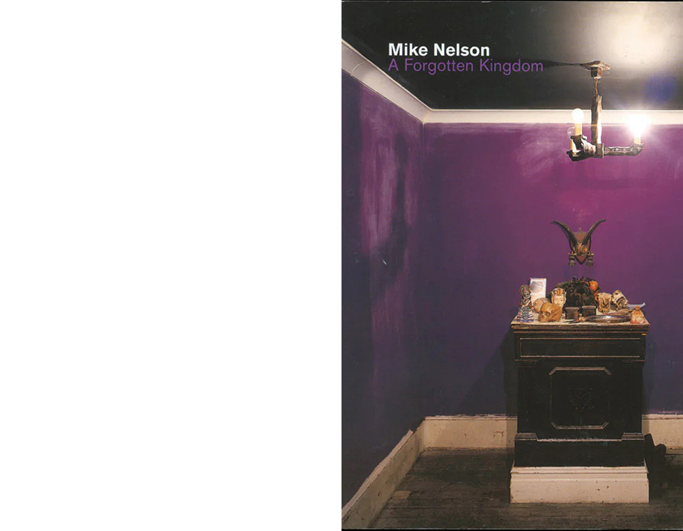
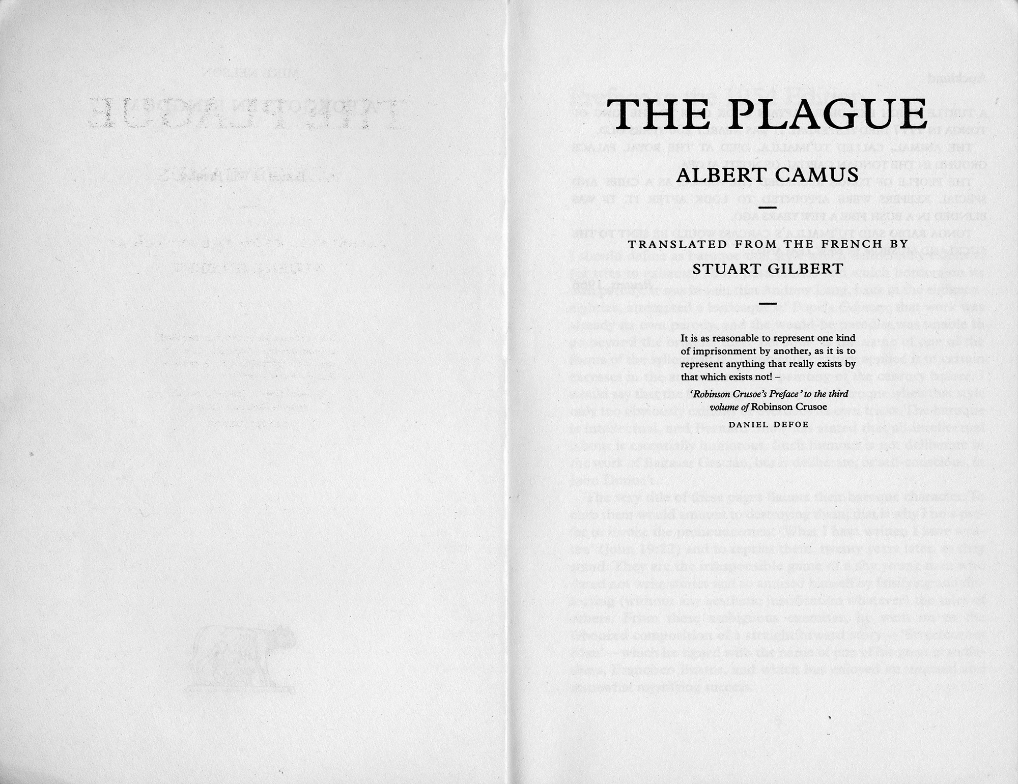
This book was produced in lieu of a regular catalogue for a solo show at London’s ICA. The photograph on the cover shows a detail from a typical Nelson installation, all heavy gothic-mythic atmosphere constructed from the collection and juxtaposition of found objects and furniture, with manipulated light. The book’s corresponding translation from 3D to 2D is a collection of excerpts from a number of established authors, such as H.P. Lovecraft, Jules Verne, and Albert Camus, whose work is rooted in the same mood and colour. Generally, whole chapters are lifted from existing novels, but Nelson and his editor Will Bradley follow this idea through to the borrowed title page, contents, preface, and index. Like the installations, every detail is vital, cut-and-pasted from somewhere else to form a new work. And again, of great significance, or great design: it cost only £5 at the ICA bookshop, with the added benefit of exposing the superficiality and unnecessary expense of the surrounding heavyweights, generally more bricks than books.
21. Mevis & van Deursen, Corporate wall designs, Vienna, 2000
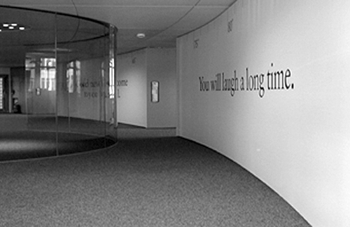
This is one view of a project by Mevis and van Deursen for a Hong Kong-based telecom company who asked them to propose a project to fill 14 empty walls of a circular space in their new Vienna office. I was working at M&vD’s studio in Amsterdam’s Chinatown around the time they were trying to come up with an idea over a couple of months. As in many design studios, one wall was permanently covered in found ephemera of random inspiration (newspaper cuttings, photos, postcards) slowly being assimilated into daily work; but on another surface a tiny slip of paper stuck had been hanging around waiting to be remembered for months. On the eve of the deadline of the Vienna job with nothing yet decided. Linda van Deursen was staring blankly at this slip of paper when an idea took shape: it had come out of a local fortune cookie, and read: “Kind assistance is close at hand.” She immediately left the studio, bought a box of cookies from a restaurant downstairs, and soon had 14 fortunes, later rendered on the long curving Vienna walls in precise proportion and set in the same centred Times New Roman.
22. Marshall McLuhan & Quentin Fiore, THE MEDIUM IS THE MASSAGE, New York, Bantam, 1967
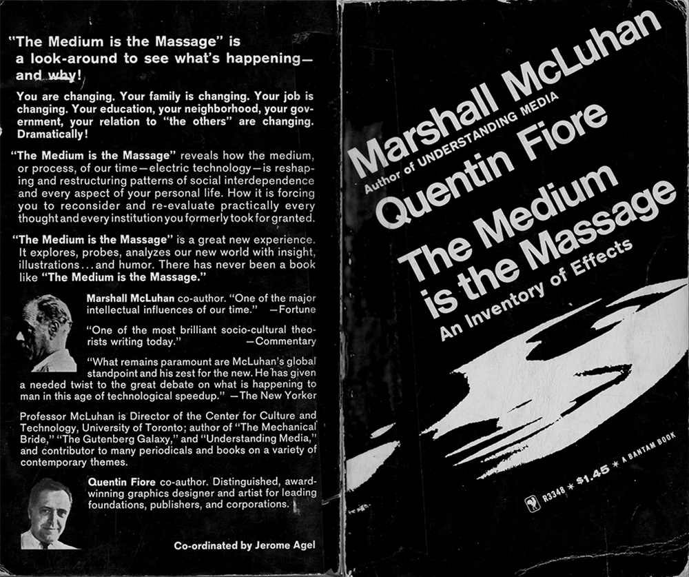
Quentin Fiore might well be the first graphic designer to be pictured on the back of someone else’s book, as honorary blurb. For years I’d talked about this as being a great example of how graphic design should be made—as author and designer working in tandem, with equal, implicit trust, like
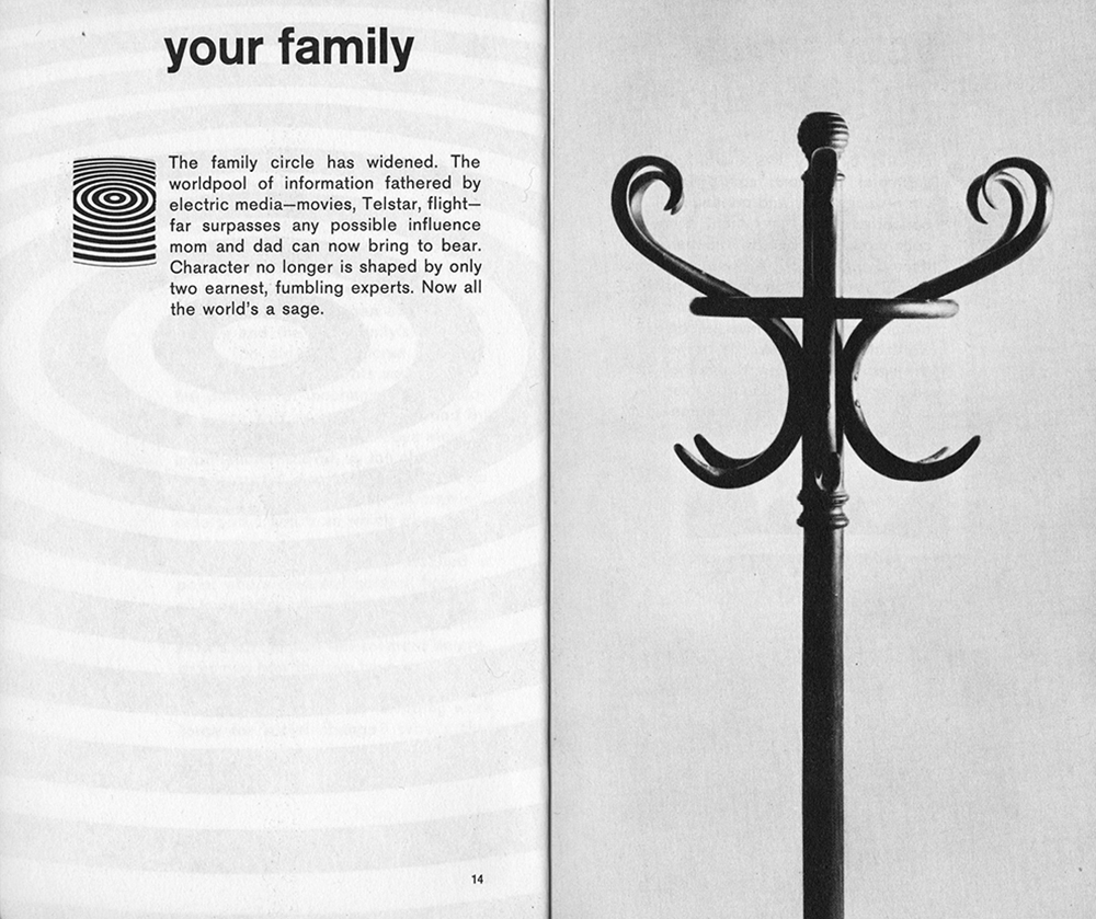
Berger’s team on Ways of Seeing. Of course I found out later that actually McLuhan had nothing to do with the making of this book. Instead, the text was compiled from other texts by an independent editor, the mercurial Jerome Agel, then handed over to Fiore, who never even so much as consulted the author. Given the notoriety of the book’s (misspelled?) title it’s easy to overlook the subtitle—An Inventory of Effects—but it’s worth rereading not only as a description of McLuhan’s casual prophecies, but equally of Fiore’s toolbox of graphic and typographic tricks, pushing the potential of then contemporary photosetting to its limits, with reversed pages, zooms, sequencing, line drawings, blown-up halftones, cartoons, and so on. This is the American cousin of Ways of Seeing, articulating the zeitgeist by example, turning the potentially dull subject of media analysis into entertaining pop philosophy without talking down to the reader. Massage is also strongly marked by the influence of TV, in terms of both the speed and style of presentation of their bits of information. One of Fiore’s most inventive gestures was this sequence of abstract details on the right hand pages, clarified in a full-frame thumbnail overleaf, each used to trigger one of McLuhan’s introductory tangents.
23. Frances Stark, COLLECTED WRITING: 1993–2003, London, Book Works, 2003
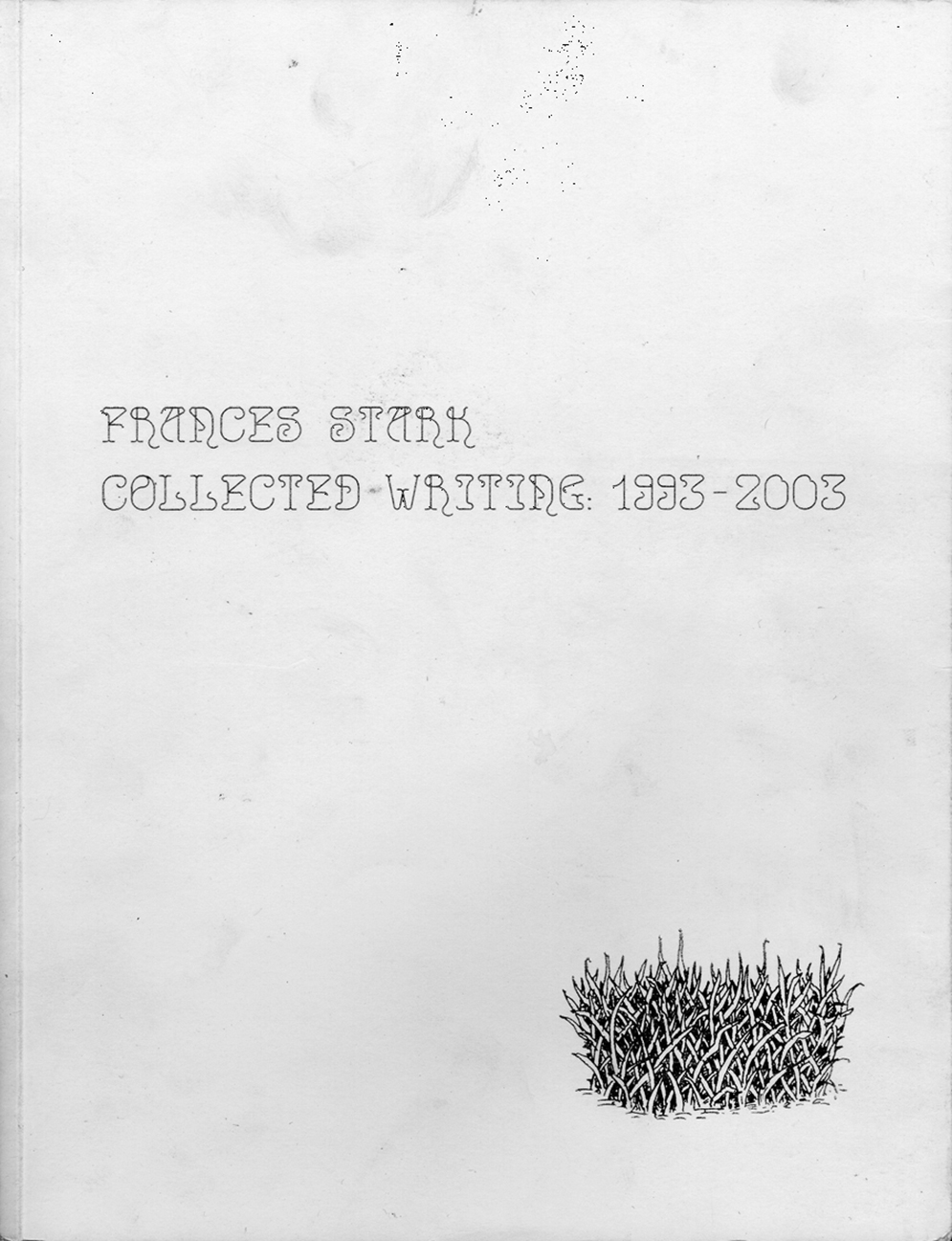
I’m only showing the cover, for a change, of this compilation of short, intimate texts. It should be just about clear from this scan that the white is smudged and slightly dirty, even though my copy is only a few months old. White covers, especially uncoated ones, are anathema to most publishing houses, being particularly susceptible to rubbing and staining. In this case the author insisted on uncoated white for precisely this reason; to
allow the the book to become visibly worn by use, embracing and amplifying the reality of the object. In effect, the user—the reader—completes the design. The idea was in slight homage to the Joy Division album Still, whose absorbent card gathered a similar filthy dignity in a record collection over a couple of decades. And so we’re back to the lens of the late 1970s again.
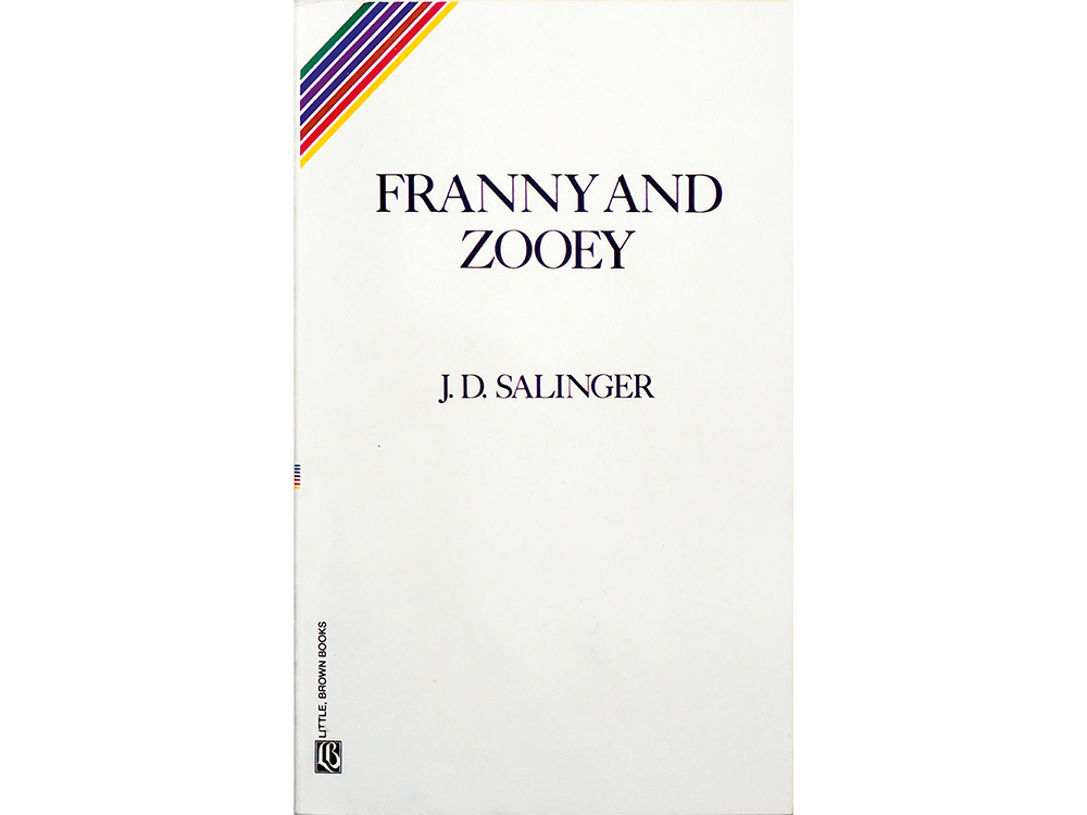
24. J.D. Salinger, FRANNY AND ZOOEY, original publication: Boston, Little, Brown, 1961
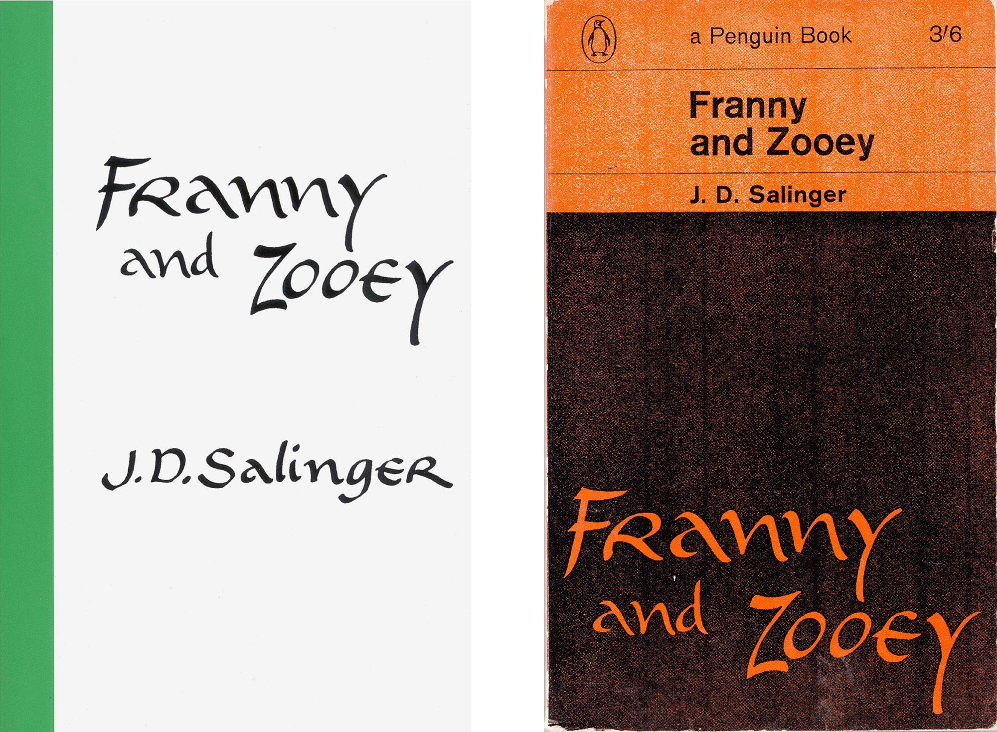
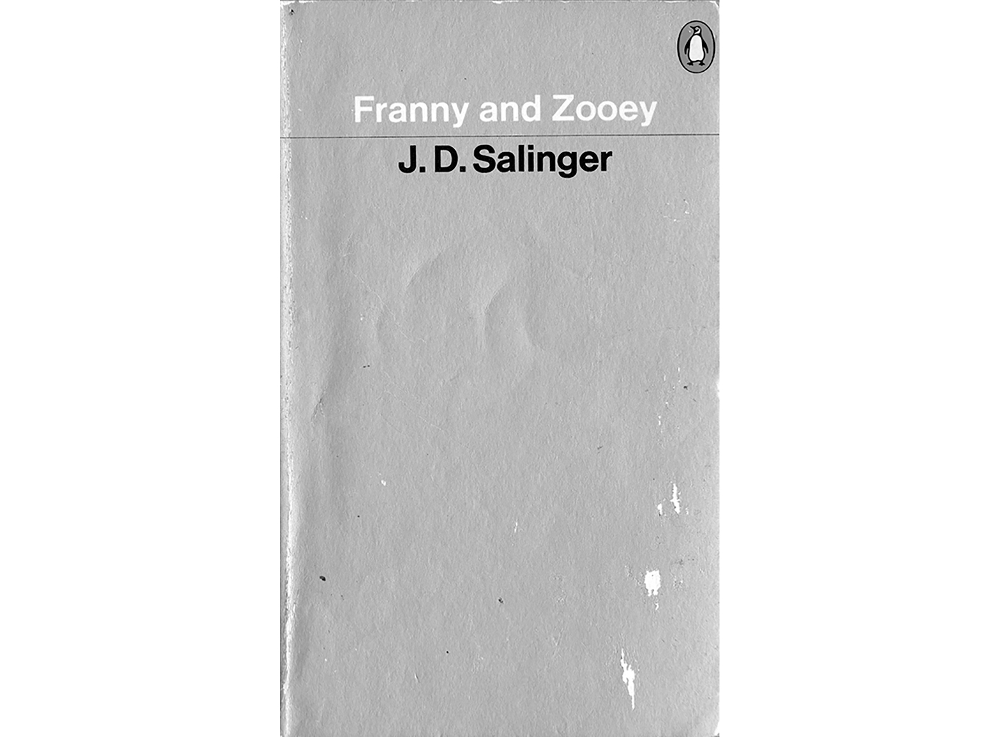
To end, I want to span the whole second half of the twentieth century with a few more covers, leading me to the proposition that in the time period roughly covered by this talk, the American author J.D. Salinger made one of the greatest graphic design decisions—as opposed to a piece of graphic design. That distinction is important, as everything I’m promoting here is from the perspective of considering design a verb rather than a noun, to design rather than a design; an open, cerebral process rather than a fixed, physical object. All the images depict objects, of course, but they are offered here as the iceberg-tips of thought processes.
In the 1950s Salinger had a clause put in his publishers’ contracts that insisted only the text of the title of the book and his name were to appear on any future editions of his work, and absolutely no images. This hardline was particularly prompted by an early fatal experience with a publisher who covered a collection of short stories, then titled For Esmé—with Love and Squalor (after one of them) with a dramatic illustrated portrait of a seductive blonde. Salinger’s outrage is understandable: his Esmé is a precocious young girl of seven, and the story depicts a chance encounter and redemptive conversation with a soldier on the verge of a nervous breakdown. Nevertheless, it’s instructive to see how various publishers and nationalities have dealt with Salinger’s legal one-liner over the past half-decade of reprints and new editions. I saw a recent Estonian edition with a portrait of Salinger himself. It was one of his last press shots, so already about 35 years out of date, which, given his self-imposed public exile and hatred for literary biography, must be an even worse crime than Esmé’s prostitution.
But there have been plenty of handsome Salingers passing through bookshops since his withdrawal. The Penguin publishing history alone maps a neat shift in ideas as well as the prominent graphic style of each decade. An early 1964 paperback edition follows the then-standard cover form developed by Jan Tschichold and upheld by Hans Schmoller, where the golden section was used as a basis for calculating the proportions of roughly top third for the penguin, publisher and price, then the title, then the author, and the lower two thirds for image. To comply with Salinger’s demand, the “image” was actually an image of the title transferred from an earlier American Bantam Books edition with charming drunken calligraphy. A subsequent edition in the cool, chrome early eighties does away with the image altogether, leaving the residue of minimalist-neutral International Style, or maybe the seed of Terence Conran with its flat silver and arch-eyebrow “object quality.” Then in the late 1990s, Penguin astutely pushed another series of covers through the loophole by using a photograph of some text—a nice exercise in lateral thinking, though the idea is better than the staid result.
My easy favourite, though, is the modest Little, Brown series, still being published: black type on white, happily centred as pure
and sure as Salinger’s prose, refusing bourgeois space between capitals but admitting a coy corner streak of rainbow rising from sinister to dexter, printed on cheap uncoated card, welcoming smudges from clutching hands and dog-ears from the jacket pockets of angry young men, all bound around cheap, light-as-air pulp paper allowing them to be sent to friends on the other side of the world at minimum cost. This is a graphic design perfectly in tune with the (zen buddhist) spirit of its author and subject matter. For the most part I salute and wholeheartedly endorse Salinger’s case against graphic design—as form generally fucking function and getting away with it—but the collection of work offered here proposes a few hardy witnesses for its defence.”
*