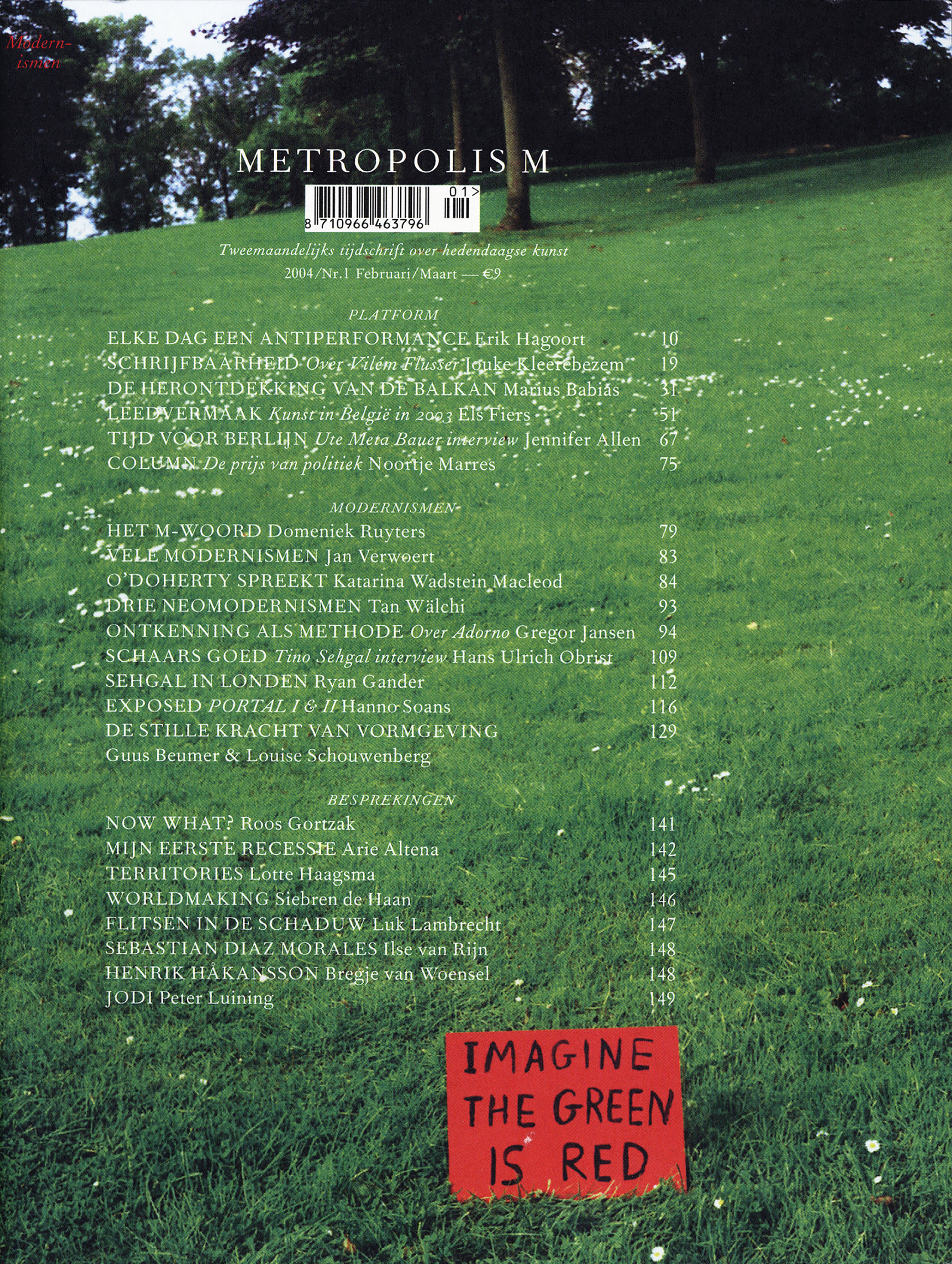
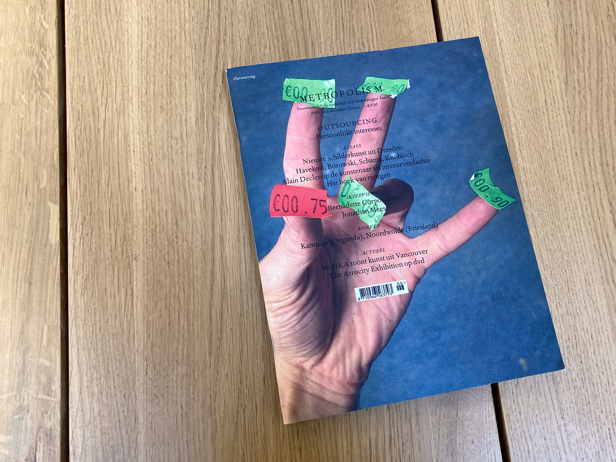
Metropolis M
2002
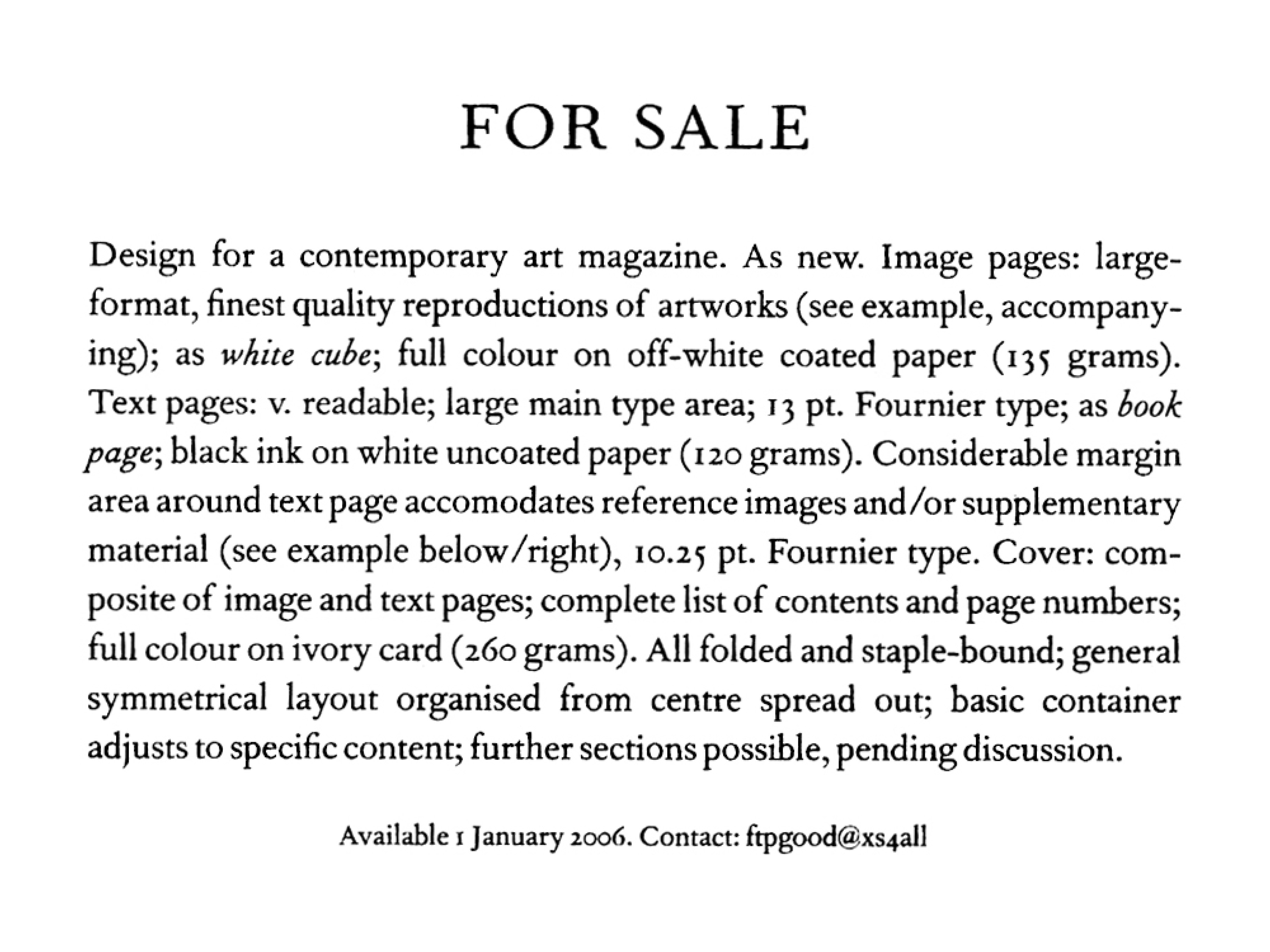
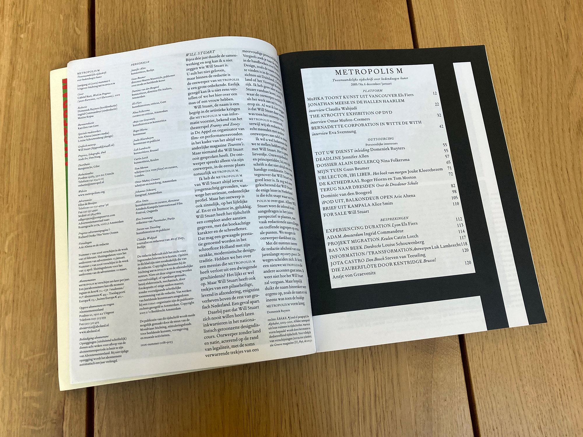
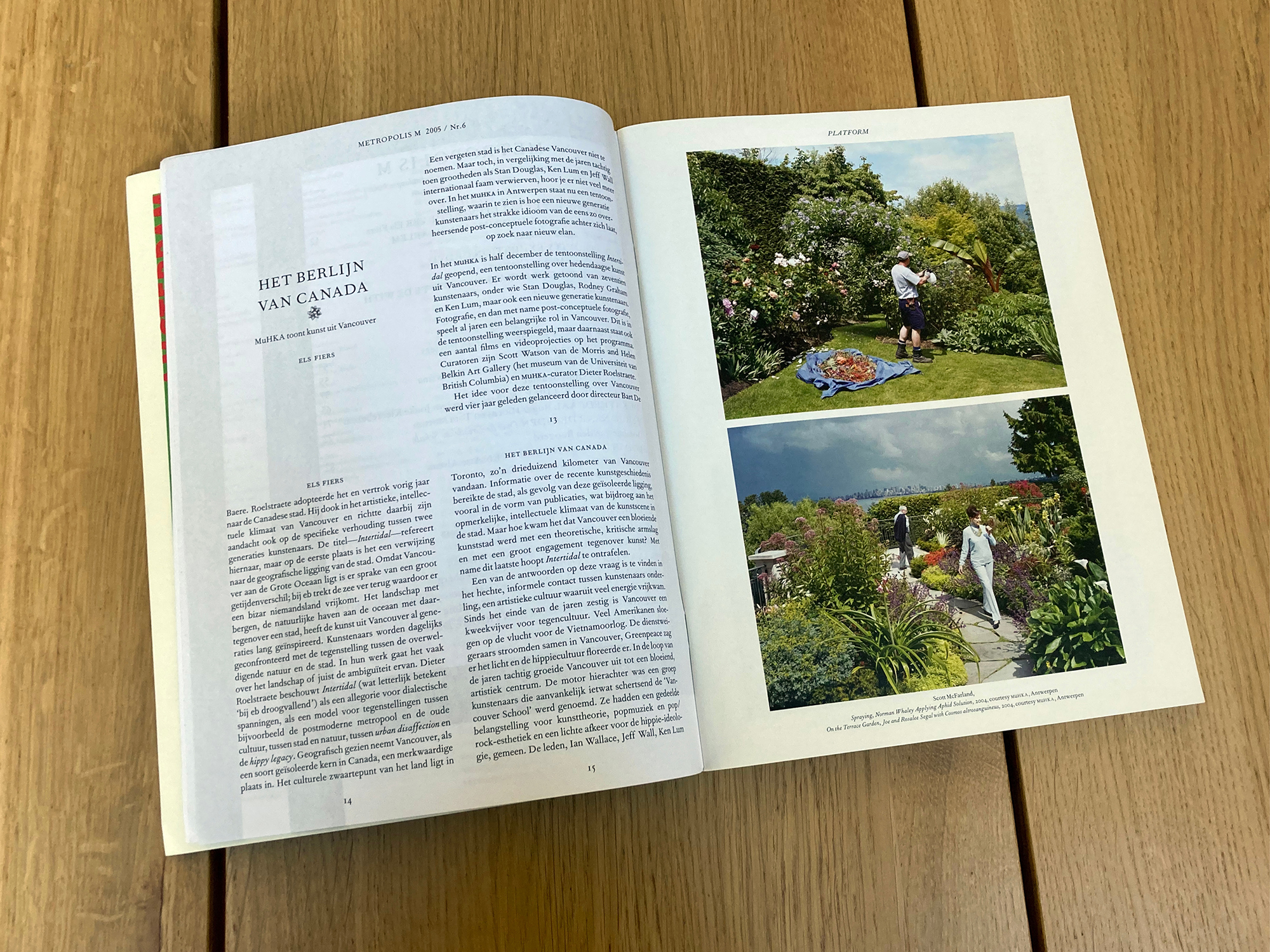
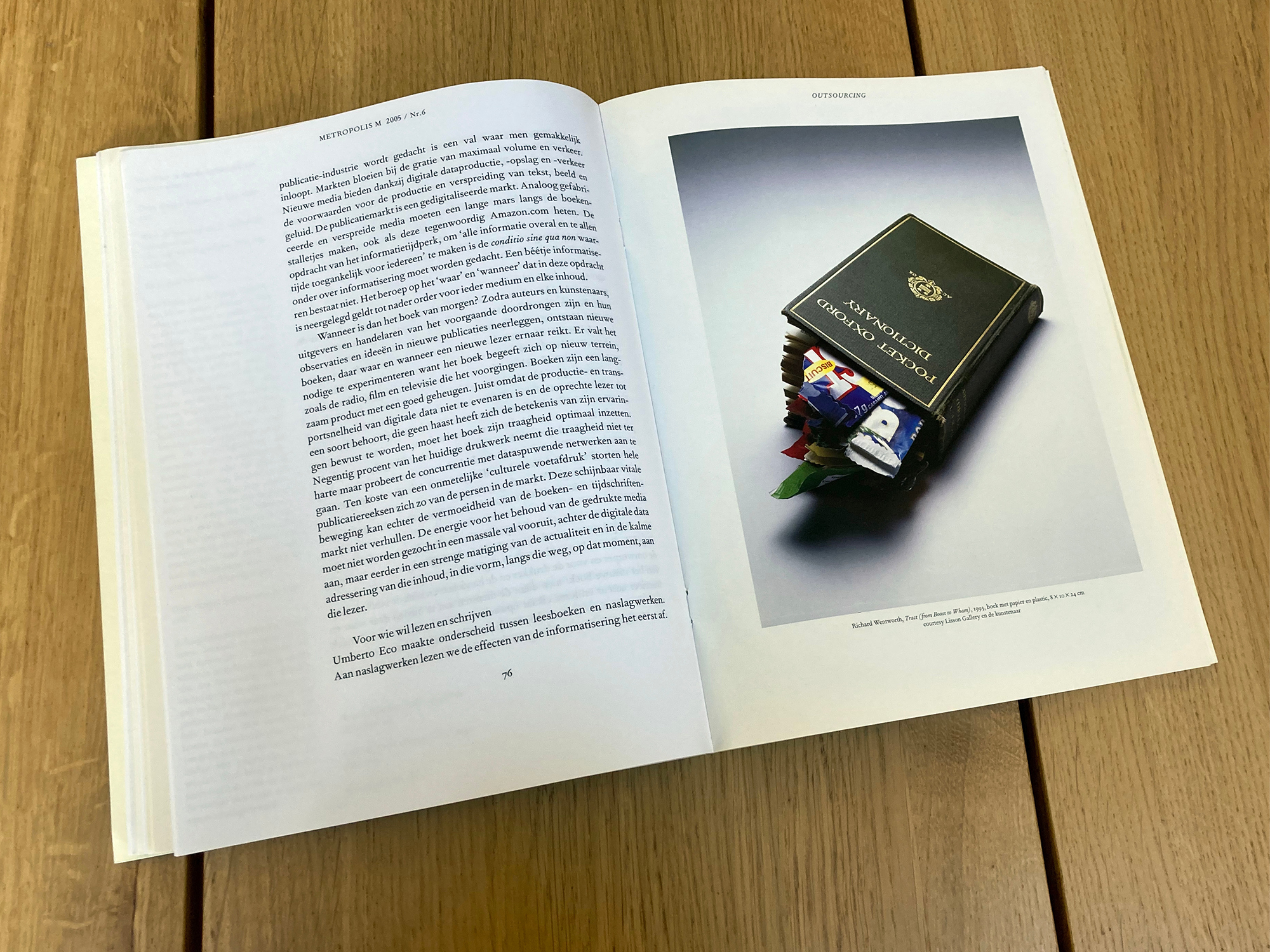
Invited to redesign this Dutch art magazine, British graphic designer Will Holder and I proposed above all to make the writing better—something less generic, more literary and propulsive, in view of actually being read rather than merely flipped though on the way to the gallery adverts. To demonstrate, we compiled a collection of art writing called Tourette’s, typeset to be as cartoonishly legible as possible—a generic classical book page with a useful large margin ready to be filled with reference material. We then designed an equally generic counterpart image page, and the combination of the two became the heart of the design. This expanded to include a Platform section, in which the pages were shrunk to fit eight on a spread rather than two, and the usual Reviews that were tightly packed akin to a newspaper.
As the sister text/image pages were respectively printed on uncoated/coated stock and saddle-stitched, the arrangement of pages had to be physically symmetrical—a material constraint that had a huge effect on the layout of each issue. When we stopped, around three years and 15 issues later, we advertised the design in a classified-style advert in our final issue, and the basic template has since been used to generate around 20 other publications.
*