Questions Without Question Marks
2007
Published in Dot Dot Dot no. 14, this piece was originally subtitled “A(nother) Conversation with Robin Kinross of Hyphen Press,” as it was based on a prior conversation with Petra Cerne Oven, fragments of which—set here in italics—were used as springboards for further discussion.
*
I used to say “typographer,” in the days when you had to say what you were in your passport. It was a matter of slightly romantic allegiance, because I never practised it in the way that most people do. I also did a lot of writing, and now I do a lot of editing—which means, reading other people’s writing, and working with texts and working with another designer. So I think now I’m an editor, and in the Continental sense, or the French sense of “editeur.” That also means “publisher.” I’m pleased with that idea; it has some of the same good qualities as “typographer.” It’s not so much visual production as word production. That’s what I do.
This is Robin’s answer to a question from an earlier interview with Petra Cerne Oven, originally published in 1999 and currently available on the Hyphen Press website. Petra framed that piece by pointing out how perfectly the hyphen represents Robin’s practice, both in the senses of carrying-on (the project of modernist enlightenment) and break-ing (from existing models of writing and publishing). This new conversation attempts to act in the same spirit, both continuing and diverging from the previous discussion.
I first met Robin in 1993, somewhere around the middle of my final year at the Department of Typography & Graphic Communication at The University of Reading, on the same course Robin had completed himself some twenty years earlier. A few interested students had invited Robin to come and give an informal afternoon talk, of which my time-bleached memory recalls three things. The first was an introductory talk loosely concerned with “Locality,” beginning with some photographs of a small rural building somewhere in what we then still thought of as Continental Europe, a description of how its form and materials were drawn from the area’s history and geography, and ending with a protracted discussion about the precise typographic alignment of three occurrences of the word “Architecture” on a Max Bill-designed book cover. This talk was also memorable for the fact that, against Reading protocol, Robin was both sat down and, apparently, improvising. The second was a personal mini-epiphany induced by the contents of a box Robin had brought along: various publications and ephemera as examples of local principles in contemporary printed matter, mostly Dutch, and approximately half of which were back issues of the maverick architectural journal Oase—Oasis!—designed by the then relatively uncelebrated Karel Martens. The third was an absurdly overheated discussion about the design of two wine glasses placed in proximity to Robin towards the end of the proceedings. In the closing sequence a forgotten member of the audience is demanding – with more irritation than seemed strictly necessary—“What do you MEAN one is obviously better than the other!? Which one!?”, to which Robin duly held up the one that was obviously better than the other. At this point things started to make a certain sense to me. In retrospect this was my unofficial personal prologue to Robin’s first major work Modern Typography, which he had self-published a couple of years beforehand.
…
It’s quite a strange book. It was the ideal book for me, at that time. It had flaps on the cover, and it was printed letterpress. I think of it as “the last letterpress book.” The printer went out of business soon after it was done. It was like leaving the sinking ship of that technics: everything was going down, but, well, we produced this book.
SBB: In Modern Typography you describe a social watershed around 1973 related to the global oil crisis, and in your interview with Petra, another in 1989 related to the dismantling of the Berlin wall. In the seven years since that interview I guess it’s hard to deny another watershed in 2001 related to terrorism. Can you say something about how you perceive the changes during each of these periods has affected your publishing or other activities?
RK: My idea about the Zeitgeist, and the way in which we see “periods” as starting and finishing, is that it is something that you tend to construct after the event. Yet, events like the oil-price crisis of 1973, or the fall of Communism in the autumn of 1989 and in the months following, and now 9/11, did all come with the sense of a powerful shock. You feel that you are living in history, whereas for the rest of your life, it’s just days going by and getting on with your own immediate, personal concerns. But in those days of historical crisis, life thickens—the plot thickens. In 1973, quite a few of us in Britain felt that the world was going to end, or that we would be living in a different society, of scarcity and necessity. I found a confirmation of this in a book by Gilbert Adair—Myths and Memories, published in 1986—in which he says exactly that people thought the world was going to end then.
1980 and the time around then: I remember it as the coming of a new, radical conservatism, with Margaret Thatcher in Britain, and Ronald Reagan in the USA, and Helmut Kohl in what was still West Germany. It was also the coming of Postmodernism. I had started working with Norman Potter, an “out and out Modernist,”
as I think he once put it. We went through this exercise of getting in touch with people that he had known or worked with in the 1950s and 1960s—people who might help with the new version of his book. Were they still modernists? Some of them had changed. Some of them were even becoming Postmodernists. (An architect like Terry Farrell in Britain, author of many grim Postmodern edifices, would be a good example of this.) It reminded me of a film of the 1950s, The Invasion of the Bodysnatchers. You look into the eyes of your girlfriend and see that she is different, has a blank look, has been taken over by some alien force.
With 9/11 and 2001, I don’t feel the same sense of life thickening. Perhaps it’s just that I want to refuse this as a reason for a change of practice. It’s become a joke, almost. “Why does this item cost more now?—Because of 9/11.” The price of shipping books from Europe to the USA has gone up significantly in the last few years. I’ve been told that where previously a shipment was examined superficially—maybe just one crate was opened out of many—now every crate is opened and inspected. That takes time and costs money. I suppose I feel that the events of 9/11 and subsequently would never have happened if the USA had been following a more forthright, open, even-handed foreign policy, in Israel-Palestine, especially. So we are paying for this. I feel we need to go on despite being told that everything is different now—as if these events hadn’t happened. We need to assert some normality
and continuity.
…
There was something Anthony Froshaug once said to me: “you’ve got the publishing bug as well.” He’d had it too. A lot of people have it. It’s some wish to disseminate: to produce books or texts or information, and spread it around. Maybe it is a bug or a disease. There’s something I do continually: if I see a newspaper article that I think will interest someone else, I cut it out and give it to them. Or I make two photocopies, and give one to that friend and the other to someone else. Maybe that’s the publishing activity at its most basic: perhaps it’s an instinct rather than a disease.
SBB: Hyphen appears to be not only still afloat, but pretty stable, even introducing new series and so on. While arts publishing generally seems to be in some sort of crisis, driven to overproduction, blandness, and the steady erosion of standards by the nature of both print economies and middle management, how do you maintain this alternative?
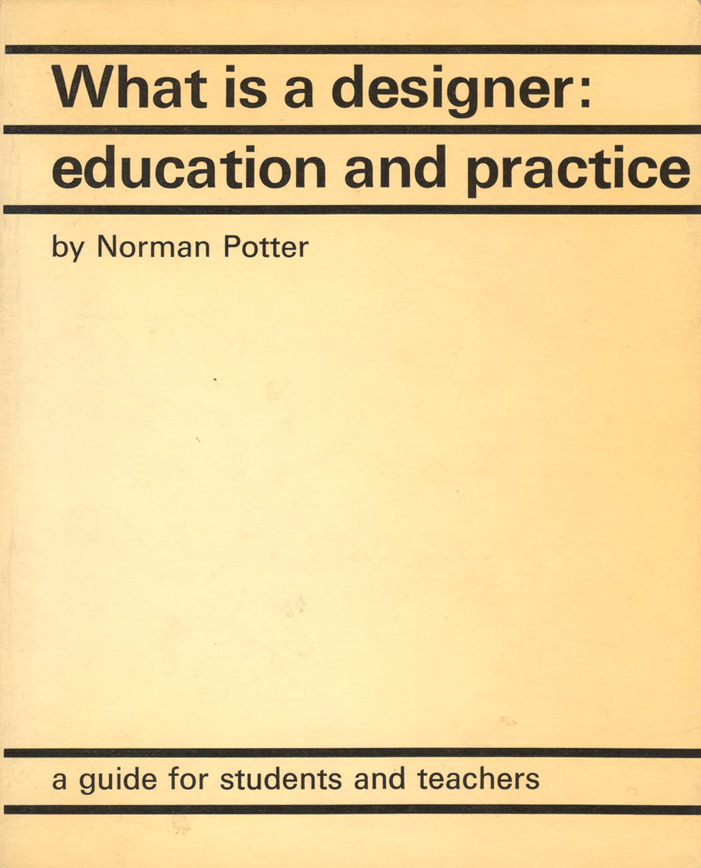
RK: As far as my own publishing effort is concerned, the longer you go on, the more you can build on what you’ve done. So, in the last five or six years, books have begun to go out of print, and I’ve begun to make reprints or new editions. What is a designer is a case of this. In 2002 we made a fourth edition in a smaller format. It’s now a true pocket book. Perhaps this is its final destination. (Norman Potter had died in 1995, so now there was no awkward author to dispute the new format.) Another way of consolidating is selling rights to translated editions, and this has begun to happen now. It’s very gratifying, and it helps the economy of the effort, with royalties beginning to come in with no further expenses or effort. Norman used to say, half seriously, “what about the Chinese market?” Last week I got an offer for a Chinese translation of one of the books—unfortunately not What is a designer.
This leads on to a theme that I’d like to expand on, both in the publishing, and perhaps in this interview. This is the reprinting of existing work, and the rediscovery of old texts. It was how I started, by bringing Potter’s book back into existence. We did it again with Harry Carter’s book A View of Early Typography, which appeared in a Hyphen edition in 2002, having been published by Oxford University Press in 1969, and then lying out of print for many years. This act of re-publication goes against the grain of publishing as it now exists in the bland corporate sphere. The tendency of large-scale publishing is to forget the old ones and to reinvent them. To some extent, this is understandable. The subject matter, the methods, the technologies, may all have changed. A book will begin to look dated in its design, and the firm that holds rights in it may not want to resuscitate it as it stands. It seems to me a noble and useful project to bring books back to life: at least, those books that still have life in them. Small, marginal publishers are well placed to do that.
...
I suffer from a certain moralism. I’ve tended to make moral arguments, such as: “this person has been neglected and should be better known,” or “this is an honest man; the world is full of dishonest people who are always in the headlines, why don’t we pay attention to the ones who aren’t in the headlines.”
SBB: These notions of reference and renewal seem particularly timely. A few years ago Will Holder and I produced a small-run publication called Tourette’s in which a tiny editorial note proposed: “A lot has been said already, and if we all keep trying to repeat and improve ourselves in new ways, some of the nicest things might get lost in the resulting pile”; and in Dot Dot Dot no. 12, Ben Watson and Esther Leslie wrote “that which burns brightest burns most briefly, and in true modernist fashion brilliance must be but fleeting, timely, not eternal, a coincidence of moment, viewer and object.” There’s something about both these quotes which affirms for me the idea of design as verb rather than noun—as a way of thinking rather than a material end product. When teaching I always find myself talking about the importance of realising the thing you end up with at the close of a project is merely one possible cut-off point of the design, and that there still remain any number of potential directions or possibilities for revision. This attitude of continuation was always embodied for me by the fact that Potter’s What is a designer has no question mark. Perhaps you could unpack that title—and that thought!—for me.
RK: The title of Norman’s book is poetic, suggestive, like everything he wrote. In my mind, it means “this is what I think design is; well, let’s try it this way and see where we get to.” Often bookshops or people who ask about the book refer to it as “What is a designer?” with a question mark. One colleague said it sounded like a careers advice text (“What is Psychiatric Nursing?”). But the lack of a question mark in the title makes all the difference. There is also the disjunction between “what” and “designer.” “Who is a designer” or “what is design”—either of those would be expected, but not this mixture of the impersonal and the personal. Then he plays a nice trick by calling the first chapter “What is a designer?”, with the emphasis on “is.” We might have rammed this home by calling that chapter “So, what is a designer, anyway?”
…
I remember a long conversation with Norman Potter and a common friend, in her garden, one summer evening. Norman persuaded me. He was a brilliant arguer: fantastically strong in reasoning. He said something like: “You have to publish it yourself. That’s part of the content.” He thought that the book itself should be a kind of demonstration: an existential acting-out. Perhaps it’s like asking a composer if they can play the piece that they have composed. It’s an exaggeration, but publishing the book myself was a kind of validation of what I was arguing. Certainly the form of the book, the design of it—although now I’m not happy with that—I felt this had to confirm or support the arguments of the book.
SBB: Could you relate some of the particular lessons learned through publishing, editing or designing of your own books? Have you refined your approach? For example, was the recent introduction of Hyphen books in standardised formats a reaction to your experience publishing the earlier autonomous books?
RK: The trouble with my book Modern Typography, in its first edition, was, I came to think, in its own design. The design suffered from being too pondered: the process went on too long, without anyone pressing me to finish it. And also the whole process of making it was quite introverted. The wide left margin was meant to have pictures in it, to begin with. Then I decided not to use marginal pictures, but somehow forgot that this could mean that the left margin could be reduced, or that the page size could become smaller. And so on. Looking back at it now,
I think the design of the book has a certain visible intention and a naivety or innocence. It’s an attempt to make books in a certain way. That feels good, even if the details seem mostly wrong. In the second edition, we used a more modest format, and it’s more standardised in its design. It’s less about the design and more about the content.
The surprising thing to me is that the Hyphen books are, I think, rather various in appearance and style. So far it has been like a journey, meeting people along the way, walking with them a bit, and taking paths that they suggest—which wouldn’t have happened if I’d been walking alone, or according to a foreseen plan. It’s like the essay form, which is
the way of writing that I feel most comfortable with: you start out not knowing where you will go, and the form of the piece tends to be made up as you go. T.W. Adorno expounds all this in his wonderful piece “The Essay as Form,” which I read a few years ago with a great sense of confirmation.
…
I’m very suspicious of separated history […] What I want more is “this poster from 1817 was made because of the great interest in—whatever the topic is, and there was a development in printing technique which made it possible to make it so big, and there was an enlightened customer who had this much money to spend, but he ran out of money and this is why there were only ….” In other words, a more realistic level of discussion. I’ve seen that students who don’t think they are interested in history are actually interested in this kind of discussion: they are drawn into it; it connects to their own experience.
SBB: The retrospective rationalising and organising of history we mentioned earlier must apply at a smaller scale to Hyphen Press too, in the sense you describe of there having never been any masterplan, that you just “fell into” publishing through certain friendships or the love of particular works. I might argue that an aspect of the modernism your publishing circumscribes is the very lack of any agenda or expectations, only a set of moral working principles, and that it’s precisely this lack of presumption that breathes life into the work. Is it important to maintain a sense of unknowing, of making it up as you go along? Have you ever felt your work was becoming too predictable or out of breath?
RK: Yes, and more often recently. To do fresh work, as we’re saying, you do need to take a step back and pause. Then something different can happen. It’s perhaps what distinguishes mere journalism or “journeyman work” from more substantial writing or production. As a writer, eventually you reach some point where the words just pour out without difficulty, as fast as you can type them. To write for a living, which usually means writing journalism, you do need to reach this state.
But this is dangerous, because of the risk that you start to “run on empty”—repeat ideas, phrases, formulations. Or you just become a machine for rehashing given material: putting pieces together out of quotes from people that you phone or meet. This was one reason why I decided to stop a rather intensive phase of journalism at the end of the 1980s, and put most of my effort into something more long-lasting: making books. I felt I had begun to repeat myself.
Norman Potter’s work, and the experience of working with him, was and still is formative for me. I remember he once told me he never gave the same lecture twice. Of course this is disastrous for an easy, lucrative career as a speaker on the conference circuit. But he felt that to keep it lively you had to do it differently every time, according to the circumstances of the audience, the venue, the occasion. I don’t give many talks anyway, but on the one or two occasions where I’ve repeated a lecture, it’s always gone wrong. Much better to do each one fresh. There is more work of preparation, but on the day you have a charge of fresh energy that isn’t there with repetition.
…
There were people making these manifestos, even, about what graphic design could or should be. My attempt was to discuss the arguments, and not the design that followed, or was said to follow, from the arguments. I thought the arguments were bad ones, and false. If you see what you think is confusion, and you think you know what the muddle is, then you go and say to the people saying these things “look, you’re confused.” [laughs] I begin to think that people found that quite strange. In graphic design, that is not so expected. Of course in philosophy or in history or other such areas, it happens all the time. That’s partly what philosophy is: people saying “look, this is what’s going on here.”
SBB: In his book A Year (With Swollen Appendices) Brian Eno writes the following in relation to the notion of abandoning what he calls “axis thinking”: “It’s extraordinary that when the Berlin Wall came down everyone assumed that the whole world was about to become one big market economy running on the same set of rules. What happened instead was that the old dualism Communism/Capitalism was revealed to conceal a host of possible hybrids. Now only the most ideological governments (England, Cuba) still retain their fundamentalist commitment to one end of the continuum: most governments are experimenting vigorously with complicated customised blendings of market forces and state intervention.”
I’d argue that you can effectively apply this view to the prevailing condition of graphic design and typography (if not publishing), in the sense that there are no longer any general concerns about affiliation with some larger principle—the most recent obvious dualism being, of course, Modernism/Postmodernism. But I have to admit that feel a bit dualistic about it myself.
On one hand I think this is a good thing. One point I forgot to mention in my introduction about your Reading visit is that you also left behind your polemical “More Light” article, originally published in 1993, which I’m guessing was some sort of precursor (maybe an angry younger brother) to your Fellow Readers pamphlet. There you write: “An approach: Traditional? Modern? Postmodern? Forget those worries, and go back a step. Think what it is that you want to do. Think for yourself! Disregard preconceptions, models, influences.” In this sense, I think the current condition is halfway there
—recent generations have forgotten those worries; the struggle now is towards the independent thinking part. This is also summed up nicely in a throwaway comment you make in answer to Petra’s question about why graphic design stars (and by implication any kind of celebrity) are such a bad thing: because “it stops people thinking for themselves.”
On the other hand I think it’s a bad thing. The difficulty of writing about the breed of modernism you practise and, in doing so, promote, is that it’s attitude rather than form, fluid rather than concrete, and therefore difficult for people to get a handle on, because “readers” are used to having visual examples, when the form is typically “read” as shorthand for the ideas. The problem isn’t really a fundamental set of working principles itself, only when they become fundamentalist. I think it’s desirable to work with an explicit set of beliefs—with preconceptions, models and influences—but I think the important thing is that they’re worked through and out individually, over time and practice, not force-fed and swallowed. Without any principles at all you end up with some kind of vaguely existential tribal drift that Roger Bridgman lamented in his significantly-titled “I’m Scared” (1962) and “Who Cares?” (2002) pieces in the early issues of Dot Dot Dot.
All this is leading up to saying there’s a quiet, modest radicality to Hyphen Press that I want to stick a flag in here, simply because it’s easy to miss. Radical has three basic meanings: 1. Arising from or going to a root or source; 2. Departing markedly from the usual or custom-ary; and 3. Favouring or effecting fundamental or revolutionary changes in current practices, conditions, or institutions. Both the uncommon historical span in Modern Typography and its appendixed “butterfly collection” of loaded images demonstrate all three: arising from the root of the subject, departing from the ways in which the subject is usually handled, and in doing so acting as a model towards changing current practice. Fellow Readers is another clear example: the immediacy of the text and brevity of its argument required a relatively speedy dissemination in order to participate in a contemporary argument, which informed the resurrection of the pamphlet format.
RK: There’s a story I want to tell that perhaps qualifies some of the nice things you’re suggesting about my lack of dogmatism and the suggestion that we’ve moved on beyond the polarities. I mention it in the spirit of self-criticism and
self-questioning. And I have to mention Norman Potter again, though the attitude that he expressed is one that I share. A large part of the point of not having pictures in What is a designer is not to prejudice readers, to allow
them to think for themselves. Occasionally Norman or I would encounter people who had read the book and thought it was wonderful, inspiring. They would show us their work, and it seemed really disappointing, just on the immediate level of appearance. We would think silently “oh dear, they just don’t get it.” So there can be a disjunction between ideas and products. You can have very good, noble intentions and still make uninteresting work. In the end, what you want is the thing itself, not the idea itself. What is an idea? An idea isn’t really something to keep you alive and healthy. But then again, maybe this is to fall into polarisation. What is most desirable is when these poles disappear. What is produced is some fusion or embodiment. It has a richness.
…
It’s a familiar paradox. You develop a system. In principle you can tell other people how to do the work. But when it comes to it, you realise that it’s actually a little bit more complicated. You begin to think that it needs the original people to do it right. In other words, it’s more like art than it is like science or method. What that art is is not exactly mysterious, but it’s a subtle matter.
SBB: This brings me back to the standardisation question again. In Petra’s interview you recalled Norman Potter urging you to self-publish Modern Typography because the self-publishing—the DIY—was ‘part of the argument’. Are the recently-standardised Hyphen formats and typeface (Fred Smeijers’ Arnhem) be considered a model in the same way? Why arrive at this point now, after a couple of decades of every book assuming a different form? I was thinking recently about how the majority of graphic design and typography I appreciate are those which feel ‘standardised’ because they seem to have been designed by time rather than people. I’m thinking of The Guardian, The New York Times, The New Yorker, Time Out, even: all the result of a collective effort, spanning generations and technics, rather than springing from some single genius moment. This might be considered, like the revisiting and refining existing books that we discussed earlier, in terms of publishing—and designing—as palimpsest.
RK: Perhaps it’s part of this feeling of doing it for the long term. But certainly to fix the materials and the formats gives a freedom that I enjoy. If the format, the paper, the binding method, the typeface, and so on, are already given—then you are free to get on with making the book. You can play variations on the given materials. Maybe a certain title will demand a different kind of paper. But then you have a starting point from which to depart, and you are no longer facing the infinite—which of these five hundred possibilities shall I choose?
When I saw the typeface Arnhem, I thought, “that’s it.” At last there was a good, strong typeface that had been designed to be a digital thing from the start. So it could be superior to all the digitised versions of the hot-metal classics, which always feel like not very good translations that have lost something in the process. But Arnhem has the right balance of character and anonymity. Plus, of course, it had been made by a close colleague and friend, Fred Smeijers. So that felt good—to be joining hands with someone I knew well. Other contenders, such as Scala, designed by another good friend, Martin Majoor, had always seemed a bit too definite or stylish in their character. The typefaces I like most of all are the ones that just seem to be there without calling attention to themselves: newspaper typefaces, especially. I would have used Times and Plantin all the time if we were still doing metal typography.
…
Well, I come from an earlier culture, and an earlier generation. We were against heroes. As Brecht said, we wanted “a land without heroes.” We thought that heroes only brought disasters. We were in favour of equality and collaboration, working without hierarchy. All those ideas.
SBB: In slight relation to this, yet another quote, this time from John Berger’s latest novel, Here Is Where We Meet, in which he describes the present condition as capitalist “digital time” which continues forever uninterrupted through day and night, the seasons, birth and death: “It’s as indifferent to specificity and quality as money, and contrasts to the cyclical time of nature, of cold and warmth, of presence and feeling […] digital time knows only vertical columns of ones and zeros, of cash flows and Dow indices. Within digital time, no whereabouts can be found or established; journeys no longer have a specific gravity of a destination. Destination has lost ‘its territory of experience’.” It seems to me that the production of books works towards the maintenance of such a territory.
RK: Yes, that’s one of the qualities that draws me to books. (Though, unfortunately, the more books you make, the less books you have time to read, or seem to be able to read.) But I cling to the idea that a book is for the long term. It will be there for as long as we’re still above water. There’s one part of the process of publishing that I enjoy especially. In the UK, one is asked to send one copy of any new book to the British Library, and copies also to the five ‘legal deposit’ libraries in Oxford, Cambridge, Edinburgh, Dublin, and Aberystwyth in Wales. When that’s done, I always have the feeling that the book is there for ever. Even if every other copy is dispersed, or lost, or vandalised at Liverpool docks (as happened with one of our shipments to the USA), there will still be these six copies for the future.
I confess this is some sort of left-over religious attitude towards the holy book. It’s also why I will never be able to throw any book into the rubbish bin, though some people I know can, or could, before the days of recycling of paper. That kind of reverence also means that you have to do everything to get the material of the book right, and free of error. (Though, unfortunately, the books I’ve made have often been quite full of mistakes—usually the result of giving ourselves unwise deadlines, to meet an exhibition opening or some such event.) Mistakes are the worst things in a book. Well, the books I want to make are the long-lasting ones. This becomes hard work in a culture in which books are being poured out every week, many of them put together very rapidly by people who want to “do a book” as part of career advancement, whether as an academic or as a chat-show host.
…
If you throw everything away, then you end up with nothing—or with complete freedom, with individuals saying ‘I have a right to do this; don’t say anything about me, because you’re interfering with my personal rights’. I’m not sure how this really connects with the deconstruction arguments. But I think it does, because part of that argument is to say that each reader makes his or her own reading: “don’t interfere with the reading that I am making; it’s mine.” So yes, to boil it down, that was what that was all about. And now I think it has passed on. What is fashionable now, in purely visual terms, is not that wild deconstruction. Things have changed.
SBB: Finally, a question I’ve wanted to ask you for a while now. A few years ago, at the close of a piece I wrote about Maureen Mooren & Daniël van der Velden’s redesign of Archis magazine, I quoted a section in Modern Typography where you suggest the prospect of “an endless series of ‘modernisms,’ of multiple pastiche, and a sad, restless search for whatever might look new.” My conclusion was that this exactly described the form and attitude of Archis (though not in a necessarily negative way). At the time you hinted that I’d misunderstood your text. Could you say why, and whether you feel since then we’ve descended to the situation you anticipated there? Incidentally, I noticed you withdrew that entire “Permanent restlessness” block of text that this came from in the second edition ….
RK: Archis was extreme. I was amazed when I saw it, and could hardly believe what I was seeing. It looked rather Japanese, in that it was so largely based on imitation of existing forms (the design-styles of other magazines), with huge self-awareness, and fanatically precise details. But, yes, I did think it was awful. My blunt criticism of it would be that it was not just over-designed, but that the content was not well served. It was hard to know what the articles were about. Maybe this all mirrored the complexity of a world now saturated with media and representation. But in these circumstances, what is good to have is not a mirror, but the sharp knife of a clear analysis. I remember that in the copies I borrowed from you, after you had written your article in Eye (no. 45, 2002), the one article I really wanted to read had been torn out—along the neatly serrated margin that all the pages had! Tear-out pages are, I feel, truly something that you might see in a nightmare.
When I wrote that passage in the first edition of Modern Typography, I was making a criticism, against the prospect of new modernisms that are just pastiches (the word was definitely meant as a put-down). It’s perhaps interesting to try to make distinctions between things made now that go under the name of ‘modernism’. For example, the architecture of Richard Meier is modernist, but I’ve always felt there was an element of pastiche in it, as if he knows too much about the history of modern architecture. His “white architecture” has too many memories of the white buildings of heroic modernism, and it doesn’t feel so appropriate in dull northern climates, such as you get in The Hague (the town hall there, designed by Meier’s office). Perhaps this works better in the buildings for the Getty Center in Los Angeles. Also the kinds of buildings he has done—often large buildings, for rich clients—don’t have the spare quality that animates the modern work that we tend to like best. The early work of Norman Foster had a fresh, spare modernist spirit, but now most of what the Foster office does feels rather dead, because of the size of it, the materials.
When I wrote the first edition of that book I did feel more embattled than I do now. It was the mid-1980s, and the time of ascendant post-modernism in all parts of life. It was a more polemical moment. Now a lot of that has passed, and the worst of post-modernism—the very superficial, badly made things, such as the Memphis furniture from Milan—now look laughable (if they ever didn’t). I don’t think I can explain why, but the situation feels better now. Objectively seen, it isn’t. The galloping changes to the way our climate works, the degradation of the environment, the political crises all over the world—one could go on and on. But twentieth-century modernism, at its brightest and most hopeful, lived in the shadow of catastrophe—two huge wars. Rather than the “sad and restless” of the recent past, maybe the spirit now is of a sharpening of the senses.
*