An Edition
2021
This conversation with James Langdon about The Serving Library’s collection of a hundred or so objects was published in Revue Faire no. 31. It was intended as a companion to the The Serving Library Annual 2020/21, which comprised a photographic inventory of the objects alongside fragments from the essays they originally illustrated in some way. After a brief introduction by James, here we zoom out to look at the history and intentions of the collection as a whole. On reflection I have no idea why the piece was titled “An Edition,” because it's not.
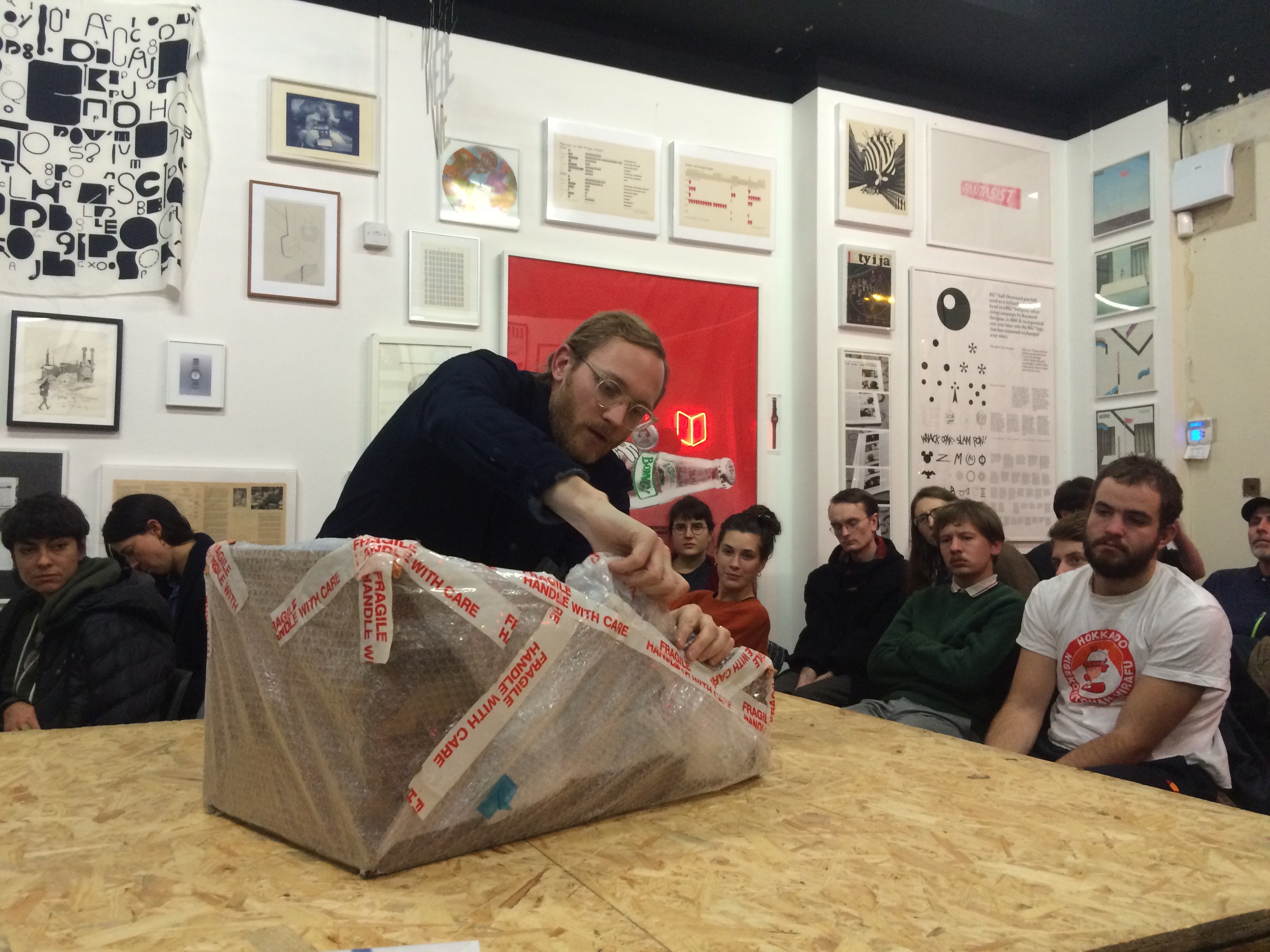
Lead image: James unwrapping a piece of Norman Potter’s Penton Kitchen at The Serving Library, India Buildings, Liverpool, 2018.
*
Dot Dot Dot’s inquiring disposition antagonised those who saw graphic design as a set of conveniently apolitical visual practices, inherited from a few elite modernist forefathers. For this faction, neomodernist rhetoric, passed on through half-quoted mantras like “the designer must not interpret the text,” and “let the content speak for itself” had been both liberating and lucrative. Countless designers in the 1990s—small studios and large agencies alike—repeated these anodyne mantras to convince corporate clients of their stale Swiss-neutral aesthetics. As a counter-position to this state of affairs, take Daniel van der Velden’s “The girl in the picture ...,” published in
Dot Dot Dot issue three. The piece documents pages and pages of correspondence—electronic and old-school fax—generated by Van der Velden in the course of a futile attempt to identify an anonymous figure in an old advertising photograph. If a typical graphic designer’s “side-project” might previously have consisted of organising an exhibition of some gorgeous “forgotten” poster archive, this was something else entirely. A poetic evocation of a pre-internet era of ephemeral knowledge, but also a provocative claim for a novel economy of practice: a designer exercising their autonomy—and spending their valuable time!—on gratuitous *research.* Dot Dot Dot fostered, and itself exemplified, this approach.
The final Dot Dot Dot was published in 2010. Its successor publication, Bulletins of The Serving Library (now The Serving Library Annual) has expanded its editorial group. The Serving Library was founded by Stuart Bertolotti-Bailey with regular Dot Dot Dot contributors Angie Keefer and David Reinfurt. Peter Bilak had left halfway through Dot Dot Dot’s run, with Reinfurt taking over as co-editor at around the same time. Keefer has since left, and Francesca Bertolotti-Bailey and Vincenzo Latronico have joined the editorial group. While the editorial purview, correspondingly, has continued to expand, Bulletins of The Serving Library rationalised its predecessor’s graphic indiscipline. Dot Dot Dot had experimented with inconsistency: articles designed by their contributors, a custom typeface designed iteratively according to the context of each issue, and what regular contributor Paul Elliman described as the “aesthetics of prosthetics”—the practice of scanning or otherwise maintaining the original graphic formats of texts quoted from other sources. The various formats of Serving Library journals, by contrast, have maintained a far stricter template, conceptualised around the programmatic and distributive concerns of Dexter Sinister, the collaborative art practice of Bertolotti-Bailey and Reinfurt. This templated format self-consciously lowered the stakes, in relation to graphic design, diffusing the antagonism of Dot Dot Dot.
In the course of these 20 years of publishing, the editors have amassed a significant collection of almost 100 objects that have appeared in the magazines, and this collection is the subject of the conversation that follows. The collection has been widely exhibited—in various design schools, residency programmes, and exhibition spaces in Europe and North America—growing steadily in the process. In autumn of 2020 it relocated to an annex of the artist-run space 019 in Ghent, with the prospect of a long-term home there. Its contents are by nature various, in format and intent: from images produced to commission for articles, to artworks representing particular histories, positions, and significant practitioners. This collection is a record of the kinds of cultural production that the magazines have supported. The latest issue of The Serving Library Annual documents each individual work in the collection. This issue of Revue Faire is a companion piece to that publication. The emphasis here is on the collection as a whole: its context, and in particular, its *teachability.* Teaching is an important aspect of The Serving Library for a number of reasons. Publishing, graphic design practice, and education can be intellectually and creatively complementary practices, of course. Their combination also represents perhaps the most economically viable kind of autonomy possible on the precarious fringes of art and publishing that might describe the conditions of practice of many of the magazines’ contributors. The Serving Library collection creates a space primed for teaching, rich with connective threads leading in and out of the recent history and practice of graphic design.
...
J: The most recent Serving Library Annual documents a collection of almost 100 objects that have appeared since 2000, first in Dot Dot Dot, later in Bulletins of the Serving Library, and now in The Serving Library Annual. I’ve had several encounters with this collection, and my understanding is that you and your co-editors have more “accumulated” than “directed” it. Is that how it was?
S: I think of it more as having been *curated by circumstance*, a mapping of both our editorial interests and those of a large pool of contributors over the last 20 years. In the beginning, we simply had a number of items lying around that had been scanned or photographed for an issue of the journal, and for one reason or another we’d kept hold of them. They might have been given to us by a contributor who hadn’t needed them back, or perhaps we’d commissioned an illustration to accompany an article and still had the original artwork. The idea of exhibiting them initially came about quite casually, but over time it gathered momentum and became a whole parallel project to the journal. As the objects travelled around from place to place, we started to devise excuses to acquire specific things—actively commissioning essays that involved an artefact or an object we wanted to add to the set, for instance. But the main reasons for new items being acquired are mostly practical: Is it possible to get hold of this thing? Can we afford it or get it for free? If we do get it, can we keep it? These basic constraints mean only a very small percentage of images that have been featured in the journals can possibly find their way into the collection in the form of an object.
In fact, the three things you’ve been involved in contributing are good examples of different ways in which this kind of collecting happens. Most recently there was your piece “Vectors for Looking,” on different manifestations of perspective in art, literature, and film. On the basis of your writing, we invited another regular collaborator, Mathew Kneebone, to provide images for the piece, and he kindly sent us three of the series of illustrations he made to add to the collection.
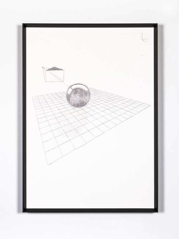
J: In that case, Mathew read the texts and proposed this series of pencil drawings based on the user interface of the 3D graphics software Blender. We went back and forth, deciding on a constellation of texts and drawings that worked well together. That dialogue informed the structure of the piece: the texts were written knowing that the drawings would be there, and vice versa.
S: That symbiotic relationship between tex and image is always the ideal for us. Before that, we published your piece “Now in Colour,” concerning a kitchen designed by the British designer and teacher Norman Potter. In it, you refer to a tiny magazine clipping from a 1960s weekend newspaper supplement, which is apparently the only surviving colour photograph of the kitchen. You had found it amongst some documents of Potter’s, I think ...
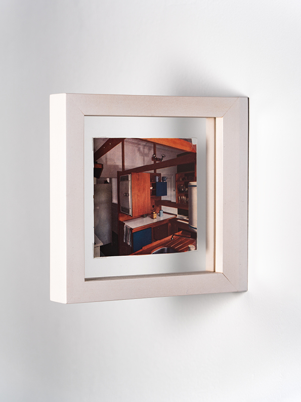
J: Finding that clipping was instrumental in the writing of the piece. It provided the conclusion to this narrative I had, about only knowing this kitchen—probably Potter’s most recognisable work of design—through these clichéd, mid-twentieth century black and white photographs. I had always assumed from those images that it was made in blond plywood, and was then completely surprised to discover that the kitchen, in storage in Potter’s daughter’s loft, was actually bright blue. I couldn’t end the piece without giving some reaction to the incongruity of the blue, and that’s when I found the clipping. On the back of it is this totally unrelated fragment of a photograph of a traditional English country kitchen. It’s the absolute aesthetic and philosophical opposite of Potter’s modernism. And yet practically everything in *that* kitchen is *also* blue. Speculating about that weird blue continuity became the conclusion to the piece …
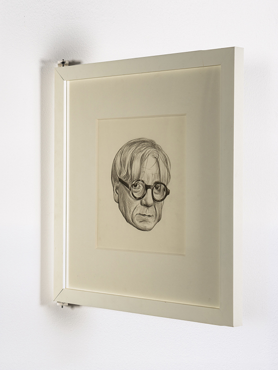
S: … which this also determined how we had the clipping framed, in a manner I believe is called “flag-mounted,” sandwiched between two panes of glass sticking out of the wall so both sides are visible. And in fact we then used the same method for the last item you were instrumental in our acquiring—a pair of back and front portraits of the Scottish writer Gilbert Adair made by Simon Manfield, which accompanied the piece you wrote about digital voice synthesis, “Gilbert Adair Continued.” Those drawings existed already, if I remember correctly.
J: Yes, I had already written a short piece about Adair and asked Simon to draw a cutaway of Adair’s head as if he were a robot to go with it. For that reason I would say that those drawings are the least storied of the three examples. They are completely faithful to the piece, but they function more like an icon for it, rather than a catalyst.
S: For the Bulletins in particular—to some extent in the printed journals, but especially on the website—this iconic aspect is really important for us too, because they rely on leading images that function as something between a front cover and a title page. They’re not merely illustrations: they primarily have to draw you into the pieces too, and so ideally have a kind of magnetic mystery about them.
J: Then to what extent are the objects in the collection actually representative of the published pieces they relate to. Is that a requirement?
S: That’s not the only reason for collecting the objects, and certainly there must be examples of things we could quite easily get hold of but just aren’t interesting enough to warrant it. A big part of the drive to keep on doing this is an enjoyment in the unexpected things that happen along the way—the various vectors, tangents, and anecdotes produced in the process. That’s what makes the Serving Library collection quite different from that of a regular art institution that operates according to more predetermined reasons, protocols and processes. The fact that we’re not particularly precious about the objects, and that we’ve been pushed and pulled by this so-called circumstantial curating, is also one of the reasons I think the collection makes for a productive educational tool. There’s always the possibility of surplus anecdotes attaching themselves to the objects—a snowball effect—which means new aspects can be brought into a discussion. They acquire a kind of richness along the way. Something that *follows* from an object, not just the object in itself.
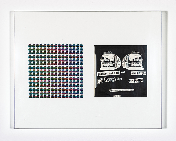
A good example of this grew out of two images of buses in an early issue of Dot Dot Dot. One depicts an infamous bus driven around the U.S. by the Merry Pranksters, a loose group of counterculture figures from California in the mid-1960s whose de facto leader was the writer Ken Kesey, all immortalised in Tom Wolfe’s book The Electric Kool-Aid Acid Test. The bus was painted all over in a psychedelic rainbow of colour, and displays its destination as a nicely misspelt F-U-R-T-H-U-R. In the journal, this was juxtaposed with an image of a very different bus made by Jamie Reid for a Sex Pistols record sleeve, whose destination is instead NOWHERE. The idea was simply to point to this antimony: one bus going further and one going nowhere, as representative of contrasting hippy and punk ideologies, one far-out, one nihilistic. And both marked by graphic aspects that also mirror the two subcultures: one an extravagantly-coloured painting, the other a faded black-and-white photocopy.
When we started gathering things together for the first exhibition, I was particularly keen to find material carriers of these two images, to make a physical version of the pages in the journal. The Sex Pistols one was straightforward enough as it was on the back of the sleeve for the seven-inch single “Pretty Vacant” which made number six in the British charts, so I was easily able to find a copy on eBay or wherever for next to nothing. It arrived in the mail completely trashed – someone had clearly used it as a coffee mat. Then I started looking around for a FURTHUR equivalent in a format that could be displayed next to it, and happened across a website selling hippy memorabilia—based in San Francisco, obviously—that sold LSD blotter art. These are pristine reproductions of the graphics that were printed on tabs of acid, perforated like the originals to provide hundreds of individual trips. And one of them depicted the bus! It turned out the website was run by Ken Kesey’s son Zane, who emailed me something like “I’ll stick it in the mail to Amsterdam right away, dude,” and sure enough it showed up a few weeks later, but with a surprise: it had been messily autographed in coloured felt-tips by various Pranksters—which wasn’t advertised or on the image on the website—and lo and behold it was exactly the same size as the Sex Pistols sleeve.
So these two objects ended up in the first exhibition of the collection that I carried in a plastic suitcase to Tallinn, Estonia, in 2005. This inaugural display comprised a bunch of lo-fi objects pinned to the columns of a large industrial space that our host Kristjan had managed to borrow for a couple of weeks. The morning after the opening, we were cleaning up the space and I found that a corner of the sheet of blotter art had been discreetly torn off; maybe ten tabs in total. Kristjan said it was most likely the work of a group of Russians who had been furtively drinking in the corner all night and apparently convinced themselves that it was actual acid! I loved that, but also thought, well, we can’t let this keep happening or there’ll be no blotter left. That’s why we started framing the objects—not to make the whole thing seem like an art collection, but simply to protect them. In a way, I’d rather they were left unprotected, but as we started to acquire some actual artworks, some of which are quite valuable, it made sense to show them a bit of respect.
Maybe six months later, someone invited us to contribute something to a small exhibition in London, and I suggested the newly-framed buses. Again I carried the piece over myself to avoid shipping costs, but it was too big to fit in the overhead locker so EasyJet made me check it in. I arrived at Gatwick and stood waiting for the package to come out on the belt but it never appeared. Naturally I imagined security had unwrapped it, assumed the blotter contained actual LSD, and that any moment there would to be a firm hand on my shoulder. But nothing happened: it simply vanished. I still had the tag and spent a good two weeks on the phone to EasyJet and Gatwick but to no avail. Of course both kept claiming it was the other company’s responsibility. So I had to buy another pair of buses, and this time the blotter arrived unsigned—a shadow of its former self. But all this adds several more layers of anecdote to the snowball, an essay in itself.
J: The two buses seem like a perfect “set piece.” Are there other specific connections between objects that you plan around when the collection is installed in a new location?
S: There would be so many that it almost seems better not to try. The installations are always driven far more by the particular context and limitations—or possibilities—of a given location. In Tallinn, for instance, the arrangement was entirely dictated by the cavernous space supported by a geometric grid of square columns. It looked more like a car park, and had no lighting or heating, so we brought in some electric heaters and two industrial spotlights, then lit the whole space from a single side. People entered the space from the opposite end and were immediately blinded; the exhibition was then revealed only when you walked to the end, adjusted your eyes and turned back on yourself. A one-dimensional exhibition! So in this scenario there wasn’t even the *possibility* of juxtaposing of objects because they were all necessarily equidistant from each other, placed in no particular order on the columns.
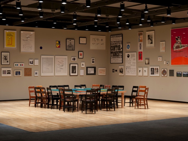
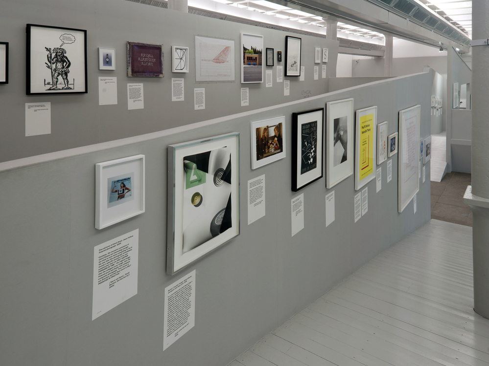
Over the next few years we typically exhibited the collection in large art venues with a lot of wallspace. The most natural approach here seemed to be expansive, salon-style hangs where the objects are clustered together to form a large non-linear cloud. This coerced you into registering the whole thing as a single gestalt first, and the individual items second, which seemed the right way round to me. The only other organising principle I recall was to put small things that really needed to be read lower on the wall and larger-format prints and posters up above, plus some subtler things like aligning all the eyes in the various portraits of people at actual eye-height. The other strategy we’ve used a few times is to get other people to hang the objects, taking the responsibility out of our hands. Sometimes this has been the starting point of a teaching workshop: a general discussion about different ways and means of arranging things, which leads to a collective settling on one of those ways, that we then implement together.
The collection is currently in the custody of 019 in Ghent, and will remain there or thereabouts for the foreseeable future. They have a kind of garage annexe to their main Kunsthal space which is *just* big enough to contain all the objects, so again this already dictates the density of display. It meant the objects had to be *very* carefully arranged to fit: a kind of Tetris hang that 019 worked out first on Google SketchUp. They then built modular walls that are very slightly smaller than the room, which I guess was easier and cheaper than refurbishing the original brick walls, but it also now means the collection can be quite easily moved to other temporary locations. Right now, for example, it’s on loan to LLS Paleis in Antwerp. They were able to transport the modular wall sections intact, then rearrange them to cut diagonally across the new venue, which is more like an apartment.
J: The effect of being enveloped by the salon hang does create a space that is “primed” for teaching and discussion. We taught a workshop together in the collection in 2017, while it was installed in the India Buildings in Liverpool. That hang also completely filled the space from floor to ceiling. I remember appreciating the immediate availability of the objects and their stories. You had placed the shipping crates in the centre of the room as a makeshift table, and in a space of that size everything was relatable. The defining gesture was pointing. Pointing with both arms at once to different things. Standing by one thing whilst directing attention back to another. One consequence of the collection being curated by circumstance, as you put it, is that it is very accommodating of other entry points. For me those might have been the objects that I knew best, that we have already mentioned, or some of those that were formative for me as a Dot Dot Dot reader, like the Wire album covers or the Naive Set Theory print.
S: I’ve come to think that the closest model is a kids’ nursery, where the walls are full of friezes—alphabets, shapes, colours – that are constantly available for teachers to refer to during specific exercises, while also always present as an ambient backdrop. As our editorial group has changed over time, and because we’ve never managed to all live in the same place at once, we’ve never been able to establish such a teaching environment as originally intended. Even during that semi-permanent spell in Liverpool, the teaching has always been necessarily short-term—one-off seminars, or at most maybe a week of classes. The most sustained use was at the Banff Centre in Canada, where we ran a five-week summer school in 2011. We were able to combine it with an exhibition in the Walter Phillips Gallery, a large white cube space in the same complex. We set the exhibition up as a classroom, mounting it together with the participants as I just described during the first week; it looked a bit like a film set with everything installed and lit quite dramatically in one corner. For the next few weeks, one of us would lead a seminar for three hours every morning, each based on a new topic and drawing to a greater or lesser extent on the journal and collection.
J: What’s your feeling about how the backdrop of the collection has been experienced by workshop participants? Does the primed space ever intimidate people, or produce inertia? I said that it allows many entry points for the teacher, but for some participants I could imagine it seeming like the walls are already full and the stories are already told ...
S: Maybe that’s true, I don’t know—I can’t remember anyone ever mentioning that, or otherwise sensing that was the case. But I think the way we use the collection is casual and open enough to preclude that feeling. We usually just grab stuff from the wall and literally bring it to the table. It’s not prescriptive. One of the other editors, Francesca, refers to it as a kind of 3D PowerPoint presentation.
J: Being in the presence of the collection does remove a layer of abstraction. There’s no need to rely on images. When you show something on a screen to facilitate a discussion, you probably choose a couple of images of that thing, but it has to be selective. It’s only a partial view that you provide. When the original thing is there, you might have chosen it, but everyone has the possibility of an encounter with it that’s not entirely filtered by you.
The Norman Potter magazine clipping that we already mentioned is a perfect example here. In an obvious sense: to be able to appreciate that those two images just happened to be printed front and back on the same leaf you need to see the original format. But, more importantly: because Potter had this saying about “no backs,” which I wrote about in the piece. It means that if you are going to have an opinion about something you have to be in its presence, to be able to see it from all angles. An image on screen can never substitute for that. That clipping being something that only reveals itself when you see it from the front and the back elevates its importance in any discussion about Potter. It’s a very economical representation of those ideas from the piece.
S: A presentation on a screen also tends to give things an archival feel and automatically fixes them in a linear sequence.
J: The collection is various. It includes artworks, design objects, and plain old unpretentious *things.* From the beginning, Dot Dot Dot was notoriously difficult to categorize in terms of disciplines and genres. Given that, it would be interesting to know *who* has participated in the educational situations that you’ve created with the collection. I assume that the context is always focused on art and design, but can you elaborate?
S: I think that’s changed as the scope of the journals has changed. That first exhibition in Tallinn happened because Peter and I were there to do a week’s teaching in the graphic design department at EKA, so they were inevitably the main audience. Two years later we presented the collection at the Lyon Biennial, an international contemporary art biennial with a completely different crowd.
When we first moved to Liverpool, we made a very public-facing installation of the collection at the Tate gallery. In that context it was really necessary to explain in the clearest possible terms both what The Serving Library is in general, then what the collection is in particular. To some extent, we had to try to stop the collection being seen as a bunch of artworks, but if you’re hanging things on the white walls of a major public museum that’s not easy! And then you quickly realise how convoluted the whole thing can start to sound: that this collection of objects started in relation to a graphic design journal, whose outlook gradually became broader … and then transitioned into this other form of publishing with a digital bias … and that along the way we amassed this collection of objects derived from the journals … which is actually intended as an educational space, and so on and so on. It sounds ridiculous: get to the point! But the whole project simply has a long, complex, open plan backstory, and precisely what’s compelling about being “curated by circumstance” is that it can’t be easily diluted into some short, concise summary. This is why the Serving Library can come across as obscure, or reticent, or insider-y, and another reason why I think it can only fully become itself in a context that has some longevity. It needs a committed group of readers, viewers and participants, ideally over a number of years, at one institution, in a single location. It’s a very slow-burning project. The danger is that people don’t stick around long enough to pay the requisite amount of attention to get it—whether on the website, in the pages of the journal, or in the space of an exhibition. And if they don’t, we’ve only got ourselves to blame.
J: Now, hopefully, you’ll have that longevity at 019, where I know that Valentijn Goethals, in particular, has been instrumental in taking the collection on. I’m interested to know how you feel about that transfer of some of the responsibility for it to a “younger generation,” so to say. I think I first heard the expression “post-Dot Dot Dot generation” around 2012, already almost ten years ago. I took it to signal a disregard for an intellectual frame of reference in graphic design. An urge to just be gratuitously visual and not feel compelled to explain or historicise something. In hindsight I think there was also a reaction against a mode of practice: autonomous, financially quite precarious, often art-world oriented ...
S: It’s a horrible term, the “intellectual frame” for graphic design. I always thought about what we did more in terms of depth and surface, all wrapped in a kind of contradictory humour. When we started Dot Dot Dot, most graphic design journals were about surface. There were things like Octavo or Eye, with their sharp, well-defined photographs of design work, and then Emigre, where its own design was a big part of the point. We consciously downplayed images in Dot Dot Dot. They were often in black-and-white, usually scanned rather than photographed, and generally rough and ready in one way or another. You could say we deliberately downplayed the surface to get at the depth below. Indeed, I often describe the objects as tips of icebergs, with the real interest submerged in the essays that accompanied them. In this sense, Dot Dot Dot was at least as literary as it was visual. It was also a reaction against the increasing role of marketing and PR in defining what graphic design was. Dot Dot Dot was a kind of relief from that, I think: a space for people who bring other interests to graphic design – music, literature, film and so on – with little desire to merely make things at the end of some marketing chain, making visual interpretations of ideas that have already been decided by someone else. There are many writers, spaces, organisations, publishers, bookshops and so on that have continued to support this alternative, more expansive idea of graphic design—the 019 collective being a fitting example, of course.
There are less positive developments, too. Gen Z and graphic design as self-centred storytelling, for instance, which in my view is always in danger of resulting in a kind of inane solipsism with no real connection to the world, or appeal to anyone beyond whoever made the work in the first place. In my experience, the best or at least most interesting students are inevitably those who come at graphic design from some other angle, who use it to channel things they’re otherwise invested in, intellectual or otherwise ...
J: Ever since the issue of Dot Dot Dot where you printed the accounts on the cover, there’s been a complex relationship with the print format, or with “resources” more broadly, in what you do. I interpreted the transition to the Serving Library format, with its emphasis on digital publishing via the website, as a reaction to the wastefulness and indirectness of print. How do you reconcile that with the growth of the collection, and it by now becoming something that needs institutional resources to maintain and activate?
S: We’ve always continued to print the journal alongside freely distributing it as PDFs, which for a good while now has made no sense whatsoever in terms of cashflow or the environment. Merely by “virtue” of being physical, the journal and collection are already objectionable.
As The Serving Library’s editorial group has changed over the years, we’ve tried to constantly renew and recycle the material we’ve published, which might be about architecture, music, literature, philosophy, mathematics, artificial intelligence, whatever. At the same time we’ve always had this foundational interest in publishing as a subject itself. But rather than simply writing about publishing, we’ve tended to deal with it operationally, by the *ways* in which we publish. As such, it was a deliberate move to keep the print journal going while making the same content freely available via the website It has allowed us to compare those modes of publishing—to variously point to the similarities and differences, particularly in the discursive settings like seminars that we’ve talked about.
Personally speaking, because my fellow editors don’t necessarily agree, my current feeling is that we ought to stop making the journal and stop releasing the PDFs, which would also of course wipe out the premise for collecting the objects, and instead treat The Serving Library more as a bank of material to be continually re-used in different ways, focusing our energy and attention on re-activating and re-animating what we’ve built up over the years. This partly comes out of the financial, environmental, and moral pressures that you brought up. But it’s also because I simply think the work we’ve done has been underused for all the reasons we’ve already touched on: the project’s pronounced opacity, the trouble in finding and reaching an audience with such broadband interests, and the difficulty in finding a long-term and accessible home.
At the time of this conversation the collection has been at 019 for about six months, and so far the pandemic has severely limited physical access to it, but we have done a couple of well-received remote teaching projects. In those cases, the collection was inevitably a rather abstract backdrop, but now all the objects are well-photographed and up on the website, the collection can perhaps begin to function in the virtual context too.
*