Hardy Perennials
2013
This lightly reworked version of a talk in two halves was originally published on www.servinglibrary.org and in Bulletins of The Serving Library 6. It was first presented at Yale Union, Portland, Oregon, during a 2012 exhibition of Saul Steinberg’s work for the New Yorker magazine.
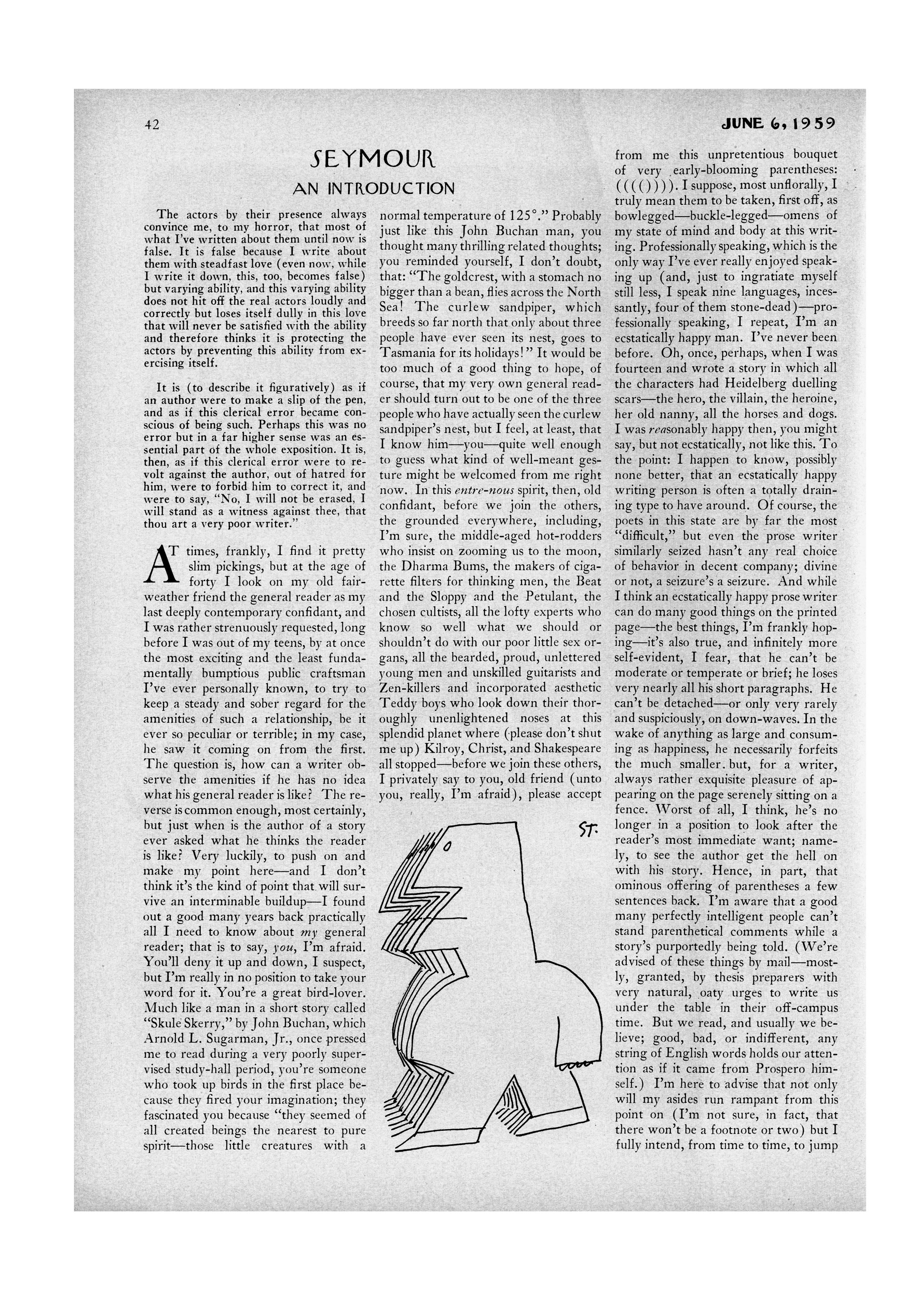
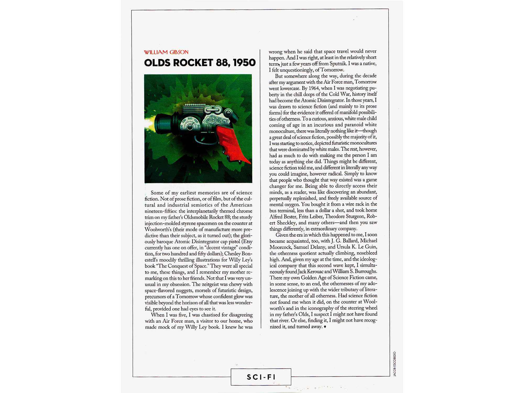
Lead image: Page 42 of The New Yorker, June 6th, 1959. This single page conflates this bulletin’s twin concerns, The New Yorker and J.D. Salinger, both of which are underscored, auspiciously enough, by Steinberg’s parenthetical man at the foot of the page.
*
I. ALWAYS THE SAME, ALWAYS DIFFERENT
Some years ago, I was invited to write a paragraph about my favorite magazine designs. After drawing a total blank, I concluded that this came down to something I’ve been repeating for so long that it’s become a kind of mantra (or maybe a prayer): design is a verb not a noun. The question “What are your favorite magazine designs?,” though, is clearly based on the inverse premise. Rather than the ways in which things get made (ways of working, approaches, attitudes) the invitation asks for a list of things themselves (results, objects, products), and so it’s anathema to my way of conceiving design.
But there’s a way to reverse—or parallel park—into the question, which is to point to those magazines that seem to capture those so-called “ways of thinking” more emphatically than most, those whose editorial character is ingrained and palpable. The immediate examples that spring to mind are certain familiar, stalwart and, as it happens, frequently New York-based publications: Harper’s Weekly, Time, Time Out, National Geographic, The New York Review of Books, and The New Yorker. All of which are getting on a bit in magazine years, and this is precisely the point: to an unusual degree they’ve been *designed by time,* that is, refined through a slow, sculptural process that involves hordes of individuals passing through the publication over an extended period, tinkering and modifying within strictly guarded limits.
In an industry marked by incessant redesign and ersatz improvement, and with a high turnaround of personnel often more intent on asserting their own personalities in the short-term than perpetuating an imprint’s personality in the long run, such slow, organic evolution is the exception rather than the rule. And it’s The New Yorker above all, to my mind, that manifests the benefits of such caution, having maintained a virtually unchanged editorial format for what’s now approaching 90 years.
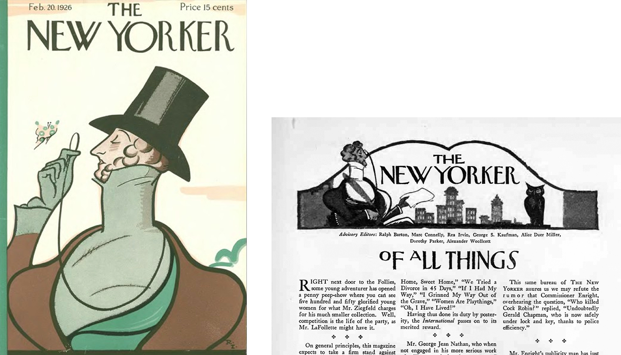
The New Yorker was founded in 1925 by Harold Ross [below left], an ex-newspaper man. He’d done his homework, and from the outset had a clear notion of the sort of thing he intended to put out: a distinctly local, sophisticated humor journal, in which the humor was “actually funny.” At the same time he had little idea how to flesh out such a broad sketch—no real precedent to speak of, and no ready pool of contributors beyond a few members of a few small literary circles, most famously the Algonquin Round Table, most of whom already wrote for other magazines.

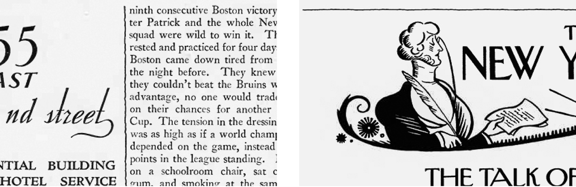
More than anyone else, it was another member of Ross’s circle, the self-titled “art consultant” Rea Irvin [above right], who was responsible for the way the first issue looked, and so to a remarkable degree for the way it looks today. It was Irvin who created and christened, for instance, that inimitable cover mascot Eustace Tilley. Variously remodeled, Tilley still fronts each year’s anniversary issue and presides weekly over the gossip section that was initially called “Of All Things” and latterly “Talk of the Town.” He also drew that distinctive headline font (since mechanized, digitized, and now known simply as Irvin type), and set those familiar two or three columns of text per page, dense and economical yet still highly legible.
But pulling The New Yorker’s graphic devices apart from its editorial approach in this way seems fundamentally wrong. What is editing, exactly? Deciding what to include, and how to include it; and at The New Yorker, verbal and visual aspects were always unusually symbiotic, that is, mutually supportive. Here are two quick examples. At some point fairly early on, Ross complained that Irvin’s text pages were “too loose,” needed “tightening up,” and proposed adding vertical rules between columns. He rejected Irvin’s first sample rule for being “too straight”—too rigid, too formal, not irregular enough; so Irvin returned to the drawing board in search of an adequately decadent replacement, and only after some days came back with a concrete line that matched the abstract one in Ross’s head. It remains intact today, if now horizontal.
Conversely, Irvin played a significant part in the evolution of the classic New Yorker cartoon—arguably the magazine’s most distinctive innovation—by establishing that spoken captions be set both italicized and in quotation marks. This double emphasis afforded punchlines a sense of pronounced immediacy, as if capturing a split-second, that made the previous convention—out of quotes and in plain roman type—seem stilted by comparison.
These two apparently minor details—a casual dividing line and an emphasized punch-line, a graphic change instigated by the editor-in-chief and a verbal one instigated by the art director—are typical of the attention to detail, equally focused on meaning and feeling.
The magazine advanced by such instinctive trial-and-error, a small committed core of New Yorkers floating between departments and roles, flailing towards something that didn’t yet exist—a compound identity no-one could quite put their finger on. By its own estimation, the magazine had a far stronger grip on what it wasn’t than what it was, a tendency marked by the self-reflexive tic of referring to itself in its own pages. One writer psychoanalyzed this tendency as amounting to “hanging up a series of mirrors in the hallway of the magazine’s childhood hoping to catch from time to time an accurate and becoming reflection.” Precisely: busy trying to perceive what it was in the process of becoming.
…
In a favorite typographic exchange, the German artist Kurt Schwitters declared: “Innumerable laws may be written. The most important is: never make it as someone before you did.” To which the English typographer Anthony Froshaug responded: “Schwitters is quite wrong. Make it as they did, unless the constraints are changed.” He went on: “When constraints change, the important thing is not to spray a random pattern across the page, but to assess the old, with the new, requirements.”
It’s important not to take Froshaug’s reaction as reactionary. If you dwell on this statement closely (say, for about 18 years, like me) you might come to realize the following points. First, that constraints, or circumstances, are rarely if ever exactly the same. Second, that all language, verbal or graphic, is by definition based on what someone before you did—on conventions. *Meaning is necessarily shared.* And third, that Froshaug is therefore simply, and complexly, making a case against novelty for its own sake, but absolutely for clear and lively communication. He would have liked The New Yorker.
Here’s an apparently restrained memo from the editor responding to some proposed change or other:
I think it would be a foolish mistake, would violently impair the whole personality of the magazine. I don’t think there is any argument in favor of it whatsoever … My definite conviction is this: the format of the New Yorker is all right; it’s been adequately proven all right by several years of signal success. All attempts to “high power” the magazine ought to be kicked in the teeth.
It would be wrong, too, to read Ross’s attitude—ethos, really—as mere conservatism. He’s by no means anachronistic or luddite. On the contrary, I’d claim instead that his stubborn decorum is quietly subversive. In refusing to bow to fashion, industry convention, or the whims or demands of readers, advertisers, and distributors, his editorial integrity is radical in the deeper sense related in these lines from “Dispersion,” an essay by New York artist Seth Price:
An argument against art that addresses contemporary issues and topical culture rests on the virtue of slowness, often cast aside due to the urgency with which one’s work must appear. Slowness works against all of our prevailing urges and requirements: it’s a resistance to the contemporary mandate of speed. Moving with the times places you in a blind spot: if you’re part of the general tenor, it’s difficult to add a dissonant note.
Note that this isn’t against speed per se, only the mandate of speed imposed by others. Harold Ross was a staunch man, described by one of his staff as “constitutionally resistant to change.” But he generally had good reasons to remain so. Until 1992, for instance, writers were named only at the ends of their texts, and the reasons were entirely pragmatic. For starters, few articles were more than a page long, so the author’s name was easily found anyway. More interestingly, most of the early writers were moonlighting, and had to sign their work with clandestine initials or pseudonyms. In those earlier, slimmer years, Ross was also often embarrassed by the number of pieces in a single issue written by the same people, and preferred to hide the fact. For similar reasons the magazine managed to get by without a table of contents until 1969.
As The New Yorker gathered longer articles and a reputation, its own stable of writers became more than happy to be credited. But even though Ross’s sound, if somewhat neurotic, reasons to downplay individuals gradually dissipated, he chose to maintain the convention of names at the end for a new, emerging reason: the anonymity served to establish a first person plural, a “we” that was not only a cipher for a collective editorial, but for New Yorkers generally—a demographic flattered by association with the magazine’s gathering sophistication. And so Ross thought it prudent to push the notion that, in a vague but pervasive way, The New Yorker was made not only for but also by its readers.
It might sound counterintuitive, but it seems that the relative fixity of the magazine’s structure allowed for the relative chaos of its burgeoning content, and that Ross’s and Irvin’s founding decisions were less important than the fact that they rigorously maintained them. In this way, The New Yorker was allowed to *become itself*—to grow into its fancy dress. The content was not simply forced to fit the form. While Ross saw that sticking within confines was completely productive, a decent compost in which to flourish, he was equally adamant that the writing always came first. In most magazines, contributions are written or cut to lengths dictated by the format. Not so at The New Yorker, where layouts are preferably reworked or pages added—often to extreme extents. “When I started this magazine,” Ross wrote, “I didn’t allow an art editor within three blocks of the premises and gave the type the right of way.”

This is typical: in accounting for the editorial essence of The New Yorker, I paradoxically bounce from applauding its restrictions and conventions, to equally applauding its openness and elasticity. Which leads me to think that the real point to be made is how the magazine’s singular verve isn’t the result of one or the other but an active synthesis of the two, the simultaneously careful and haphazard negotiation of freedom and order. In short, The New Yorker displays the defining quality of any decent magazine—that it’s essentially a *plastic* medium.
This patient, barely perceptible development continued through the tenure of Ross’s equally legendary and equally steadfast successor William Shawn. The magazine’s first and only real rupture came as late as the early 1990s, following the appointment of Tina Brown, a 38-year-old Englishwoman fresh from a successful revamp of Vanity Fair. Brown refurnished the magazine with unabashed populism: gossip, money, power, profanity, and celebrity (Roseanne Barr was invited to guest-edit an issue), all of which met with the sort of indignation and resistance you might expect from the older school of readers and writers.
Despite Brown’s controversial direction, the immediacy and extent of which was of course absolutely alien to the magazine’s regular crawl, when current editor David Remnick took over six years later, consensus opinion suggests he swung the magazine back to its relatively staid equilibrium, though he also maintained many of Brown’s innovations like color photography and edgier illustration. If you compare this week’s issue with the original 1925 one, though, the similarities remain far more striking than the differences.
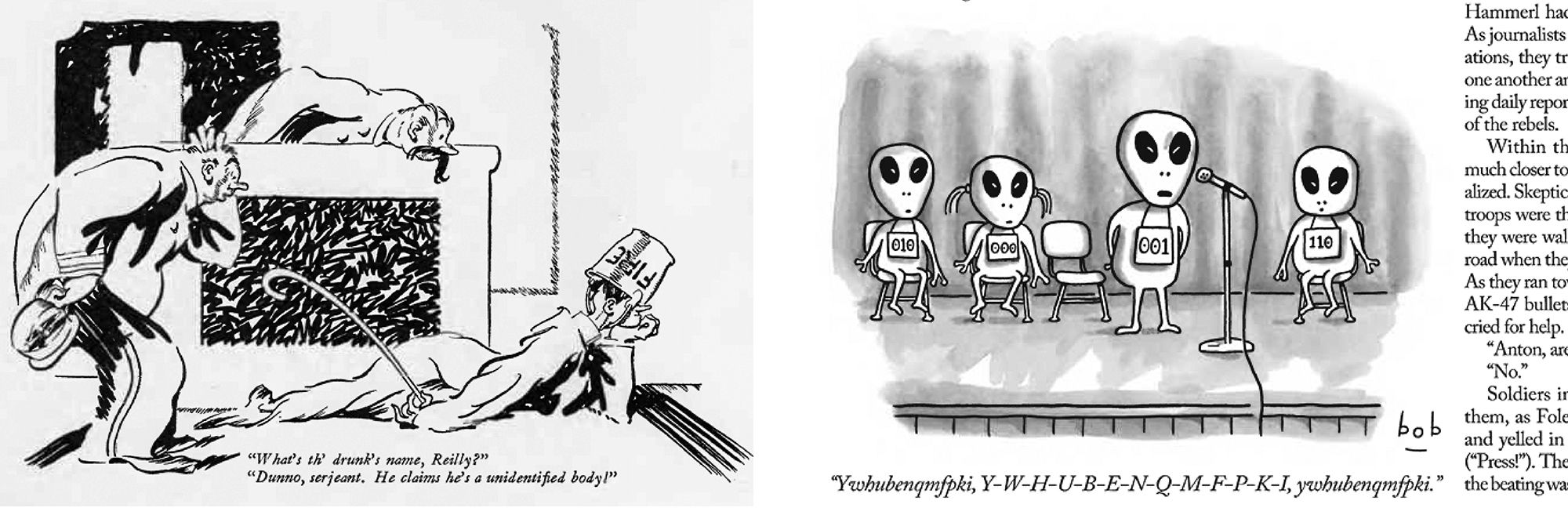
At this point, some 90 years after Ross set it up, The New Yorker is an extremely well-oiled machine, one that’s instituted its own set of standards and an internal sense of proportion. The hardline is such that when a reader comes across something like this page from a sci-fi special issue a couple of weeks ago, with a circumscribing box, sanserif (i.e. sans-Irwin) type, and more white space than normal at top and tail, what would amount to a minor move for any other magazine seems comparatively seismic in The New Yorker. It’s surprisingly surprising, and I like to think that this fosters a sensitivity to subtlety.
As a typographer, one of the more enduring lessons I ever absorbed came out of a discussion with a teacher of mine called Paul Stiff. We were talking at the level of micro-typesetting, specifically about the proper way to order and space the various pieces of punctuation in a sentence that ended with a quotation within a larger quotation that was then footnoted:

Clearly, the issue not as straightforward as it might initially seem. Apart from considering the differences in British and American standards, which prioritize linguistic and aesthetic sense respectively, further decisions involve more slippery conventions, plus the possibility of manual spacing to tighten the whole thing up. Basically, there’s a whole microcosm of possibility down there. Paul’s point was that if you can make sound judgements at this level of detail, the same sensibility transposes to a broader scale, in terms of what we might more grandly call a sense of “composition.” To repeat an adage that the later Zen-Buddhist Salinger would probably agree with, this kind of learning involves seeing rather than looking, otherwise known as *insight.*
It brings to mind a cluster of notes by architect Rem Koolhaas—from the book S, M, L, XL, aptly enough—that record his first impressions of meetings in Japan. It’s written as a sort of long-form haiku that nicely performs the precision he’s in the process of absorbing from his hosts:
We had been 6 times to Japan
each time for 7 days;
each day we had “meetings”:
25 people together from 8 A.M. to 10 P.M.;
at each meeting: 200–400 points.
#1: please choose between 2 greys
for the bathroom;
#113: foundations don’t work.
To Koolhaas’s (Western) sensibility, this sequence—in which they discuss the choice of decorative bathroom tiles before sorting out the building’s foundations—is absurdly out of whack, and he wonders whether this betrays either a Japanese inability to define hierarchy (a disturbing lack of proportion or pragmatism) or is perhaps a deliberate strategy to keep foreigners on their toes. Then he registers a third, more exciting hypothesis: that for his Japanese colleagues no point is ever unimportant. This, he muses, would explain the bewildering, frequently maddening attention to detail and, by extension, the unusual density of quality in Japanese building. No single decision is considered any more important than any other: god is in the details and the superstructure.
The New Yorker is jam-packed with these kinds of lessons at all levels: the benefits of its eccentric orthography (like those notorious umlauts used to distinguish twin vowels: “reëvaluate”); how to fit so many words within such a thin column with so little hyphenation; the easy articulation of its complex listings sections; and on up to the eminently foldable, roll-able, pocket-able, durable paper. In all these cases, consider how easy they are to use, then comprehend why. Such careful details populate countless other publications too, of course, but again, The New Yorker is exemplary because of its unusual degree of consistency. As John Peel used to say about postpunk stalwarts The Fall, it’s “Always the same, always different.” Robin Kinross put it like this: “The mannerisms are apparent but they don’t stay still.”[1]
…
II. WHEN CANTANKEROUS ATTITUDE BECOMES FORM
Curiously enough, the novelist J.D. Salinger was outspoken on the subject of graphic design, and his antagonism was formative to my own ambivalence. From the point of view of an angry young man, his was always a usefully offset vantage—that of an unusually invested author who was (via the bitter mouthpiece of Holden Caulfield) famously against “phoniness” in all its forms. This remains a fairly good euphemism for much that operates under the name “graphic design” these days.
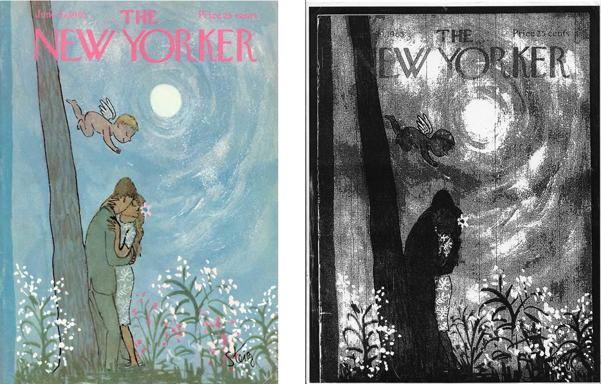
In the wake of the success of The Catcher in the Rye in 1951, which is to say, once he’d acquired a certain clout in the publishing world, Salinger issued a caveat in his contracts that forbade illustrations to be used on the covers of his books. In effect, he was making sure to limit the amount of damage graphic design—then in the process of shapeshifting into “marketing”—could do. The particular instance that supposedly triggered Salinger’s rancor was a fantastically inappropriate cover drawn for a collection of short stories titled after one of them, For Esmé—with Love and Squalor.
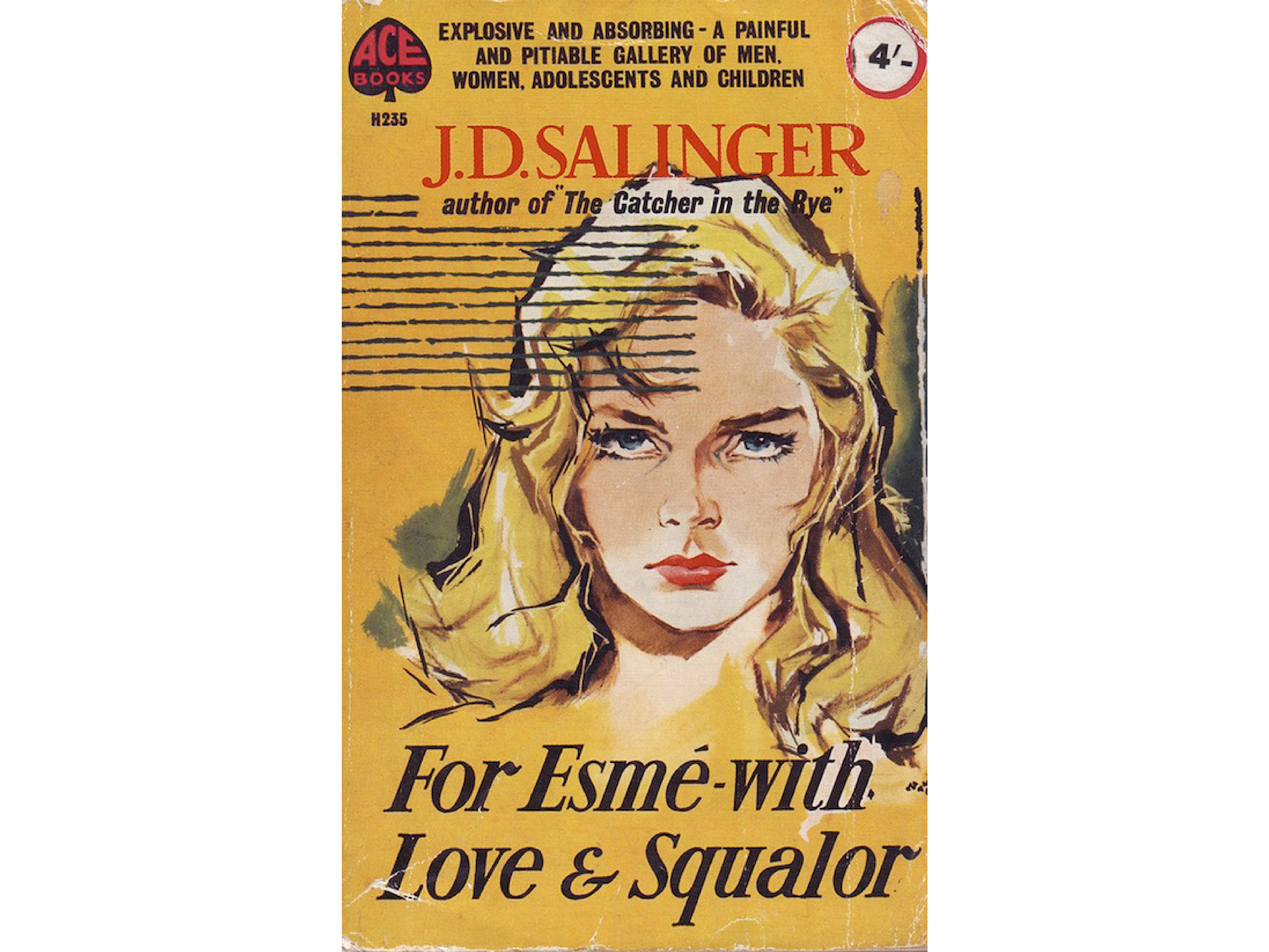
The Esmé in question is, typically for Salinger, a gifted prepubescent, whose kindly conversation redeems a soldier on the verge of a nervous breakdown during the Second World War. The illustration on this edition, however, stylistically reduces the book to pure pulp, its suggestiveness—of “a painful, pitiable gallery of men, women, adolescents and children”—far removed from Salinger’s tender heroine, to say the least.
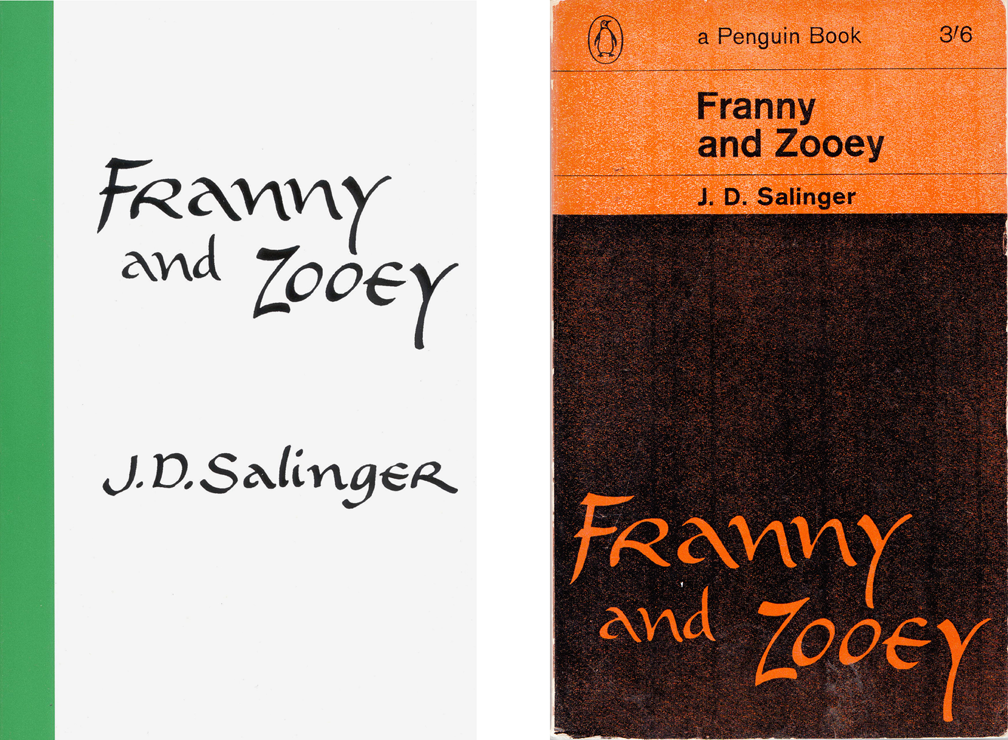
Here’s a clear and unusually exaggerated case, then, of a form that, while admittedly following its commercial function, is clearly way out of line with its content. To use a term I’ll come back to later, it’s *equivocal* in the sense of being non-specific; the same style could be readily applied to different instances, as a clip-on part. This Esmé is, then, clearly an imposter … a case of false identity. An *unequivocal* form, on the other hand, would correspond to that sense of inevitability I mentioned earlier: conclusive, plausible, and hard to imagine otherwise. I’m not suggesting the seductive, marketed Esmé here is irrelevant—she’s well made-up to sell books, after all—only irresponsible. The numerous editions of Salinger’s work published since his forbidding clause include some lively responses, such as the oddball calligraphy of this early American volume, or this subsequent Penguin edition, which manages to stick within the rules of their seminal series design by “quoting” the former lettering, effectively turning it into an image and so in accord with their aesthetic policy.
None are more in tune with Salinger’s attitude, though, than this set of covers, published by Little, Brown, and happily still in print.
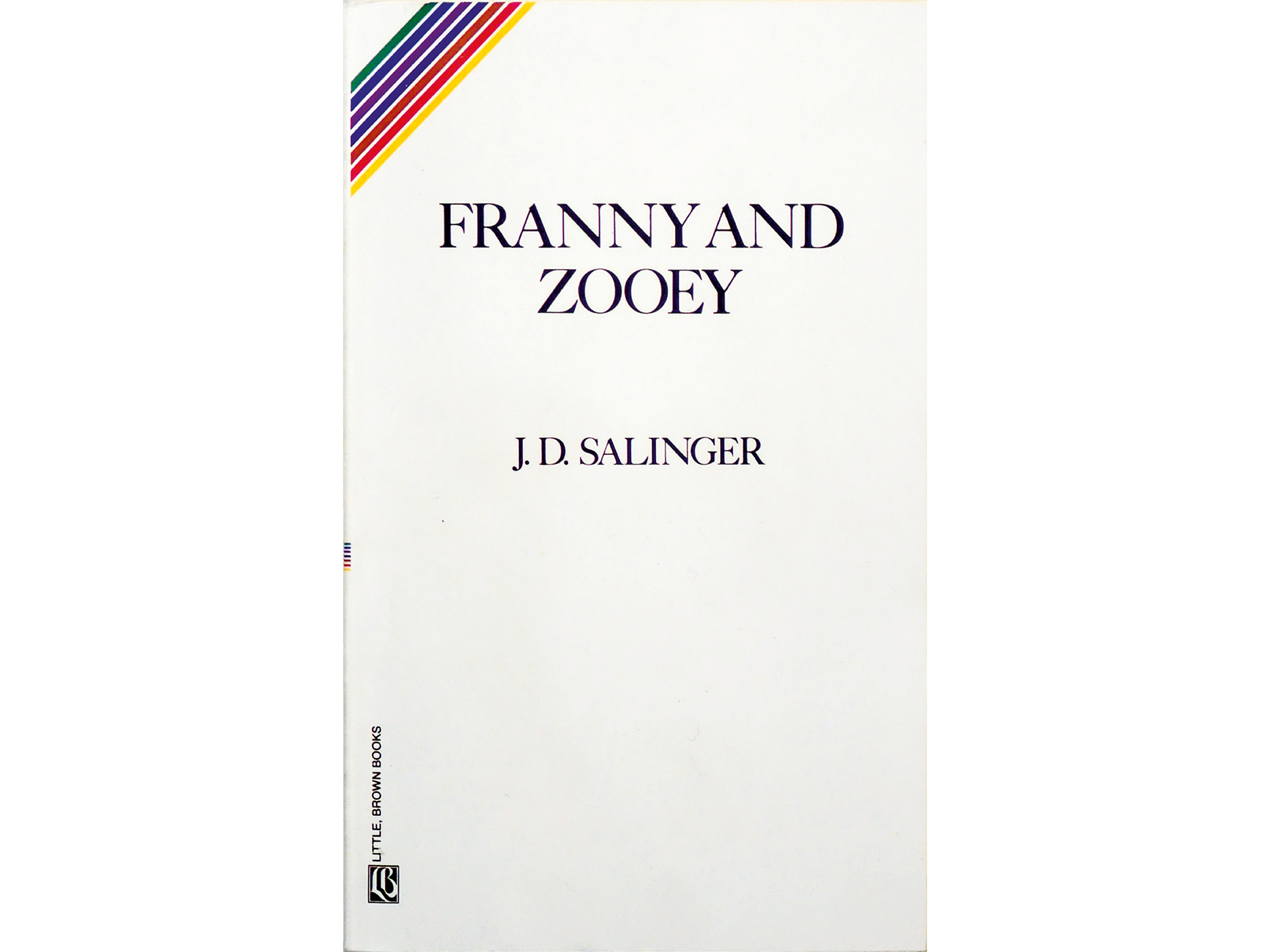
I like to imagine that Salinger himself was responsible for these editions, though obviously I don’t think that he literally prepared the artwork or wrote a brief, only that they correspond entirely with the sensibility of his prose. That’s to say, the Little, Brown books seem *inevitable*: a family of modest, diminutive paperbacks typeset without pretension or fancy, with an uncoated card cover only slightly stiffer than its light-as-a-feather interior, which makes them easy to pocket and cheap to mail; the title and author in unaffected, unspaced capitals; and literally cutting across such austerity, that still-surprising abstract rainbow at top left. All seems fully consonant with the maverick Zen philosophy Salinger was working out in and through his later fiction.
It’s useful to pause here and quickly summarize Salinger’s bio- and bibliography. After attending various colleges in and around New York, then an apparently traumatic stint in the War, Salinger began publishing short pieces in the higher-brow society and literary magazines of the day. His first piece published in The New Yorker was “A Perfect Day for Bananafish” in 1948. The Catcher in the Rye, his only proper novel, was published three years later to immediate success, followed by only three more books in his lifetime: Nine Stories (the alternate title of For Esmé ) in 1953, Franny and Zooey in 1961, and another double bill, Raise High the Roof Beams, Carpenters and Seymour: an Introduction in 1963. All of which were assembled from stories previously published in (and in a couple of cases, rejected by) The New Yorker. They became increasingly, and in the end exclusively, concerned with chronicling the Glass family, an Irish-Jewish pack of supernaturally gifted and singularly precocious siblings—particularly its eldest brother, sage, seer, mystic, and suicide, Seymour, who shoots himself in the head in the last line of “Bananafish,” along with his younger brother Buddy, the family’s happily secluded nominal biographer.
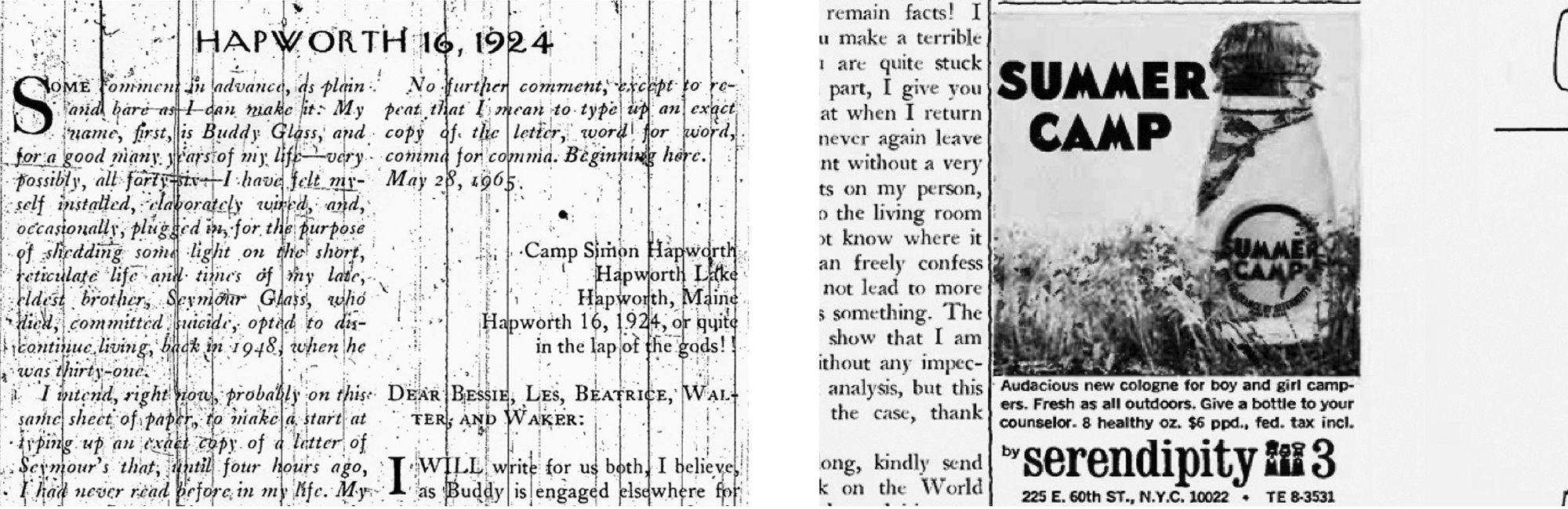
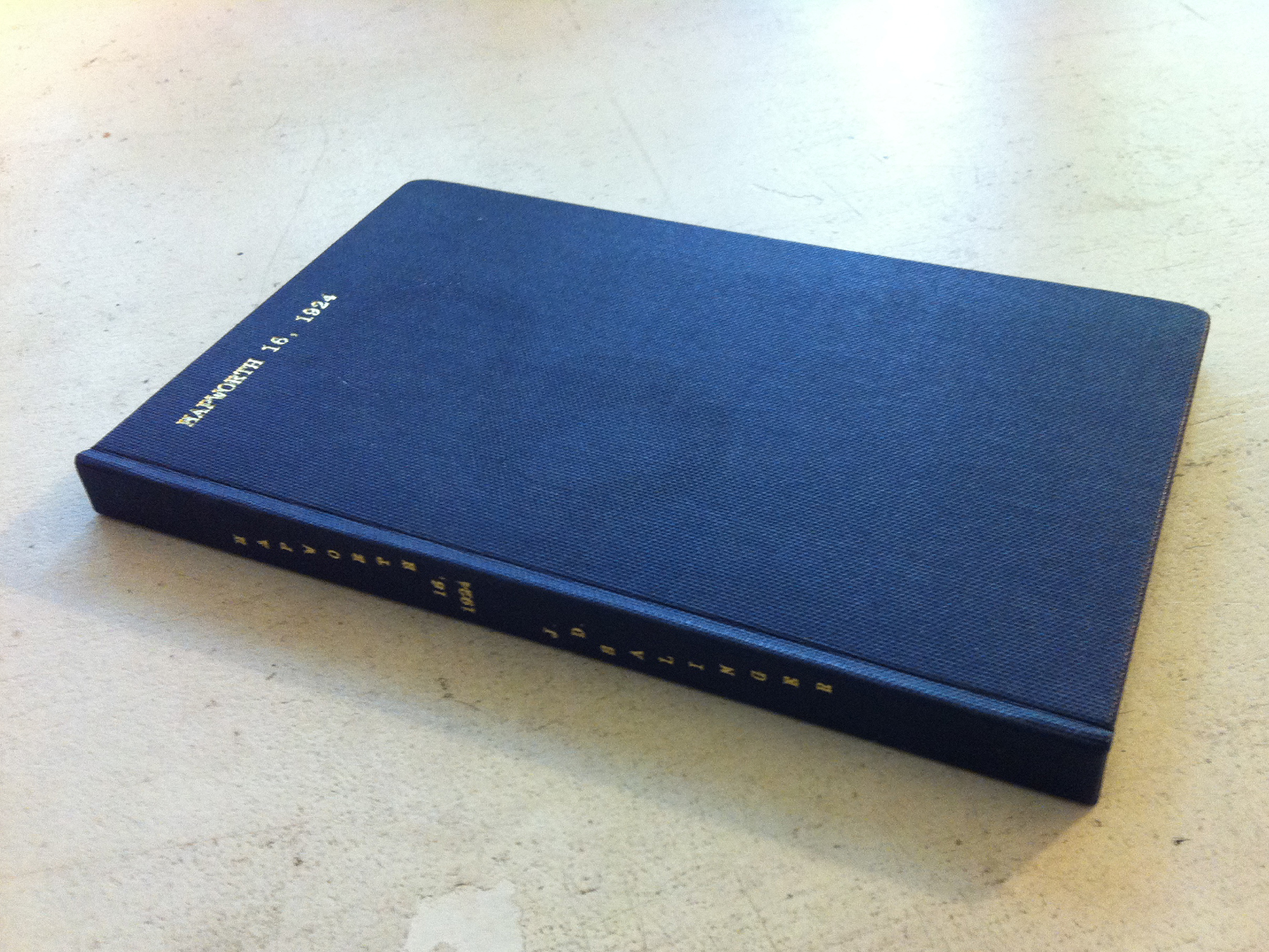
In 1953, in the wake of the attention lavished on The Catcher in the Rye, Salinger withdrew from public view, then spent the remainder of his life isolated, like Buddy, in rural New Hampshire, due north of New York. Persistent rumors claimed he was writing further Glass episodes with no particular intention to release them. What remains his last published story, “Hapworth 16, 1924,” was published in The New Yorker on June 19, 1965. In fictional chronological time, however, this is actually the first instalment of the Glass saga, in the form of a 26,000-word letter sent home from summer camp by an insanely precocious—and perhaps literally insane—seven-year old Seymour. The story takes up most of the issue, running over some 80 pages. Unlike Salinger’s other New Yorker pieces, though, it was never turned into a book, most likely because it met with an embarrassed silence, generally deemed a conceit too far along the obtuse, mystical trajectory his stories had followed since he was first published in the magazine. It was taken as evidence that Salinger was “on his way to hell in a handbasket,” as one of many critics put it.
When I first came to New York in 2005 there were two, let’s say, “official” ways to read “Hapworth.” First, by acquiring a copy of the original issue, which was by this time, some 40 years after publication, selling upwards of $400, despite the magazine’s massive circulation at the time. (It must’ve been around the 400,000 mark in 1965; it’s currently just over a million.) Or otherwise by finding an archived copy either bound in volumes or recorded on microfilm at a well-stocked public library—though reportedly, pages 32–118 have been ripped out of many library copies.
You could of course try to get hold of a second-hand duplication of either, but even these weren’t easy to come by. “Hapworth” was also conspicuous by its absence on the burgeoning internet when I began looking in earnest back then, presumably due to Salinger’s notorious vigilance. Years earlier, he had won a protracted court case against a British biographer, Ian Hamilton, that resulted in Hamilton’s book being cut to around half its original length and so a shadow of its former self. Basically, Salinger was someone whose copyright was taken very seriously.
So one of the first things I did on moving to New York was pay a visit to the Public Library on 5th Avenue. Clearly, I wasn’t the first person to have had this idea. The microfilm was so badly warped that I needed a librarian’s help affixing it to the spindle, and the scratches were so severe that I had to reverse the printer setting to white on black. Even then the text was barely decipherable. Three hours, $12 in dimes and a half-dozen paper jams later, my expedition was complete. I read “Hapworth” slowly over the next few weeks, four or five pages at a time. This was partly due to the strain on my eyes of the blurry white-on-black text, but mainly because I suspected it would be the last thing I’d ever read by Salinger for the very first time.
The last paragraph is actually lifted wholesale from an article I read in 2005 in the Brooklyn Rail, which prompted me to make the same expedition. It was written to celebrate the release of The Complete New Yorker, an 8-DVD-ROM archive containing half a million pages from all 4,000-plus issues since 1925. I became intrigued by the various entwined values suddenly in flux: the auratic value of the lost story, the romantic value of the pilgrimage to the library, and the monetary value of the original publication—all of which were significantly heightened by Salinger’s seclusion. I was curious, too, to see how the release of the digitized archive would recalibrate this delicate economy, given that such as the Seymour issue mentioned at the start of this piece would suddenly be made available, cheap, convenient, pristine, and to some sensitive types, perhaps, a little mundane.
Of course, those eight DVDs were already almost obsolete. After only a couple of years they were supplanted by a portable hard disk, and now the whole archive is online and fully available to subscribers. As it turns out, the monetary value doesn’t seem to have been affected (original copies of the “Hapworth” issue remain at a steady $400), though I expect the numbers of romantics making the pilgrimage to the New York Public Library have fallen off a bit.
The NYPL’s fiche reader can output directly to a laser printer, which is the source of the distressed fragments below. I want to point to three things in these scans. First, Salinger’s opening line in “Hapworth,” which could double as an epigraph to the present essay: “Some comment in advance, as plain and bare as I can make it.” Second, the small advert for a fragrance called “Summer Camp” on sale at a store in Manhattan called at Serendipity 3, which was purported by Salinger cultists to be a postmodern hoax in reference to Seymour’s camp Hapworth. And third, how the scratches from the fiche’s general wear and tear trace the story I just told, an unwitting graphic testament and example of what I’ve come to think of as form as a kind of deposit or side-effect — a form of *evidence*.
The French philosopher Jean-Luc Nancy describes something similar in a chapter on “The Vestige of Art” in his book The Muses. His “vestige” approximates “the trace of a cause” as opposed to an image of the cause itself, which isn’t quite the same thing. The distinction is admittedly infra -thin, but thankfully he magnifies it with two simple examples: the smoke of a cigarette rather than the cigarette itself (or its ash), and the footprint of a shoe rather than the shoe (or body) of the person who made it. Both are clearly *traces of the causes of specific actions.* All of which is blatant enough when a machine inadvertently yet conspicuously creates this vestige to trace some 40 years of committed readers. However, as you might have guessed, I want to claim that there’s an approach to designing, or form-giving, that precipitates a similar state—a sort of form-taunting.
Now, I said that there were two official primary sources of “Hapworth” in the archives, but there was a third, less official means, too—a notorious bootleg published in 1974. The same year, a newspaper report claimed that, “During the last two months, about 25,000 copies of these books, priced at $3 to $5 … have been peddled in person to bookstores at $1.50 each by men who always call themselves John Greenberg and say they come from Berkeley. Their descriptions have varied from city to city.”
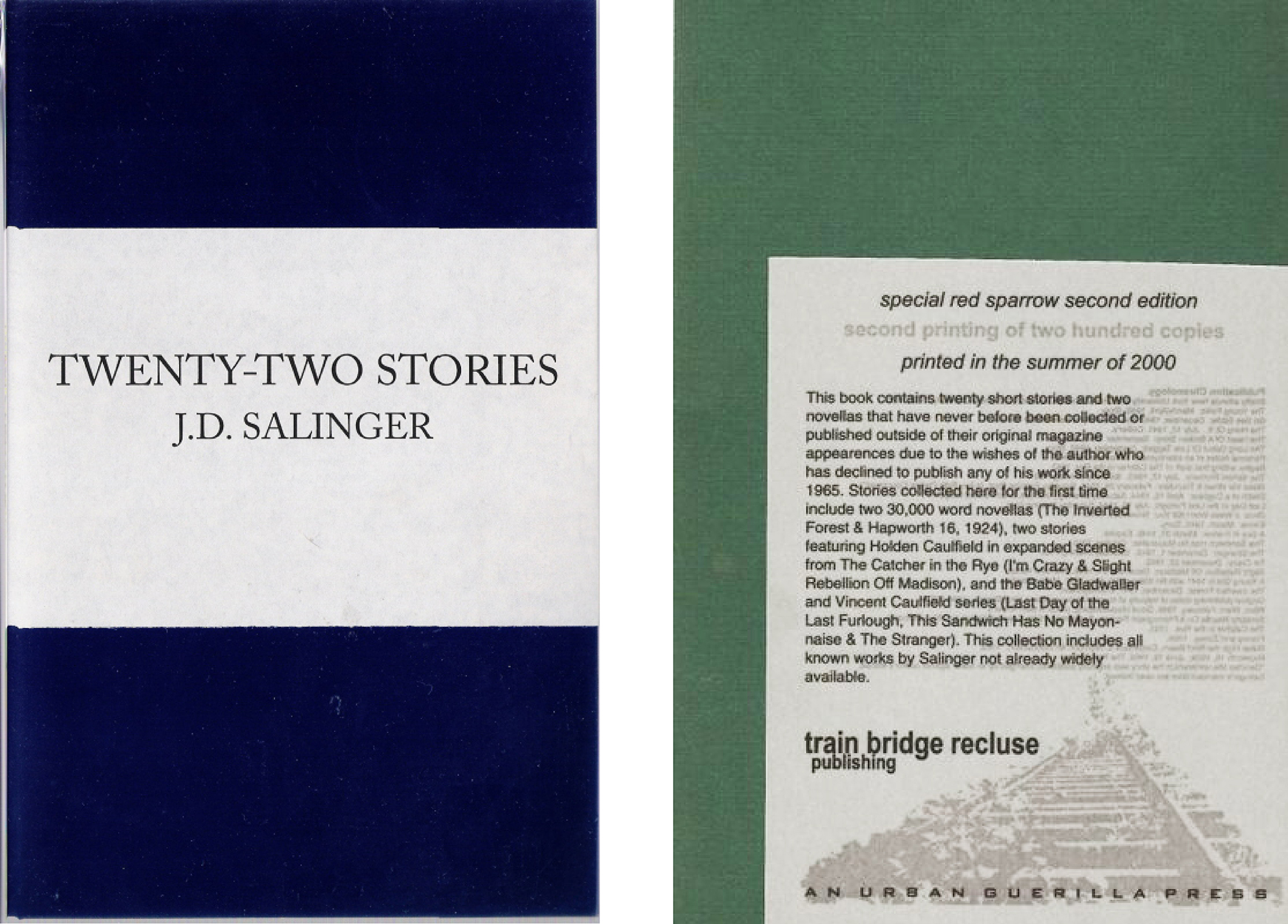
Here’s the cover of the original bootleg—at least, as far as it’s possible to know these things second-hand—that now retails online for at least $1000. Copies were eventually seized by Salinger’s lawyers and pulped. And next to it, a remake from 2000, which was similarly apprehended and the bootleggers penalized. Then sometime in 2007 I inadvertently came across a couple of password-protected PDFs of what I assume to be the second samizdat on an Eastern European website. Fortunately the password was attached, and I was able to make an edition from that PDF as a wedding present with a cover the same indigo blue as the original bootleg. And here’s another produced in Amsterdam around the same time by a tiny hobbyist imprint that shall remain truly nameless.

It perhaps goes without saying by now that the form (or in this case, un-form) of this genealogy of covers is distinctly drawn from the specific circumstances of their production. It just about bears repeating one more time that, as such, they come across as inevitable and unequivocal. It’s hard to keep tabs on exactly which of the various “underpublished” stories (as they’re nicely known) these pirate editions contain, but hidden in the back of at least one of them are two pieces from 1970 ascribed to a certain “Giles Weaver,” who’s rumored to have been Salinger writing under a pseudonym. A fairly solid case for the claim was made in a short article by Mark Phillips from 1985. If it is Salinger, the ante of curiosity is upped by the fact that this remains his most recent output by a considerable margin of five years since “Hapworth.”And for someone as revered and reclusive as this particular writer, this is obviously a Big Deal.
Giles Weaver’s writing is an enigma in its own right. His entire body of work comprises two installations of what are titled “Notes from the Underground” in the form of a “log” (that anticipate all the characteristics of what we now know to be a blog) published in subsequent issues of The Phoenix, which was a self-proclaimed “pacifist literary journal” founded in the 1930s. Terminated by the War, the journal rose again, phoenix-like, in 1970, and Weaver showed up in the first two numbers of this new series with a pair of markedly odd diatribes that often border on gibberish—but fascinatingly so. Other than the fact that they describe locations and daily affairs that seem fully consonant with Salinger’s life in New Hampshire (not to mention a pronounced sense of resentment and an abiding interest in Eastern religion), what makes the case particularly convincing, it seems to me, is that the writing doesn’t merely abide Salinger’s previous style or interests, but rather anticipates what they might have plausibly become if carried on along a certain manic trajectory. That’s to say, Weaver is either Salinger in disguise, or someone who could anticipate and write a plausible impersonation of how Salinger might have been writing five years on from “Hapworth”—which as an act of mimicry in itself would be an impressive literary feat. Here’s a sample:
Dear Phoenix, This here isn’t meant to be a definitive analysis of our situation and if anyone pleases themselves to regard it as such or pleases themselves to publish it as such I will be pleased to render unto them a knuckle sandwich right in the kisser not via typewriter but with my fist, so to speak, so to speak due to the fact of the matter—that is to say, I find bloodshed a form of communication.
Which, as Phillips notes, is a stylistic maneuver so wholly Salingerian that it’s hard to conceive anyone else writing in quite the same manner.
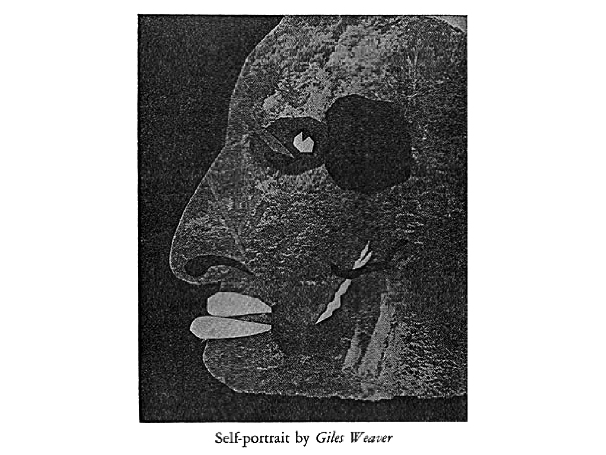
“Weaver” prefaces his log entries by listing the contents of an envelope sent to the editor of The Phoenix along with his manuscript, including this self-portrait, a Xerox of a paper collage that’s duly printed, per his request, with the piece. If this is Salinger writing, it’s certainly an intriguing about-face: the publicity-despising writer who repeatedly rejects any and all depictions of his prose and absolutely refuses photographs of himself, here providing his own self-portrait to front what essentially amounts to an autobiographical diary.
There’s a ring of truth-being-stranger-than-fiction about the Weaver case, and here are two more pieces of prosecuting evidence. First, Salinger’s character names often tended towards thinly-veiled double entendres, the most famous and obvious instance being “See-more Glass” as alluding to the saintly visionary of a sensitive, fragile family. With this in mind, says Phillips, could “Giles Weaver” not serve to similarly cloak a surreptitious weaver of guile? Second, a biographical note in The Phoenix describes the writer as “the pseudonym for a writer living like a solitary bushman in America’s Kalahari.” Hmn.
…
To wrap this up, in the late 1990s rumors started to circulate that a book edition of “Hapworth” was finally due to be released by a tiny publishing house from Virginia called Orchises Press. Although a catalog number appeared, further details were suspiciously scarce — a series of deferrals and little else. Eventually I stopped checking its progress, but a couple of months after Salinger died at the age of 91 in January 2010, New York magazine ran a short story by the founder of Orchises Press, Roger Lathbury, who had written to Salinger on a whim back in 1988 saying he was keen to properly publish what still remained the author’s most recent and severely underpublished output. He was duly shocked, he recalled, to receive back a typed note, signed “JDS,” saying he’d consider it.
Lathbury received a follow-up in the spring of 1996—that’s eight years later—from Salinger’s agent to announce that a personal letter was on its way granting the request, along with a caveat of exacting standards. It seemed that Lathbury had somehow been positively vetted, presumably for not being pushy or otherwise representing the commercialism that Salinger resented. A breezy letter from Salinger followed, proposing lunch, followed by a phone call, and the two met the next week at the National Gallery of Art in Washington DC.
Lathbury had hastily prepared a hardback dummy he hoped would satisfy Salinger’s demands. He made sure, for instance, to set the story with plenty of leading—the space between lines of type—to ensure that, quoting one of Salinger’s letter’s, “Seymour could breathe.” This, he realized, would also usefully serve to bulk up a novella that, although long for a magazine, was notably short for a book. And this in turn appeared to solve another problem: Salinger had stated that he strongly preferred type on a book’s spine to read horizontally rather than vertically—that’s to say, across the width of a spine rather than along its length. Obviously, the thinner the book was, the tricker this would be to achieve. Lathbury goes on:
As I worked out the specifications, I tried deliberately not to make the book “elegant.” He had been quick to object to my use of the word, which to him connoted narcissism and preciousness. The buckram he asked me to use is the functional, unpretty material that libraries use to rebind worn-out books. Hapworth, the book, was to start out this way: straightforward and pure.
The two met to discuss further protestant requirements: no running heads, a plain blue fabric headband to match the plain binding, no dust jacket (of course), and on the buckram cover nothing more than the title and Salinger’s name, in that order. In the months that followed, a few more esoteric requirements were insisted upon, including the remarkable condition that distributors and stores would have to buy the book for the same price as the customers: no wholesale and no mark-up. In other words, the sole profit that any bookstore wishing to stock it would be the privilege of being able to sell it!
Such estimable arrogance continued to drive Salinger’s increasingly manic art direction: on second (or forty-second) thoughts, the title and name were to be omitted from the cover and left only on the spine. Then, when Lathbury regrettably informed Salinger that the spine was actually too small for the type to be stamped cleanly into the fabric, the author proposed that it should run downwards, strung out on a very slight diagonal as a minor concession to legibility. According to the by now heroically long-suffering Lathbury, the dummy spine he had made from these specs was “awful: ugly, difficult to read, ostentatiously weird.” In my humble opinion, though, it’s about as close to sublime as graphic design—if you can call it that—gets: a graphic equivalent of that little bit of perfect prose about bloodshed-as-communication. So few elements, such an outlandish result.
Gilles Deleuze once described the nature of true friendship as the ability to apprehend the particular nature of another’s madness, the nuance of their peculiarity. If the appreciation of art (or literature, or graphic design) can be considered an equivalent kind of “friendship,” one that involves an analogous kind of connection and empathy, it follows that our appreciation of a certain work amounts to our recognizing its own intrinsic “madness,” its own idiosyncratic trace that guarantees it sprung from one mind, and one mind alone. This rings entirely true to me. It grasps the nature of what’s particular about Salinger’s writing and these book covers, both born of the same temperament. And so it seems fitting that Salinger’s last work ends up bound in a cover analogous to the story’s return to childhood—a kind of Zen form, if you like. (It’s surely impossible to make a claim for “Zen” in this context without sounding faintly ridiculous, though if I could make it sound grounded rather than flighty, this is still the word I’d want to use.) And so it came to pass that a few weeks before the book was finally due to come out—now almost a decade since Lathbury had first proposed it—Salinger pulled the plug on the whole project, on the grounds that Lathbury had registered the book with the Library of Congress, distributors had taken note, and advance copies were being touted on the internet. Unforgivable.
More recently, though, someone else (who had obviously read the New York magazine piece) made the edition that Orchises Press didn’t—a couple of people, in fact, at the Jan van Eyck Akademie in Maastricht in 2010. They did a remarkably thorough job, and the result is as pure as surely even Salinger could hope for.
This returns me, finally, to that earlier point about insight. Learning how to regard, to really *see* this kind of work—products that emphatically capture the thought that accompanies making—fosters working in the same manner, with the same care, with the same attention to detail, and at the same patient rate. Such objects are thus inherently pedagogical: lessons can be learned, and those lessons put to further use.[2]
I have no real sense of how clearly the two halves of this essay overlap—or need to, really. But at the risk of repeating myself one more time, the point of bringing them together here is that the similarly slow, stubborn attitudes of the collectively-minded New Yorker and the single-minded Salinger are similarly manifest in inevitable and unequivocal products. At once impervious to passing fashion and received wisdom, they are sibling instances of bracingly neurotic design.
*
Notes:
1. Sometime between presenting the original talk and writing up the present text, I came across the following announcement: “But starting on Monday, New Yorker fans are going to notice some small but subtle design changes [...] The magazine is updating its table of contents, contributors page, ‘Goings On About Town,’ Briefly Noted and Fiction sections. These changes include changing the number of columns, redrawing the Irvin typeface and introducing Neutraface as a secondary one. [...] Mr. Remnick said he expected to receive some complaints from readers next week.” (The New York Times, September 15, 2013)
2. Sometime between presenting the original talk and writing up the present text, I came across the following announcement: “Now, with the release of a new biography by David Shields and Shane Salerno (and the companion documentary), comes the claim that five new Salinger books will be published between 2015 and 2020—including The Family Glass, an anthology of existing Glass stories as well as new material and a genealogy of the eccentric clan ….” (www.entertainment.time.com/2013/09/07/discovering-j-d-salingers-lost-stories)