The Truth About Hollis
2013
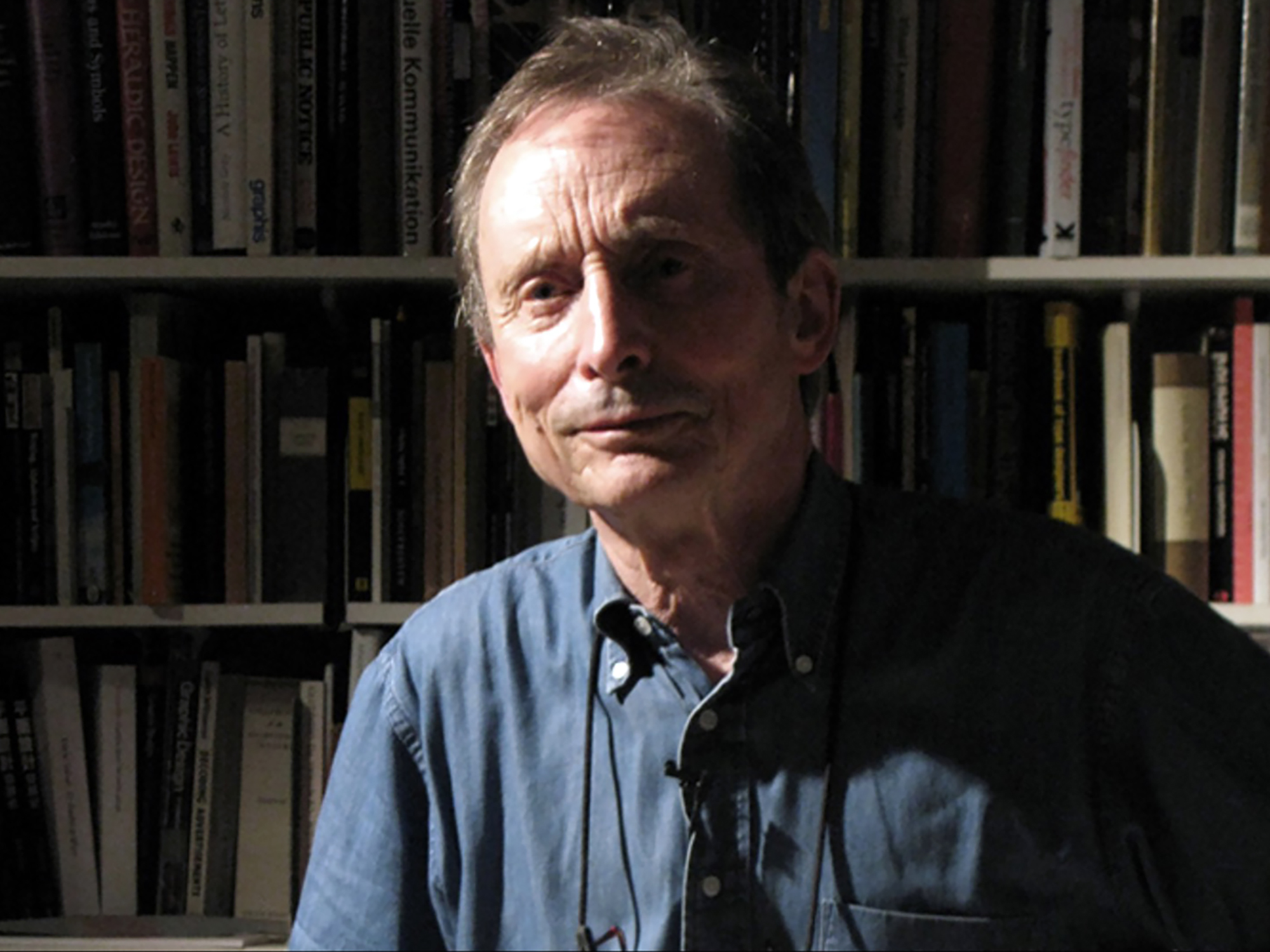
The following talk was delivered in the basement of Artists Space in New York as part of a retrospective of Richard Hollis’s work upstairs that I co-curated with Emily King in 2013. On one wall within the exhibition we had projected footage of a life-size Hollis talking about his work before an audience in London a couple of weeks prior, then organized his work to match to the sequence of his presentation in order that an audience could walk through the work in sync with his account. As such, I tried to avoid repeating here what he was articulating there and focus as much on his writing as his design work.
*
Much of what I’m going to say tonight about Richard Hollis’s work follows in the large footprints of British typographer, publisher, and design historian Robin Kinross, who was the first to pinpoint the particularity of Richard’s work in an article titled “The New Tradition” back in the late 1980s. Robin used the term to flag the fact that Richard’s work is very much its own thing—an approach rooted in the modern movement, yet worked out in a unique way—personally, practically and pragmatically; “on the ground,” so to speak.
In recuperating that largely lapsed term “the modern movement,” I mean to emphasize a specific set of attitudes related to, yet essentially distinct from, more commonplace conceptions of modernism. “Modernism” is of course a famously slippery and promiscuous term, and one reason for supplanting it here is to avoid its hydra-headedness, which tends to blur into useless ambiguity. More specifically, then, by “modern movement” I’m alluding to a markedly socially grounded and implicitly socialist denomination of modernism, contrary to a set of stylistic tropes more common to the North American conception of the term.
I could summarize the latter more specifically by pointing to a New York-based idea of modernism, with reference to Clement Greenberg’s definition of the term as the self-awareness of a medium, working towards the realization of its most fundamental characteristic (most famously the “flatness” of painting). Or I could equally summarize it in graphic design terms by pointing to the elemental forms and one-liner concepts that characterized the huge amount of work developed for advertising and big business in the US from the 1950s onwards.
By contrast, the modern movement I have in mind has less to do with form or style, but consists rather in an attitude or disposition. There’s a rhetorical shortcut to all this: I want to isolate the “movement” from the “modern.” Fundamentally, I think this is what Richard did: he took modernism and ran with it.
Now, as well as being a graphic designer, Richard is also an important design historian and, to a lesser degree, a theorist. Actually, it’s more accurate to say he was a very good distiller and synthesizer of other people’s theories as part and parcel of his histories. He dislikes overly academic writing, and expressly avoided what he considered unnecessarily technical jargon such as “signifier” and “signified”—but he was always careful to explain why he was avoiding it too. He writes as engagingly and understandably for as wide an audience as possible, and this is one of many subtle ethical aspects of his work: both the stuff that he makes, and his accounts of other people’s stuff, are unusually clear-headed and generous.
A teacher of mine once said to me: understand history and the present will take care of itself. Richard is a prime case in point. He has his interests, obsessions, and influences like anyone else, but over 50 years of work he also properly digested and transformed them. Moreover, he’s a rare instance of someone equally accomplished as a historian and a practitioner, and both roles significantly feed each other. In this sense he lives in the same place in my mind as Jean-Luc Godard. It always amazed me to discover Godard was an encyclopaedic and outspoken film critic years before making films. How did he manage, I wondered, to make that first propulsive decade of movies without being hindered if not entirely paralyzed by the weight of his own theoretical upbringing, as is surely far more common?
Graphic design is famously alien to art galleries, because it’s quoted so far out of context as to alienate any audience trying to grasp what makes it good. Let’s begin with a definition. Richard has a very nice way of defining graphic design that’s counter-intuitively straightforward—like much of his work. “Graphic design,” he says, “is what is made by graphic designers.” It’s a deceptive tautology. He’s not being funny; he’s making the point that the vast majority of things that are categorically graphic weren’t necessarily designed—laid out, configured, articulated—by someone who considers themselves a designer. Graphic design on Richard’s terms, then, is work made by someone well aware that they’re in the business of manipulating text and image, ideally according to meaning.
I’m deliberately using the word “ideally” there, because with this redundant-sounding definition Richard means to imply that this awareness is critical—that’s to say, self-doubting and constructive. And from here it’s only a short jump to say that graphic design is something made by someone committed to the idea that the practice has its own histories, theories, and peculiarities. For him, then, calling something graphic design is already a value judgment, and on more than one occasion he’s lamented that this sense—of engagement with the discipline, of the discipline of the discipline—is increasingly scarce. I’m not sure I entirely agree with that, though I know why Richard thought so considering where the field seemed to be headed back in the early 1990s when he said it. More on this later.
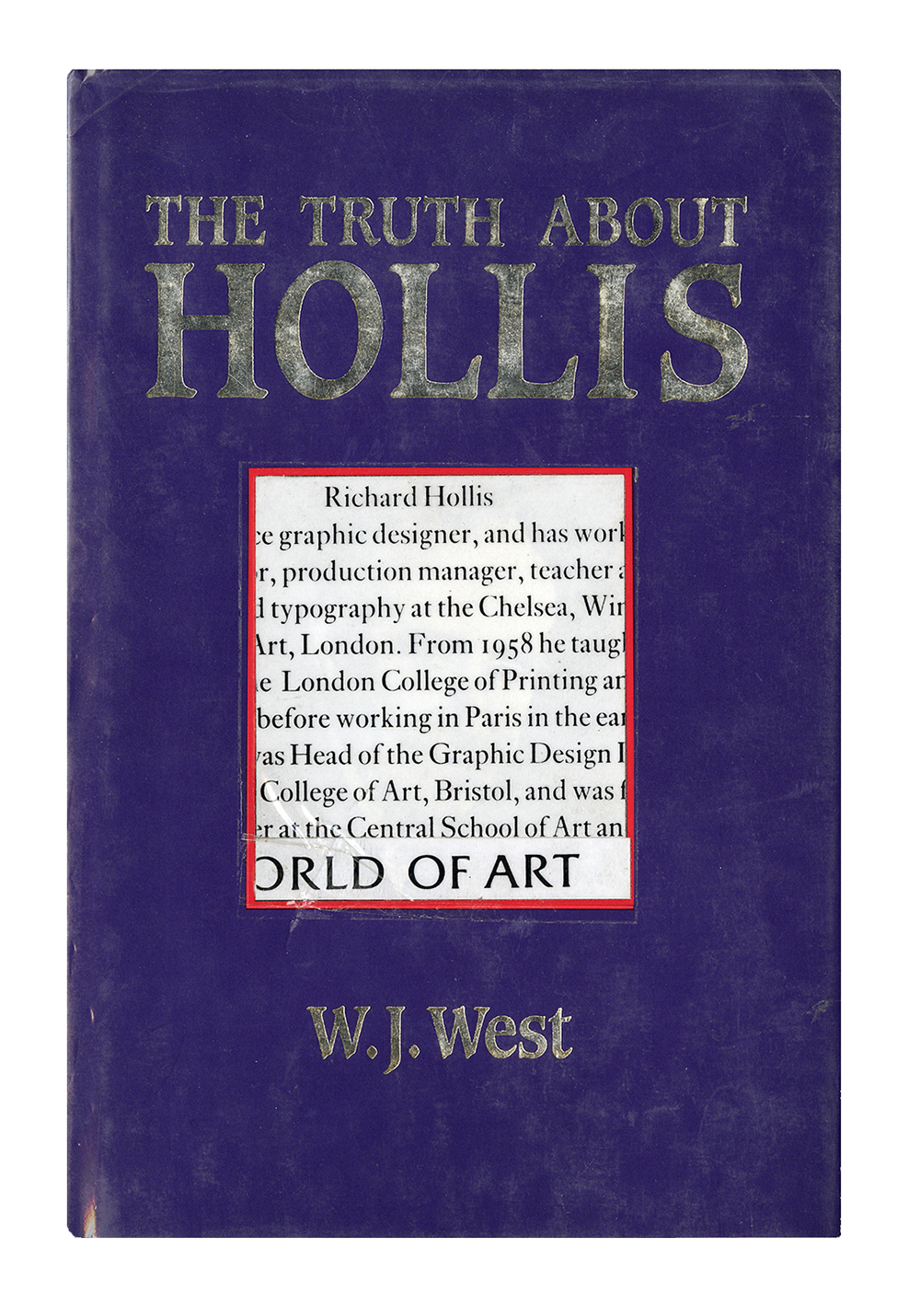
The book whose title I've stolen for this talk, The Truth About Hollis, actually concerns a Communist sympathizer and spy in MI5 during World War II. A copy has been on a high shelf in the toilet next to Richard’s basement studio in London’s Clerkenwell for as long as I can remember, which is to say around 1995 when I started working with him. It was a few years before I actually pulled it off the shelf to discover the cover had been doctored by a friend to include a fragment from a biographical note in one of Richard’s books. Anyway, back then Richard had just bought his first Apple Mac and wanted me to show him how to use it. I was just as interested in learning from him what’s known as “paste-up”—a technique that was then fast approaching extinction.
Richard says that graphic design can be considered in terms of three key aspects—social, technical, and aesthetic; but that far too much attention is devoted in writing and teaching to the aesthetic at the expense of the other two, in which case you miss at least 66% of what’s interesting about a given piece of work. With this in mind, I’ll start with an overview of the technics of print in the time of Richard’s work; the social and aesthetic ones will emerge in due course.
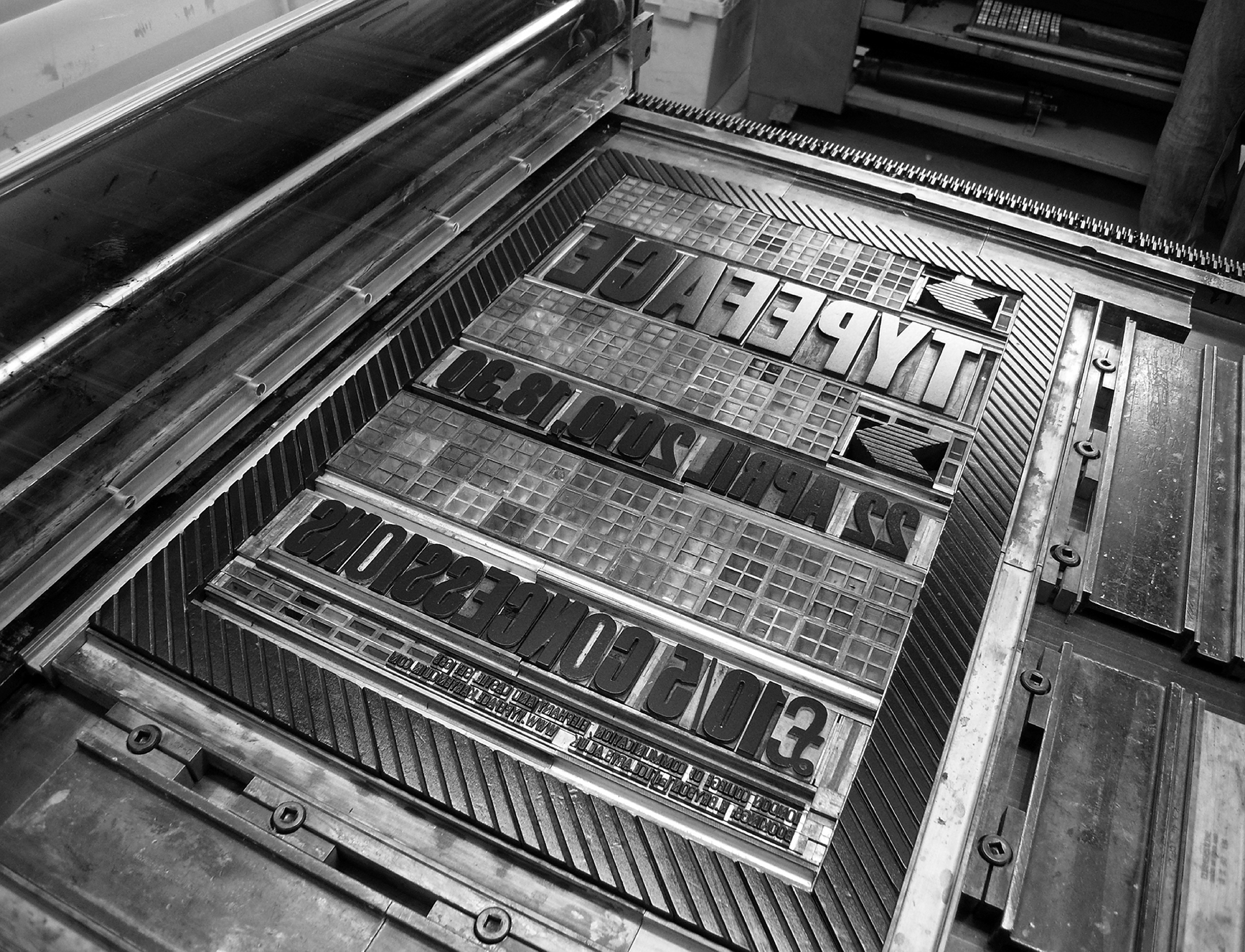
The work upstairs crosses three technical paradigms, beginning in the 1950s with letterpress, a process that had remained largely unchanged since Gutenberg’s invention of moveable metal type in the first half of the fifteenth century. The emerging figure of the graphic designer typically provided instructions for a printer to follow when assembling the metal or wooden type into a frame from which to pull an impression, sometimes together with engraved images. The designer thus had to specify his desires in the language of the printer and photoengraver. He was limited by the typefaces the particular printer had in stock, along with other factors such as the paper formats available on specific machines.
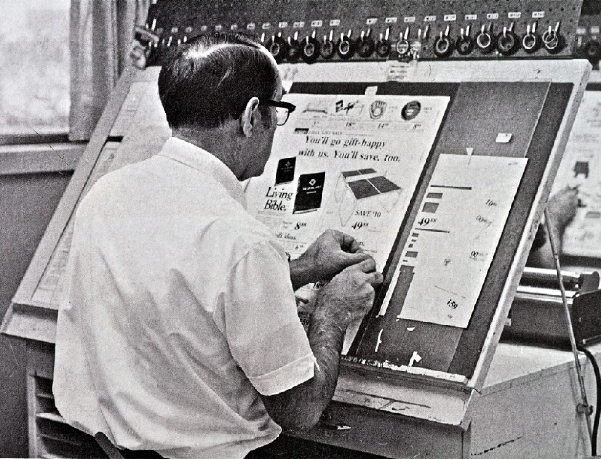
Next, photosetting and offset printing began to properly replace letterpress during the 1960s. Here the designer was required to literally paste up bits of paper—strips of type known as “galleys,” perhaps supplemented with dry transfer lettering, handwriting, or even sticking together words letter-by-letter, combined with photographs or drawings. The composite result was itself photographed and a printing plate made from the negative. Designers had their own process cameras and made their own halftone images, the equivalent of scanning an image today. As such, they began to take control of the production process.
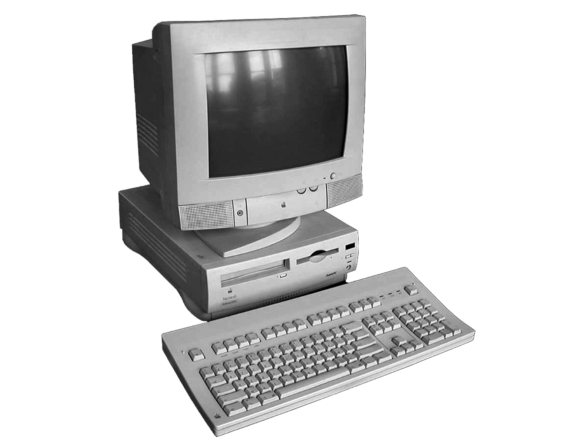
And photosetting has in turn been superseded since the late 1980s by computer page-makeup for offset printing, which involves programming digital instructions in order to output on-off ink values to make plates, without the need to go through a middleman.
You can clearly see the traces of each of these processes—from letterpress through photosetting to computer page-makeup—across the chronology of the work upstairs.
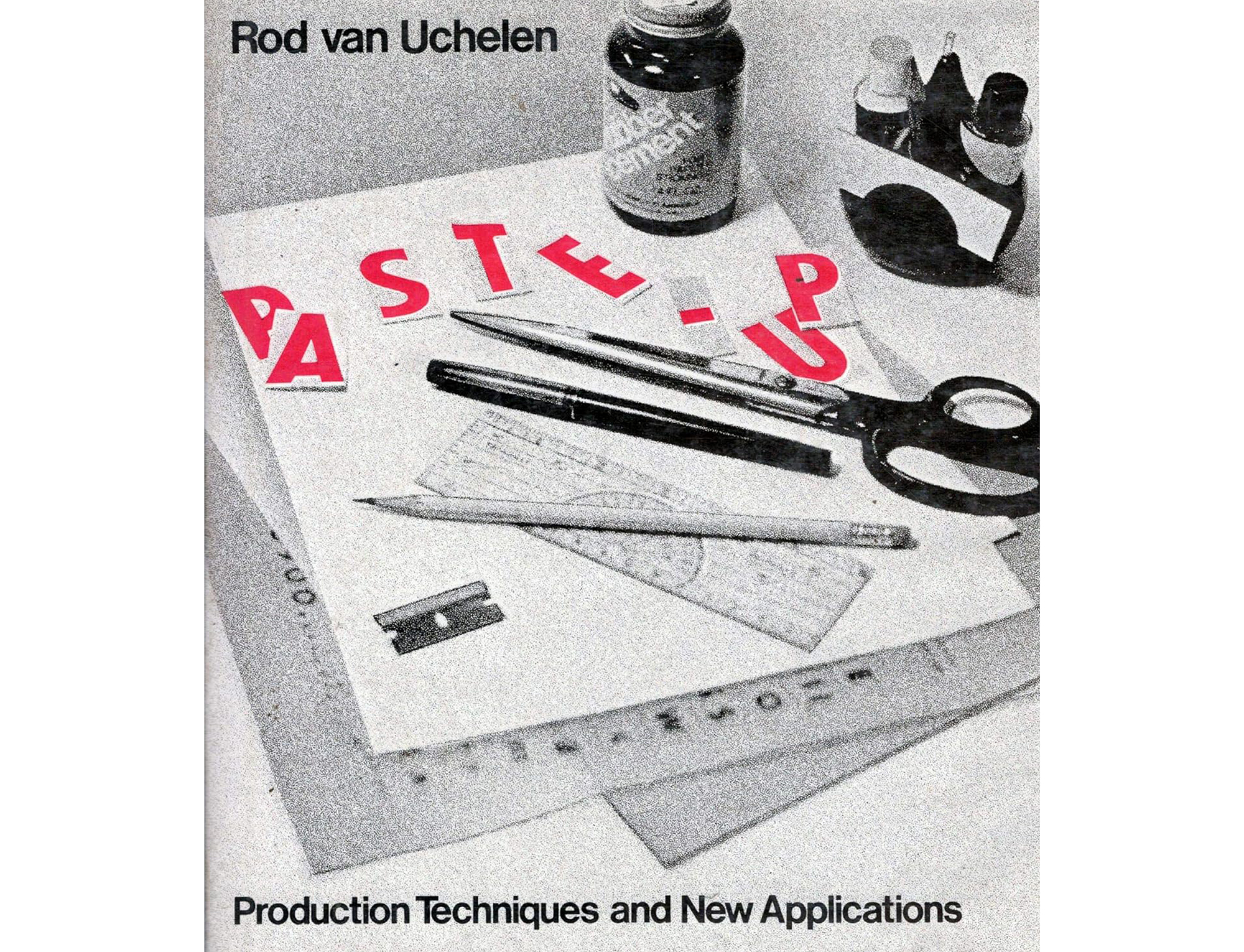
The middle process of paste-up—to make master sheets for photosetting—was probably used to make the majority of it. Richard often emphasizes how fundamentally physical graphic designing was before the advent of personal computers. As this book cover for Rod van Uchelen’s Production Techniques and New Applications from 1977 suggests, paste-up epitomizes this physicality, assembling what’s essentially the final material to be reproduced at actual size. This is very different from designing for print on a computer, in virtual space and likely not at the same scale as the object itself (unless it’s a web page or digital document, of course) and therefore at a far greater remove which, make no mistake, affects things enormously.
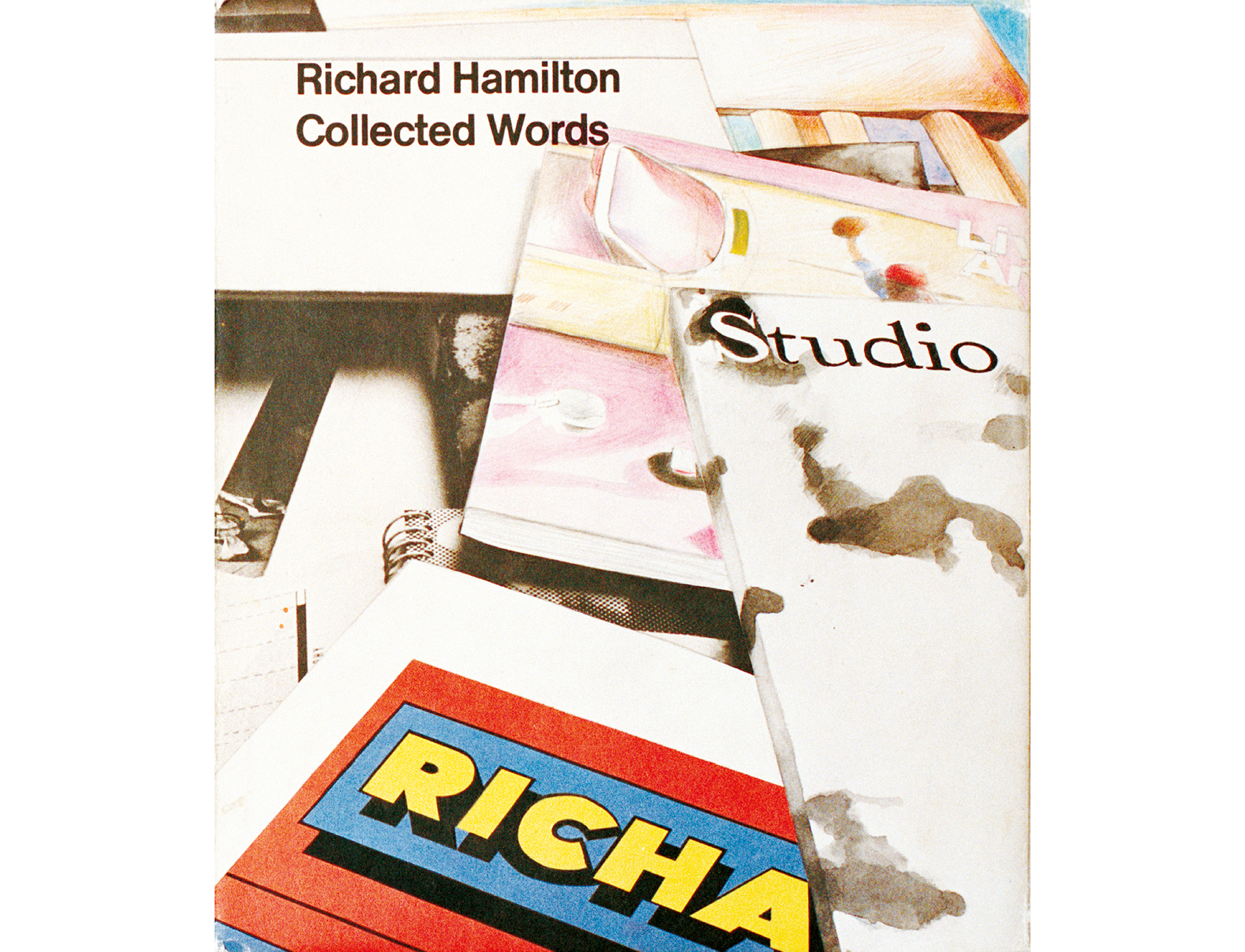
Incidentally, the British pop artist Richard Hamilton appears to have paid homage—or ripped off—the Paste Up cover for his 1980 book Collected Writing; and actually it’s instructive to consider the work of Richards Hamilton and Hollis in parallel, as similar temperaments working respectively in art and design during the same postwar period. Both worked freely across a wide variety of media, both were firmly rooted in their disciplines’ respective histories, and their work is similarly marked by a strong literary interest. The key difference is that where Hamilton articulates his own interests, Hollis articulates those of others; but in my opinion the similarities are greater than this disciplinary divergence, not least in that they both somehow managed to stay young—by which I just mean their work never seemed to slip from anything other than a state of total engagement.
To reiterate slightly, the perennial problem of a show like this, endemic to showing any graphic design in a gallery, is that it’s by no means given that a viewer comprehends how it was made and in what context—and both can directly affect the way it looks. The danger is that you read the form as though it sprang fully formed from the designer’s mind, in which case you tend to read it as an exercise in style, as formalism to compare and contrast with, say, Art Nouveau or International Style or the posters of Toulouse Lautrec. This is what happens if you’re unable to adequately deconstruct the work, by which I don’t mean to invoke the plateaus of French theory, only emphasize that you can learn about graphic designing by performing a kind of calculus on it. By mentally dismantling a piece of graphic design you can understand how to do graphic design—and other things besides. So another claim I’ll make for Richard’s work is that, for those inclined to look for it, it is unusually didactic.
…
In a published conversation from 1992, Richard talks with Robin Kinross about Graphic Design: a Concise History, a book that Richard was then in the process of compiling, and which came out two years later. Richard is very digressive in conversation, and it’s useful to see how this character trait feeds and feeds into his graphic work—as open-mindedness made manifest. Robin, who edited the conversation, clearly understood this, and so the final version includes a number of incidental digressions. For instance, they’re in the middle of talking about those differences between European and American modernism when Richard happens to look out of the window and notice two contrasting British Telecom vans. BT were the sole public telecommunications company in the UK until 1984 when it was typically privatized by Margaret Thatcher’s Conservative government.
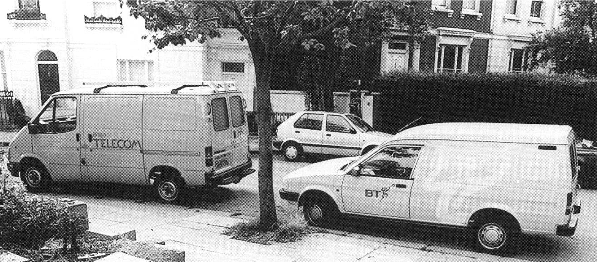
At first, Richard thinks the vehicle behind is an old one over-painted by another company, then realizes it’s actually BT’s newly implemented identity.
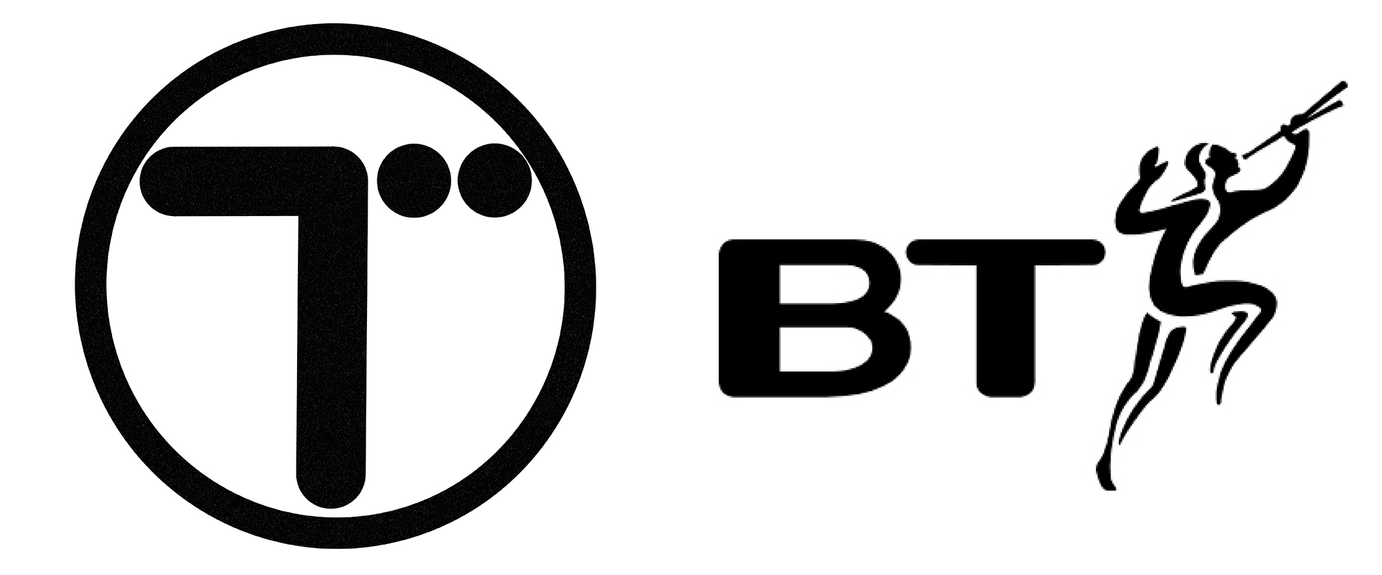
The pied piper motif was designed by Wolff Olins, the trailblazing design firm who more or less single-handedly introduced the concept of Corporate Identity—the wholesale repackaging of a company’s image according to how it wanted to be perceived, thus inaugurating the era of spin doctoring that, in the UK at least, reached some kind of logical conclusion in Tony Blair’s New Labour.
Incredibly enough, then, this snapshot of the two vans freeze-frames a shift in graphic design corollary to the socio-political moment, away from the sort of ubiquitous second-generation geometric abstraction rooted in modernist ideas of social construction—however flawed or naive—and towards an era dominated by Public Relations and marketing. Robin adroitly describes Wolff Olins’ piper as “such a pathetic, wispy image—pipe-dreams,” and in actual fact it was publicly reviled as the “prancing ponce.” Later, as the vans drive off, Richard exclaims, “It’s incredible: the old van and the new van. You see: there’s ‘graphic design’ moving away, followed by ‘marketing.’”
And just to give you a further idea of the sharp and answerable nature of their dialogue, in a later section concerning the work of the Swiss typographer Jan Tschichold, modernist graphic design’s first and most eloquent propagator, Robin wonders whether Richard is talking and writing about design purely in terms of “formal values” or “stylization.” In other words, he accuses him precisely of isolating aesthetics from context and technics.
Richard insists not; what he’s trying to do, he says, is work backwards to get at the embedded attitudes that underpin the work. Compared to the “heroic” modernists like Tschichold, he says, there’s now a scarcity of serious thinking behind what is, in the end, a social service—which is why “bad or incoherent design is offensive.” He illustrates the point by reading an excerpt from the current draft of his book-in-progress, a description of this poster by Tschichold:
This is a poster of extreme economy and precision. The image is a photograph in negative, its left-hand edge on the centre of the sheet. The word-element “photograph’”starts at the edge of the image. This is overprinted on the image, and so forms a unit of meaning with it, and is the first part of a subtitle “his apparatus.” The second half of the subtitle, “his works” is placed after a dash. The dash bridges between the image area and the white paper of the sheet, so that the works are literally the outcome of the process. The rest of the textual information is related by size and position according to its importance. “Where’”is aligned horizontally with “what.” This is related vertically to “who” at the top, and the start of the main title below …
– and so on.
This sort of work can therefore be properly labelled “heroic” because so much attention was dedicated to its realization using brand new technical means without reference to established conventions. A huge amount of intelligence is compressed into these pioneering artefacts that record the development of a graphic language. Now, “graphic language” is the sort of term that tends to get bandied about a lot in design discourse, its meaning vague enough to sound profound when it’s usually another euphemism for formalism. But thanks to the sharply focused lens of Richard’s patient description, here you can appreciate how Tschichold’s poster is arranged according to a plausible grammar. It explicitly makes sense, and so the idea of a “graphic language” carries some weight.
Richard goes on to say that such innovation can be distinguished from its later imitation by a certain “finesse” and “conviction.” However, as these essential qualities are all but impossible to glean by looking at tiny pictures of physical objects, his extensive written descriptions are designed foremost to compensate for the information lost in translation, to reinstate in text what’s lost in the image. By writing so rigorously about the technical processes at play in the work, thanks to his first-hand understanding of them as a practising designer, Richard demonstrates how to “read” it. He gives you the tools and shows how to use them.
This is the real purpose of writing a history, he concludes; and against the likely demands of his publishers, whom he predicts will argue, why provide a lengthy, ink- and time-consuming description of an image that’s already in front of the reader?, he’ll answer: because without a proper understanding of the social and technical conditions under which is was made, which is more or less inevitable if they haven’t lived through the period in question or produced these things in the same way, the reader won’t be equipped to read them correctly. The graphic literacy that Richard’s writing teaches allows you to apprehend the depth of thinking that went into the work. Without it, you limit the extension of your own knowledge and so lose the full constructive effect. Graphic design then becomes simply—and boringly—an exercise in formalism: elements arranged one way or another, big or small, red or green, top or bottom … whatever.
Robin then nicely points out that Richard is acting just as heroically by insisting on his exacting descriptions—unprecedented in existing design histories, under-appreciated by his publisher, yet carrying on regardless. “The social cannot be estimated merely in terms of numbers produced or numbers of people who see and use it,” writes Robin elsewhere. “It’s a question of human spirit and human culture … beyond and against the expectations of societies ordered by accounting economics and material and human waste.”
To return to the view from Richard’s window, those auspiciously departing and arriving BT vehicles mark a second shift—namely, in Richard’s career at the turn of the 1990s. Like the majority of his generation of designers working in London from the 1950s onwards, he suddenly found himself facing a significant transition. The postwar design scene was initially populated by small inventive studios and individuals, who had such a regular supply of cultural, social and political work that they were able to casually pass work back and forth to each other. However, through the 1980s and 90s, all three sectors began to assimilate the ways and means of big business, preoccupied with quantification—of user-friendliness, audience participation, attendance figures, and so forth.
As like attracts like, these newly corporatized cultural bodies, with their attendant departments devoted to developing and maintaining public image, now preferred to work with design companies of a similar stripe. That is, with equivalent ambition, stature, clout, and other facets of the corporate scheme (secretaries, fax machines, interminable meetings). The smaller-fish studios were swallowed by this new model (i.e., subjugation to market forces), and the work made under such conditions was inevitably more compromised.
Fortunately, Richard had enough of a reputation by this point to survive such a paradigm shift, but from this point on, his work became notably more polarized between what we might call the extremely marginalized (for charities, small galleries, and friends) and extremely protected (as a sort of designer-by-royal-appointment-to-Bridget Riley, for instance); certainly nothing that came close to the sense of long-term investment in cultural development that characterizes his work for Penguin, the BBC, Pluto Press, the Museum of Modern Art Oxford, or the Whitechapel Art Gallery. Robin summarizes in “The New Tradition”: “When the [Whitechapel] Gallery was reopened in its upmarket guise in 1985, Hollis was replaced by a design group. The new graphic style, in tune with the building, went white and expensive.”
By the end of the 1990s, the privatization and corporatization of mainstream culture was seemingly complete, and remains that way. At the same time, the increasingly rapid, extensive, fluid and inexpensive connectivity afforded by the nascent internet upended long-established economies of scale in publishing. This in turn led to the so-called “long tail” of culture, the flipside of that corporate mainstream populated by myriad niche interests, countless instances of relatively small numbers of unusually devoted readers and viewers. This is where that so-called heroic spirit—that attention and dedication—that Richard lamented as having declined or disappeared since the heyday of modernism now surfaces: elsewhere for sure, but by no means eradicated. Again I’ll come back to this at the end.
…
The other week, Richard told me he’d found a note to himself from his time as a teacher that read along the lines of: it’s far more useful to talk about one work in depth than superficially cut across a large batch. With this in mind, I want to look at three specific examples of his work. The first is Ways of Seeing, the seminal book he made in 1972 as one of a team of five: its author, John Berger, an artist, Sven Blomberg, a TV producer, Mike Dibb and a “critical friend” of Berger’s, Chris Fox. In the event their roles were reportedly far less distinct, with plenty of room for manoeuvre and a lot of argument; the democratic spirit upheld, too, in Berger’s insistence that the royalties from the first printing were split equally five ways.
In showing such a well-known and well-regarded book as Ways of Seeing here I mean emphasize that one of the qualities of his work I admire most is how obvious it is—and yet counterintuitively obvious, if that makes any sense. It’s so straight that it’s peculiar in a way makes more ostentatiously “weird” work seem overly contrived. Robin once described Richard’s work as inventive rather than innovative. There’s no ego here; no new-for-the-sake-of-being-new.
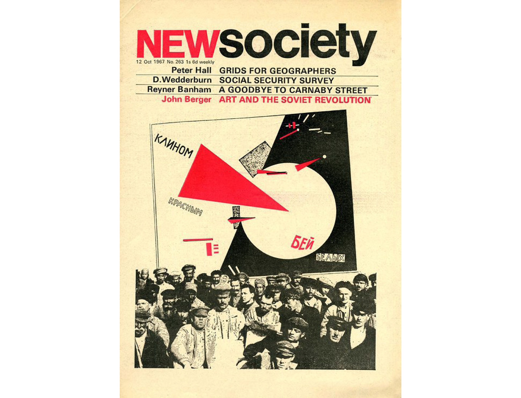
Richard’s involvement in Ways of Seeing was borne of a chance meeting in the mid-1960s with Berger, back then an artist, critic and novelist. Hollis was the art editor of New Society, a weekly journal of social and cultural commentary, to which Berger contributed regularly.
Hollis found himself arguing with Berger at a party, criticizing something he had recently said on TV for being “exaggeratedly Marxist.” The ensuing debate led to Berger inviting Richard to help realize his fourth novel, G.. Berger originally intended to illustrate this in the style of surrealist chief André Bréton's 1928 novel Nadja, which married text and images to form a composite portrait of a Parisian woman. In the end Berger’s idea never really developed beyond the inclusion of two small illustrations, though there are notable experiments with spacing paragraphs relative to shifts in time, thought and meaning that clearly pre-empt the filmic devices of their later work together. Hollis remembers Berger fondly as being the rare sort of writer modest enough to happily to cut or extend his text to fit a paragraph or page—likely a hangover from his work as a journalist. Berger clearly appreciated the collaboration too, as he asked Hollis to work on the book to be tied in with his four-part BBC TV series. Ways of Seeing was an unprecedented approach to the public discussion of fine art, essentially an illustrated monologue that explored the idea of art as commodity and its relation to society—to pornography, to advertising, to children, and so on. It was also an explicitly new way of dealing with art on TV.
Rather than the book being primarily author-, editor- or designer-led, the book pushes for a third, largely uncharted way of working. Equivalent examples that come to mind are the close collaborations between Marshall McLuhan & Quentin Fiore (e.g., 1967’s The Medium is The Massage), and more recently Rem Koolhaas & Bruce Mau (e.g., 1995’s S, M, L, XL). The form and content of both books is similarly symbiotic. All exemplify of what I’ve come to think of as a truth-is-stranger-than-fiction aesthetic—in the sense that a willingness to draw form from content rather than apply a personal stylistic agenda makes for work that ends up more visually radical than a purely formalistic approach where radicality itself is the main aim.
Yes, the book is attractively odd. Yes, it offers a whole new way to think about book design in the same way the TV series departs from the usual ways of showing art on TV. But it’s equally worth appreciating Ways of Seeing for its bloody-mindedness. It begins already on the cover, which immediately announces both its maverick character and its outspoken point of view. Berger’s opening line: “The child looks and recognizes before it can speak.” You see the idea of the text starting on the cover before you read the words, just as you see Magritte’s image before you read the explanation—an immediacy and authority that’s reinforced by the unusually bold body type.
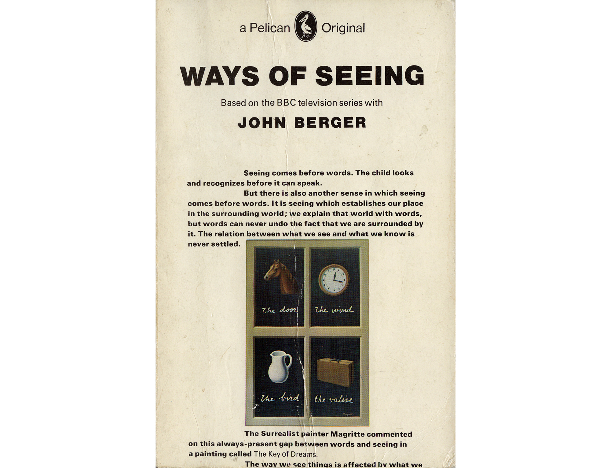
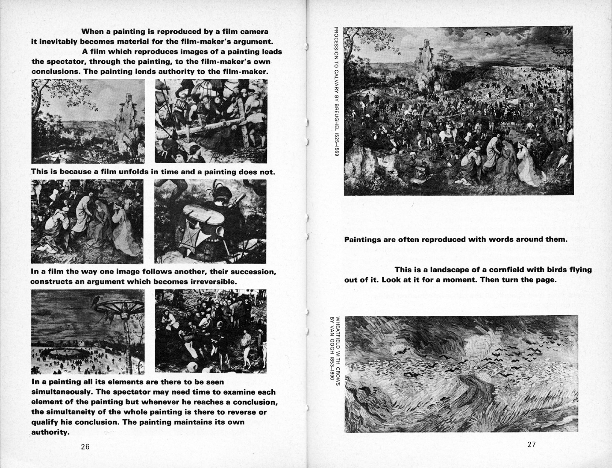
The bold type was intended to match the visual weight of the images, as well as Berger’s strident TV voice. It is left-justified, unhyphenated, broken and manipulated in order to duplicate and reinforce meaning: pictures of work are inserted as and when they are mentioned in the text, their size determined by aligning the left edge on the large text indent and scaling according to what space remains on the page. Hollis and Berger reasoned that full picture captions would interrupt the flow of the argument, so most of the supplementary information is pushed to the back of the book while a simple name, title and date runs up the side of each image—a method also designed to discourage speed-reading the book by images alone. In the opening pages Berger writes: “The form of the book is as much to do with our purpose as the arguments contained in it.” And so it duplicates the TV series in this sense as well—self-reflexively drawing attention to its own design in line with its founding principle: critical engagement with the work at hand.
A Ways of Seeing that didn’t begin on the cover, or with images divorced from the text, or assembled into a different format, or set in different type, would be a very different animal (recent editions demonstrate this well enough). Not everyone liked it, though: apparently, the first time Penguin’s head designer Hans Schmoller saw a copy of the first edition he threw it down the corridor in fury.
…
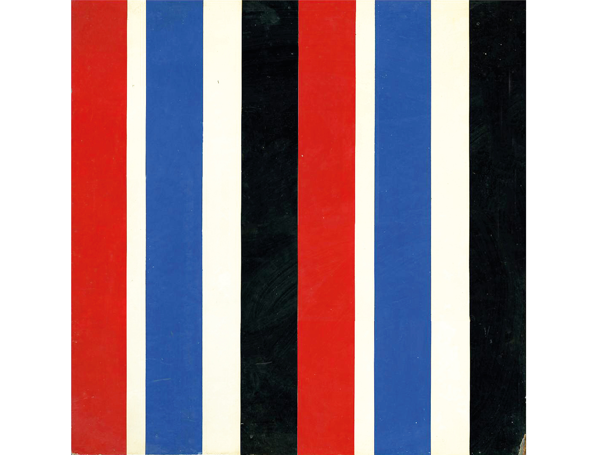
The next examples of Richard’s work I want to look at are the catalogues and ephemera he produced for London’s Whitechapel gallery. Spanning a period of fifteen years (with a gap in the middle), this body of work shows the subtle shift from a relatively dogmatic approach to something far more flexible and easygoing. Early in his career, Richard was preoccupied with Concrete Art, in which the form of the work derives from a set of rules. Here’s a typical painting he made at the time: the relative proportions of the stripes are based on units of three, and the pattern repeated after the central axis. He calls it a “visual statement.”
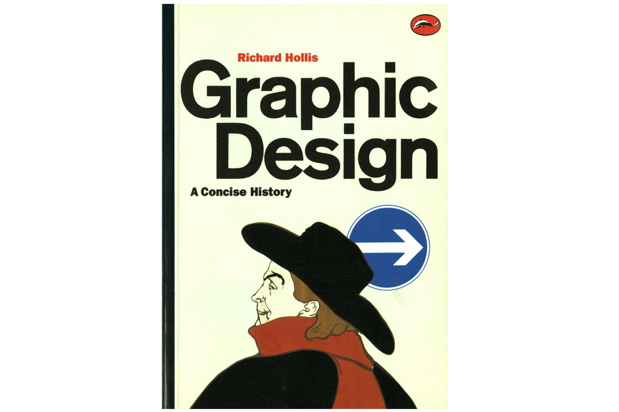
The equivalent tendency in graphic design was most fully realized in Switzerland after the Second World War. Richard’s second major history book from 2006 documents this movement, which was variously known—paradoxically—as both Swiss Modernism and International Style, demonstrated and propagated by a number of accomplished practitioner-theorists such as Karl Gerstner, Josef Muller-Brockmann, and Max Bill. One of the genre’s defining features is the underlying grid structure. Relatively strict, complex templates are particularly useful when working with Swiss material because it is often multilingual and so requires setting in German, French and Italian. It makes clear sense to run the three languages in parallel to avoid repeating images, and this requires well-organized and clearly articulated pages.
Though it made less overt technical sense elsewhere, thanks to a few imported magazines and influential teachers, this clean, clinical Swiss look was commonplace in 1960s London. More than most of his colleagues, however, Richard adapted the grid to his own, idiosyncratic ends; the emphatically squared-up page became a means of combining words and pictures in unusually pronounced and articulate ways. One feature that’s particularly evident in Richard’s work for the Whitechapel gallery is his use of large text indents, often as a second axis on which to align images. As with the Tschichold poster, the underlying structure affords a clear graphic grammar—a means of carrying a reader through the material. Though Richard’s prominent use of grids was by no means gratuitous, i.e. by no means merely stylistic, it’s no contradiction to say it was also stylish; it became characteristic.
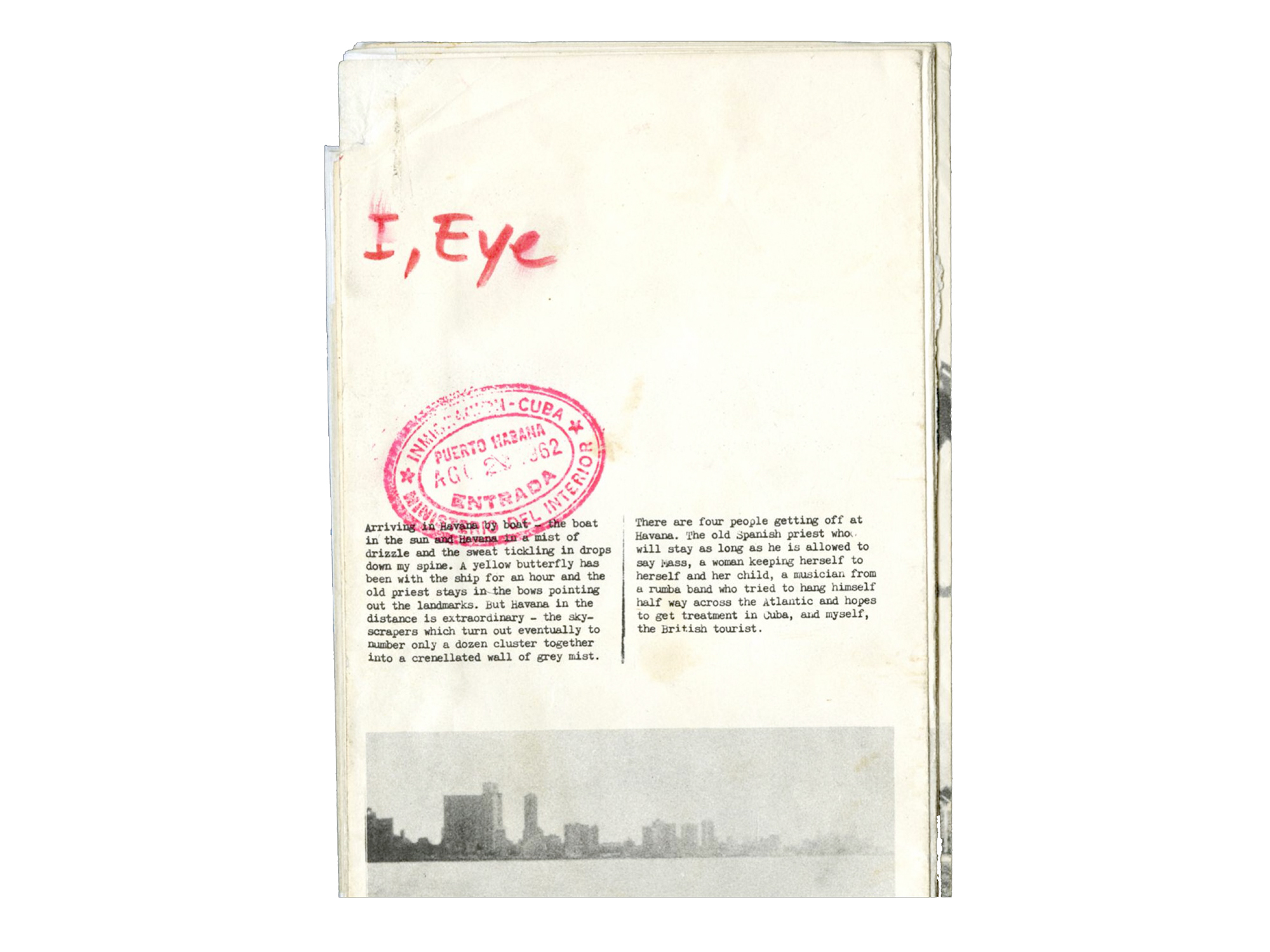
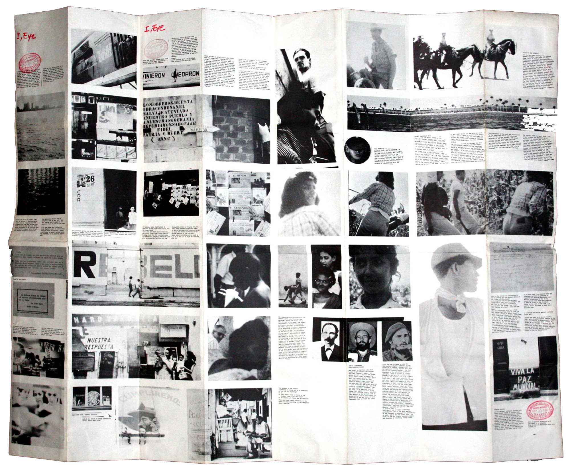
Even more formative than the Swiss influence is a folding broadsheet titled I, Eye. This is a record of a trip Richard made to Castro’s Cuba. He (Richard, not Castro) was responsible for all aspects of the document—taking and developing the photographs, writing and editing the observations, then pasting both together in negative on a glass sheet lit from below by a lamp. A printing plate was made directly from this master; the title was added by hand at the end, along with an impression from a Cuban rubber stamp. What’s particularly prescient here, is how the folds form a physical grid on which to hang the unfolding narrative—that is, a framework on which work out the relative order and freedom in the arrangement of material. In fact, the DNA for a lot of what came after is encapsulated in this modest piece of reportage, and it’s plain to see how the same hands-on thinking informs and plays out in many different ways over the decade that Richard worked for the Whitechapel.
It’s instructive to see how the same intelligence plays out in different circumstances. Many of the features that made Ways of Seeing so distinctive are carried over into the Whitechapel work (not least that large text indent again), but there are a few new demands and responses as well. Where Ways of Seeing is a linear argument sustained over 160 small-format pages, occasionally making inventive use of the page break, the Whitechapel’s various invitations, leaflets, pamphlets and posters were designed to unfold from smaller discrete panels to larger composite ones, with various bits of information arranged according to this sequence. It puts the “physical grid” of the Cuba document to work for the Whitechapel—an unusually tangible and active identity.
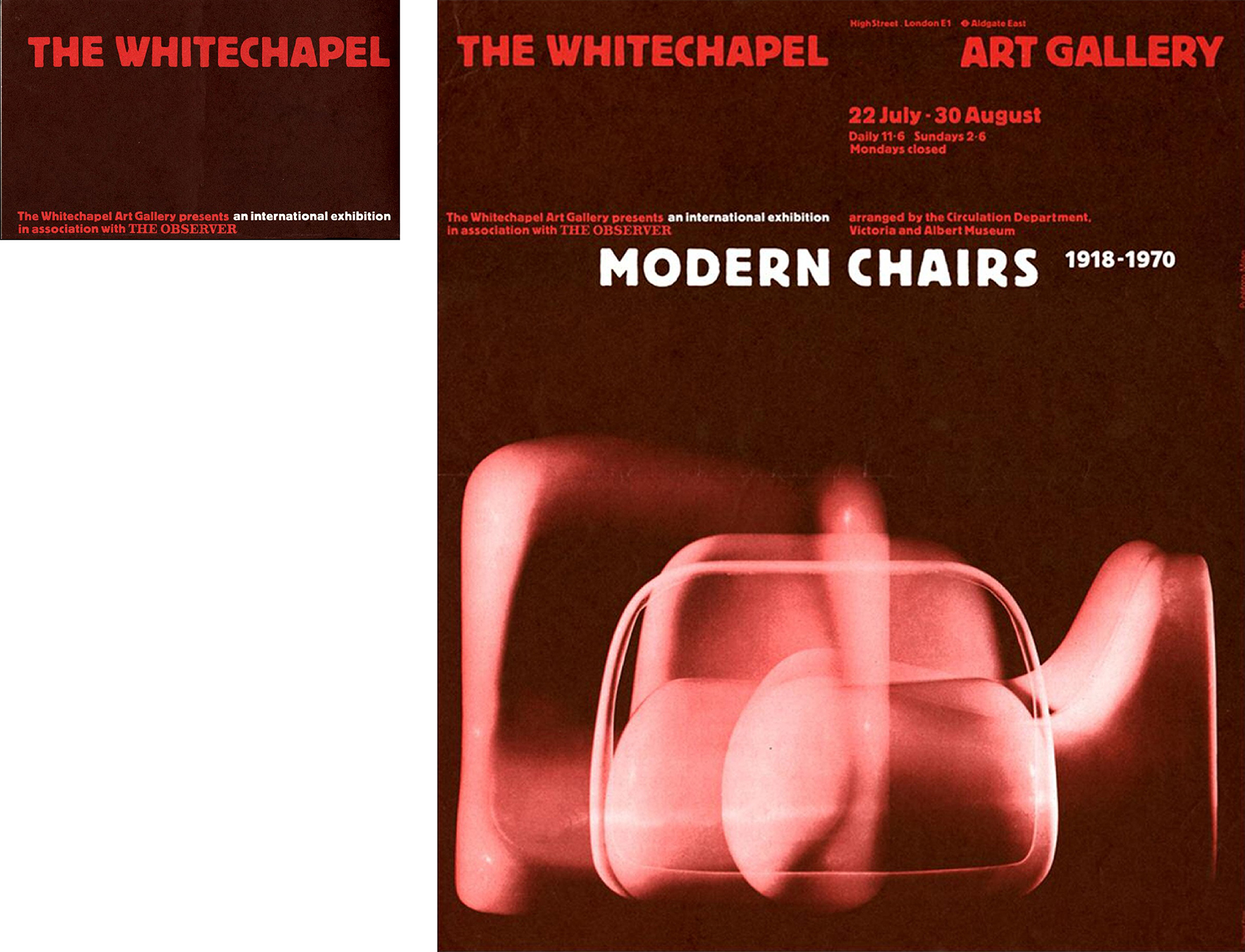
The folds became as much part of the identity as the typeface. This was a redrawn version of Block, a German font that dates from the same period as the Whitechapel building and happens to recall its distinctive architecture. Richard also made the most of a cheap two-colour palette, combining different percentages of halftone screens to make a range of secondary colours, and often overprinting them to make something like black. Such economy of means—how to achieve the most with the least—was a common modernist dictum, of course, though Richard thinks it was just as much a consequence of being brought up in the austerity of postwar Britain.
…
I want to prologue my last example by showing a small card by another cross-generationally influential typographer, Anthony Froshaug.
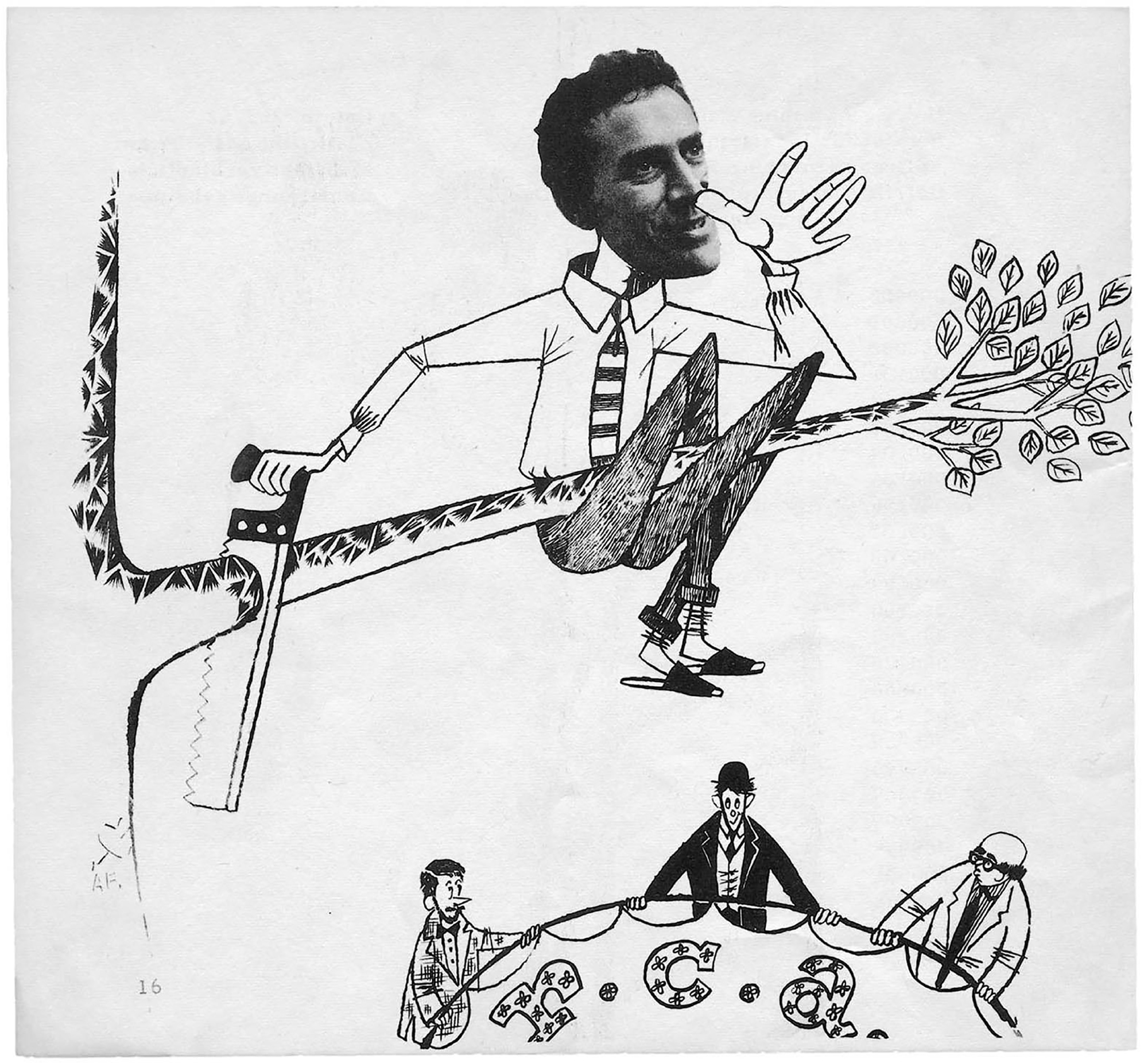
Despite this photograph, he was a famously severe, temperamental character, but far and away the most eloquent importer of modern movement ideas into Britain. Although older than Richard, they taught at the Royal College around the same time. Richard once told me that during some of Froshaug’s classes he was called in to translate Froshaug’s ideas—from English into English!; the implication being that his reasoning was too complex, perhaps too linguistically high-flown or technically specific for most students to comprehend.
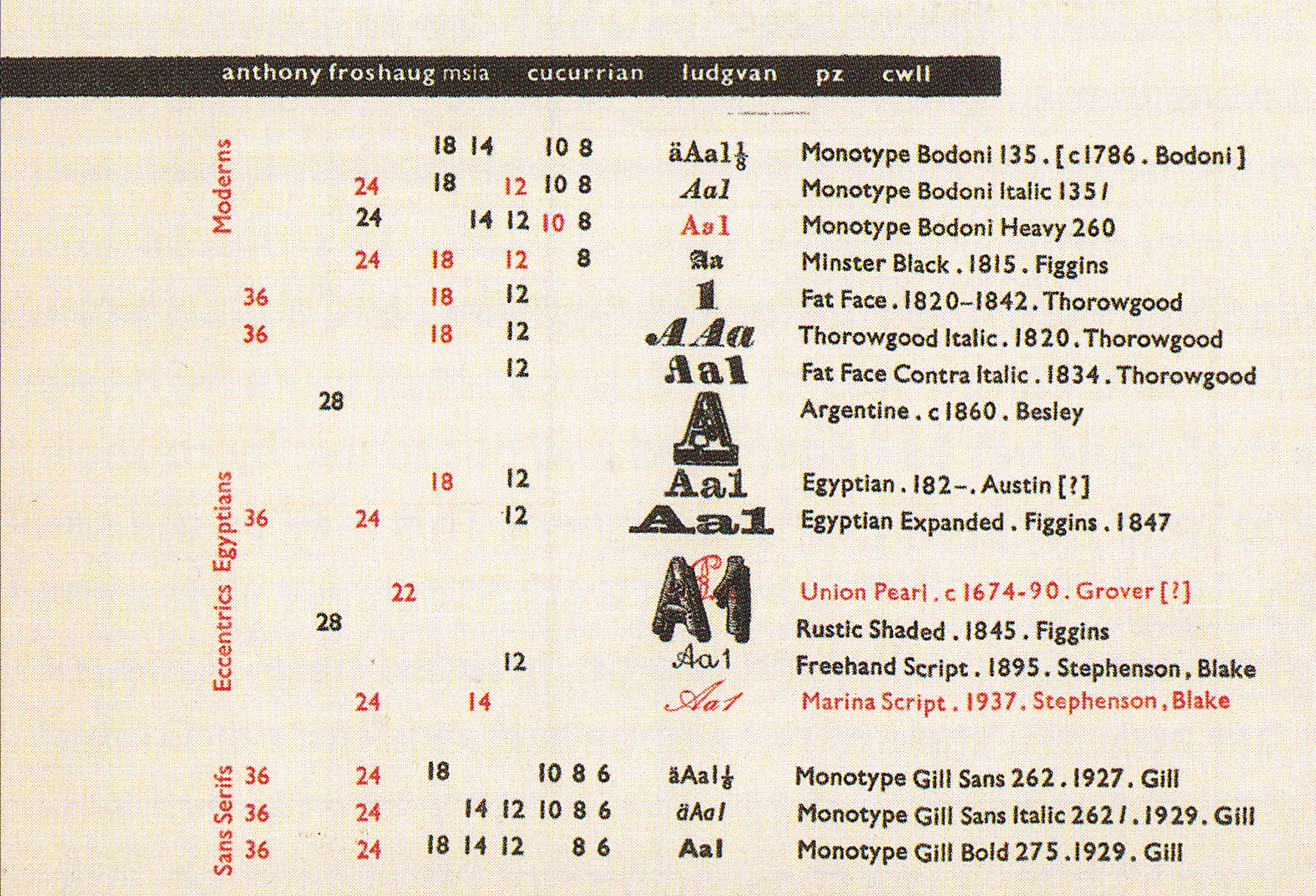
I’m showing this card of his as a phosphorescent example of what I described earlier as a pedagogically-charged piece of work, and the sort of thing that influenced Richard too. One of the nice things about working with him was to be occasionally given stuff like this as and when it fell out from behind a cabinet or slipped from between a stack of posters he was in the process of shifting from one drawer to another.
So we’re looking at a postcard-size sample chart, an inventory of metal type in Froshaug’s own letterpress workshop made to show what’s available and possible in moveable type—a table of tools. The various elements are clearly configured according to their relational meaning—arranged, that is, according to a logic immanent in the raw material, the information to be conveyed. Hierarchically, the types are grouped first according to historical style (the four categories set to read vertically up the left edge: Moderns, Egyptians, etc.), then, within these sets, listed roughly according to size from small to large, grouped in families (roman, italic, bold, etc.) and colored black or red according to availability. And the whole is fundamentally organized around a central axis that gives real examples of each typeface (A’s, 1’s and, where available, fractions). Sizes in stock are set in a matrix that runs off to the left, with secondary information (the year designed, the designer) to the right.
It’s plain to see, then, how the subject matter of the card (the material possibilities of a particular press) along with the card’s specific purpose (to show it as clearly and quickly in as small a space as possible) have determined what I propose we might consider an authentic configuration—authentic in the sense that it’s been articulated “true” to the intrinsic nature of the information. This is also to say that it functions in the first place according to the extrinsic, communal conventions of language. As preposterous as it might sound, then, I want to claim this as a piece of social work. I already quoted Richard as saying, “my own view of design is that it is inevitably part of the social servicing, and that is why bad or incoherent design is offensive.” In pointing to its clarity, invention and answerability, I want to claim his approach as a form of “social work,” too. Writing about someone else, Robin expanded on this idea:
Multiplication of text is a social act that provides a forum for dialogue and exchange; deliberately making text hard to read is thus a public offence [… Consider] a page of words that say something of interest, [set in] an ordinary typeface, without pretensions […] In its freedom and order, it is a model for social arrangements too.
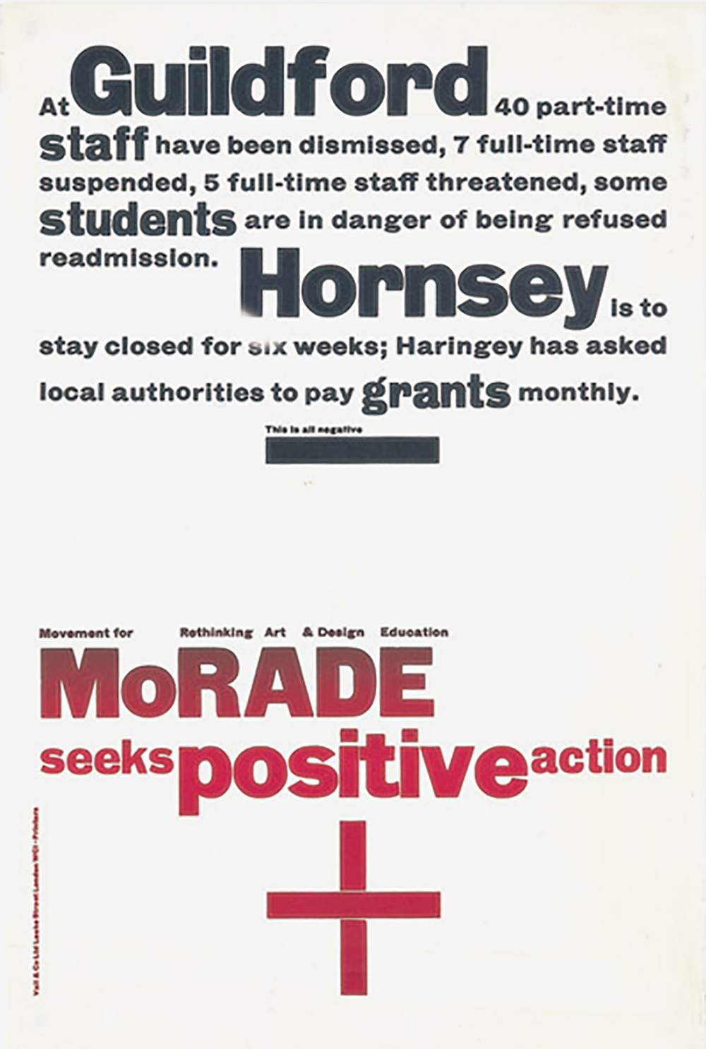
All of which leads me onto this third and final piece of Richard’s work—his 1968 poster for MoRADE, a student protest movement. By now I assume you can read the work in the sense I’ve been propagating, so I’ll leave you to look at it for a minute. I'll only add—because it’s unclear from the screen, though readily apparent from the real thing upstairs if you get up close—that it was fed through the machine the wrong way round, width-ways, in order to print graduating between two colours of ink along the length, from a negative-signifying black to a positive-signifying red. Once again you can plainly see the trace of the thinking involved, and how this thought that survives its dated and marginal context.
To wrap this up, I want to flag one final shift in Richard’s career that again mirrors a shift in culture at large—this time in the period since he began to wind down his work rate. Consider the recent proliferation of those who started out as (for want of a way better term) “straight” graphic designers branching out into other roles in the broader ecology of communication. Over the last ten years or so there have been countless instances of people working not only at the coalface of graphic design, but doing the commissioning or producing or selling things themselves. I’m referring to people trained or otherwise versed in graphic design starting up publishing imprints, galleries, summer schools, event spaces, journals, magazines and shops—myself included.
I think this is a logical enough extension of the reason many people get into the field in the first place: to share information and articulate it accordingly. And I think it’s a logical enough response to the general scarcity of engaging work and conducive working relationships (for all the reasons related to the corporatization of culture I outlined earlier). I mention it mainly to say that I don’t think the commitment to hard thinking and constructive communication that Richard lamented as having all but disappeared since Tschichold and his heroic modernist ilk has disappeared per se; rather, it’s been displaced. In the face of what seem to be apparently diminishing if not yet extinct opportunities to work in more obviously social areas, whether designing public transport signage, or government forms, or culturally-oriented publishing imprints beyond the grip of the marketing mentality (and here I mean the digital versions of these things too), this cultural diaspora have begun preoccupying themselves by manufacturing culture rather than graphic-designing it. Or actually, to manufacture it in order to then graphic design it too. They make their own work. Hence the general turn to publishing in its most exploded sense, which is only to say a return to its original etymological sense: making things public.
And while on one hand this could be seen as entirely positive, on the other it’s difficult to see how it can be sustained without the support of state subsidies or private beneficiaries in one more or less clandestine form or another. It’s equally difficult not to feel that this is going to dry up at some point soon once various cultural policy plugs are pulled, as happened in a shockingly short space of time in The Netherlands a couple of years ago.
It’s hard to ignore the feeling, too, that the situation produces simply too much stuff made with too much love. That might sound ridiculous, but I can’t be alone in walking around events like Printed Matter’s book fair at PS1 here in New York last weekend with the pressing feeling that the amount of printed matter being lovingly produced with often astounding dedication and no less astoundingly refined graphic design seems out of all proportion to its imagined readership; and that there’s no way more than say 5% of this avalanche of printed matter can possibly matter, or at the very least be adequately digested relative to the amount of work put it. In short, the system is out of whack, and I’d anticipate an impending survival of the fittest on the horizon. Something has to give.
Okay, I’m generalizing wildly now, and possibly delusional, but I like to imagine that exhibitions such as the one upstairs, showing work produced under such distinctly other, largely lapsed conditions might excite actual commissions that emerge from the kind of social spirit that originally generated much of it in the first place—from outside as well as inside the arts. Even Richard has spent the last few years publishing—and editing and designing—a few books by friends and colleagues under his own imprint. And in this sense I’d say he remains entirely in tune with the current generation of those who still pass for graphic designers on the basis of his own definition. That’s to say, those who are in it for culture rather than capital, and conceive of graphic design as something more than mere marketing, something made instead with what I like to think of as a telling intelligence.
*