So-called Ephemera
2016
This “talk” was originally published on www.servinglibrary.org and in Bulletins of The Serving Library 11. It was rewritten from notes of a seminar on typography held in the library at the Museum Sztuki in Lodz, Poland, on the occasion of The Themersons and the Avant-Garde (February 22 – May 5, 2013). As both the room and the group were quite small, an unusually lenient librarian let us pass around various bits and pieces from the museum’s Themerson archive—an intimacy that allowed for the sort of close reading and careful scrutiny that the talk was out to promote.
It is a sister piece to Lower-case ethics
*
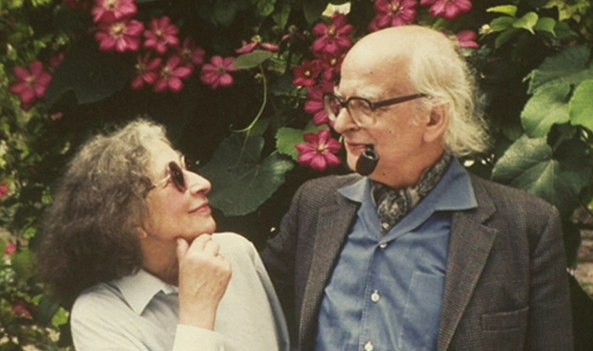
This seminar concerns the work of the polymathic Polish couple Stefan and Franciszka Themerson. He was a philosophically inclined writer; she an astute artist and graphic designer. In 1930s Warsaw they worked together on children’s books and experimental films before moving to Paris, soon being forced apart by the War. They eventually reunited and settled in London, where they established the staunchly independent Gaberbocchus Press, an avant-garde publishing imprint through which most of their subsequent work was channeled.
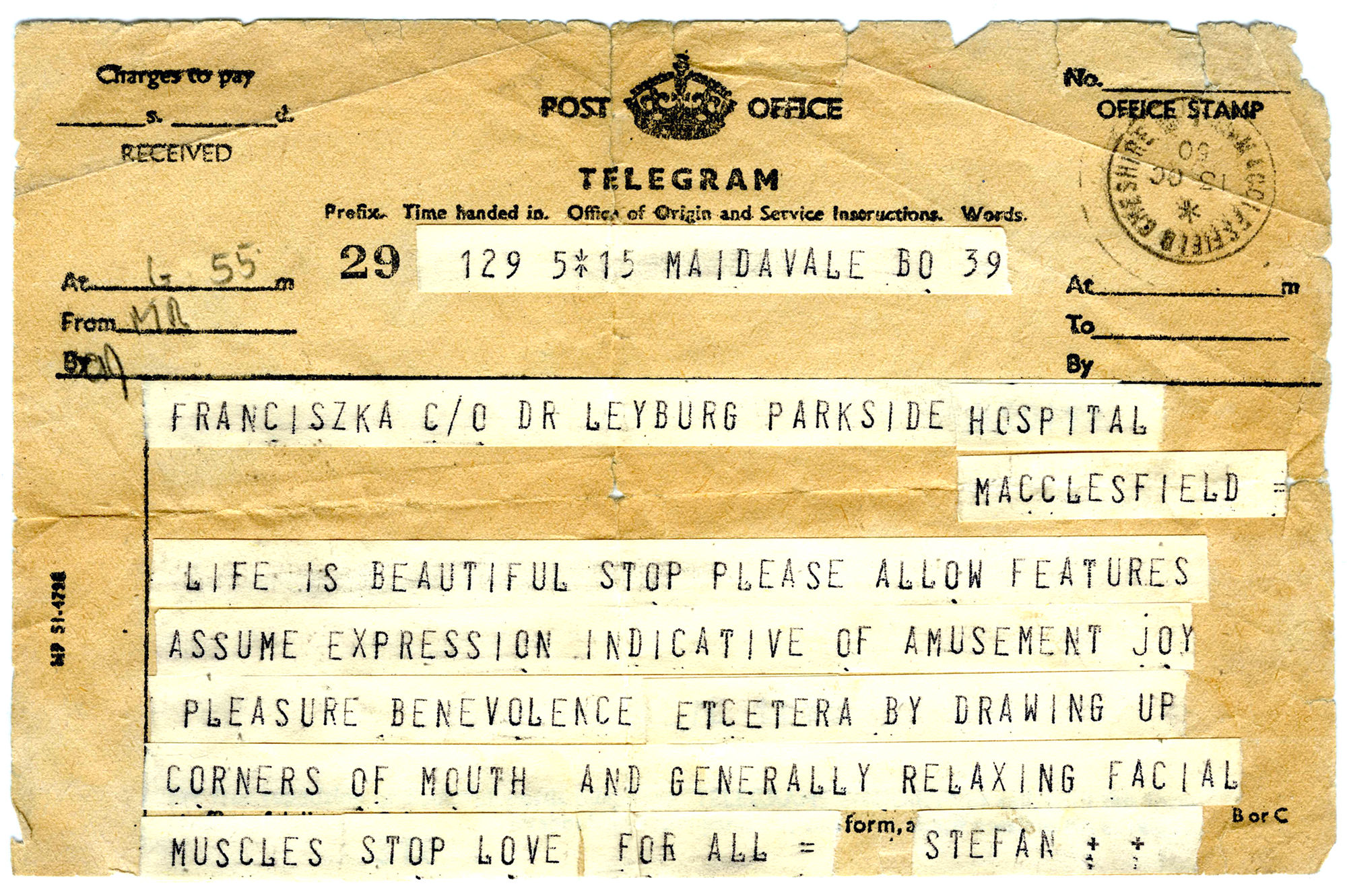
To give you a quick taste of their demeanor, here’s a telegram he once sent to cheer her up:
Now, the modest stack of folders and packets that comprise the Themerson archive here in the museum library are littered with bits of ephemera. That’s the technical term for those miscellaneous pieces of print such as announcements, invitations, pamphlets, and promotional material that gather in the margins of the so-called real work, meaning the books, films, drawings, paintings, costumes, masks and so forth on display a few streets away in the gallery. As the name suggests, ephemera is designed for—and often on—the spur of the moment. Like a telegram, it isn’t really meant to last, so it’s somewhat paradoxical that this sort of material has been carefully archived for posterity. Thankfully so, as it tells us a lot about the Themersons’ attitude and approach, about their colorful humor. I want to take a closer look at this minor miscellany and think about the ways in which it both feeds and extends their major artworks, and vice versa. In fact, in their case I think the distinction is moot—and that it’s precisely this lack of distinction which makes their oeuvre persuasive and illuminating.
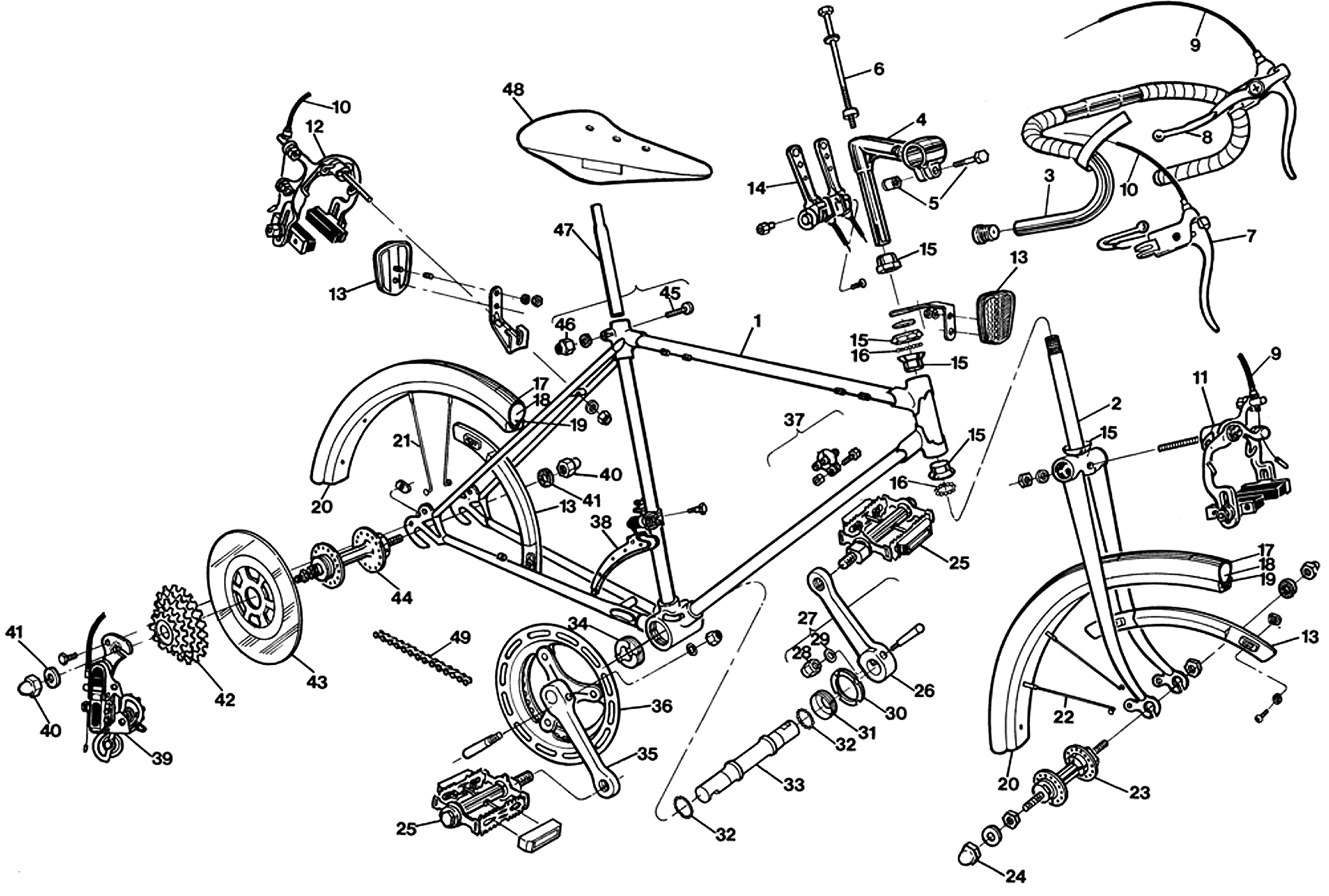
I often think of the Themersons’ output as “publishing in its most exploded sense,” though I have in mind two distinct connotations of “exploded.” The first is an expanded idea of what publishing—literally making things public—could mean: not only magazines and books, or PDFs and websites, but equally readings, performances, films, animations, and even talks like the one you’re listening to right now. As for the second, picture the sort of diagram that shows the constituent parts of, say, a bicycle, while simultaneously projecting how they all fit together. While you clearly see these separate bits and pieces, you can equally perceive what the bike will look like when sucked back into the final assembly.
Imagine the bicycle as a publishing house—one for whom “house” is as pertinent as “publishing,” one that deems all its component parts equally important, however ostensibly insignificant or supplementary; and yet also one that is just as preoccupied with the sum of those parts—with the imprint of the imprint, so to speak. Both senses of exploded imply questioning the platitudes of publishing, which is one of the things the Themersons and their Gaberbocchus Press were all about.
A couple of years ago I saw the German critic Diedrich Diederichsen speak about the artist Martin Kippenberger’s work in terms of two broken joke structures: (1) the endless shaggy dog story that rolls on and on without a punchline; and (2) the joke that ends with the same punchline repeated over and over again. Kippenberger, he said, similarly conceived his work as an endless chain, in the sense that each new piece became the premise for making the next: a painting painted as one of a series to be exhibited in a gallery to be advertised by a poster to be collected into in a book of posters to be announced by a postcard and so on and so on. Kippenberger also once asserted that he’d rather be a comma than a full stop. Wonderful.
According to Diederichsen, this career mechanism conflates both types of broken joke, i.e. (1) the same generating principle on repeat, in view of (2) perpetuating an incessant stream of work. Constituent of this attitude, he went on, Kippenberger worked without any sense of hierarchy between media, so painting and postcard were on equal terms in this unusually egalitarian body of work.
I want to keep this anecdote in mind as we sift through the Themersons’ work. When the same sensibility plays out in diverse circumstances and multiple mediums, the character that runs through the accumulating body of work—its essential identity, its peculiar charm—is offset in greater relief and therefore easier to grasp. One of the guardians of the Themerson archive in London, Nick Wadley, recalled that when he finally met the couple after having been familiar with their Gaberbocchus books for some time, he was shocked to discover how completely the couple’s character mirrored their publications’ personality. “Subtle, wise and funny,” he summed up, “affectionate, ridiculous, merciless, and moral.” This is especially true if we manage to ignore the usual class system that separates upper-case Art from lower-case artifacts and simply treat it all as the product of a singular spirit.
Be warned: I’ll be using the term “ephemera” very broadly here, and there are a few anomalies that aren’t technically ephemera at all. To compensate, I have a handful of other terms that might help situate this stuff in the general scheme of things. The French literary theorist Gérard Genette coined the word “paratext” in the 1980s to refer to those bits of language surrounding—or parallel to—a main text, that serve to present it. The paratextual zone, says Genette, is one “not just of transition but of transaction.” It is “the privileged site of a pragmatics and of a strategy, of an action on the public in the service … of a better reception of the text and a more pertinent reading—more pertinent, naturally, in the eyes of the author and his allies.”
This baggy definition circumscribes any number of supporting devices within the physical bounds of a book, including the author’s name, running heads, contents list, illustrations, footnotes, index, preface, and cover blurb. The overarching concept of paratext also covers material in some way related to the text yet published apart from it at other times or in other places, which includes biographies, autobiographies, articles and interviews. A paratext is something outside the main body that the author has had a role in or otherwise consented to. It might add sense or authority to the “main” work, or simply just publicize it. And so with a little artistic license, I want to transpose the relationship between texts and their paratexts to Gaberbocchus books and their ephemera.
ITEM:
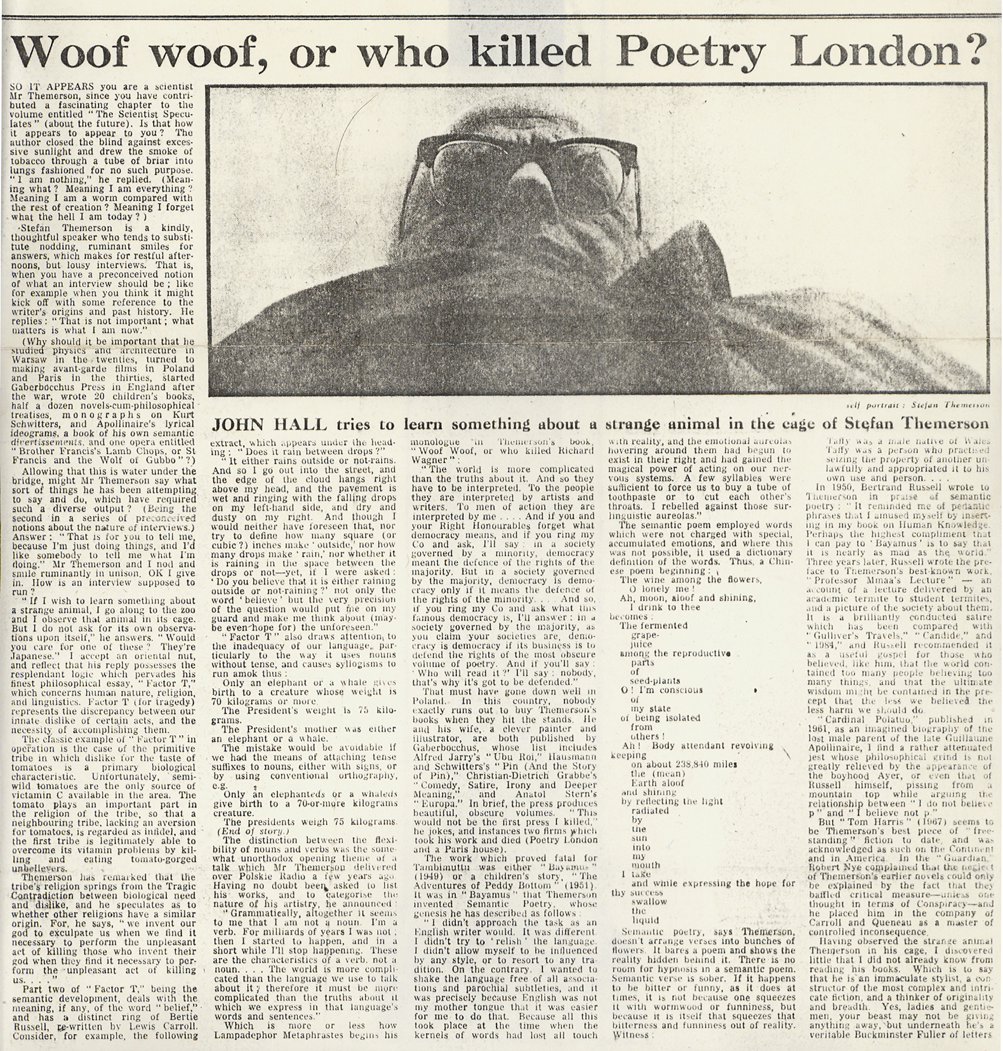
Our first example is a newspaper profile of Stefan based on an interview of sorts with a beleaguered journalist called John Hall cut from the February 27, 1971 issue of The Guardian. Themerson had an extremely low opinion of the biography genre. A close friend and collaborator once sent along a draft précis of Themerson’s life and work for approval, and instead received this typically curt if not altogether unhelpful response:
Mixture of biographic data & personal reminiscences […] I do not like that kind of literary research which consists in finding bits of author’s life & ad hoc connecting them with some bits of his work. It seems to me essentially nonscientific, prejudicial, irrelevant, misleading, & altogether too easy.
He went on to add that he should prefer to learn some irreverent things about a character in one of his novels than some irrelevant things about its author, and elsewhere unequivocally sniffed “bibliography is my biography.” I’d go even further and suggest that Themerson’s work in general is so radically idiosyncratic as to manifest an exceptional degree of character. In any case, given this disdain for literary biography it’s no surprise to learn that John Hall’s supposedly objective profile ends up markedly fraught, snagged somewhere between Themerson’s presumably reluctant consent to a little welcome publicity for Gaberbocchus, and his reflex refusal to play along with commonplace journalistic formulas. Certainly a conventional advertorial gloss wouldn’t do any of their publications justice. And sure enough, Themerson’s obstreperousness yields a seriously off-kilter profile that ends up as sharp and illuminating as anything else that emerged from the Press.
His strategy is to deflect all of Hall’s questions, obliging the interviewer more or less to answer them himself in order to give his readers first an idea about what the work is (already no easy task), then why. As it happens, Hall acquits himself quite admirably by distilling a few of his subject’s dense and often obtuse works via a series of well-executed pastiches of his subject’s stylistic conceits. The article begins, for instance, with a police-style interrogation—a recurring narrative device in a number of Themerson’s novels. Then Hall describes him putting a match to his habitual pipe via a satirical technique of Themerson’s called “semantic translation” that involves replacing stock phrases with their full-blown dictionary definitions.[1]
Then he gets annoyed:
Stefan Themerson is a kindly, thoughtful speaker who tends to substitute nodding ruminant smiles for answers, which makes for restful afternoons, but lousy interviews. That is, when you have a preconceived notion of what an interview should be; like for example when you think it might kick off with some reference to the writer’s origins and past history. He replies: “That is not important; what matters is what I am now.” Allowing that this is water under the bridge, might Mr. Themerson say what sorts of things he has been attempting to say and do, which have required such a diverse output? (Being the second in a series of preconceived notions about interviews.) Answer: “That is for you to tell me, because I’m just doing things and I’d like somebody to tell me what I’m doing.” Mr. Themerson and I nod and smile ruminantly in unison. OK I give in. How is an interview supposed to run?
Stefan muses:
“If I wish to learn something about a strange animal, I go along to the zoo and I observe that animal in its cage. But I do not ask for its own observations upon itself …”
And Hall counters that this particular rhetorical manoeuvre recalls the pedantic deadpan of a convoluted essay on logic and ethics by Themerson called “Factor T”—which of course obliges him to flesh out the reference once again. By now the pattern is set: the interviewer writes himself out of the holes left by the interviewee’s refusal to play along.
But I don’t think Themerson is merely being arrogant here. There’s a generosity to his contrarian stance that’s common among the Gaberbocchus roster, coaxing readers and critics alike into thinking for themselves, steering clear of the lazy lapse into cliché. This sounds too severe, as the imprint’s work is on the whole captivating and frequently hilarious—only not straightforwardly so, and not in a necessarily convenient or comfortable way either. Audiences are invited to reorient themselves and in doing so become *affected*: connections are made, perceptions tilted. The Gaberbocchus mandate was always to pass on past and present ways of thinking at odds with the mainstream, and to this end they were pointedly provocative. It’s even apparent in the obligatory headshot that accompanies the Guardian profile: the camera at arm’s length angled sharply upwards to snap a barely legible selfie, subverting the stereotype to the extent that attitude trumps image.
ITEM:
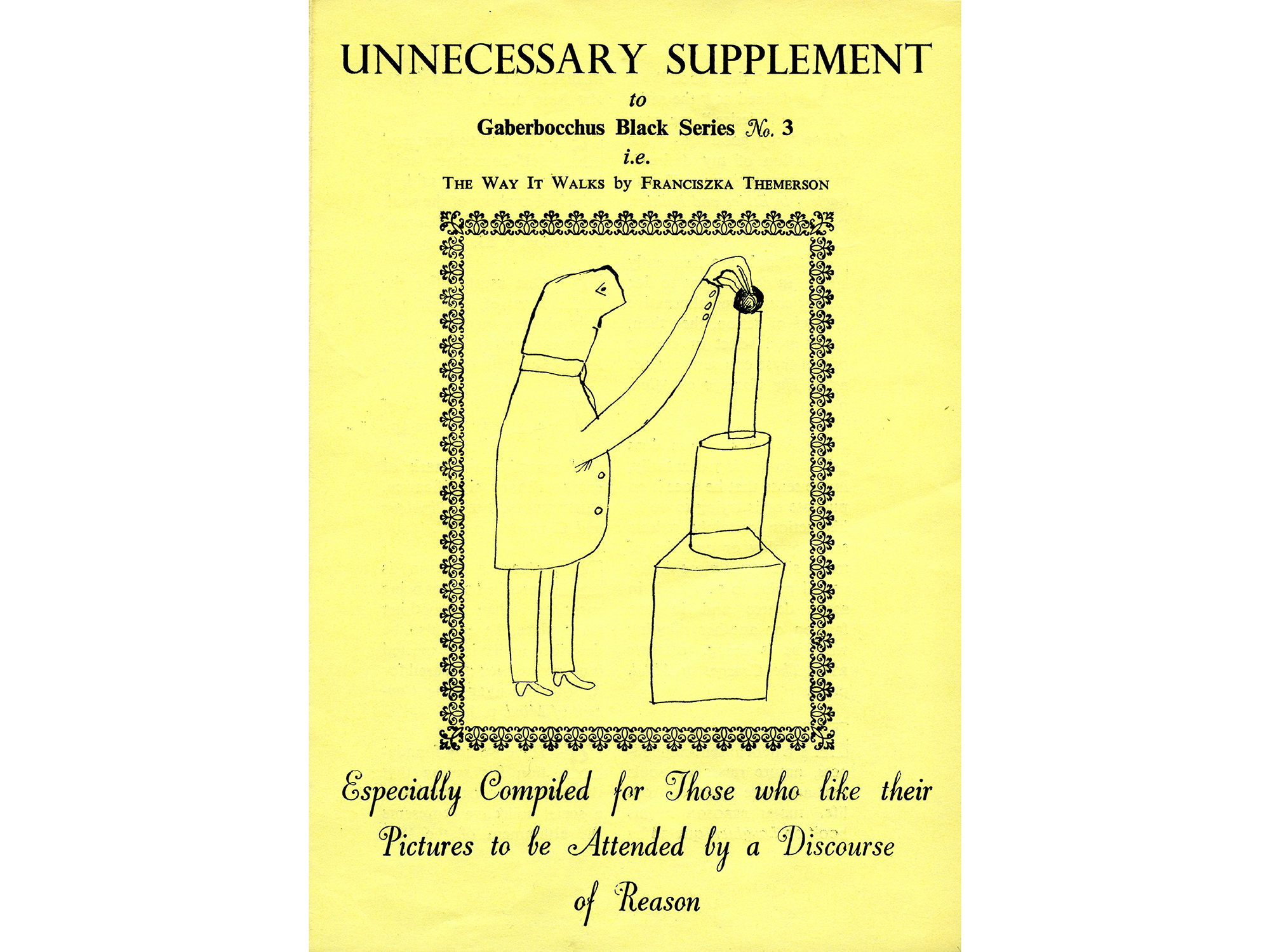
Next I want to quickly pass round this simple folded yellow sheet that grandly declares itself an “unnecessary supplement” to a handful of Franciszka’s wry cartoons of men interacting with abstract sculptural forms and machines. In case the faux-auxiliary conceit is unclear, a subtitle adds that it’s “for those who like their pictures to be attended by a discourse of reason”—a discourse that amounts to one pithy maxim per image, each quoting some kindred spirit on philosophies of mind and spirit, and by no means disposable:
11. When it is abstracted from the commonplace world of everyday life, the Ego longs for a deeper and more authentic existence. (Nicholas Berdyaev)
18. While the old method of presenting truths in the abstract has been falling out of use, there has been a corresponding adoption of the new method of presenting them in the concrete. (Herbert Spencer)
20. That different people have different purposes is an empirical matter of fact. (A.J. Ayer)
22. It is a fact that human beings do not solve problems unless they are put to them in a very drastic way. (J.D. Bernal)
We can conclude, then, that this supposedly superfluous sheet is really only *disguised* as ephemera. Its proper place is firmly tucked inside the booklet where it indeed tethers Franciszka’s ambiguous abstractions to concrete meanings—if the reader is so inclined. And by emphasizing the option, the “supplement” wryly points out that the drawings can naturally be read in different ways, winking at our general discomfort with open interpretation. In sum, this little leaflet acknowledges its own ostensibly secondary status in order to call that status into question.
ITEM:
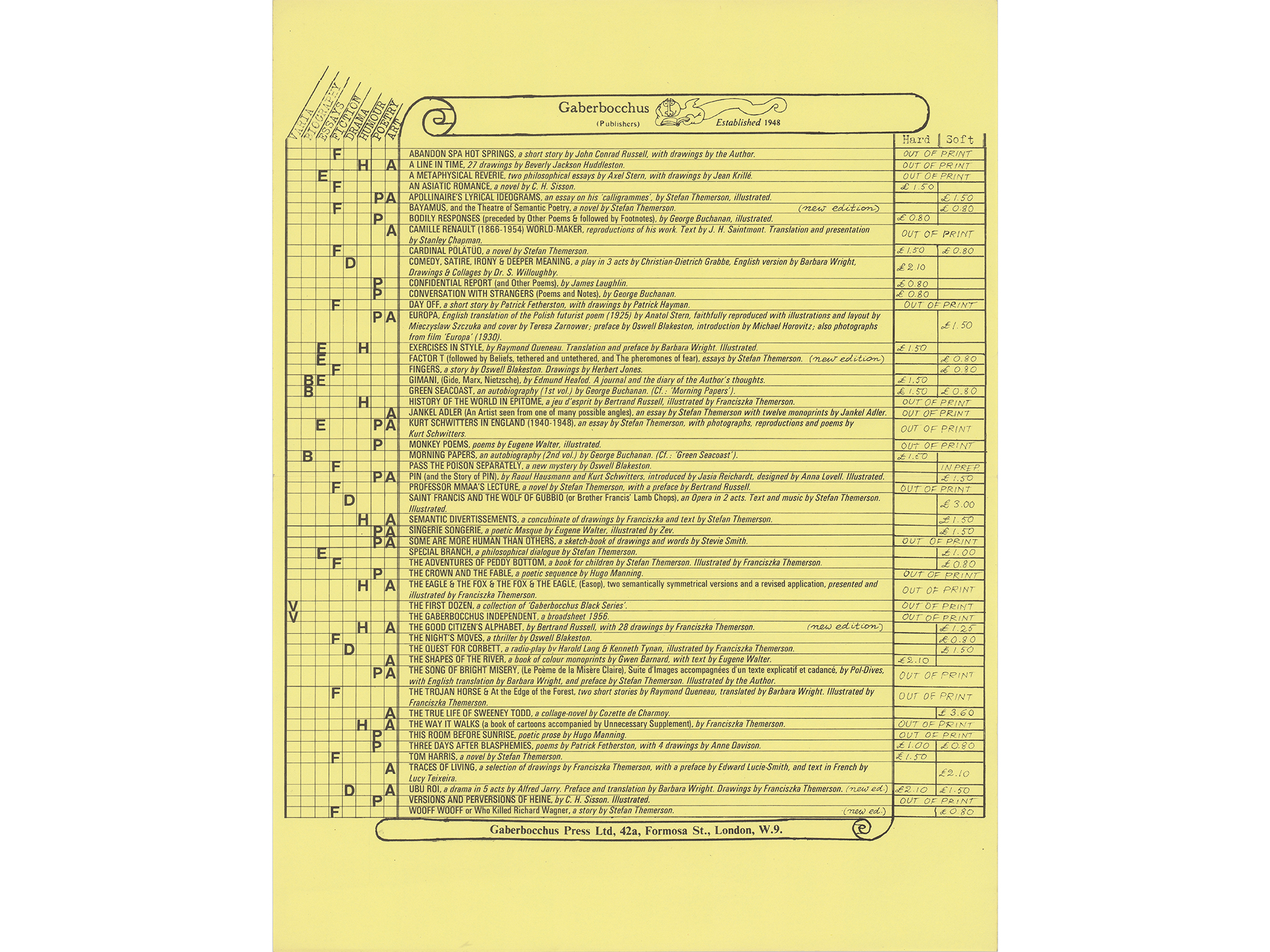
These next two pieces show alternate ways of giving form to what’s basically the same information. As a typography student I frequently worked on projects that involved everyone in the class dealing with the same raw material (same text, same images, same context, same audience) to be turned into the same thing (a plausible timetable or poster or magazine or signage system, whatever). Recently, though, I’ve noticed that design schools have become allergic to this type of homogeneous class project, now usurped by the solipsistic personal one. That’s unfortunate, because whereas group projects afford a whole class the considerable benefit of seeing the same basic matter designed in different ways, the personal project tends to answer only to itself. The fact that it’s conceived in a relative vacuum precludes the possibility of observing and speaking together about why certain works worked and others didn’t—including debating what “working” might mean in each new case. In short, direct comparison affords the opportunity to make work that’s more *answerable*.
That said, all I really want to show with these two documents is how, despite being very different, they both remain entirely Themersonian. Both are modest catalogs of Gaberbocchus publications that I imagine were intended for prospective readers and booksellers alike. The first is a pale yellow sheet printed black on one side, with the Press’s inventory turned into a cartoon scroll by Franciszka’s familiar line. This list is flanked on the left by a matrix that sorts the roster according to category, and on the right by the cost of hard- and softcover editions if still in print. It’s a quietly exemplary piece of information design that articulates a considerable amount of data in a small space without fuss and in an entirely accessible manner.
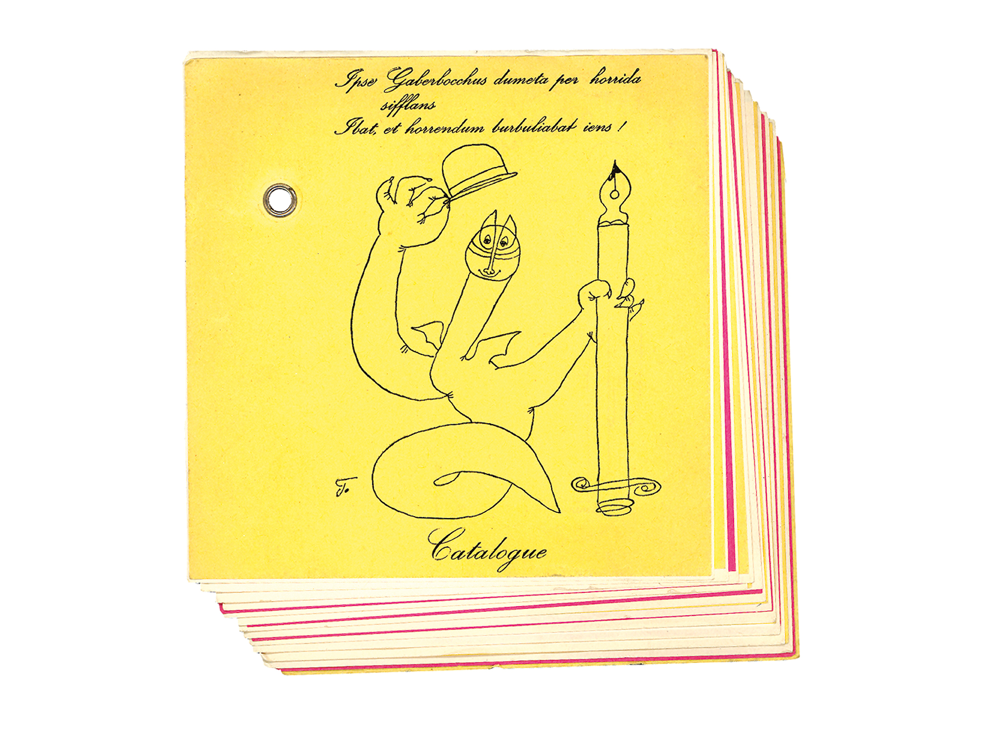
The second instance is a more conspicuously inventive stack of square slips of colored paper, each minutely offset from the last and fixed with a rivet to exaggerate the pile’s very shallow three dimensions—like an axonometric projection of Post-it notes. The individual panels announce old and new books, interspersed with Franciszka’s bibliographic doodles and fronted by the imprint’s louche dragon mascot. The paper mechanics are quintessentially Gaberbocchus: an entirely homegrown operation (initially in the basement of the Themersons’ house in North London, later moved to a building around the corner), the Press circumvented the standardizing influence of the regular printing trade. As their ideas didn’t need to be transmitted to a third party via written, graphic or spoken instructions, nothing was lost in translation. Instead, stuff was designed reflexively at the source, in view of the technology that was about to reproduce it and therefore manifestly ad hoc. Whoever made these brochures clearly had a good time doing so, as they carry the same sense of knockabout experiment as the books they advertise—a sensibility, in fact, that seems less applied (as we might say of an institutional “identity” today) than *deposited.*
ITEM:
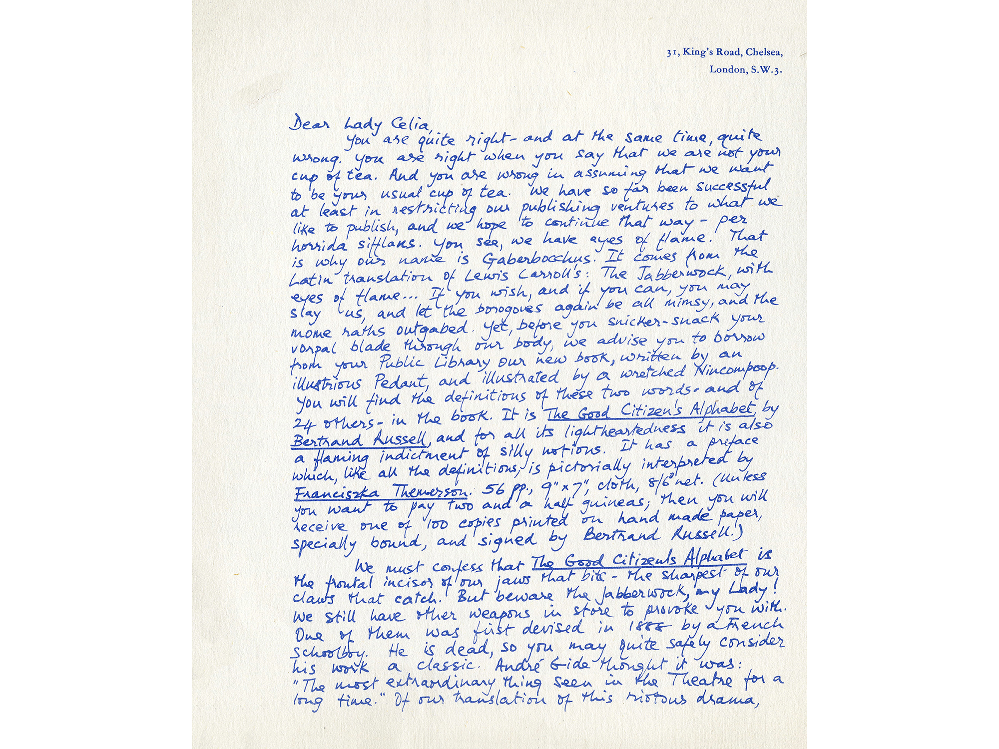
I suspect that Stefan’s pen was responsible for this handwritten blue-printed flyer, apparently written in response to a letter of complaint from one Lady Celia, who asserts that Gaberbocchus books are high-minded, elitist, and generally too arrogantly avant-garde for the common herd. The letter is possibly real, possibly fictional, and I’d guess most likely a blend of the two. In any case, the director responds:
Dear Lady Celia,
You are quite right—and at the same time, quite wrong. You are right when you say that we are not your cup of tea. And you are wrong in assuming that we want to be your usual cup of tea. We have so far been successful at least in restricting our publishing ventures to what we like to publish, and we hope to continue that way …
In order to explain the name Gaberbocchus, he launches into Lewis Carrol’s nonsense argot Jabberwocky, which leads into another advert:
Yet before you snicker-snack your vorpal blade through our body, we advise you to borrow from your Public Library our new book, written by an illustrious Pedant, and illustrated by a wretched Nincompoop. You will find the definitions of these two words—and of 24 others—in the book. It is The Good Citizen’s Alphabet by Bertrand Russell, and for all its lightheartedness it is also a flaming indictment of silly notions. It has a preface which, like all the definitions, is pictorially interpreted by Franciszka Themerson. 56 pp., 9" × 7", cloth, 8/6 net.
Again, it’s a mundane publicity task turned into a game that generates a useful text, not unlike the challenge imposed on the Guardian hack. Stefan continues to address Celia’s accusations with passing reference to as wide a range of Gaberbocchus publications as possible, simultaneously inventorizing and advertising (a) the Press’s backlist, (b) its comic disposition, and (c) the outraged Lady’s prejudices. Three birds with one stone!
Perhaps it may be as well to tell you that what we do is not a millionaire’s fancy. We are just taking advantage of the freedom provided by the private enterprise that still exists within the publishing world in this country, defying as we can the laws of economics and paying the full price for our barbarous pleasures.
Like those two previous booklists, the overtly “domestic” style here doesn’t comes across as stylized. That’s to say, it doesn’t strain to look amateurish. It simply is what it is: a casual, expedient means of announcing the books with a bit of impromptu blurb that reads less like marketing, more like a limbering up to write something else.
ITEM:
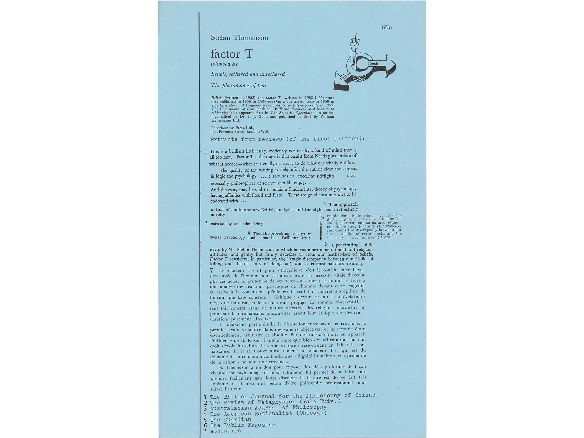
Here’s another quick flyer to advertise Stefan’s “Factor T,” visibly patched together on pale blue from a bunch of different reviews and a summary cartoon diagram. Yet again it’s plain to see how the particular premise (a collection of clippings) suggests a particular form (a collage). The previous item looked like a letter from the publisher, which is what it was. This one looks like an assembly of others’ opinions, which is what it is: things being what they are, so-called ephemera.
ITEM:
Now for a more involved example; namely, an essay with the dual title “A well-justified postscript … Topographical typography,” in which Stefan reflects on how typography influences reading. It’s the last piece in the 1965 edition of the Penrose Annual, a yearly collection of essays on the graphic arts. Specifically, the document I’m holding here is a complimentary “run on” copy of Themerson’s article, a discrete signature occasionally offered as a courtesy to authors. I mention this only to flag again the fact that it’s not literally or technically ephemeral—but certainly an orphan format.
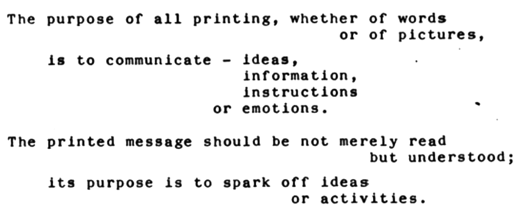
The first half of the title is a play on the term “justified text,” which is when consecutive lines are forced to correspond in (visual) length by inserting different amounts of space between the words. This results in a squared-up block of type, like most of the excerpts on the blue “Factor T” flyer. Conversely, when text is “unjustified,” the spaces between words are all identical and lines left to run their own length. This yields an irregular or “ragged” edge on one side, usually the right—like the text you’re reading right now.
To digress a little, probably the most celebrated and loaded debate in the history of typography is that of “symmetrical” versus “asymmetrical” layout, the crux of which is compressed into two articles published a few months apart in a Swiss design journal immediately after the Second World War. The first was a statement by the eminent German typographer Jan Tschichold, followed by a loosely veiled rejoinder by the equally eminent Swiss polymath Max Bill. In the postwar context, their apparently harmless aesthetic spat was unusually charged with more broadly ethical overtones.
Tschichold was and still is regarded as the godfather of modern typography, largely due to his books Die neue Typographie (1928) and Typographische Gestaltung (1935), which remain the ur-arguments for asymmetry. The premise of asymmetric typography is that words and pictures ought not be arranged according to some idea of pleasing composition (e.g. a “classically balanced page”) but actively configured to emphasize their specific meaning. However, Tschichold drifted from this early hardline, and in a 1946 article renounced his earlier pronouncements as being too extreme, advocating instead the values of conventional etiquette, balance, and order. Meanwhile, Bill steadfastly renounced such traditional views on principle, in favor of an approach that blended Tschichold’s earlier doctrine with the cool austerity of industrial aesthetics. Crudely summarized, then, symmetry capitulated to conventions, while asymmetry started from scratch in each new case.[2]
Although never addressed in Tschichold’s early work, the question of justified versus unjustified setting effectively distills the same debate. Justified text conforms to symmetrical tendencies inasmuch as it forces any text into a classically established, orthodox frame, while unjustified text conforms to asymmetrical ones inasmuch as it allows text to run its own “natural” course and so determine its own shape. As typographer Robin Kinross has noted, “the social implications are obvious.”
Unjustified setting was the modernist party line on two main counts: it broke from tradition, and it was rational. However, contrary to what we might readily expect from someone who was wholly aligned with the European avant-garde and a rare catalyst of modernist ideas in Britain, Themerson’s “well-justified postscript” actually sets out arguing the case for justification. His reasoning has nothing to do with abstract principles of balance or geometric order, nor with upholding traditional values, but the far more prosaic fact that conventions are shared codes that can usefully frame the text the reader is about to read. It’s a testament to his unwaveringly independent thinking.
Written in dialogue, the piece begins with a Stefan-like protagonist opening a book, reading a line, and slamming it shut. A second character, Brutus, asks him why he’s so upset:
“Because it is prose.”
“And you expected it to be what? Poetry?”
“Yes.”
“Why?”
“Because of its layout. A silly new fashion: unjustified setting. I wonder who could justify it.”
“Surely, this isn’t of such great importance …,” he began.
“It isn’t,” I agreed. “All the same, I’m used to it that, when I open a book, I can tell at once, without reading a word—‘O, this is a novel; and that one is a play. Here is pure mathematics and there is a musical score. This is a dictionary, that is a telephone book, and that other one is a volume of poetry.’ Now because of unjustified setting all that is no more possible, something essential has been destroyed.”
The melodrama continues as this distraught reader proclaims, first, that only justified setting affords a page of prose a unique gestalt or “face” (to the extent, he claims, that a page of Hemingway is immediately distinct from a page of Proust); second, that justified columns foster easier reading by virtue of being invisible, justified ones disruptively draw attention to their unruly presence; and third, that the line ending has always been one of poetry’s prime “weapons”—the power of which will diminish with this recent vogue for ragged lines.
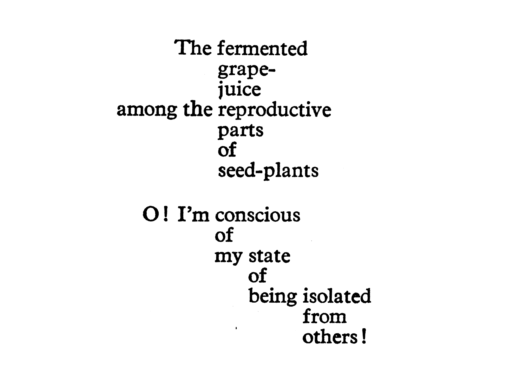
On the other hand, the story equally posits that such conventions can be usefully broken, as the protagonist proceeds to demonstrate an extreme form of unjustified setting called Internal Vertical Justification, or IVJ—another technique that repeatedly crops up in Stefan’s wider body of work. IVJ takes the idea of active, asymmetric layout to radical ends. It is entirely at odds with the premise of justification, which arranges language at the level of the page, i.e. according to an aesthetic principle. Instead, paragraphs and sentences are configured on two axes to more closely embody meaning, i.e. according to a semantic principle. In short, the aesthetics of IVJ derive from the semantics of a text. Shorter still: semantics = aesthetics. There’s no distinction:
In this strange appendix, then, Stefan offers a third philosophy of typography that coolly transcends the binary of the Bill-Tschichold debate: neither entirely symmetrical nor asymmetrical, but a considered hybrid of the relative order and relative freedom that they respectively represent *according to the particular nature of the particular job at hand*.
The point is not that every text is unique and so conventions must be perpetually scrapped, but that every case involving text deserves fresh consideration because each specific situation affects the relative importance of questions like justified versus unjustified or symmetry versus asymmetry. The benefits of conventions, says Themerson, ought to be perpetually weighed against the benefits of breaking them, and neither propagated in the abstract. Pragmatism wins out over ideology.
There are a few other aspects worth noting. First, by writing up his thoughts as a goofy dialogue, Themerson stresses that such questions can and should always be open to debate—whether that debate is with oneself, a client, an audience, or any other critical interlocutor. Second, in creating a character who takes his typography far too seriously the author shows he doesn’t take himself too seriously. And third, the real postscript here is that nothing is sacred, conditions are always prone to change, new axes are always opening up, and when they do, perspectives and requirements change, too. This last point is made succinctly at the article’s end when the protagonist casually lets slip that his interlocutor Brutus is in fact a talking dog.
ITEM:
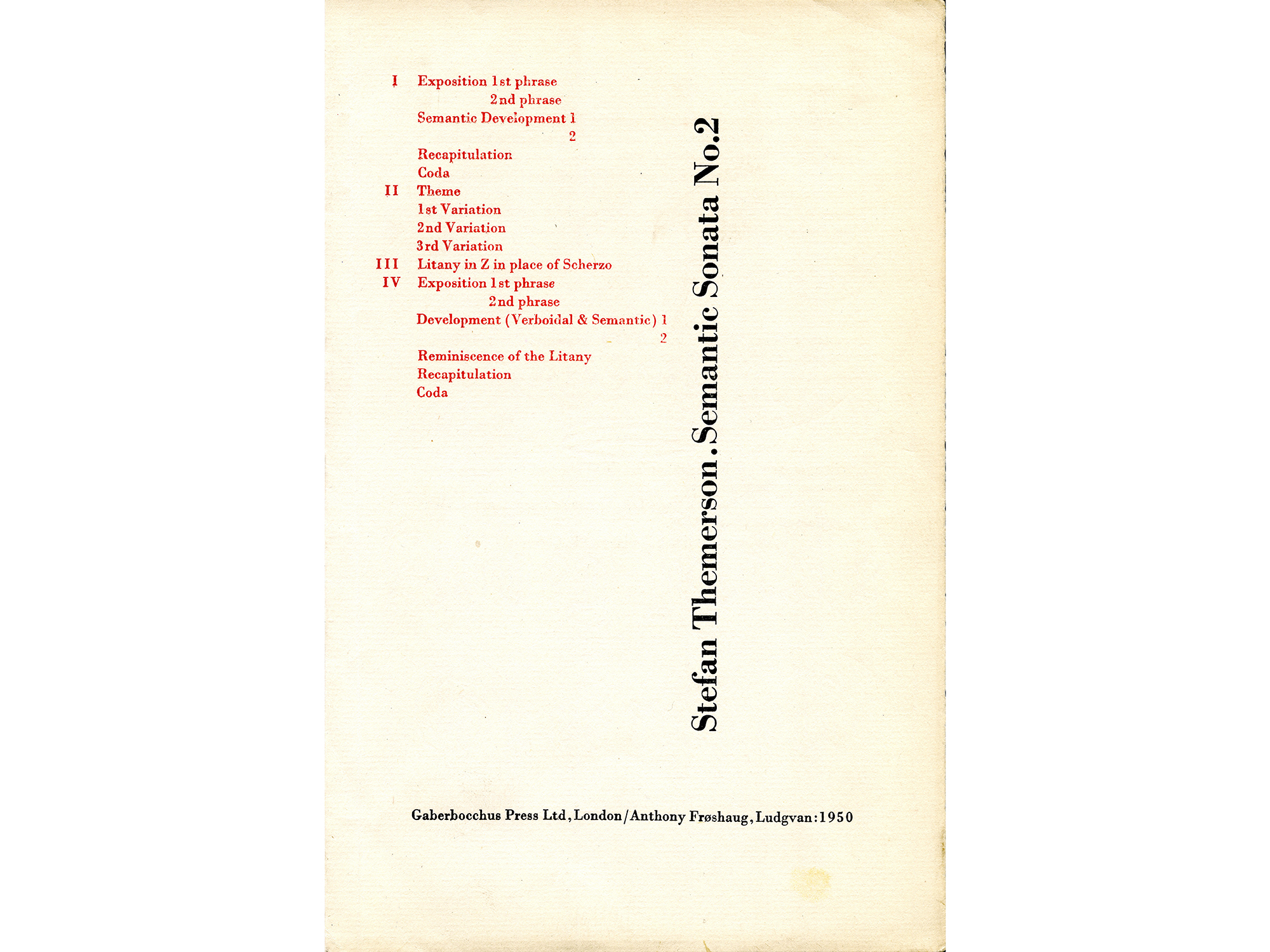
Our final talking point qualifies as ephemeral in the sense that it appears to be a working proof of something Stefan made together with the typographer Anthony Froshaug. It’s a prospectus—a sampler or teaser—for a “Semantic Sonata” written by Themerson and printed letterpress by Froshaug according to those aforementioned principles of Internal Vertical Justification. In fact, the two first met when Froshaug was curious about an IVJ section of one of Themerson’s pieces of writing published in Polish. Not speaking the language, Froshaug was unable to comprehend the meaning that appeared to dictate the arrangement, so they translated it together, stacking possible words on top of each other and becoming friends in the process. Later they worked on this sonata in tandem, too.
At the time, Froshaug was living in austere conditions in Cornwall, engaged in an elemental, back-to-basics investigation of printing by exploring the limited possibilities afforded by a small hand-operated press. Froshaug’s tinkering with the obstinate materiality of moveable metal type mirrored Themerson’s tinkering with the graphic atoms of language. Both were out to embody intrinsic relationships to constructive ends, and this project was an ideal opportunity to align form and content, technics and ethics. For instance, as you can already see from the table of contents printed in red, the “Sonata” involved a series of uncommonly large and varied line indents, and this required an equally unorthodox use of the press. Language was being radically re-assembled in both physical and conceptual terms.
Themerson once noted that contemporary philosophers are interested in the idea that the pattern of language “reflects the relationships that are in the world, and therefore [that] the study of the pattern can tell us something about the world.” Out on a limb with few clear precedents, aesthetic adventures like the “Semantic Sonata” suggest yet another analogy with social organization: namely, the theoretical ease and practical difficulty of conceiving newly meaningful arrangements.
ITEM:
To round this up, here’s a bonus discovery I’m repurposing as a full stop. It’s a detail from the Gaberbocchus-published version of Stefan’s essay “Apollinaire’s Lyrical Ideograms,” which focuses on how the mercurial French poet forged unusually symbiotic relationships between words and the things or ideas they represent, such as in “Il Pleut,” his seminal poem set as cascading lines of rain. To introduce the idea, Themerson supplants the word “red” with a small red sticker in every copy:
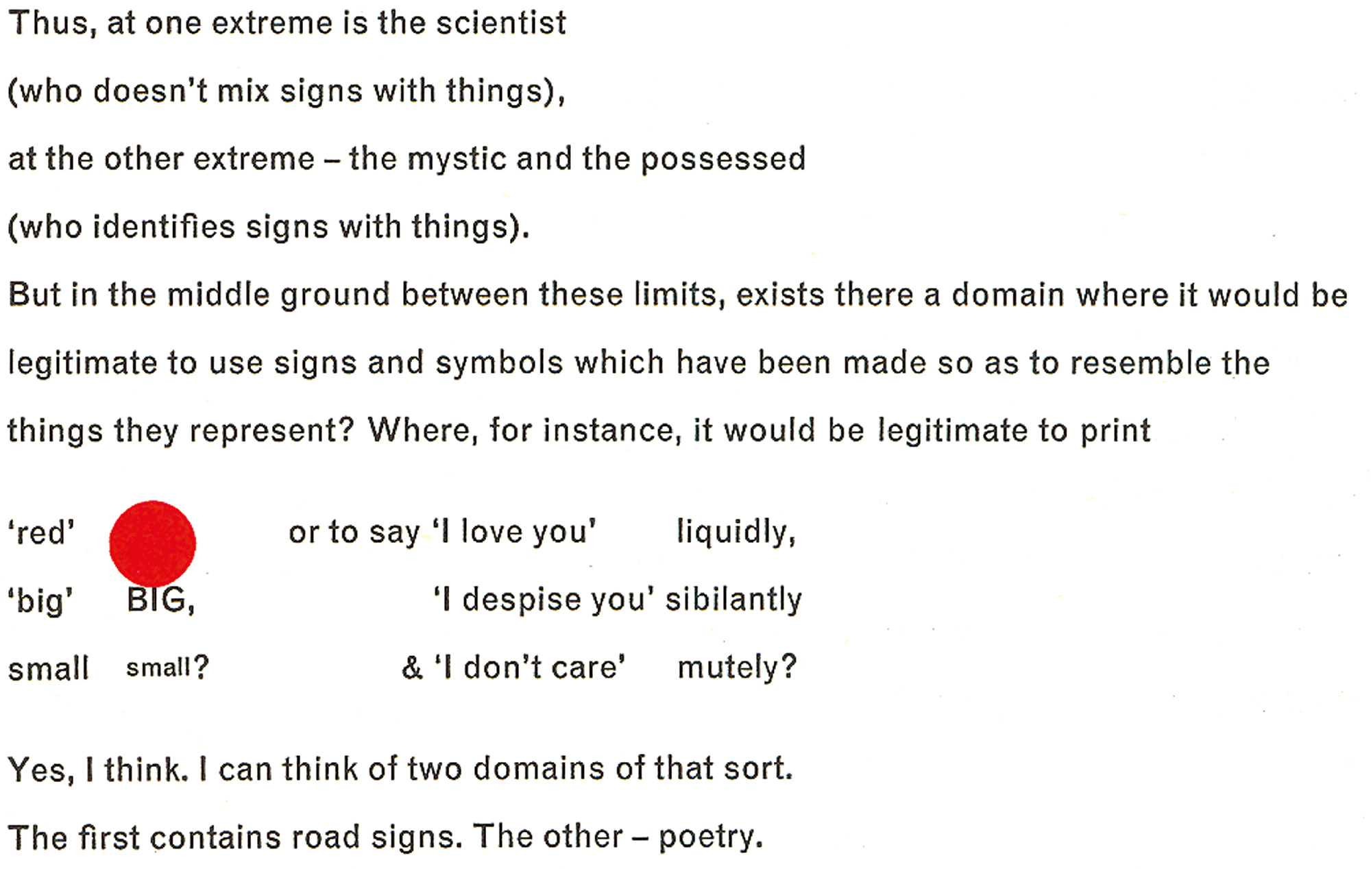
It’s a lovely gesture that marks a quality native to all of the Themersons’ work: the idea of things simply *being themselves,* without surplus or spin. It was already evident in the earliest work they made together in Warsaw in the 1930s, first photograms, then the films they conceived as “moving photograms.”
A photogram, Stefan once wrote, is a print made by direct contact, which means:
It doesn’t represent anything.
It doesn’t abstract from anything.
It is just what it is.
It is reality itself.
Whether visually or linguistically, earnestly or sardonically, Stefan was always out to convey the unmediated truth of a situation—and usually did so by forging a third route between two orthodox poles. Given the sort of close reading and looking we’ve been concerned with here, this might sound like a strangely inflated claim to make. But if we conceive of a contrary “untruth” as synonymous with the total mediation typical of today’s advertising, marketing, and propaganda, then the rogue ethos that marks the legacy of Gaberbocchus Press and their ilk remains a much-needed beacon for artists, designers, writers, and hybrids working today.
The most apposite word to describe the Themersons’ work, from enduring art to throwaway ephemera, is a compliment that sounds like an insult:
artless.
*
Notes:
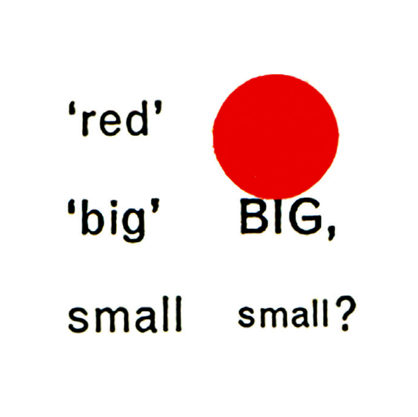
1. Semantic Translation is more double-edged than this one line summary suggests. Although it’s ostensibly an attempt to reclaim the “truth” behind words, the proposition is essentially ironic, not proselytizing. It’s more accurate to say that at best “truths” are more properly “beliefs,” and that beliefs should be treated with the utmost suspicion. One of the great benefits of Themerson’s technique is that it reminds us how “the world is more complicated than the language we use to talk about it.” Here’s an example: from some clichéd input:

to its semantically translated output:
 The process of reading through the pedantic extent of a piece of Semantic Translation is to experience language made strange; to perceive both its technical depth and its limitations. Stefan called this “scratching the form to reveal the content.”
2. To elaborate on these “overtones”: for Bill, the set of conventions collected under the awkward shorthand of “symmetry” was analogous to the conservative, traditionalist, decorative and implicitly fascist tendencies of Nazi Germany, while “asymmetry” aligned with progressive socialist positivism associated with austerity and renewal. Tschichold, meanwhile, equated asymmetry with the sort of blind ideology proclaimed by such as Bill, which now seemed unacceptably doctrinaire. For him, the all-out push for asymmetry was so blindly authoritarian and uncritically obsessed with “machine aesthetics” that it obliterated many useful lessons of tradition. Ultimately, militant modernism disregarded the notion that different kinds of text might require different solutions—some symmetrical, some asymmetrical.