Character Development
2020
This short overview of the typeface Mitim, developed with Radim Peško for Dot Dot Dot and beyond was written to accompany a survey of his work in Idea 392 (2020). There is also an exhaustive account of the project in Revue Faire 9 (2018).
*
In 2000 I co-founded Dot Dot Dot, a biannual left-field arts journal initially grounded in graphic design whose interests broadened to include all the arts and later beyond. For the first five years we designed each new issue more or less from scratch, and the typefaces we used changed accordingly. These included an update of the IBM Composer font George Maciunas used for his Fluxus ephemera, Plantin, Futura, Blado, Palatino, a version of Gill Sans with a few alternative letters based on early incarnations, Franklin Gothic Demi, Monotype Grotesque, various Garamonds, and so on. The only real common quality of these characters was that they tended towards the semibold, but we always had the feeling that nothing fit quite right.
The tenth issue, nicknamed “X,” was a “best of” the previous nine, cobbled together from original pages to make a new whole. On reflection, we resolved to make the whole process more simpler and more convenient by finally settling on a fixed grid in order to spend less time designing and more time editing—and to likewise restrict ourselves to a single font. A colleague, Radim Pesko, seemed to share our simultaneous interest in typefaces and ambivalence towards adding new ones to the world, and on this basis we thought it could be paradoxically productive to commission him to “essay” a house font in the same way we might ask anyone else to contribute an essay. The idea was to develop a new character from issue to issue, which would both ease the pressure of producing an entire family in a short space of time, and allow for the character to grow up in public.
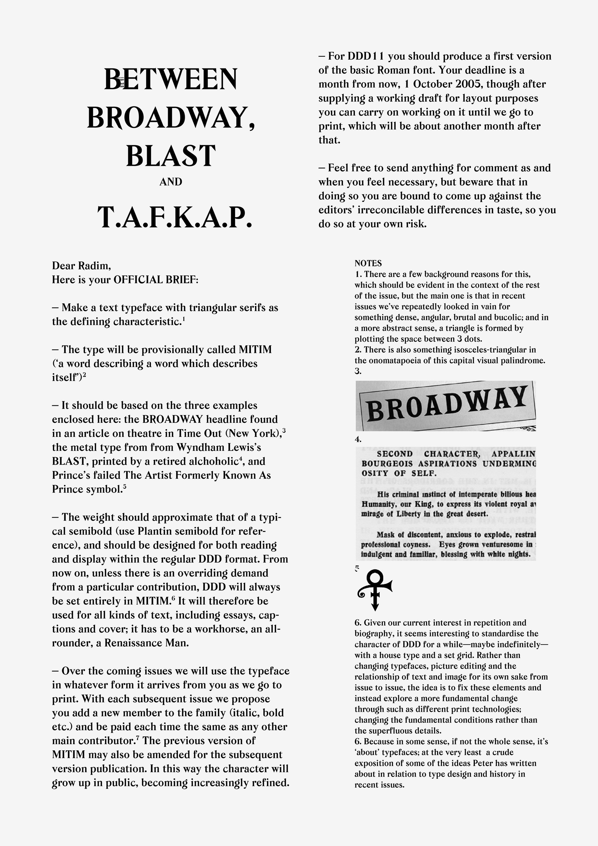
We sent Radim a fairly unhinged brief to design us a heavy semibold with triangular serifs along with three historic reference points: (1) a typeface used for the long-running small-format American theatre journal Playbill, (2) the hot metal type used to set the ferocious body text in Wyndham Lewis’s Vorticist journal BLAST, and (3) the gender-fluid symbol that had then been recently adopted by The Artist Formerly Known as Prince to replace his common name. All three sources were markedly heavy and somewhat spiky. We summarised that what we were after was something “bucolic,” but looking at a dictionary definition now I’m pretty sure we didn’t know what the word meant, exactly; it was the sound that felt apt. In retrospect I’d say we were after something a bit oily.
In any case, what Radim eventually sent back was somehow exactly what we didn’t quite have in mind. Following a contemporaneous project by the artist and regular contributor to Dot Dot Dot, Ryan Gander, we christened it “Mitim.” As recounted in a pair of interviews in issue 11, Ryan was trying to introduce a newly invented word into the English language by convincing various writers and editors he knew to insert it into their texts and publications. If this guerrilla action proved successful, Mitim would then qualify for modern dictionaries by force of public repetition—and we were more than happy to help the experiment along by setting up a reason to include the word in our pages.
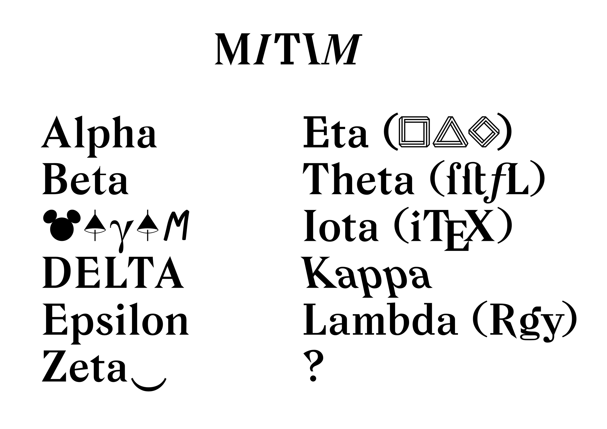
Radim appended “Mitim” with a greek “Alpha” to mark the start of the process. He sent the newborn along with the first of his oddball “waterfall” sample pages for the inside back cover, demonstrating the typeface in different sizes via a collage of pop-cultural non-sequiturs that usually amounted to a certain kind of slippery sense. Given that there was only a single weight at this point, we were forced to use ALLCAPS rather than, say, italic, to distinguish titles and suchlike. And so Mitim Alpha was duly used to typeset the whole issue and herald what turned out to be the second half of the journal’s existence.
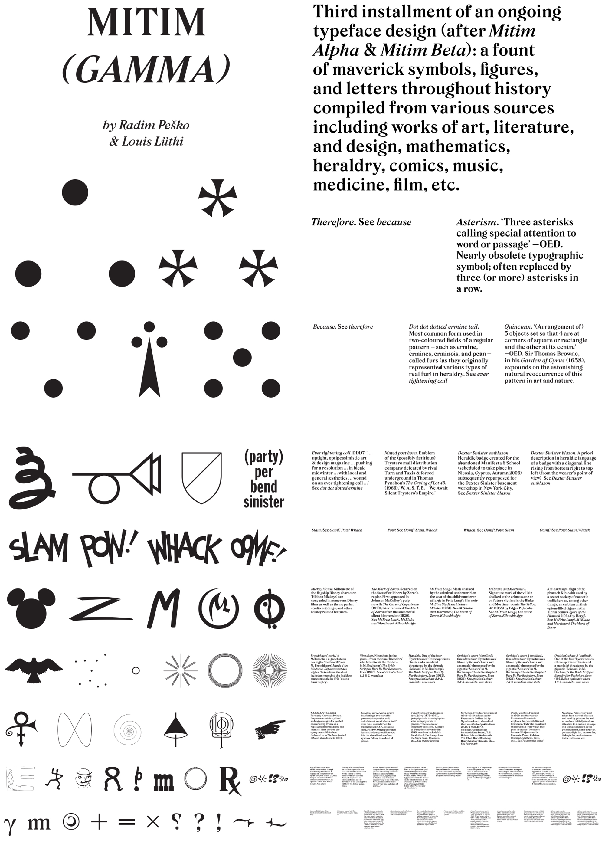
Six months later, Radim dispatched Mitim Alpha’s italic counterpart, Mitim Beta. This first pair already felt more than enough for our Calvinist taste and temperament, and they were used more or less as the basis for the remainder of Dot Dot Dot’s life. While the obvious thing to do next would have been to introduce bolder and lighter variants, we instead ordered a set of eccentric symbols and invited our most literary contributor, Louis Lüthi, to compile a series of historic glyphs together with Radim that we might put to unknown use in future issues. Duly assembled, Mitim Gamma was a free-ranging set of both specific and generic symbols for #13 drawn from the histories of literature, comics, advertising, science, fine art, medicine, and more. Radim digitised the lot, and embedded Louis’ brief accounts of each one’s provenance within the font file, accessed by pressing the shift key with each character.
The following instalment was stranger yet. For some reason the issue contained a lot of references to shadows, including one on the cover stolen from an unused cover for Cabinet magazine, and so Mitim Delta arrived in the e-mail as a set of mock-3D shadow letters that we put to work flagging a series of alphabetised quotes from Gilles Deleuze’s Abecédaire, a long-form TV interview from the early ’90s. #15’s Mitim Epsilon was limited to a single character – the fantastically named “Interrobang,” invented in the early ’60s, that combines an exclamation and question marks into single sign whose closest translation in 2020 is something like WTF. Picking up speed now, #16’s Mitim Zeta was more or less our standard Alpha, only white-on-black and back-to-front in an issue full of mirrors. #17’s Mitim Eta had stabilising blocks strapped to its feet. #18’s Mitim Theta seems to have been an occasion for finally combining Alpha and Beta into a single font for the sake of convenience, as well as adding a bunch of ligatures. The only real change in #19’s Mitim Iota were two 45-degree squares that replaced the usual dots over the i and j—an iota of a difference. And for what turned out to be our swansong 20th issue, Mitim Kappa was an anti-italic that, like our editorial approach generally, involved straining backwards to see what it had become in order to work out how to continue. Kappa was used in the issue only twice: to typeset a line on the outer spine that read “… In which DDD finally attempts to say what it stands for and what it’s gonna do about it,” and a farewell note called “Final Words.” To mark the occasion, Radim’s sample “page” was compressed into the width of the spine and printed on the inside, hidden under the binding glue and therefore only accessible by literally breaking the journal.
And that appeared to be that, because Dot Dot Dot then abruptly broke itself, by morphing into a broader enterprise called The Serving Library, all dressed in another new typeface called Meta-The-Difference-Between-The-Two-Font which is a whole other story. It turns out, however, that Mitim has had something of a clandestine career since, moonlighting in a host of other publications so far as Mitims Lamba, Mu and Nu. And so who knows, our little friend might make it all the way to Omega one day.
*