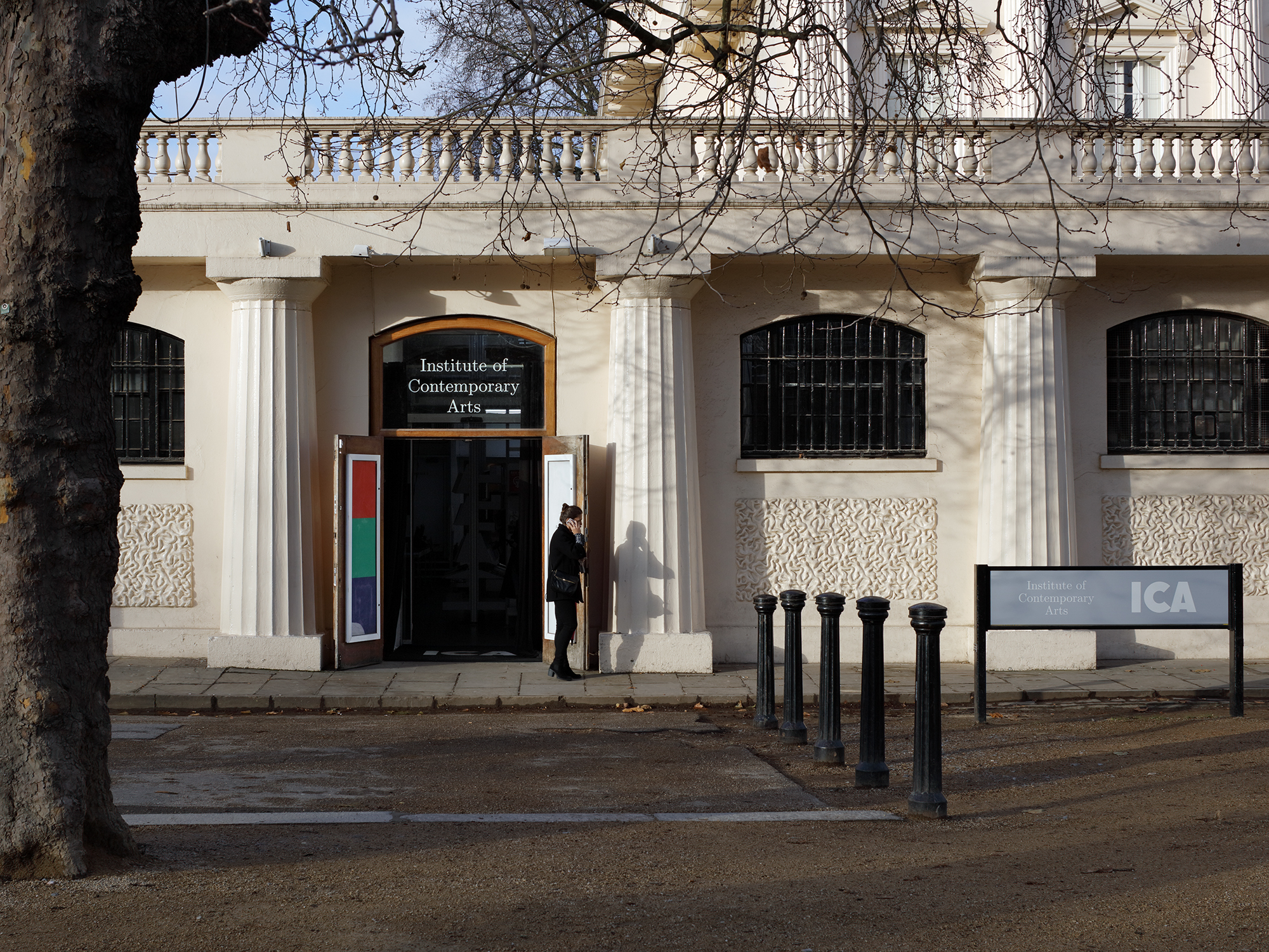
Institute of Contemporary Arts
2017–22
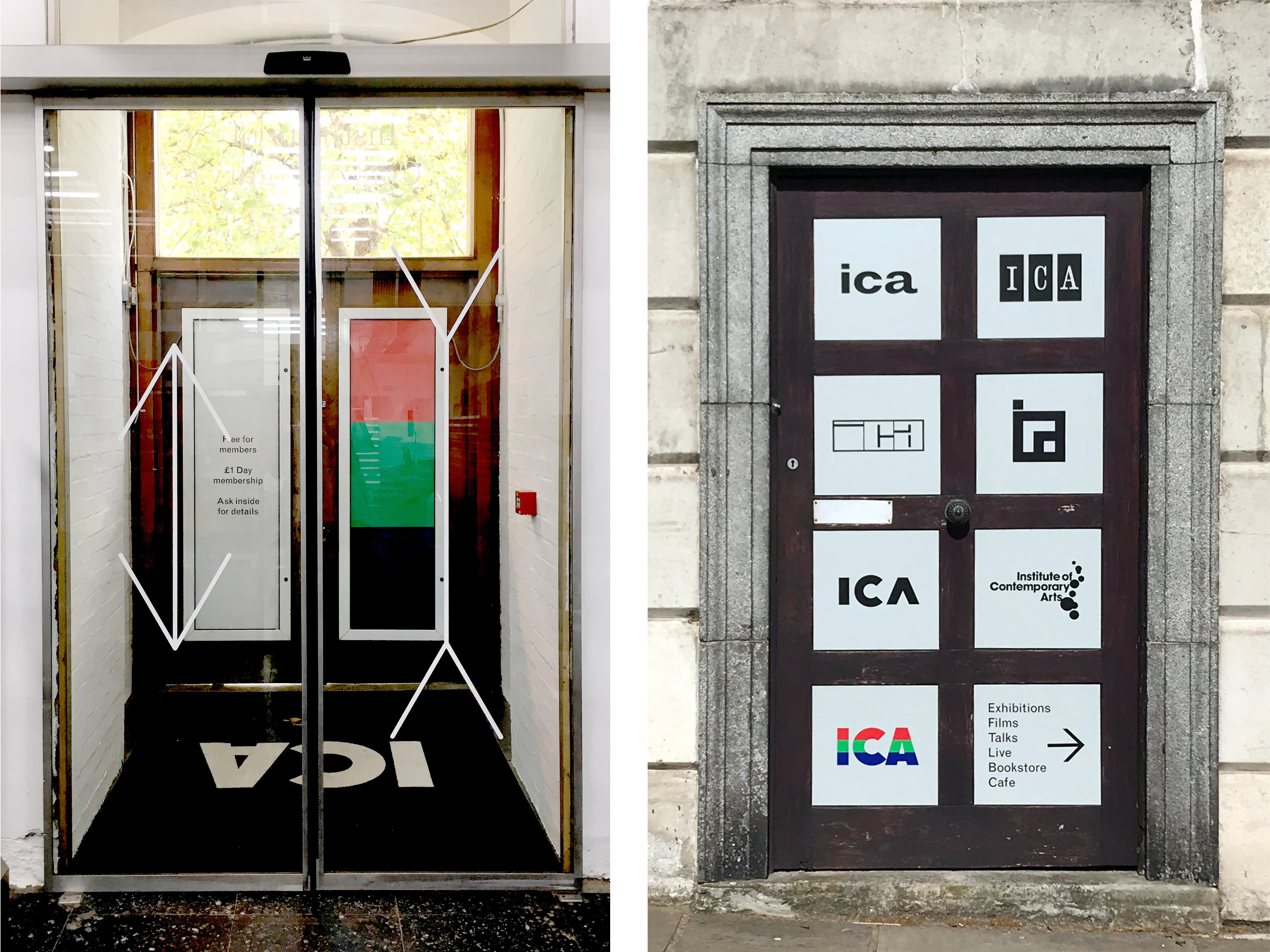
This open-ended graphic identity for the ICA was designed following ideas explored in the Dexter Sinister video essay “Identity”. Implemented in 2017 and developed over the five years I worked there as Head of Design, it was based on the following DNA:
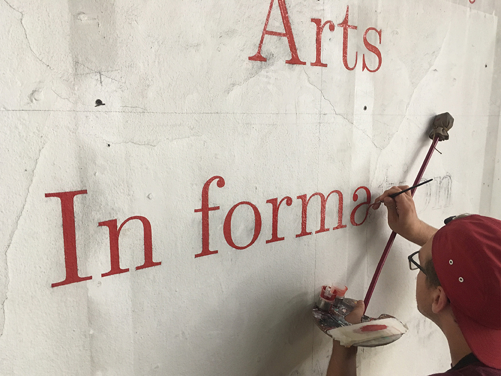
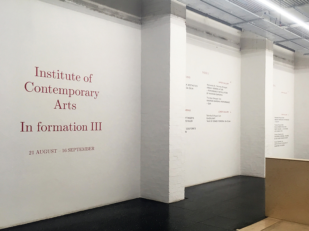
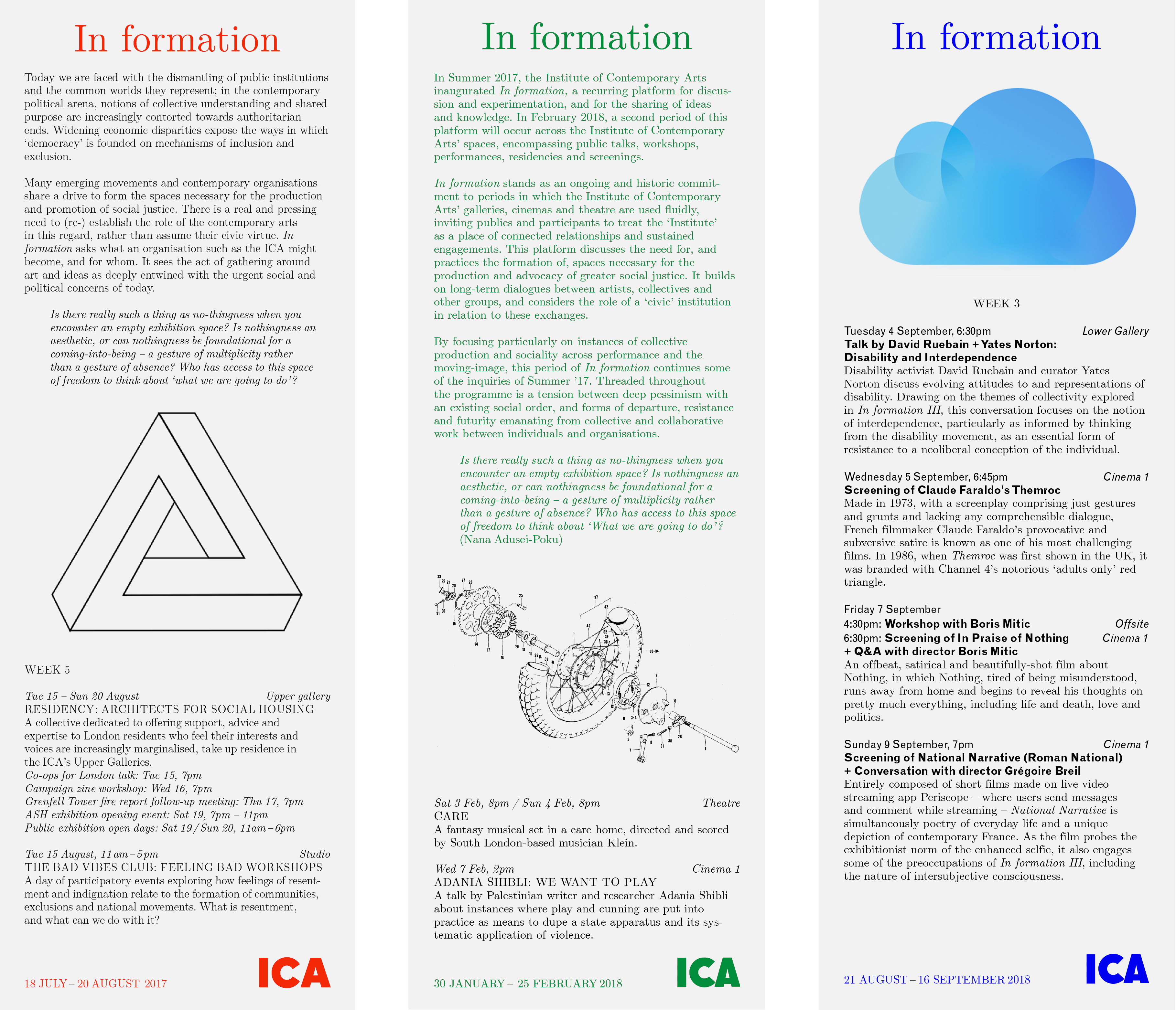
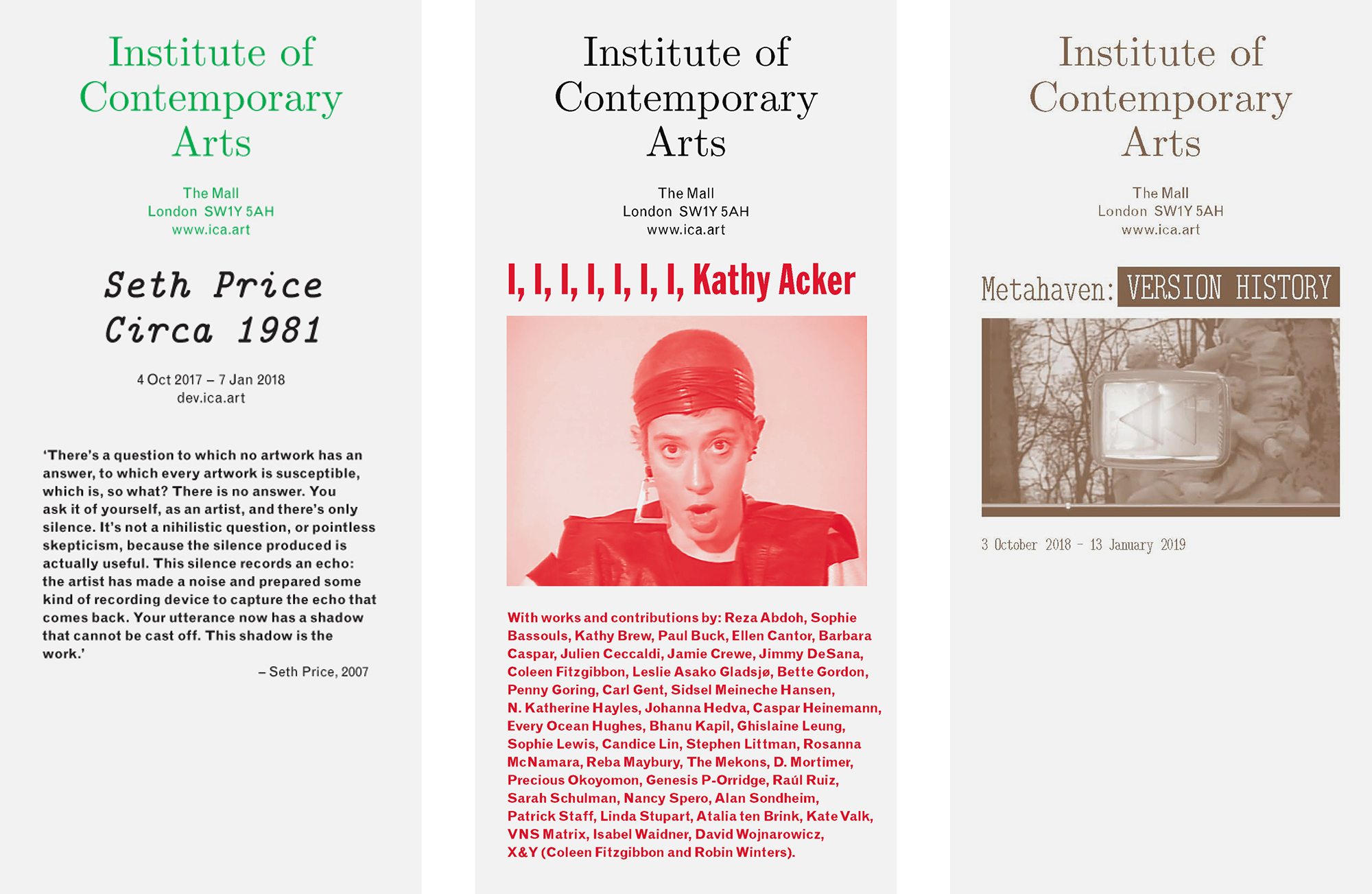
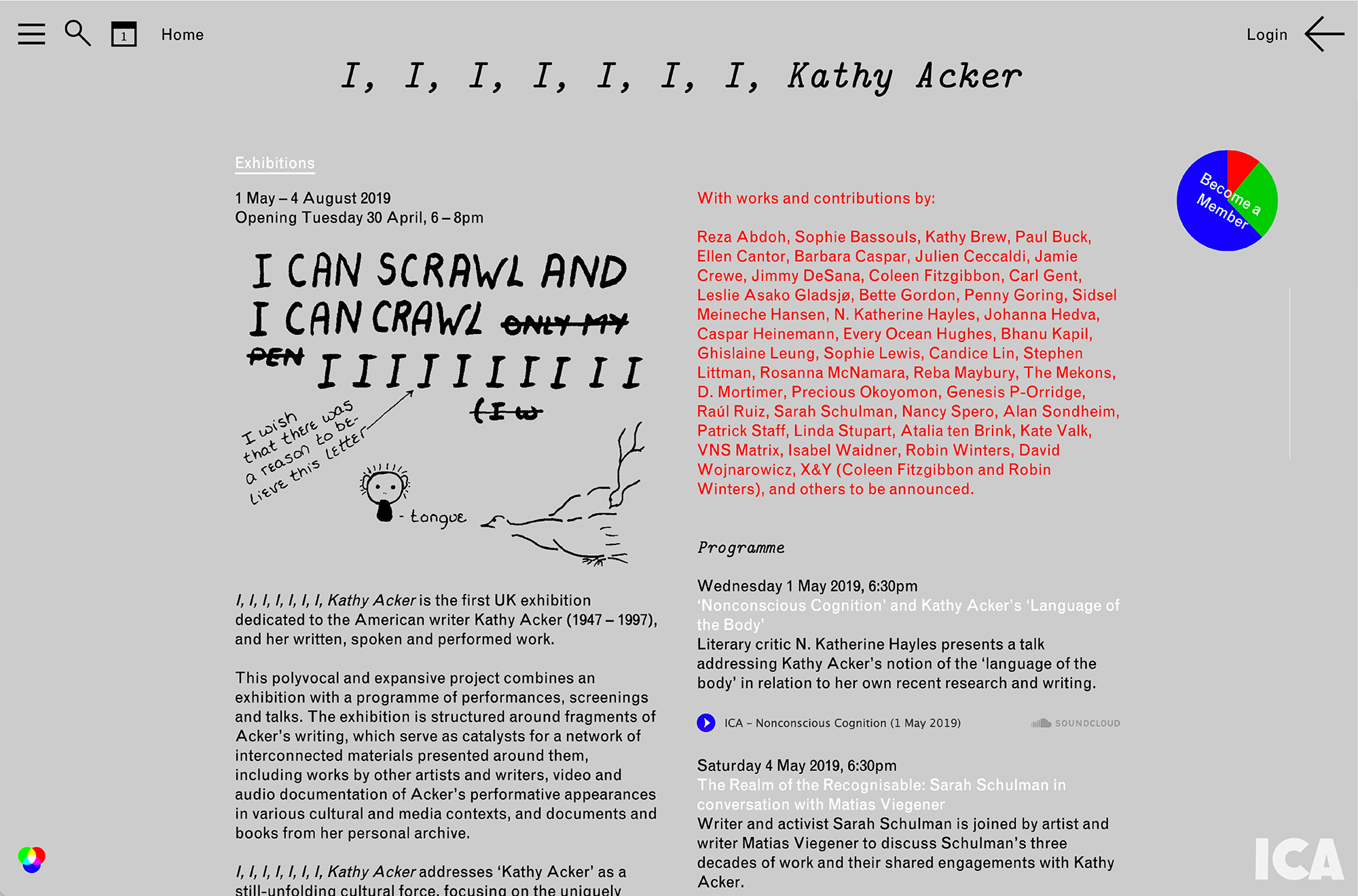
1. The parallel, equivalent use of the full name, spelled out to emphasize the plural arts, along with its acronym, variously typeset in complementary serif and sanserif fonts.
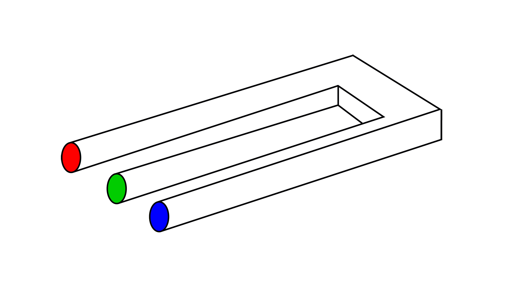
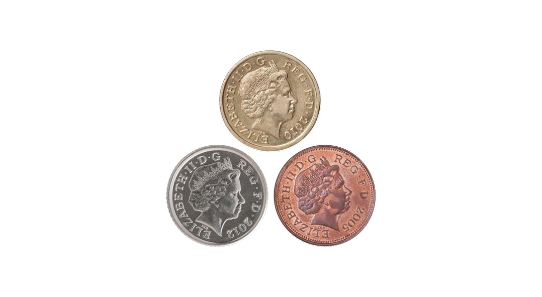
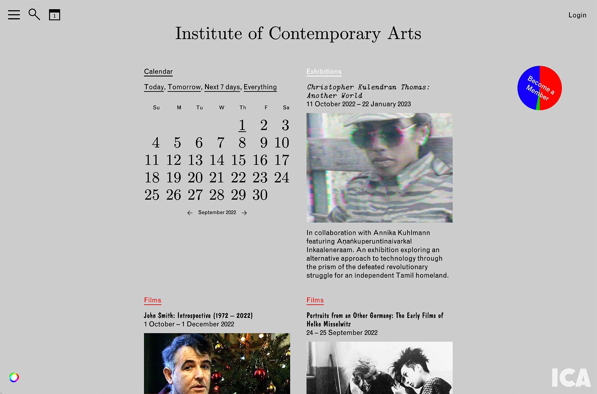
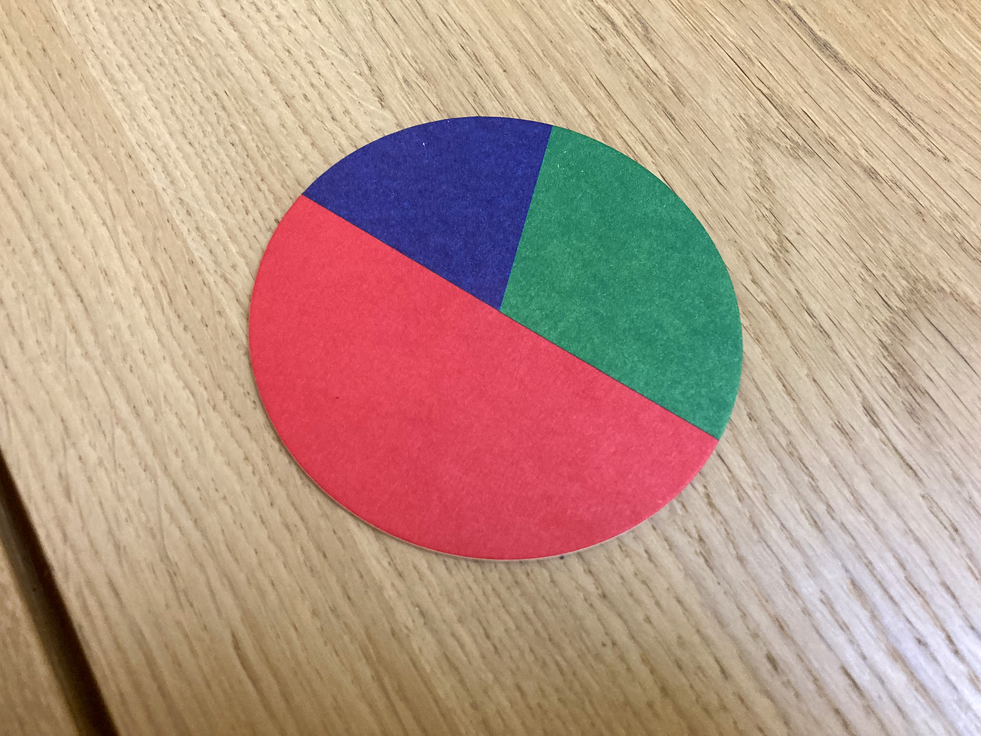
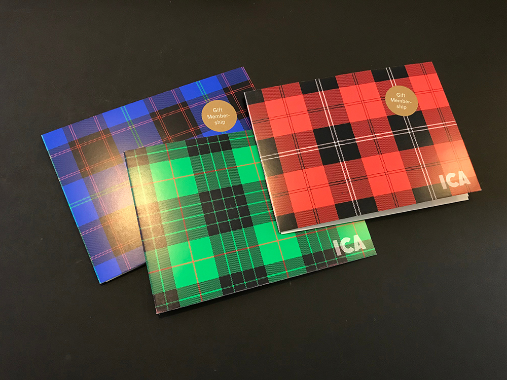
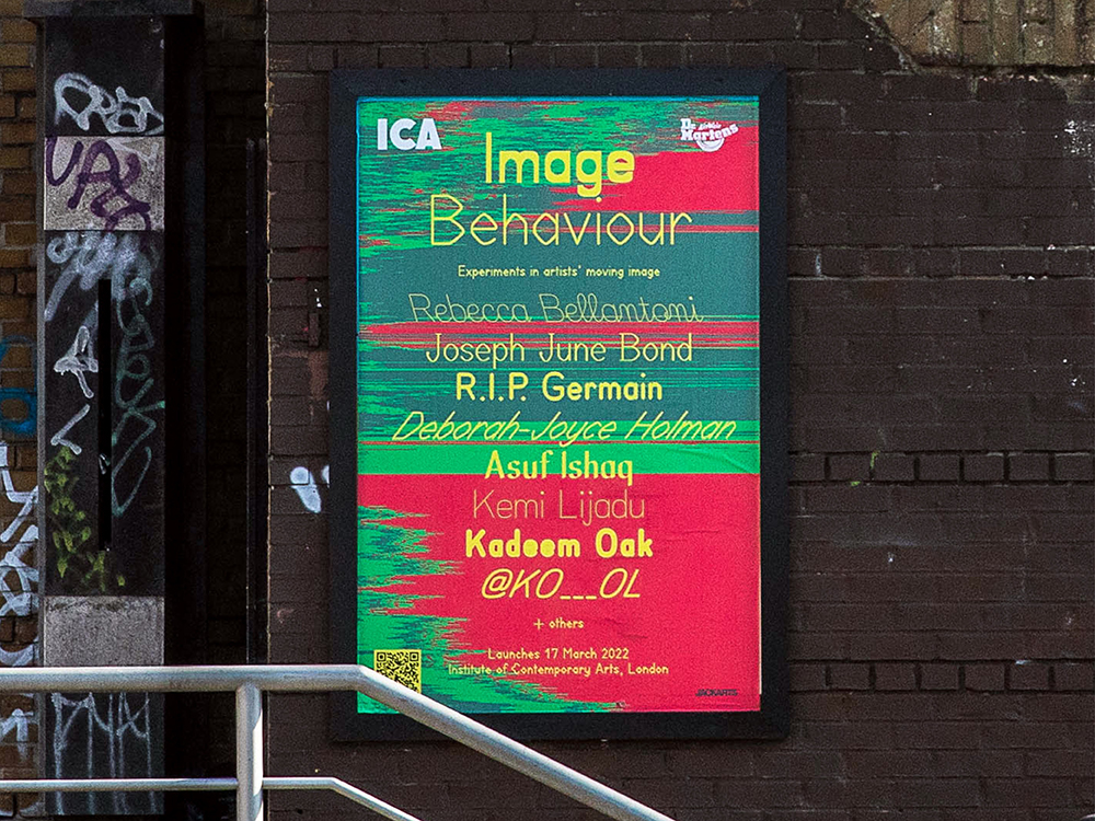
2. The frequent use of “digital primary colours” red, green and blue, often on a light grey background, along with bronze, silver and gold for more money-related matters (sponsors, donors etc.).
3. A logotype derived from a poster-catalogue designed by early ICA acolyte Richard Hamilton to accompany an exhibition of the work of James Joyce in 1950.
4. A set of familiar optical illusions used as visual headers for categories that don’t otherwise have any obvious title or clear unifying theme.
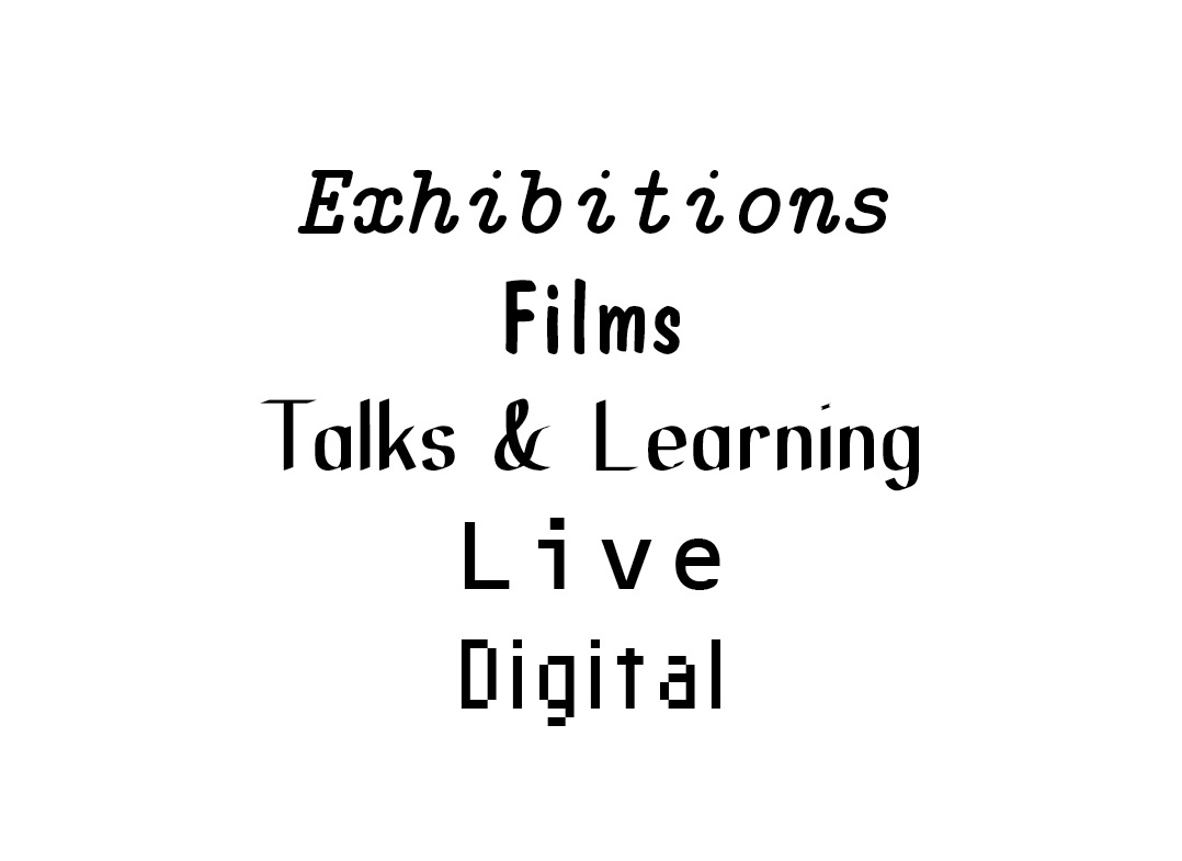
5. An emphasis on the non-hierarchical, parallel programming of the ICA’s five main strands of activity—Exhibitions, Films, Talks & Learning, Live, and Digital—each with their own font chosen to be as distinct from the others as possible.
6. Communication channels designed to be equally useful for staff on the inside and public on the outside of the institution—via what we thought of as a “Janus interface.”
*