Way of Working
2003
A first version of this essay on four books designed by British graphic designer and historian Richard Hollis was written for Dot Dot Dot 5. This slightly revised version was published in the book Ways of Working (Daegu: Aprilsnow Press, 2021), along with a greater selection of images and other texts, including one by Richard himself.
*
There are a number of books designed by Richard Hollis that I’ve come to think of as a series, despite them having been made with a variety of authors and publishers over a period of ten years. They share a conversational charm: the tone is always easygoing and engaging, like having a serious drink with the author, accompanied by a carrier bag of sketchbooks, photographs or videos. The designer’s role here is not decorative but interpretive, translating the particularities of each writer’s approach to their subject. That’s not to say the results are visually neutral; they are definitely Hollisian, but his presence is tangible, never intrusive.
Every graphic design job is the result of a peculiar tangle of relationships and conditions. It makes sense, then, to consider the work on these terms—though they may be messy, vague, and not always easy to track down and write about. Casting around for a term to sum up the aesthetic temperament of London studio Graphic Thought Facility, Emily King recently excavated “adhocism” from architectural theory. Although perfectly descriptive of GTF’s work, “ad hoc” deserves broader consideration in the realm of graphic design. That is, the very activity of designing is more ad hoc than most design writing suggests. What really happened? When graphic ideas appear to jump directly from the designer’s mind to the printed page, weeks, months and sometimes years of accident, disagreement, theft and compromise are reduced to a thumbnail of concentrated surface style, ripe for plagiarism. It seems more accurate, interesting and generous to try and unravel the depth of circumstances instead.
Embracing likely amnesia, then, Hollis and I have informally—anecdotally—recounted the various processes at work to establish how these books arrived at their final state, and why they’ve shelved themselves together in my mind. First some facts, then some thoughts. The spreads, scanned actual size, are poor substitutes for the real things, which are fairly easy to find in second-hand shops or on the internet. Ways of Seeing has been regularly reissued, and is now an art school standard—though the demands of marketing have typically diluted the bold cover typography of each new edition.
...
The ‘series’ is rooted in a chance mid-1960s meeting with the artist, critic and novelist John Berger.
At the time, Hollis was art editor of New Society, a weekly social and cultural commentary journal for which Berger regularly contributed.
At a party, Hollis criticized a commentary Berger had made on an art TV series for being exaggeratedly Marxist. The ensuing argument/conversation, during which Berger discovered he had taught Hollis in a drawing class years before, resulted in his asking Hollis to help realize his fourth novel, G.. Berger intended to illustrate this in the manner of André Breton’s Nadja (1928), a novel that married text and images to the chronicle of a Parisian woman. An earlier Berger book, A Fortunate Man (1967), made a tentative step towards this in-between medium, drawing from both magazine and book conventions. Designed with Gerald Cinamon,
it documented the life of a country doctor, the reportage punctuated with evocative photography.
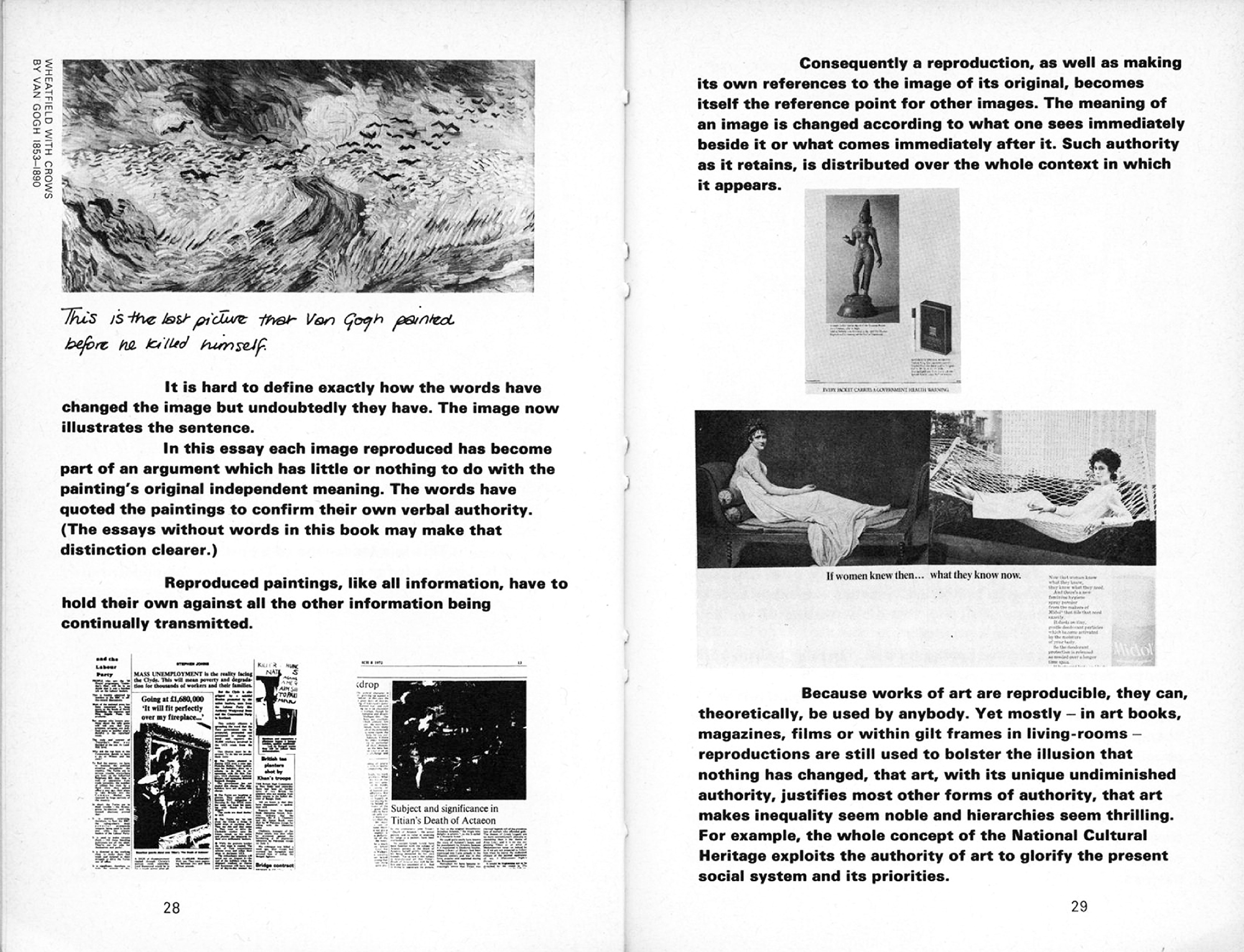
As it turned out, the G. collaboration never really developed past the inclusion of two small Berger illustrations, though there are notable experiments with spacing paragraphs relative to shifts in time, thought and meaning that presuppose the filmic devices of their later work together. (Hollis remembers Berger as being “the rare sort of writer who would be happy to cut or extend his text to fit a paragraph or page.”) But Berger had Hollis in mind for another book, tied in with the author’s BBC TV series Ways of Seeing. This was an unprecedented approach to the public discussion of fine art, essentially an illustrated monologue exploring the idea of art as commodity and its relation to society. It was also an implicit critique of clichéd TV art coverage, which typically involved an expert visiting the great galleries, standing in front of a work and reeling off conventional art history.
The book version (1972), made by an eccentric team of Berger’s acquaintances, including Hollis as designer, demonstrates the fruition of ideas bubbling under in Berger’s earlier publications. The book proper begins already on the cover, flagging at once its maverick character and outspkoen point of view. This is reinforced by a number of obtuse image-only chapters, and emphatically ragged-right blocks of non-hyphenated bold type, broken and positioned to emphasize meaning. Images appear precisely where they are mentioned within the text, their size determined by first aligning the left edge on the large text indent, then centering, which reinforces the equal status of verbal and pictorial elements. The idea being that printed text and image should approximate to Berger’s voice-over in the TV episodes, akin to the act of scrolling through a length of film while listening to the soundtrack.
The book deliberately avoids full captions with pictures (which involved a battle with copyright holders). In order to discourage speed-reading and avoid breaking the text flow, they are instead discreetly identified by title, artist and artist’s dates along the side of the image. More detailed captions are pushed to the end of the book.
In an introductory note, Berger wrote: “The form of the book is as much to do with our purpose as the arguments contained within it […] Our principal aim has been to start a process of questioning.”
Following the success of the Ways of Seeing process, Berger asked
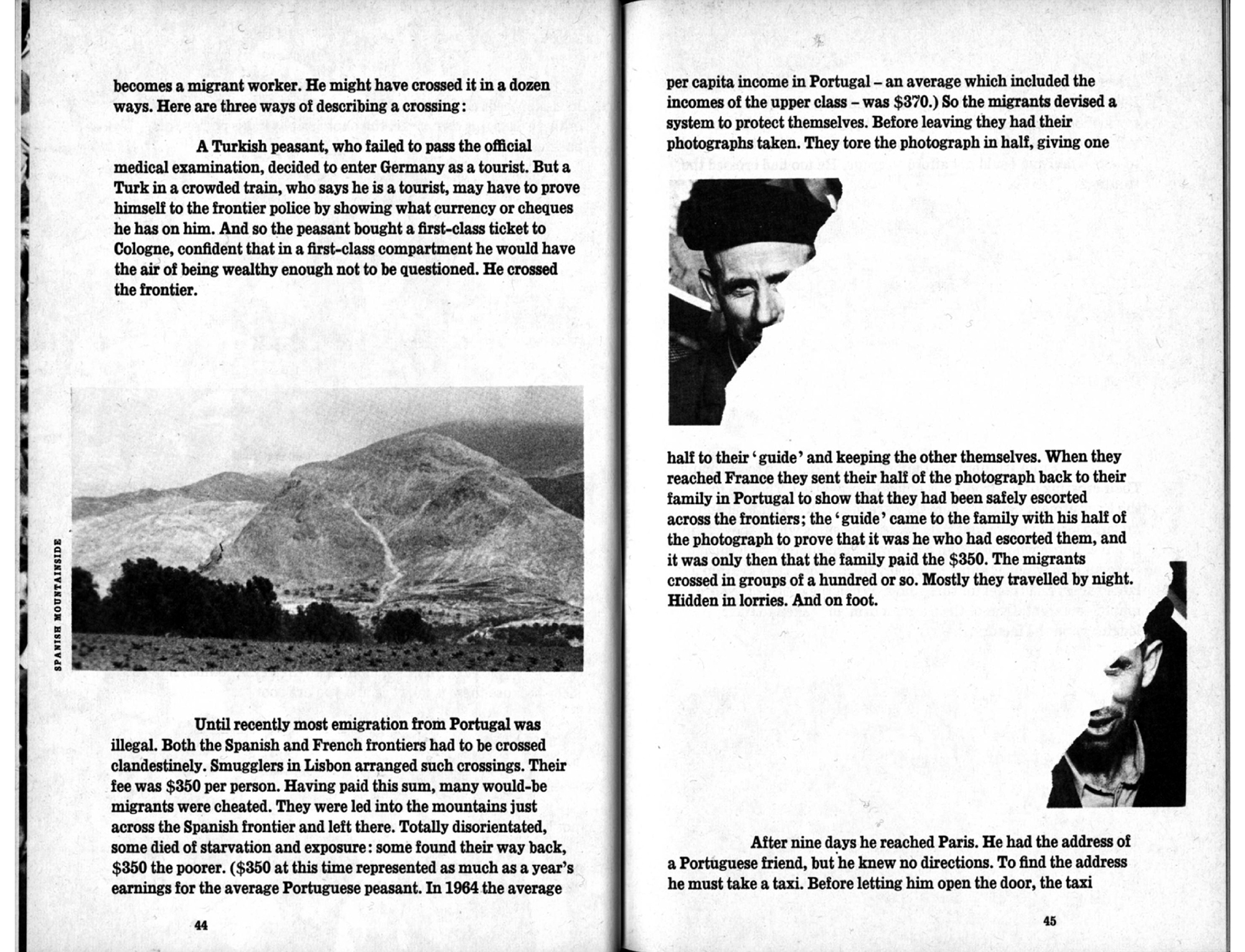
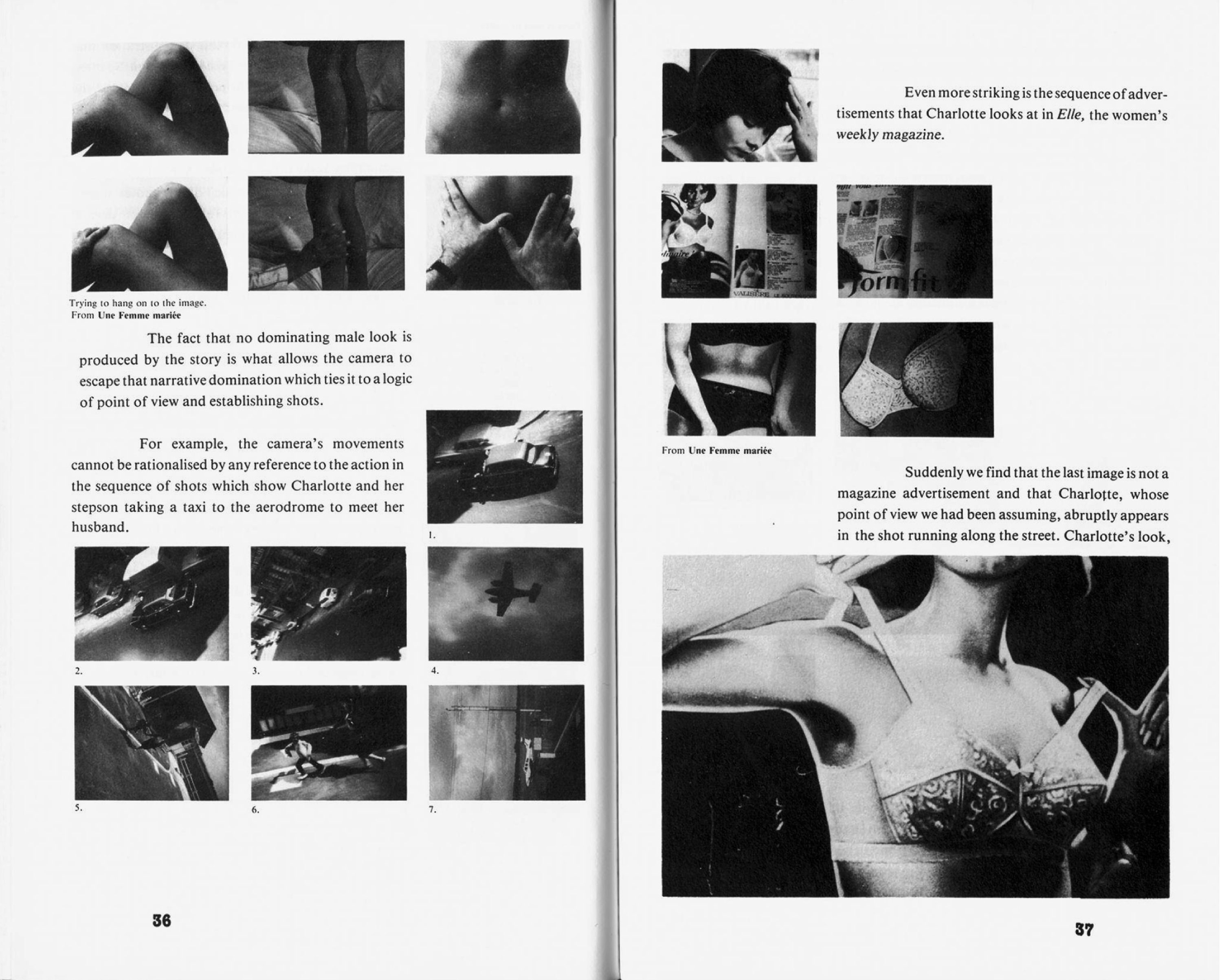
Hollis to design a subsequent work, A Seventh Man (1975). Jean Mohr’s stark documentary photographs were given equal billing with Berger’s texts, to form a simultaneously personal and political account of the plight of migrant workers in continental Europe.
The loose, seemingly improvised layout immediately recalls Ways of Seeing’s reflexive train of thought, and, like the previous book’s proximity to TV, A Seventh Man mimics documentary film. Mohr's photographs are juxtaposed with poetry, statistics, diagrams and incidental items:
a photo ripped in half, a blank non-image, a till receipt, a detail from one image isolated and enlarged, and so on. The selection and splicing together of these rhetorical devices is intended to preclude any redundancy or repetition, and the outcome matches the vitality of Berger’s outspoken voice. Again, the author makes a point of introducing the design in the opening pages:
The book consists of images and words. Both should be read in their own terms. Only occasionally is an image used to illustrate the text. The photographs [...] say things which are beyond the reach of words. The pictures in sequence make a statement: a statement which is equal and comparable to, but different from, that of the text.
Hollis has a slightly different take: “Some images are direct illustrations of the text. Indeed, they sometimes seem to prompt a new point in Berger’s argument.”
On the basis of seeing the Berger work, fiery Cambridge academic Colin MacCabe approached Hollis to design a structuralist analysis of the equally combative French auteur Jean-Luc Godard, Godard: Images, Sounds, Politics (1980). The book was initially developed by the author and designer watching the films together, and Hollis’s knowledge of French was a huge advantage in understanding the nuances.
Throughout the book, sequences of stills from these sittings punctuate the text, set in a justified column, which contracts and expands to accommodate them. Footage is used grammatically, with repetitions, jump-cuts and obscure juxtapositions that echo Godard’s own wild inventiveness. Such visual logic is also worked out typographically: the voices of Godard and his characters always appear in bold to MacCabe’s roman, for instance, and the author’s occasional notes are stuffed into gaps between columns, as if scrawled directly onto the page. The book was typeset as soon as MacCabe produced his text, chapter by chapter: Hollis pasted up the type with screened bromide prints of the images, in some instances line by line.
The main body of analysis is sandwiched by an opening title sequence that juxtaposes quotations and contemporary film images (bringing the reader up to date with the myth of the then-reclusive Godard), and a closing title sequence that reproduces a section of one of the director’s pictorial collage storyboard-scripts. Other screen conventions were appropriated, too: American Typewriter (the standard subtitling font at the time) was used on the cover, and for page numbers and chapter titles—the latter reversed white out of black in TV-format boxes.
A couple of years later, Hollis was asked by the British Film Institute to design
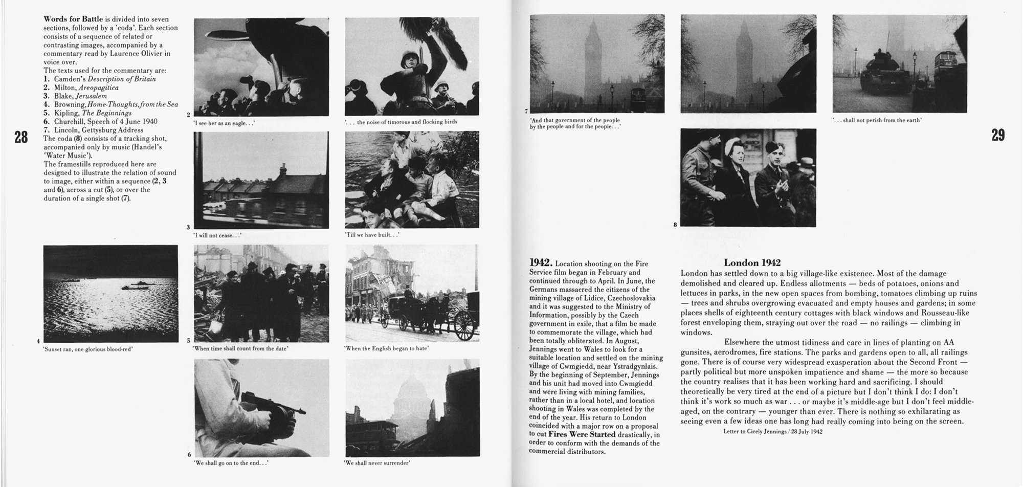
a monograph on Humphrey Jennings,
a film-maker best known for his austere, unsentimental wartime documentaries.
This book, Humphrey Jennings: Film-maker, Painter, Poet (1982) has much in common with the previous three, both in terms of subject matter (a monograph about a cross-disciplinary artist, significantly involved in experimental film) and technique (combining reproductions of numerous visual and textual media). Like the Godard book, here Hollis had a key editorial role, scanning the film archive and selecting relevant stills. This time, however, he was without an immediate working group or partner—Jennings’s daughter edited the text
from a distance—and so left with the full responsibility of piecing together a (typo)graphic story to support the verbal. Of the four books, this is perhaps the most fully formed. It draws heavily from the experiment and exploration of the previous three, recycling and refining ideas to result in a confident well-rounded impression of its subject. On this occasion however, the result feels less derived from screen-based media, and more like an unusually intense scrapbook.
...
Having worked with Hollis off and on over the past few years, it’s easy enough to trace a number of personal characteristics in the work. Not that personality in graphic design is unusual, but still it’s notable how in Hollis’s case eccentricities always seem beneficial rather than gratuitous, helping the content along rather than obstructing or jostling for attention with it. The most significant of these is his tendency in conversation to go off on a barely related tangent and end up miles away, mirrored in the books' sense of off-road improvisation. Form reacts organically to content, following a stubborn, childlike—but never childish—line of reasoning. For example, after deciding that the visual weight of the Ways of Seeing text should equal that of the images, Hollis set the entire book in bold Univers 65 – two fingers up at the sort of well-mannered book design maintained by Penguin’s chief designer at the time, Hans Schmoller. In fact, the first time Schmoller saw a copy of Ways of Seeing he pitched it down the corridor in fury, and the twinkle in Hollis’s eye as he recounts this points to a couple of other qualities at work: a casual disregard for authority and a buoyant sense of humor.
Ways of Seeing was made by a team of five: an author (Berger), a designer (Hollis), an artist (Sven Blomberg), a producer (Michael Dibb) and a ‘critical friend’ (Chris Fox), whose actual roles were more fluid than these titles suggest. I have an image of them in my mind's eye, assembled for the first time like The Usual Suspects, initially suspicious of each other, unavoidably holed up in a claustrophobic studio for weeks on end. Hollis confirms this isn’t too far from the truth, describing the process on one occasion as “trying to make sense of each others’ ideas” and on another as “trying to make sense of Sven’s bloody collages”—being sheets of juxtaposed images cut from books and magazines. When an exasperated Hollis suggested that he had trouble understanding the point being made by one such collage, Blomberg retorted “fackin’ obvious!” and stormed out to sulk on the balcony. But if the ways of seeing weren’t always eye-to-eye, the democratic spirit holds in Berger’s insistence that the royalties from the book’s first printing were split equally five ways.
There is a strong sense of mutual trust between Hollis and and the various authors and editors involved in the four books. This trail of work developed because the commissioning parties in each case had recognized Hollis’s previous work and interest. In each case a relationship was established on the basis of his approach, and because of this implicit understanding, the shared wavelength, the end product ends up greater than the sum of its constituent contributors. An intense working relationship results from a joint search for the best means of communicating ideas, through familiarity with the subject matter and the author’s relation to it. Rather than the books being editor- or designer-led, they push for a third, uncharted way. Other examples that come to mind are the similarly symbiotic collaborations between Marshall McLuhan & Quentin Fiore, or more recently Rem Koolhaas & Bruce Mau, which also result in what I've come to think of as a “truth-is-stranger-than-fiction” aesthetic. An open mind and a willingness to draw form from content, dismissing convention and personal stylistic agendas, results in work more visually radical than a purely formalistic approach where radicality itself is the main aim. In an article on Hollis called “The New Tradition,” Robin Kinross pinpointed this, describing his subject as “inventive rather than innovative.” These books feel rather than look the same precisely because they share an approach rather than a style.
It’s almost too obvious to point out that these books pre-empted digital multimedia, being collections of disparate material combined to articulate a story or argument. The then-infant influence of TV is all-pervasive, most obviously in the quick-cut documentary-style editing that results in unusually animated narratives. With the exception of A Seventh Man, the books are thematically concerned with film, so Hollis’s appropriation of the medium’s techniques are especially apt, under the influence of a few similarly cinematic works such as French documentarian Chris Marker’s Commentaires (1961). Hollis’s designs also bring to mind certain process similarities across media, such as real ink-on-ink over-printing, jump-cuts in film, or a band ending a song at the same moment: all seem fundamentally connected in the same way that “opposite” techniques like imitation overprints, graduated tints, or fade-outs in film and music are too. Again these former qualities seem to describe—and again this sounds a lot better in my head than it does on paper—an aesthetic of truth, or perhaps candour.
Tellingly, these books were made between the late 1960s and early 1980s, when layouts were typically made by cutting blocks of text from one long typeset “galley.” The two Berger books were made by drawing approximations of the pictures, with proofs of the texts stuck down onto same-size flat layout sheets. The pages were later reconstructed from these instructions by the printer, a process that involved a certain amount of juggling and guesswork. In contrast, while the later Godard and Jennings books were also constructed on double-page templates, the typesetting and images were always final “camera-ready” versions. This paste-up was eventually photographed to make film from which printing plates were made. Therefore, this process was much more precise. Resizing images or changing type characteristics were prohibitively expensive processes, so decisions had to be fixed at an early stage. This explains some odd features: in the Godard book, for instance, paragraphs intended to carry images were made thinner before knowing the exact number of stills to be used, which has left a number of erratic (i.e. otherwise inexplicable) gaps.
Compared with current page make-up software and production techniques, paste-up is a fundamentally different way of working that affects the outcome in at least three ways. Firstly, focus: The nature of paste-up means that decisions must be made sooner (and stuck with) unlike DTP, where work can be (and so always is) changed up until the last minute. Secondly, tactility: The paste-up process involves three-dimensional ink on paper rather than two-dimensional light on screen, so the designer is always working closer to the reality (scale, feel) of the final object. And thirdly, pace: Although having long since acquired an Apple Mac, Hollis still uses his long-serving wax glue machine which forces him to work at a slower, more human rate. Moreover, wax is fundamentally different from spray glue in that it can be repeatedly removed and re-stuck, allowing the work-in-progress to remain open-minded and *breathe*.
*