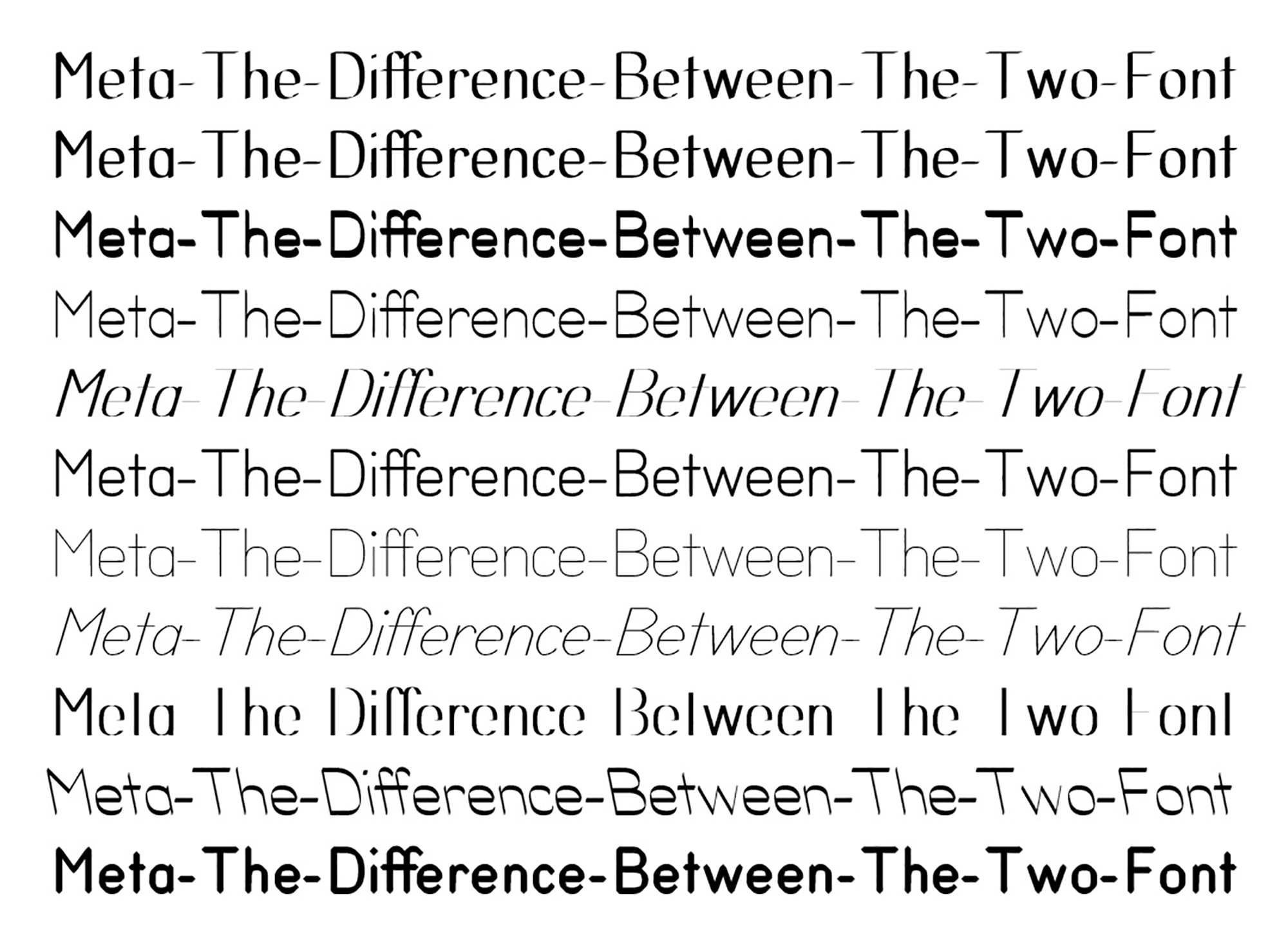
Meta-The-Difference-Between-The-Two-Font
2010 –
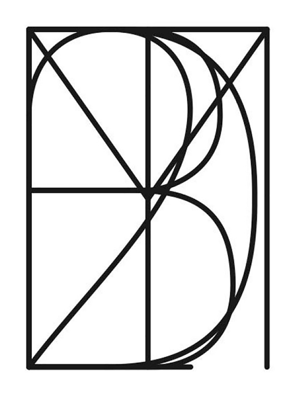
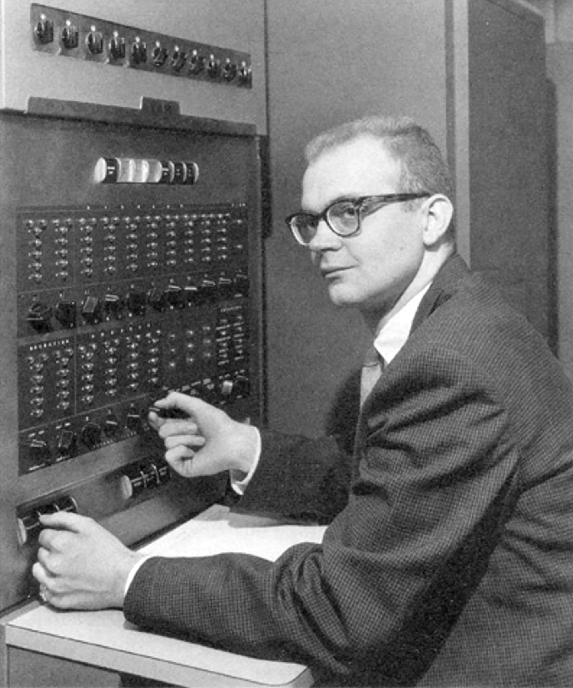
Metafont is both a description language and piece of software conceived in the 1970s by computer scientist Donald Knuth as a companion to his TeX typesetting system. It comprises a set of values—weight, slant, superness, curliness, slant, pen—that can be adjusted to generate infinite variations on the same skeleton alphabet, as opposed to the usual limited “family” of related characters that make up a typical typeface.
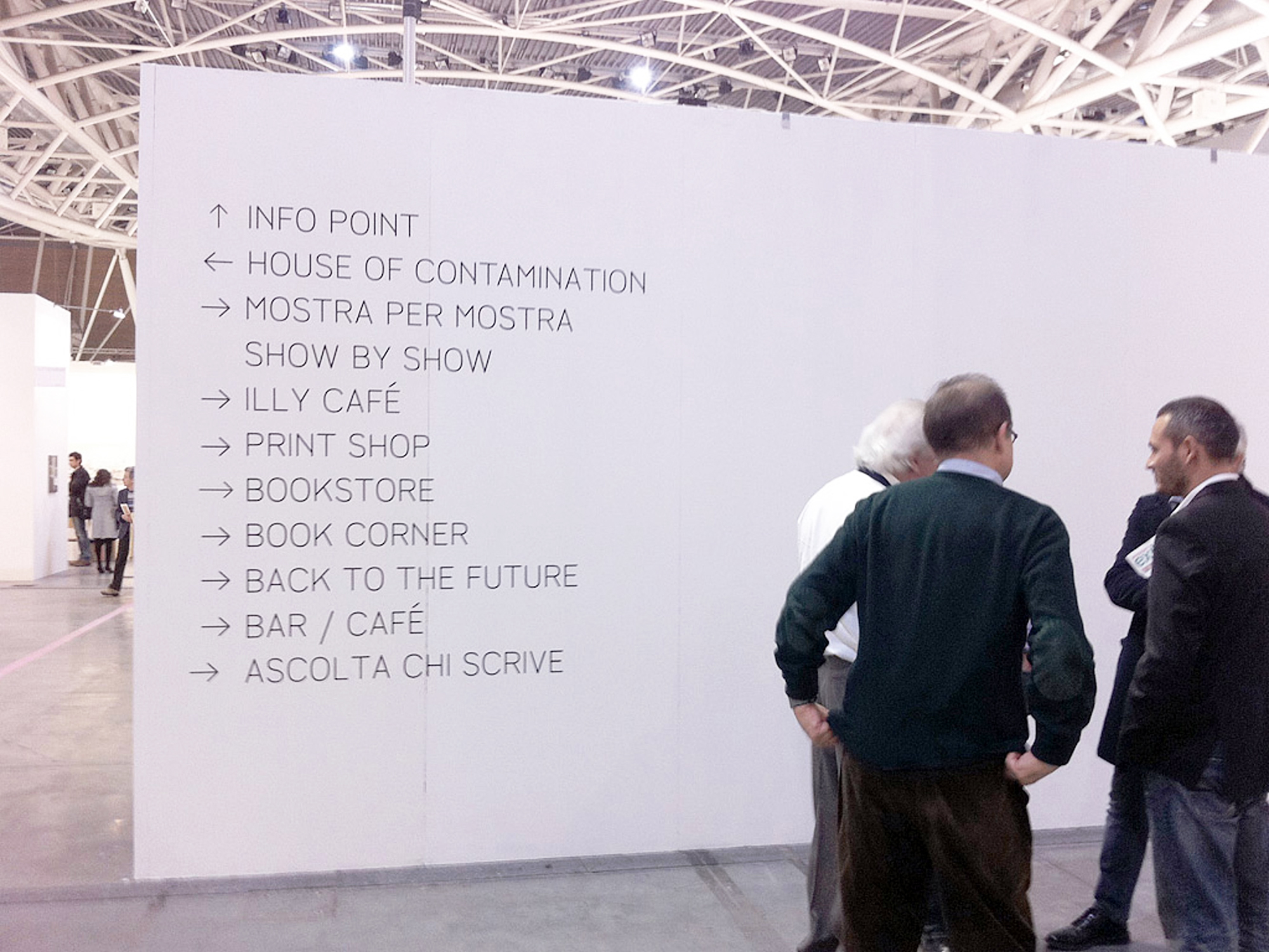
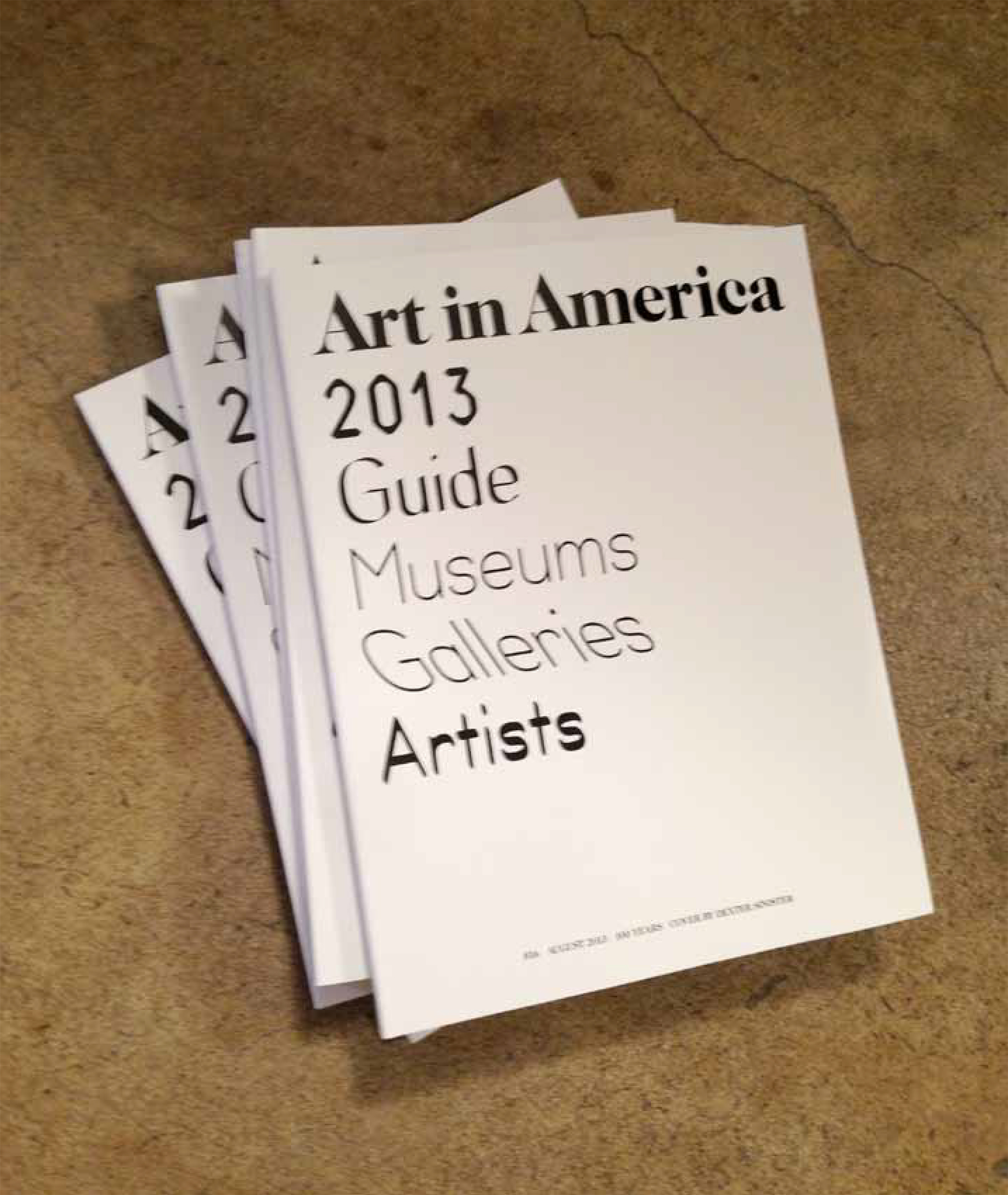
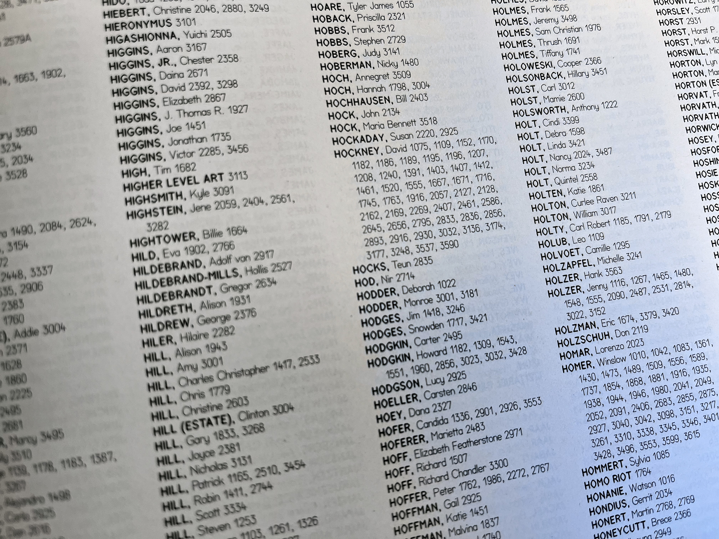
In 2010 Dexter Sinister updated Knuth’s software to run on contemporary computers, newly christened Meta-The-Difference-Between-The-Two-Font, or MTDBT2F for short. Its first outing was at the Queens Museum in New York, where it was used to typeset the museum’s entire vinyl signage system and a catalogue of texts, both under the auspices of a group exhibition, “The Curse of Bigness” (2011). We then described and demonstrated MTDBT2F in a palimpsest essay, A Note on the Type, first published in the last issue of Dot Dot Dot, then on www.servinglibrary.org and in Bulletins of The Serving Library 1, where it also became the house font, and later elsewhere. Likewise, individual MTDBT2Fs have been used in other projects, such as to typeset an entire issue of Art in America (2013), for certain aspects of the ICA’s identity, and as a logotype for PLICA jewellery.
A year or so later, we added a new parameter to Knuth’s original set, *time* … as continued in Letter & Spirit.
“A Note on the Time,” along with two sequel essays, is collected in Notes on the Type, Time, Letters & Spirits (Berlin: Sternberg, 2014), part of The Contemporary Condition, a book series we also designed using MTDBT2F.
*