The Curse of Bigness
2010
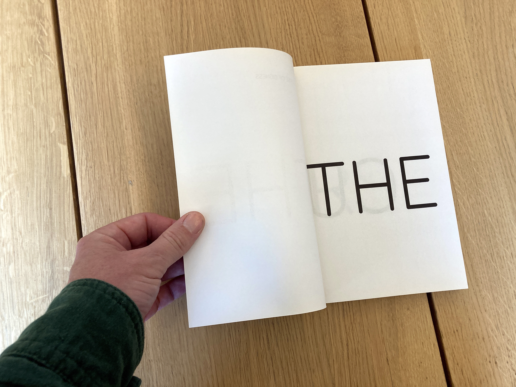
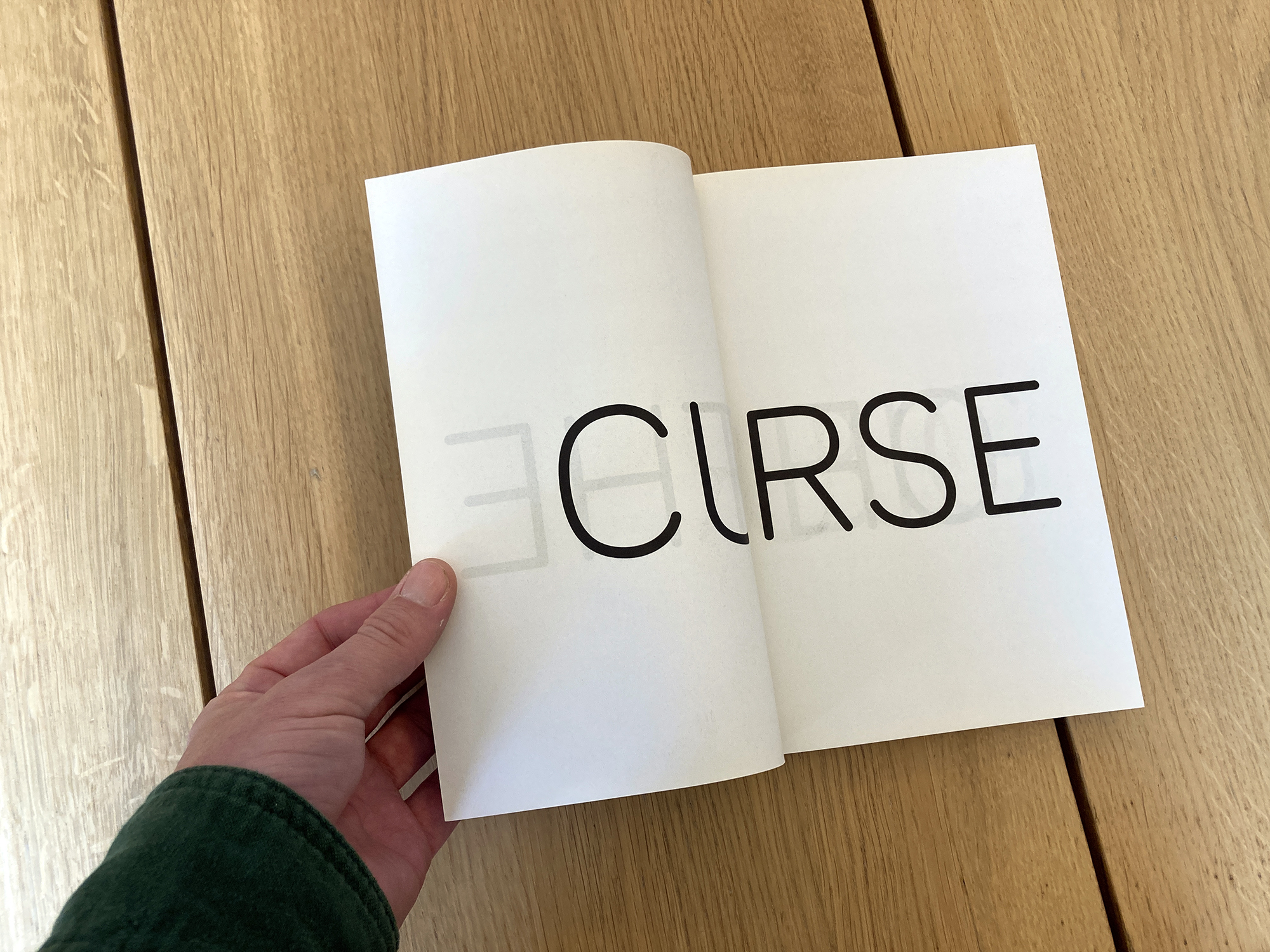
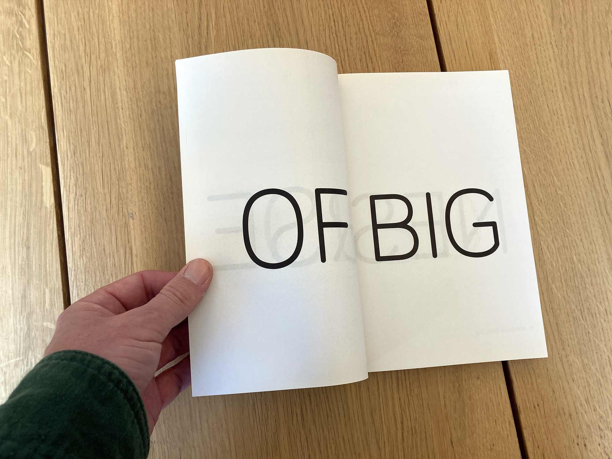
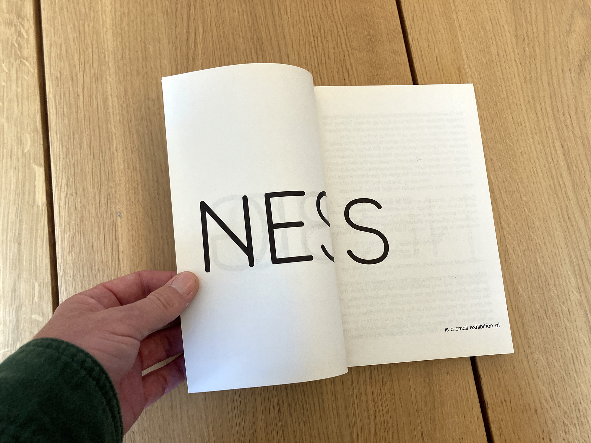
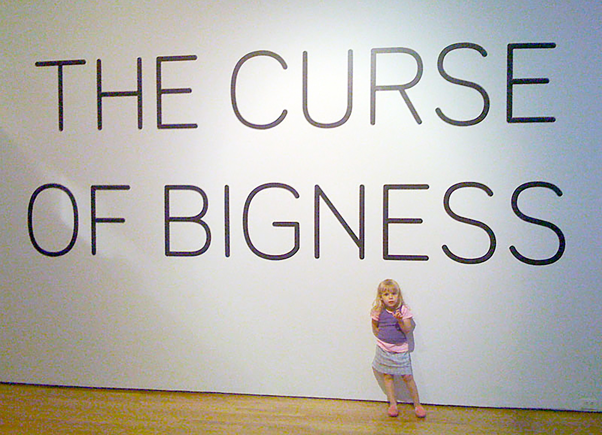
Dexter Sinister was invited to contribute to “The Curse of Bigness,” a group exhibition curated by Larissa Harris at The Queens Museum of Art, New York, in 2010. We used it as an opportunity to develop Meta-The-Difference-Between-The-Two Font (MTDBT2F), and then proposed using it to update the Museum’s shabby signage as well as the wall texts for the exhibition itself.
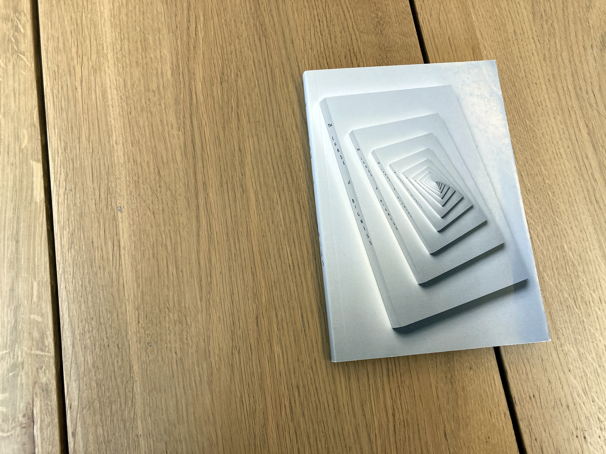
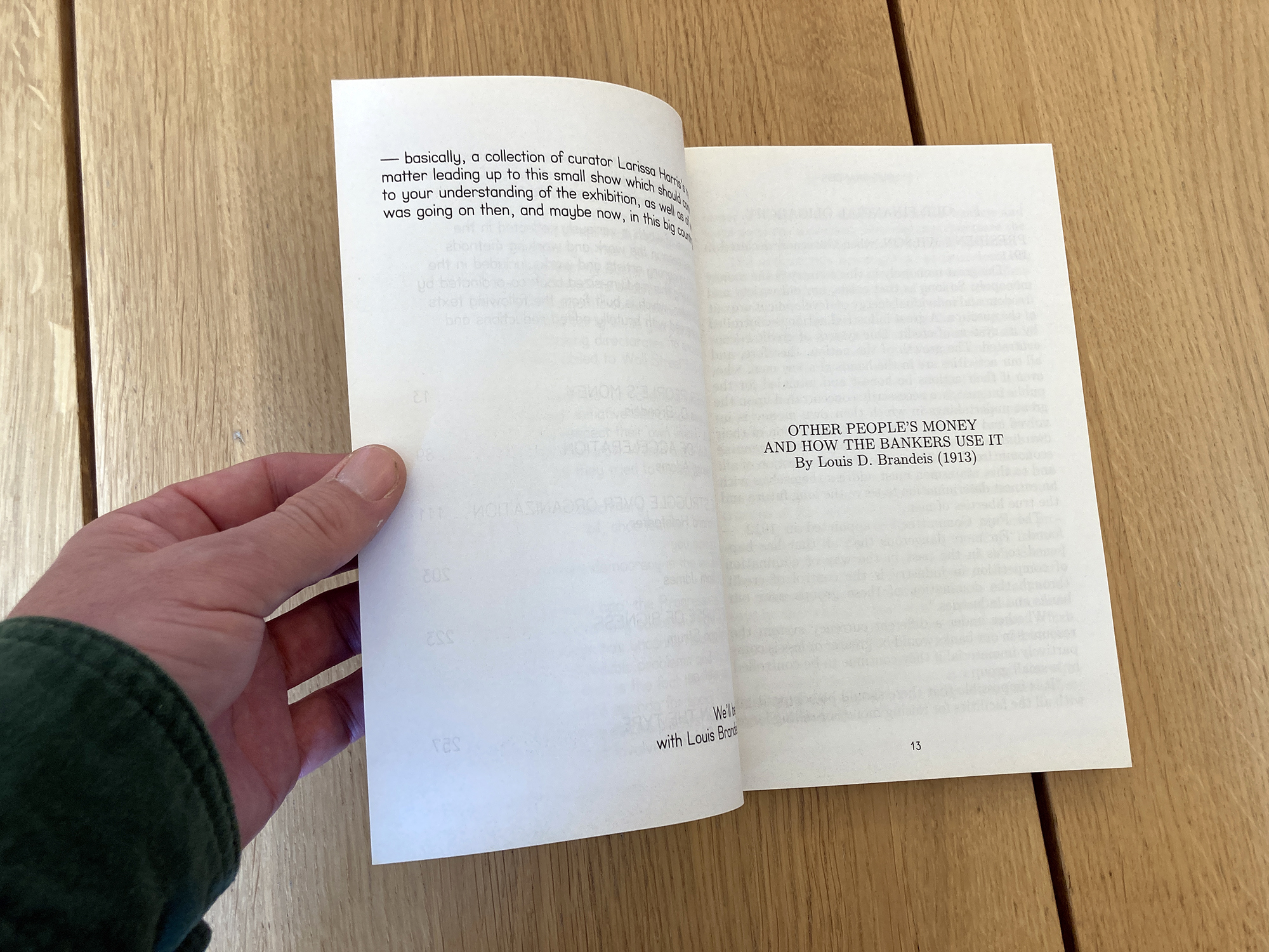
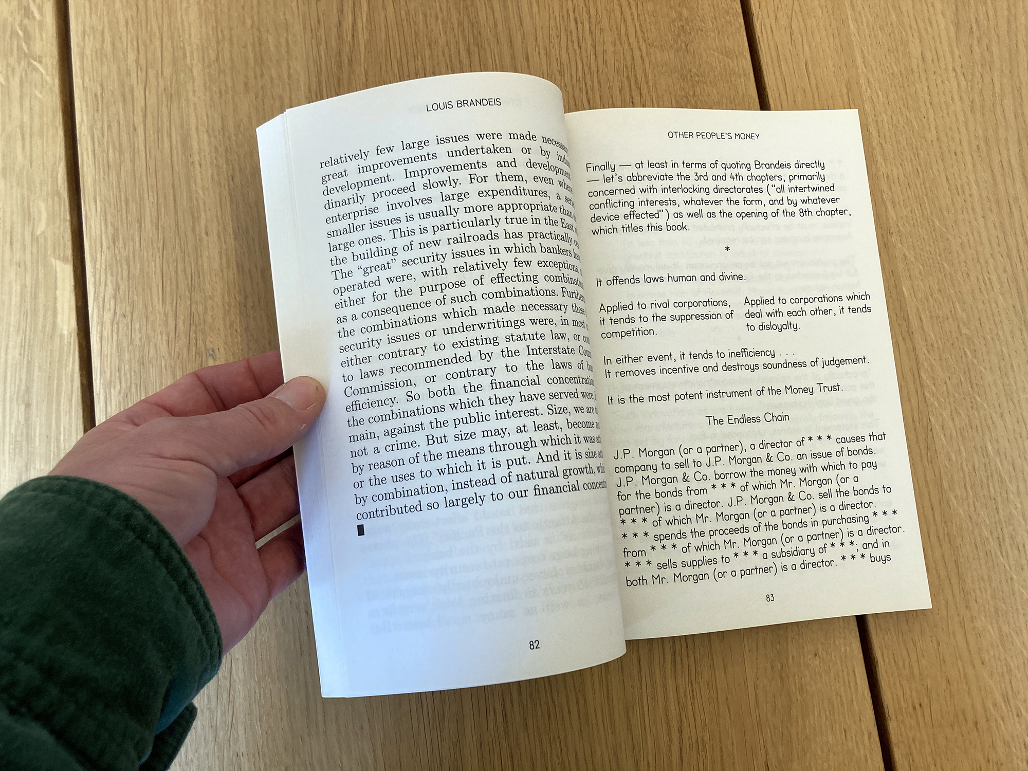
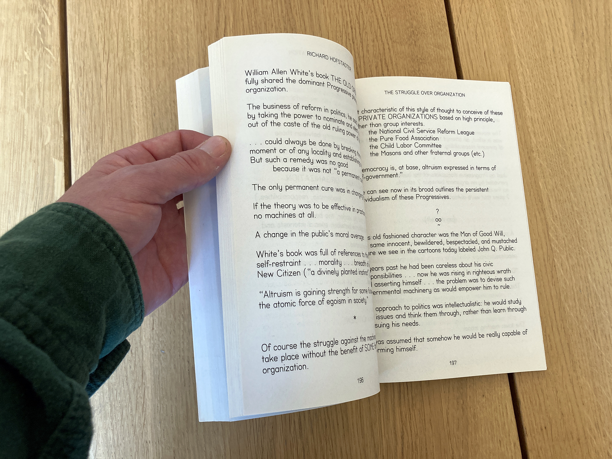
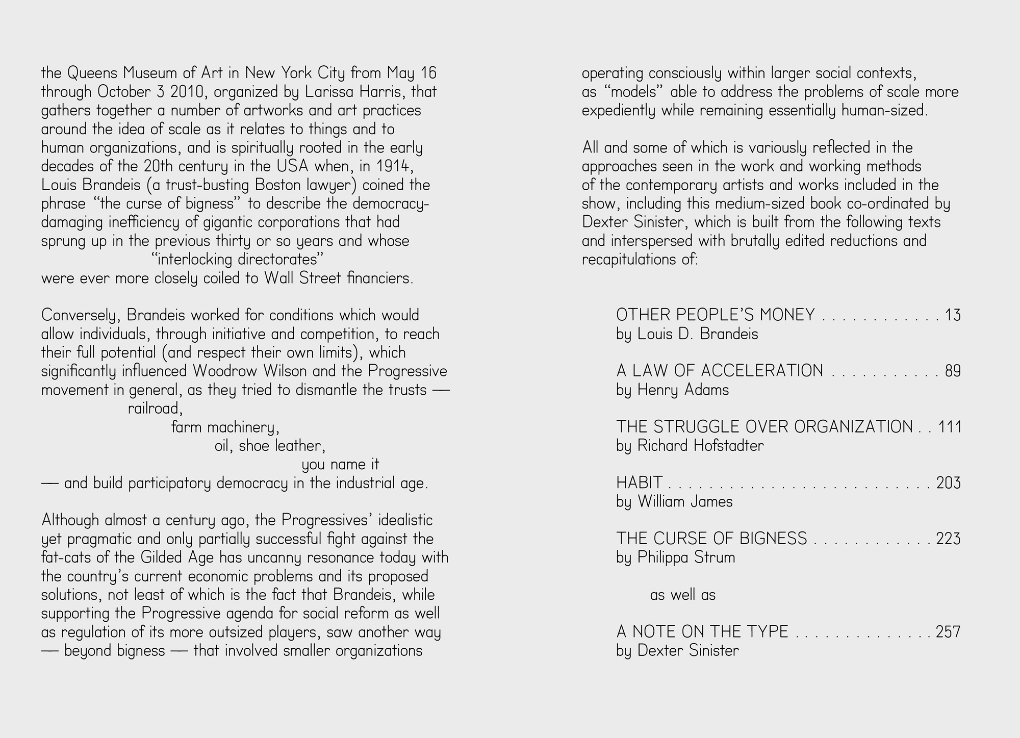
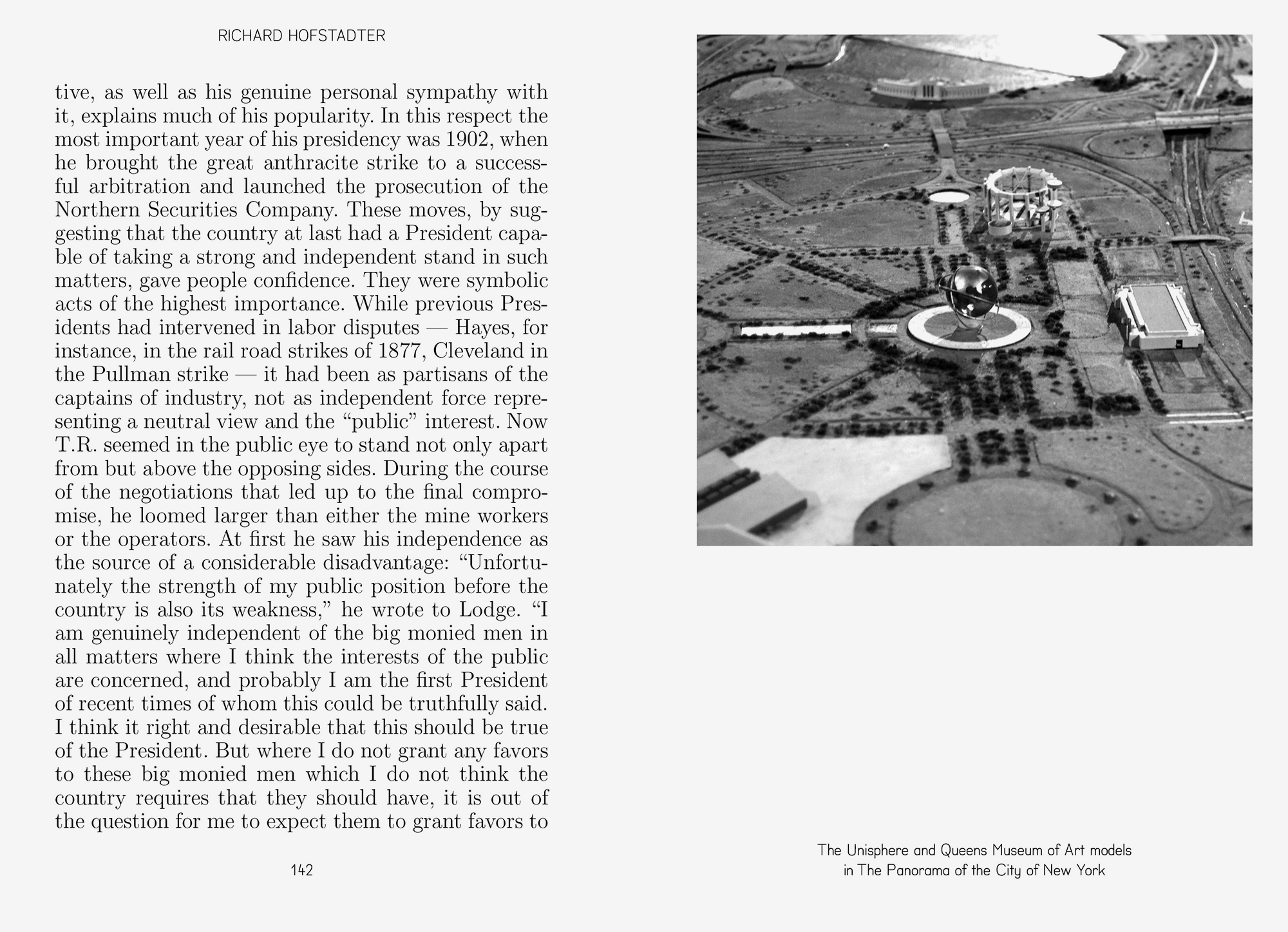
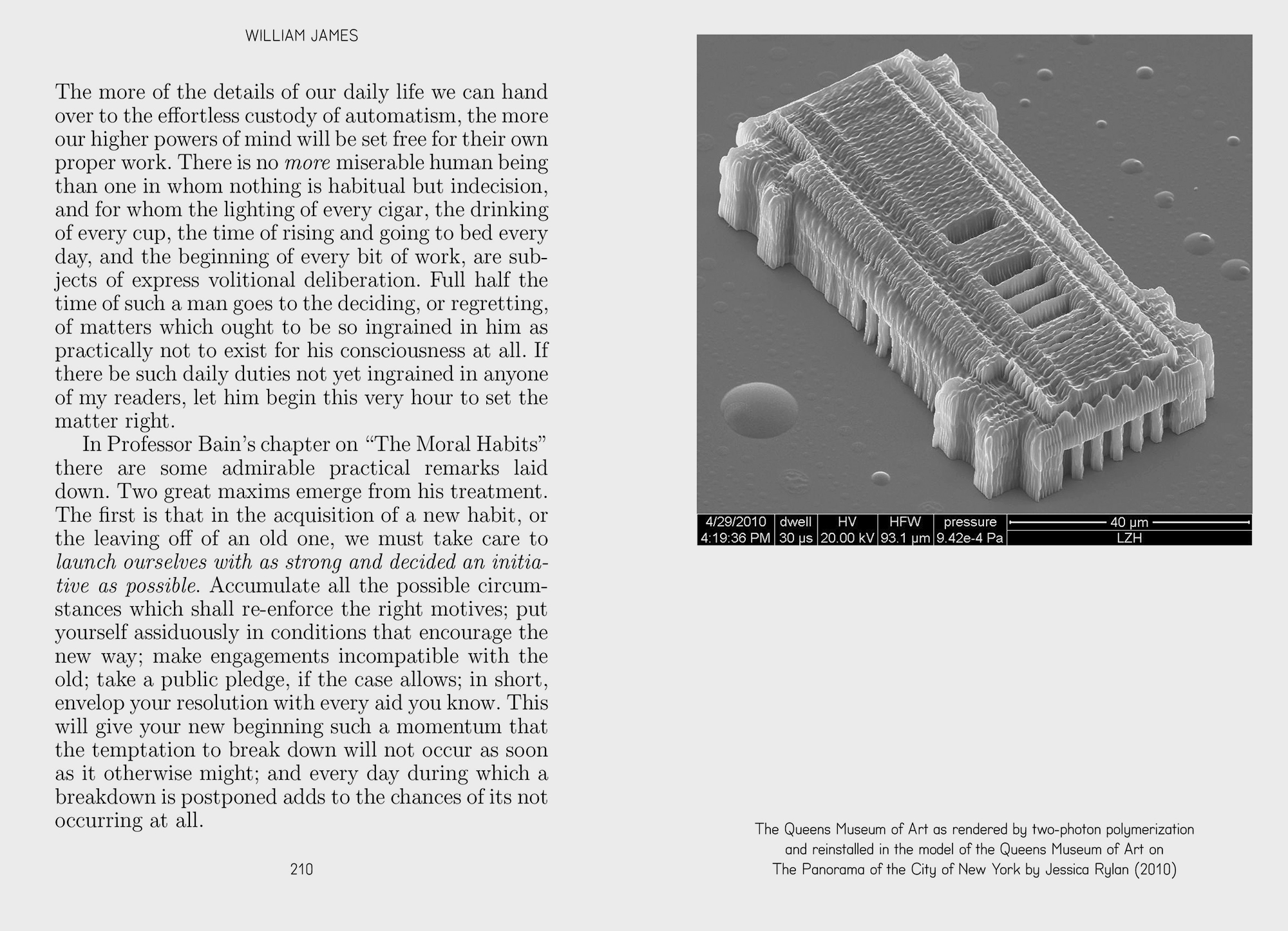
Alongside this we also made a book, essentially a reader of material that had inspired the show which centred on “trust-busting” Boston lawyer Louis Brandeis. In the early decades of the 20th century, Brandeis worked against the damaging inefficiencies of giant corporations—and in the process coined the phrase that titled the show. Various texts by Brandeis and others were reprinted, then intermittently “compressed” into hi-speed, abbreviated versions. At the end we also included the first version of our palimpsest ”Note on the Type,” which relates the history and ideas behind MTDBT2F. Finally, the incredible photograph on the cover was made by Jason Fulford.
*